Canalys: every PC sold will be an AI PC by 2030
Will every PC sold in 2030 be an AI PC? Analysts at Canalys predict that every PC sold by 2030 will have on-device AI capabilities. Microsoft, PC manufacturers, and chip manufacturers have […]
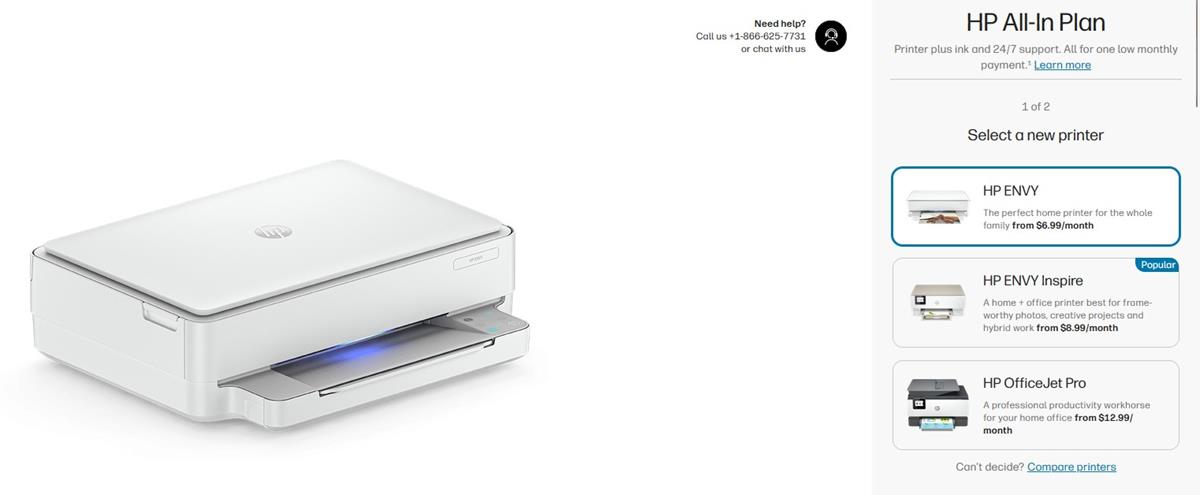
HP's All-In-Plan will let you rent printers, but it monitors them
HP has launched a new subscription service called an All-In-Plan that lets users rent a printer. The company has some restrictions in place, and monitors the content that you print. HP's All-In-Plan […]
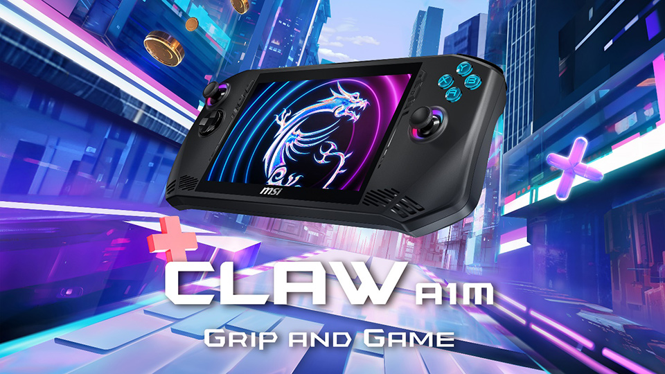
MSI unveils Intel-powered Windows gaming handheld Claw
MSI unveiled its first gaming handheld at CES 2024 today. The Intel Core Ultra-powered Claw A1M is the world's first gaming handheld with Intel's processor according to MSI. Up until last year, […]

Incase Designed by Microsoft: Microsoft accessories live on under new partnership
Microsoft announced in April 2023 that it would discontinue all Microsoft-labeled accessories in favor of its Surface brand. While Microsoft offers some accessories under the Surface brand, it is offering a limited […]

Nokia 2660 Flip review: retro phone that is surprisingly versatile
Nokia 2660 Flip is a new Nokia phone that has made digital detox its mission. While that is one reason for a purchase, there is a surprising amount of other uses for […]
HP raising Instant Ink subscription pricing significantly
Customers subscribed to HP's Instant Ink subscription service receive emails currently from HP about the service. The company explains in the email that it is raising the price of the monthly subscription […]
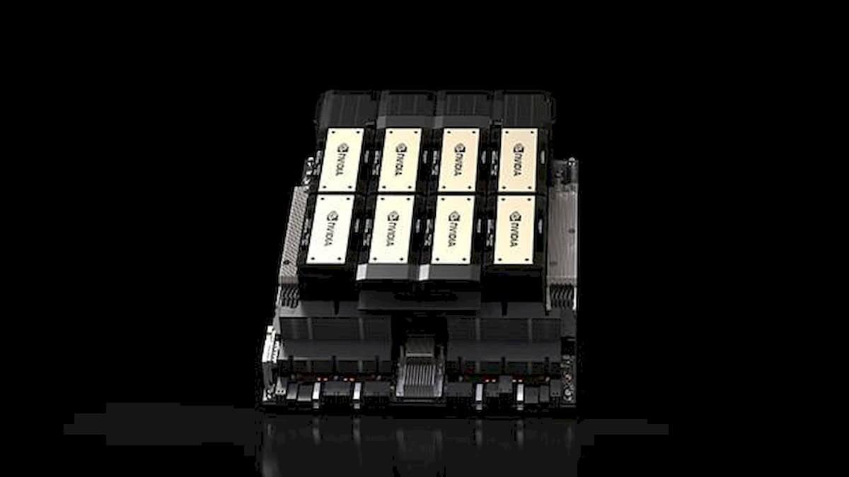
NVIDIA H200 will elevate AI technologies to unimaginable heights
The NVIDIA H200 is a powerful new AI and high-performance computing (HPC) platform that offers significant advancements in performance, memory, and efficiency. Based on the NVIDIA Hopper architecture, the H200 is the […]
Nvidia and AMD to make ARM PC chips in 2025
Nvidia and AMD will enter the ARM-based PC chip market in 2025, a report claims. This could provide some competition for Intel and Apple. Currently, only one company makes ARM-based chips which […]
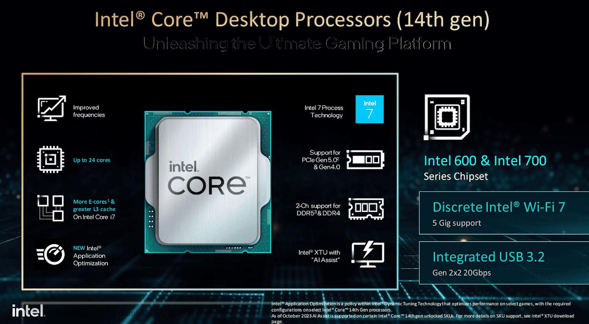
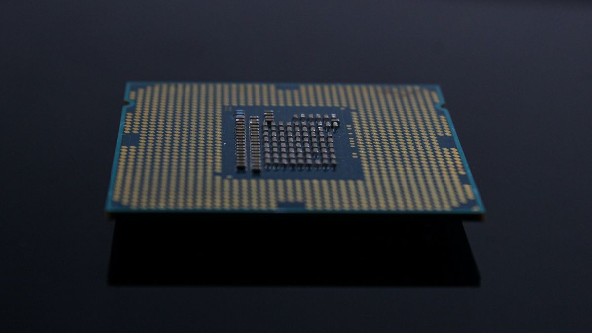
Intel launches Core 14th Generation desktop processors
Intel's latest desktop processor chips are now available officially. The first six 14th generation chips by the company are all unlocked. While they do use the same architecture as their predecessors, they […]
Intel's Raptor Lake Refresh lineup has been leaked
Intel's next desktop update, the Raptor Lake Refresh series, has been fully leaked together with Intel Core i9-14900K, Intel Core i7-14700K, and Intel Core i5-14600K, revealing full specs and pricing information. According […]

Step into the virtual world with Meta Quest 3
The Meta Connect 2023 event has come and gone, leaving in its wake a revolutionary new addition to Meta's lineup of cutting-edge VR headsets - the Meta Quest 3. Building on the […]

Raspberry Pi 5 is finally among us, here are the details
Against earlier doubts about its release this year, the highly anticipated Raspberry Pi 5 has made its debut, boasting significant enhancements while maintaining its budget-friendly appeal. Let's take a look at the […]

Microsoft announces the Surface Laptop Studio 2 and Surface Laptop Go 3
Microsoft has launched a refreshed lineup of its Surface laptops. Here are the Surface Laptop Studio 2 and the Surface Laptop Go 3. Surface Laptop Studio 2 The 2nd gen version of […]
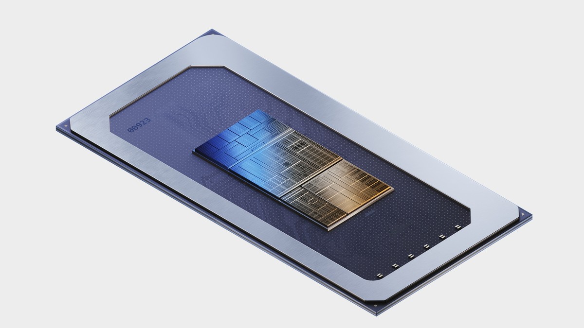
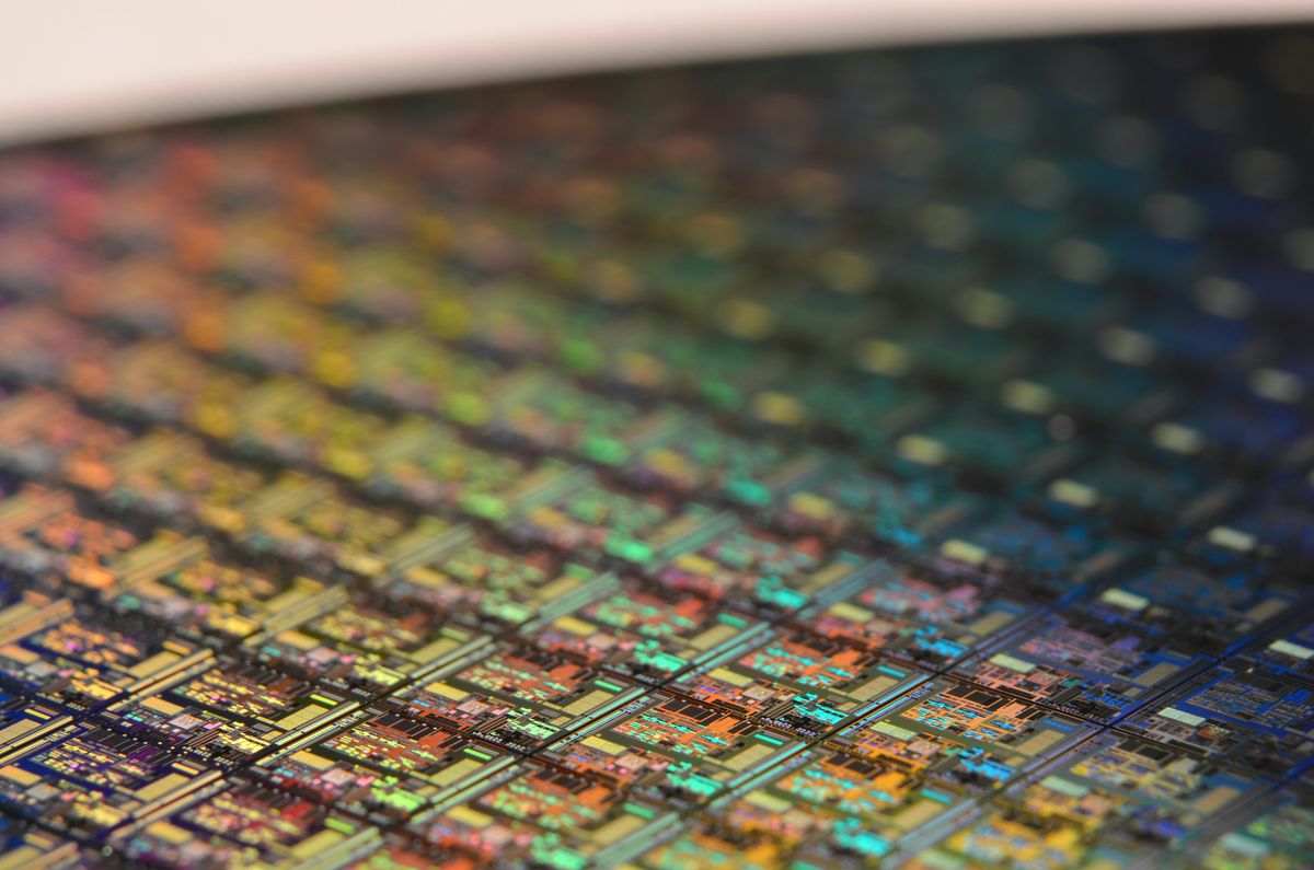
Intel's 14th-gen Meteor Lake is coming soon
Intel's next-generation Meteor Lake processors are a major departure from the company's previous CPU designs. With a tile-based chipset design, dedicated AI processing capabilities, and a new kind of cores, Meteor Lake […]
FTC case leaks a discless Xbox Series X design
In a recent revelation from documents obtained by the Federal Trade Commission (FTC), Microsoft is gearing up for a significant refresh of its Xbox Series X console in 2024. Codenamed Brooklin, this […]

What will Apple's new GPU change?
Apple continues to push the boundaries of technology, and the latest testament to its innovation is the unveiling of the Apple A17 Pro GPU. This cutting-edge component boasts a completely redesigned GPU, […]

Google increases Chromebook support to 10 years
Device support by the manufacturer or third-parties is an important factor when it comes to deciding which device to buy. Many Android smartphones, for example, have had weak support periods, but the […]

The race for chip supremacy: US vs. China
The United States is actively seeking insights into Huawei Technologies Co.'s advancements in chip technology, sparking speculation about the effectiveness of Washington's curbs on China's tech sector. National Security Advisor Jake Sullivan […]
Huawei teardown showcases China's chip breakthrough
The Huawei teardown of Mate 60 Pro conducted by tech enthusiasts has revealed a fascinating blend of cutting-edge technology and indigenous innovation. Huawei's Mate 60 Pro has emerged as a symbol of […]
NVIDIA DLSS 3.5 will offer smoother gaming than ever
NVIDIA DLSS 3.5, the latest advancement in the world of gaming graphics, is set to revolutionize how we experience ray tracing. This technology, set to launch in the coming fall, is designed […]
Samsung's Exynos 2400 comes with a 10-core CPU
Samsung continues to surprise fans and increase the level to higher grounds. According to a leak, Samsung's upcoming Exynos 2400 will feature a 10-core CPU, enhanced AI computing performance compared to prior […]
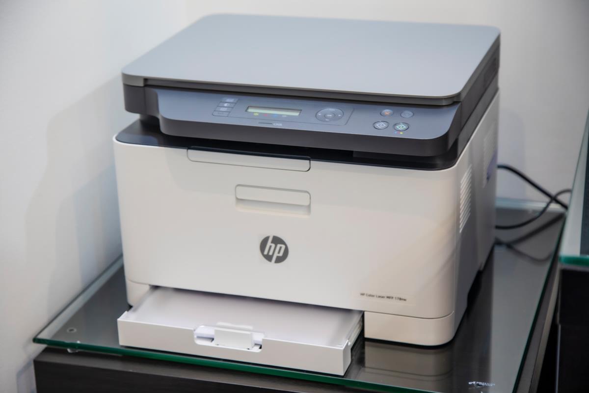
HP in hot water again over restricting functionality on its all-in-one-printers
HP is facing a class-action lawsuit in the United States that centers around the accusation that HP is intentionally bricking functionality on all-in-one printer models when ink is running low. All-in-one printers […]
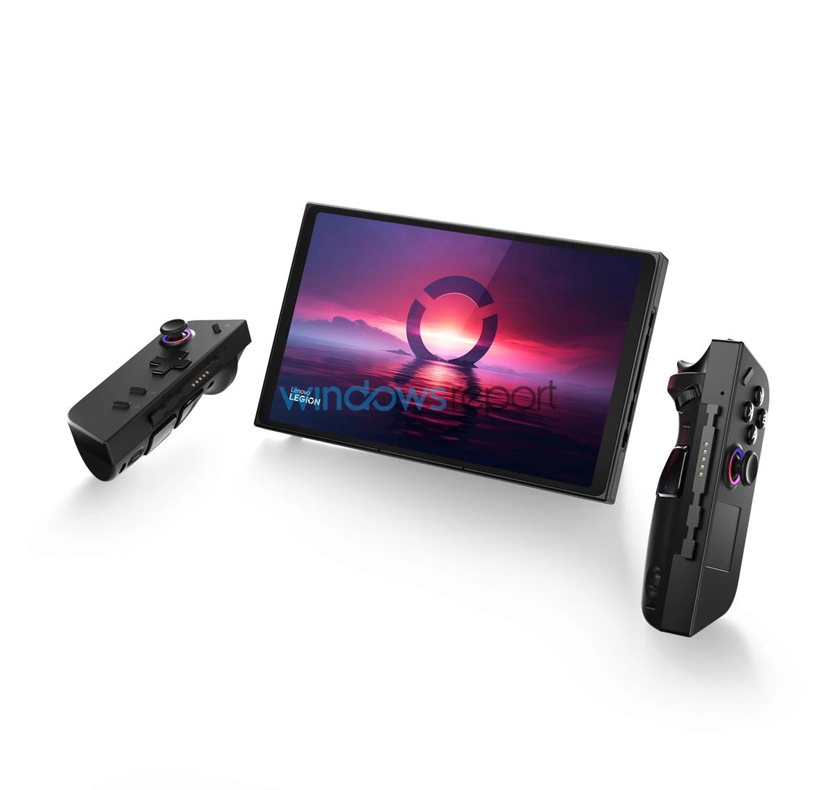
Lenovo Legion Go images leaked: looks more like the Nintendo Switch than the Steam Deck
A couple of weeks ago, rumors about a gaming handheld made by Lenovo surfaced. And now, the first images of the Lenovo Legion Go have been leaked. It's a Steam Deck...it's a […]
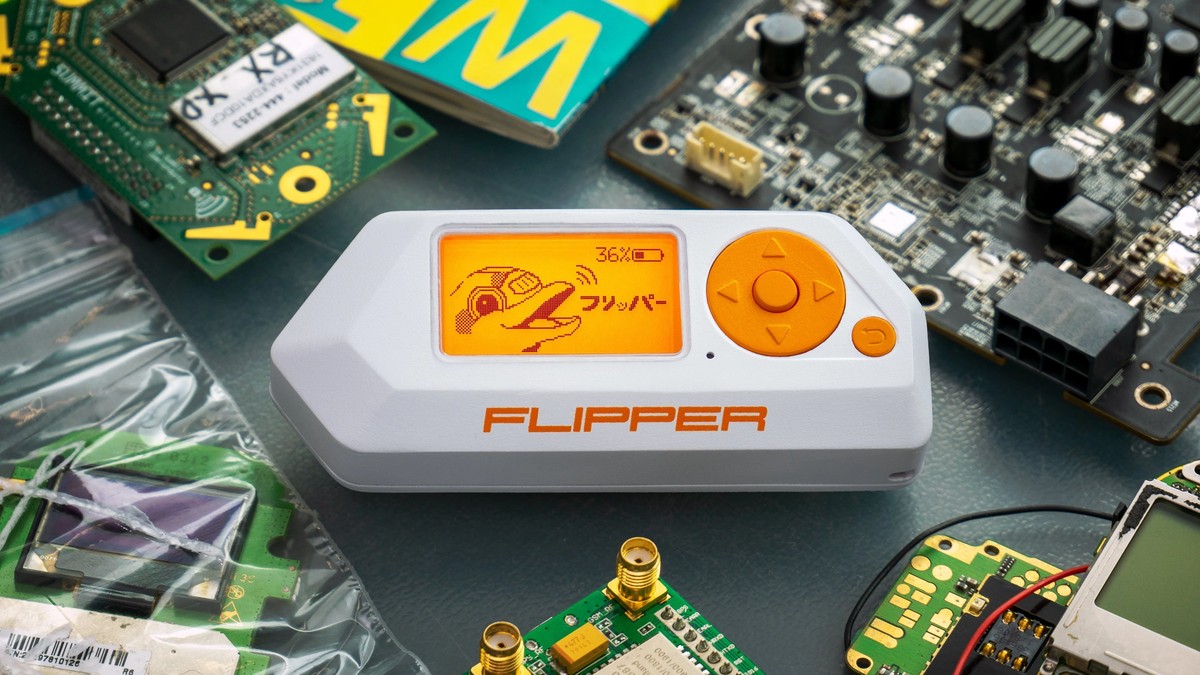
What is Flipper Zero: A closer look at the viral hacking tool
Flipper Zero is an unassuming device, while touted as a hacker's delight, has garnered significant attention due to its powerful capabilities, simple interface, and potential applications in cybersecurity. So what is Flipper […]
Intel's latest graphics driver includes Telemetry
Computer users who operate devices with Intel graphics processing units may soon have Telemetry collected by the driver, reported to Intel and potentially shared with Intel partners. To make matters even less […]
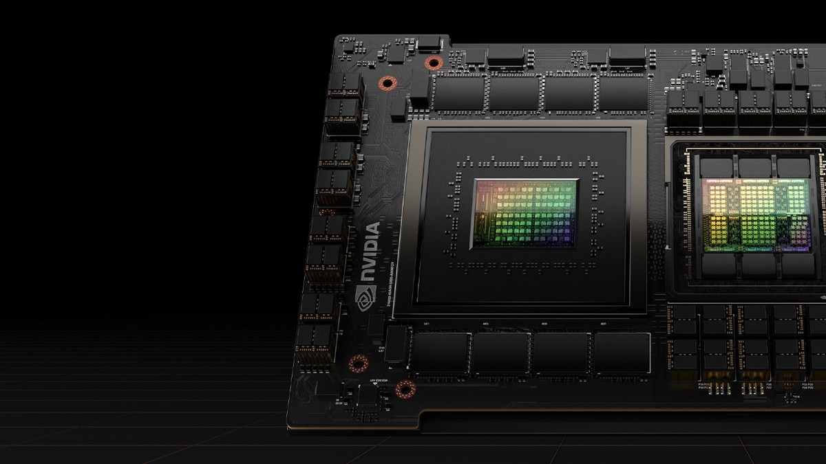
NVIDIA GH200 superchip will soon reinvent AI
NVIDIA's GH200 Grace Hopper superchip is in the works and set to change the way artificial intelligence (AI) and high-performance computing (HPC) work. This advanced chip, equipped with HBM3e memory technology, signifies […]

Lenovo is reportedly working on a PC gaming handheld called the Legion Go
Lenovo could be the next OEM to launch a PC gaming handheld. The company is said to be working on a device called the Legion Go. The Nintendo Switch, which was launched […]
Are you getting a CPU fan error? Here is how to fix it!
The CPU fan is an important component of your computer, as it helps to keep the CPU cool. If the CPU fan is not working properly, it can cause the CPU to […]
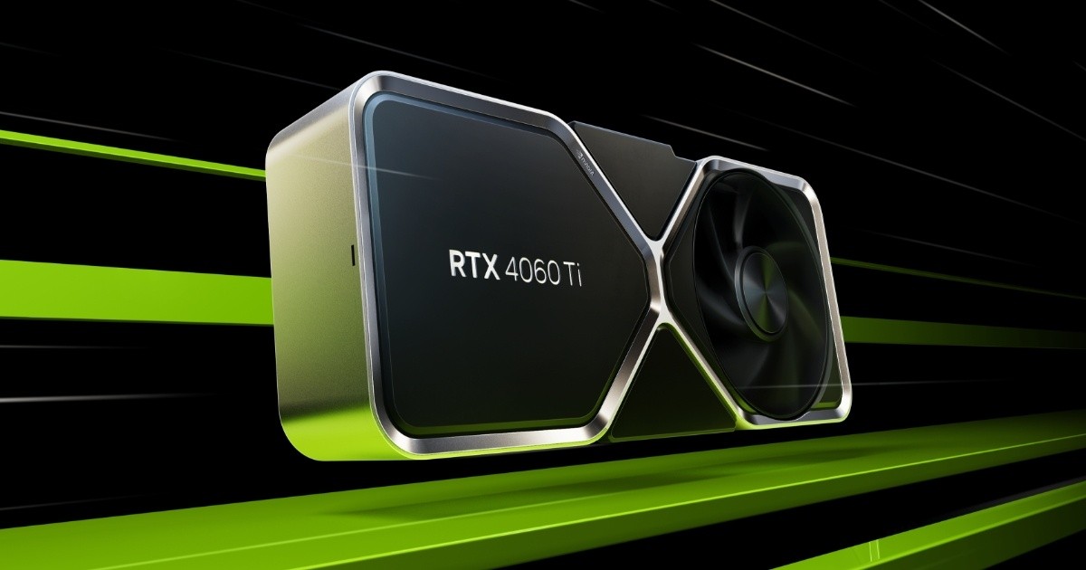
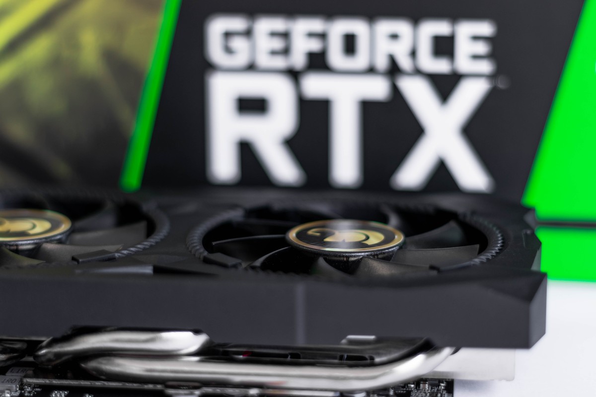
RTX 4060 Ti 16GB aims for the best in the mid-segment
Nvidia has announced the RTX 4060 Ti 16GB, a new graphics card that is based on the Ada Lovelace architecture. The card features 16GB of GDDR6 memory and is designed to be […]

New European Union law requires smartphones, laptops to have easily replaceable batteries
The European Union has passed a new law that requires smartphones to come with batteries that can be easily replaced by the user. The EU had initially submitted a proposal regarding the […]

Is there a cheap Vision Pro alternative?
After seeing the price tag of the new spatial computer of Apple, you might be looking for a cheap Vision Pro alternatives. However, don't let the hefty price tag of Apple's Vision […]
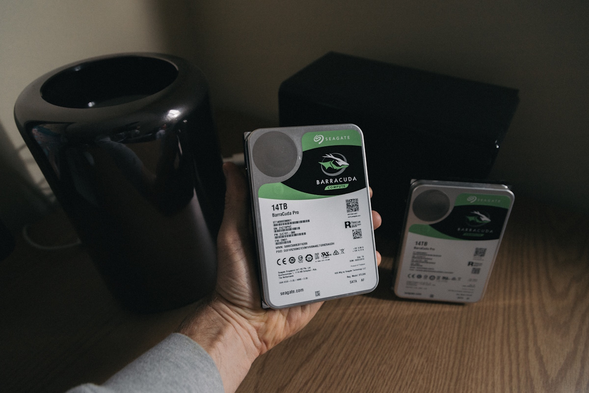
Seagate launching 32 TB hard drives later this year and 50 TB on the horizon
Remember the first hard drive that you bought? Hard drives have come a long way since the 1980s, when the first Gigabyte-sized hard drives hit the market. Computer users have two main […]
Chipgate: Powerleader's power play or Intel inside job?
The Chinese computer hardware producer, Powerleader, finds itself embroiled in controversy following allegations that its newly introduced "home-grown" chip may, in fact, be a rebadged integrated circuit (IC) from Intel Corp. This […]

NVIDIA G-Sync ULMB 2 is introduced: Should you enable it?
NVIDIA has unveiled G-Sync ULMB 2, the latest advancement in their motion blur reduction technology aimed at competitive video gamers. This new iteration represents a significant improvement over its predecessor, ULMB, which […]
Intel Meteor Lake will be the force behind AI's localization
Intel is gearing up to release its highly anticipated Meteor Lake processor, which aims to revolutionize the realm of artificial intelligence (AI) in personal computing. With dedicated circuitry designed to accelerate AI […]
Dimensity 9300 may launch without little cores
A recent leak about the MediaTek Dimensity 9300 has suggested that the upcoming processor may not include little cores thanks to its new architecture. One of the popular leakers on Weibo, Digital […]

Arm unveils Cortex-X4: Fastest so far
Moments before CEO Rene Haas' highly anticipated keynote speech at Computex in Taipei, Arm made a significant announcement, unveiling two innovative products aimed at enhancing smartphone performance. The first of these is […]

HP+ is another reason not to buy HP printers
Is printer ink really more expensive than gold? Original printer ink is without a shadow of a doubt very expensive, and companies like HP or Epson earn a lot of money from […]

Intel considers cutting ties with old tech support
Intel has put forth a proposal to streamline the x86 architecture by eliminating outdated features. The company's developer blog recently released a technical note that suggests the introduction of a new x86S […]
AMD to enter the world of cars
In a recent announcement, AMD has unveiled its latest advancements in automotive technology with the introduction of two new processors to their esteemed AMD Automotive XA Artix UltraScale+ family. These cutting-edge processors, […]