Nokia changed its iconic logo and strategy
Nokia has become a business technology company in the last couple of years. Smartphone manufacturers like Apple and Samsung have dominated the industry, and Nokia's focus moved away from smartphones. The Finnish company has decided to go with some kind of a "new year, new me" understanding and revamp its logo and introduce it before the Mobile World Congress 2023.
Nokia used to be the sole leader of the phone industry back in the day. However, it failed to keep up with the technological innovations and, for several reasons, lost its place in the smartphone market.
Lundmark to the rescue
The company appointed Pekka Lundmark as the Chief Executive in 2020 to get back to its historical days. Lundmark concentrated on service providing rather than concentrating on smartphones and sailed to a new ocean while leading the company, starting with a brand new logo. Lundmark's take on Nokia's new industry was: "The signal is very clear. We only want to be in businesses where we can see global leadership." Nokia now has series competitors like Microsoft and Amazon.
Lundmark talked to Reuters before the Mobile World Congress 2023. Many top smartphone firms came to Barcelona to showcase their newest technologies and share wisdom. Companies like Nokia attended the event to start a possible partnership, sell their products or interact with the industry's top people. "We had very good 21% growth last year in enterprise, which is currently about 8% of our sales, (or) 2 billion euros ($2.11 billion) roughly. We want to take that to double digits as quickly as possible," he said in an interview with Reuters.
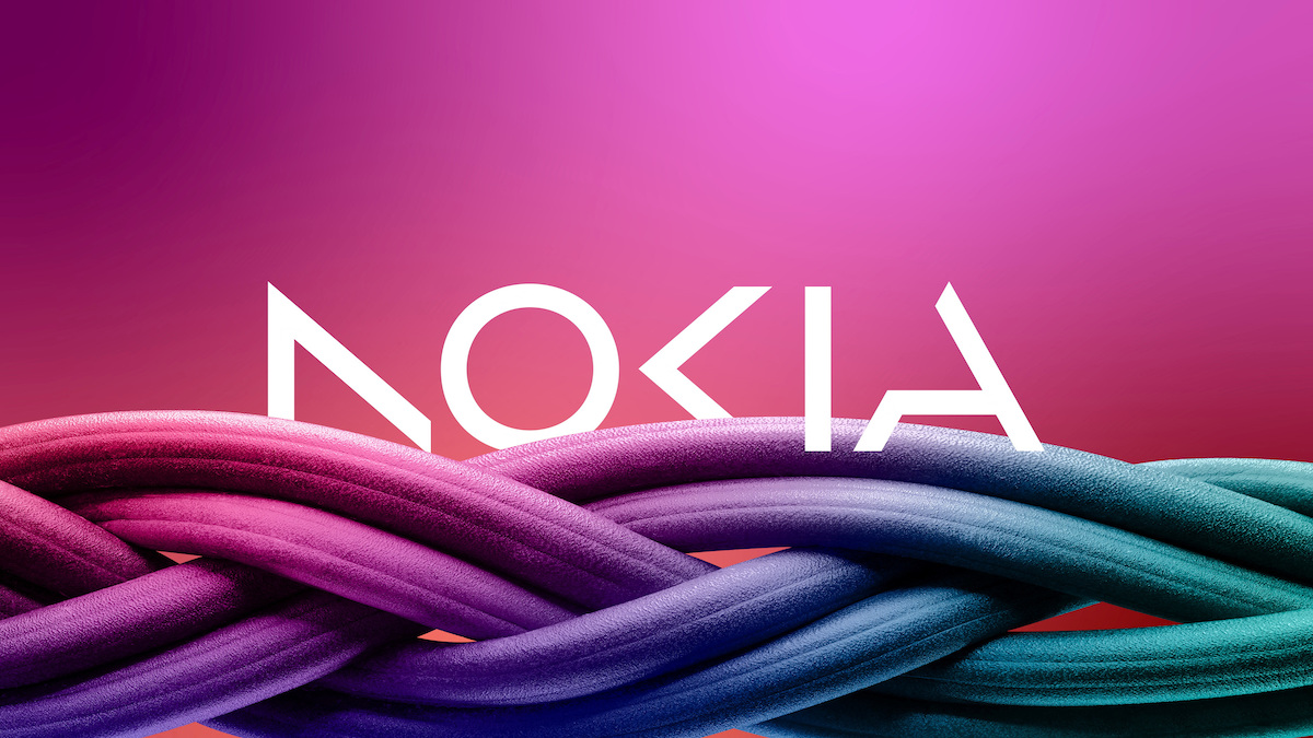
Before the event, Nokia introduced its new logo. It is time to bid farewell to the historical blue logo on the market for years, alongside the "Nokia. Connecting people" slogan. Nokia's new logo consists of five different geometrical characters, forming the company's name when get together. It looks like the historical blue color has also been left behind. It wasn't a mystery that the company has turned its attention away from manufacturing smartphones to a whole new industry within the technology world. From now on, we will see their presence with a brand-new logo, which will probably take some time to get used to.
Advertisement


Awful and incomplete in appearance. AO<iA? Where do these businesses get their mediocre designers from? This is a bigger failure than The Verge web page redesign. Google to Microsoft, all these new looks lately are horrible. An easily understood and recognizable visual image is what a logo is meant to be. This doesn't accomplish any of that.