Xlideit Image Viewer is an open source photo viewer, editor, video and music player
A lot of image viewers don't come with a photo editor, let alone support for playing videos and music. FastStone Image Viewer is an exception to this.

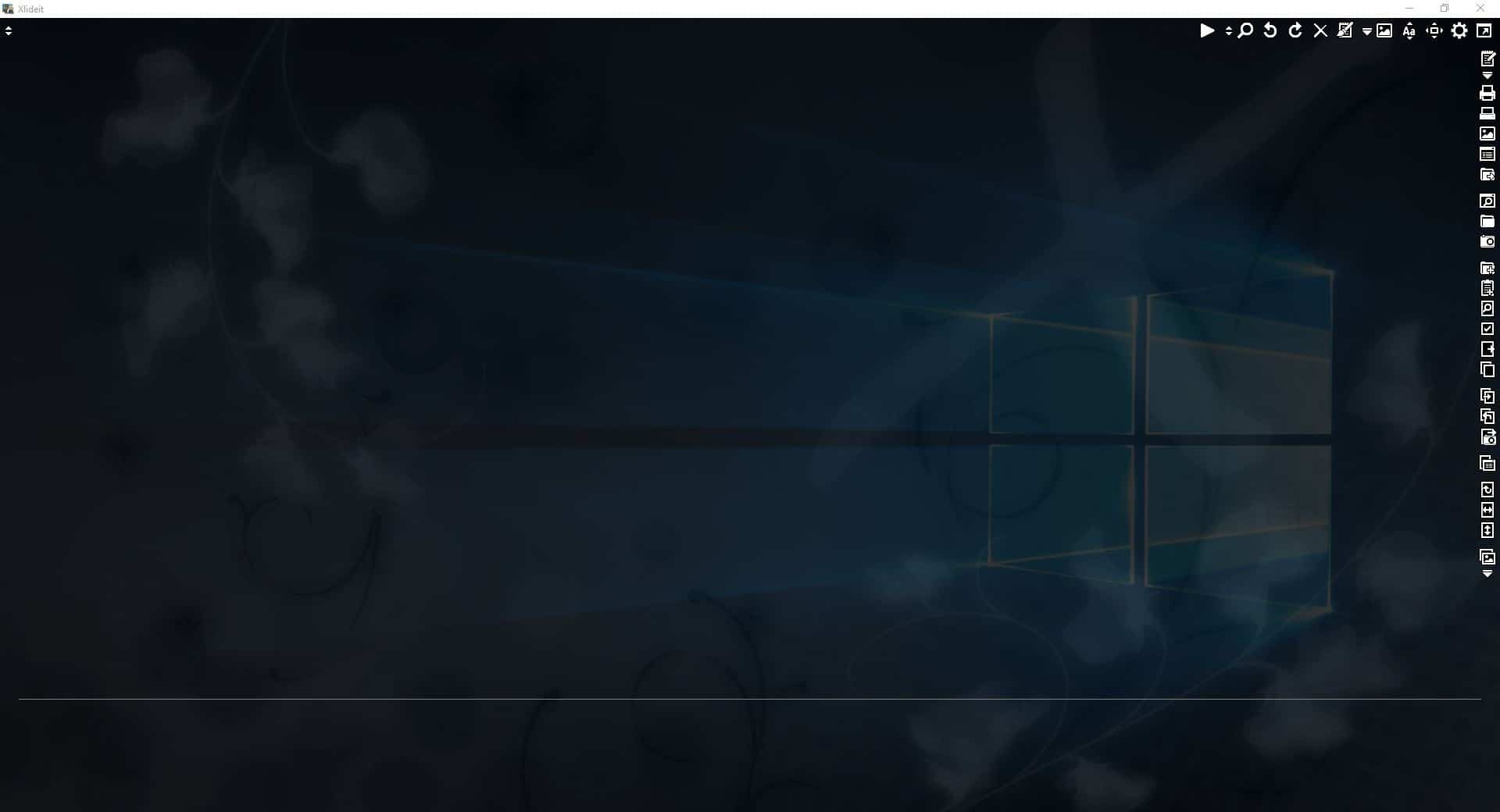
I stumbled onto another such program recently, Xlideit Image Viewer. It is a portable application, and once extracted its folder weighs about 3.30MB. The program starts in full screen mode, and loads the Pictures folder. Hit the F11 key to switch to windowed mode, or the Enter key to hide the all the elements on the interface. The program has a transparent background.
Click on the double arrow icon in the top left corner of the screen to switch to a different directory. It doesn't actually say "Select folder" or something, but if you select an image, Xlideit Image Viewer automatically loads the entire folder. This menu also has options to rescan the folder for new images, and a toggle for including sub-folders.
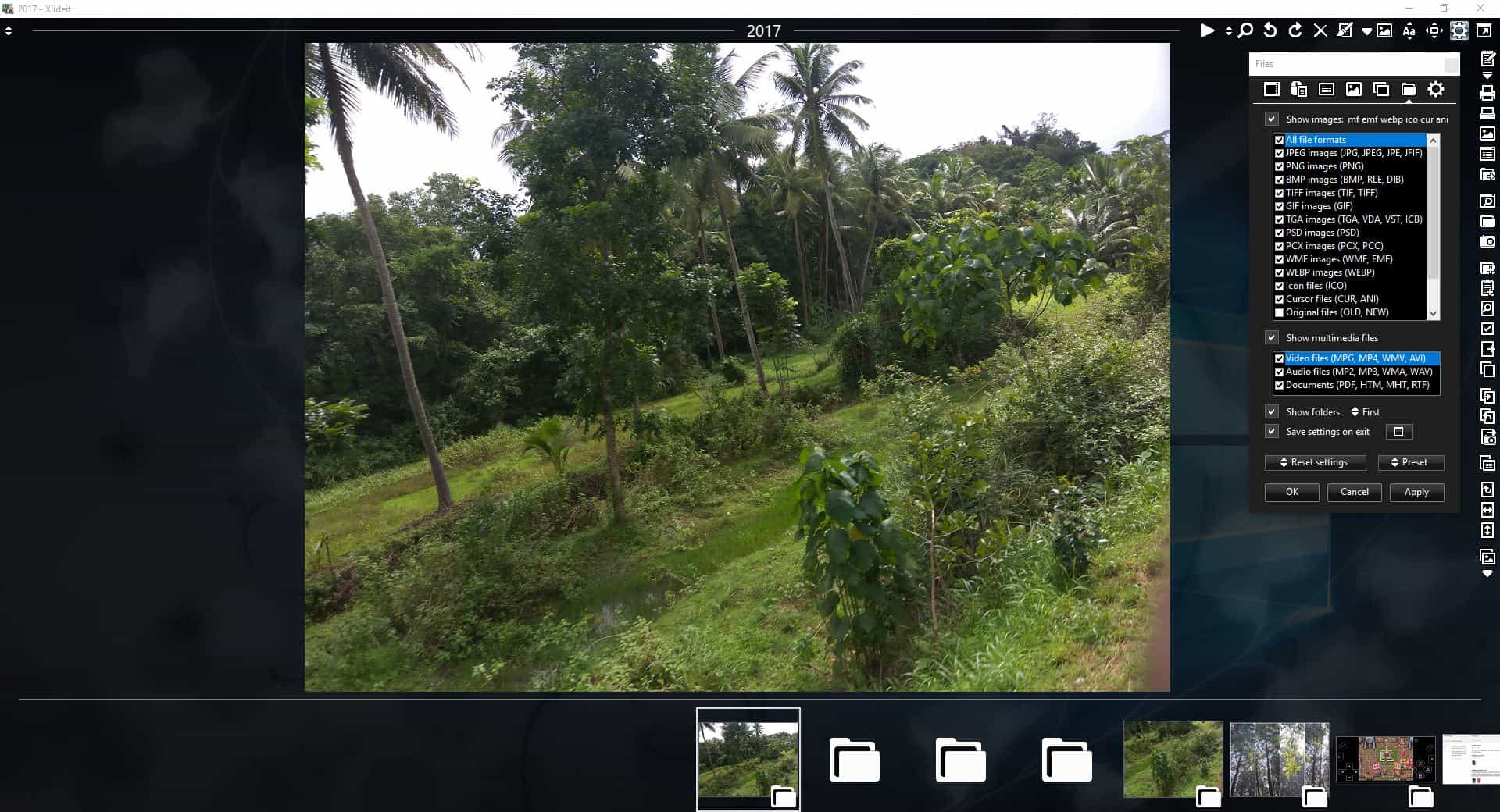
The thumbnail bar at the bottom of the screen displays the contents of the current folder. Use the left and right arrow keys to navigate to the previous or next picture, or do the same using the virtual arrow keys on either end of the panel.
Xlideit Image Viewer has a floating panel. It can be closed and recalled by clicking on the gear cog icon in the top right corner of the screen.

The first icon on the toolbar is used to start a slideshow of the pictures. The button next to it is the zoom slider, while the magnifying glass icon is a toggle for the zoom function. The next three icons are handy for rotating the images right or left, and to delete pictures (sends to the recycle bin).
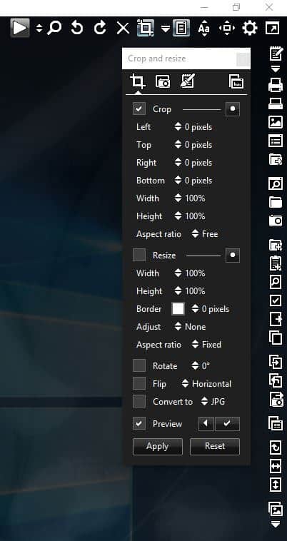
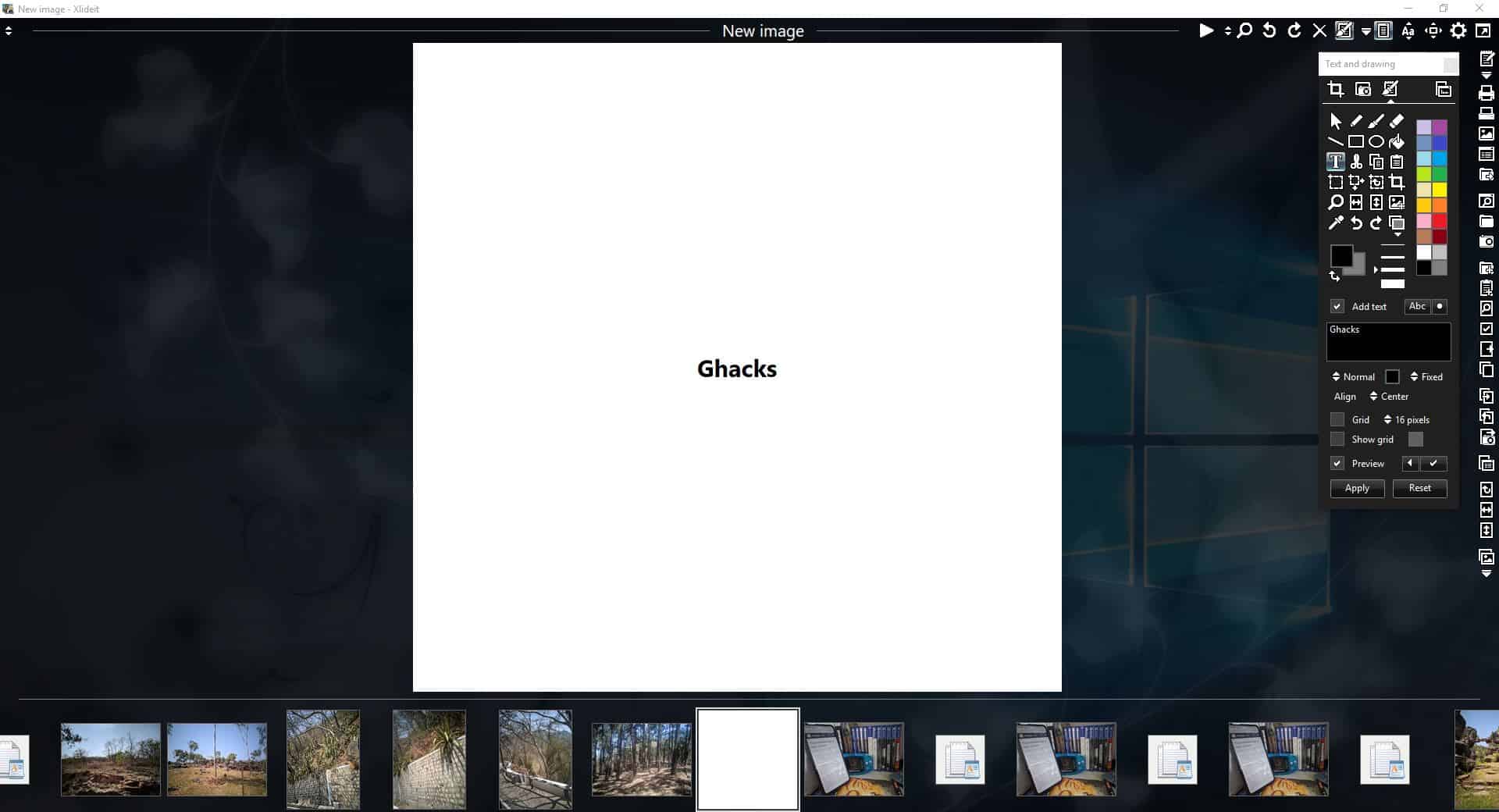
The crop tool opens a pop-up panel with four tabs. This is the image editor in Xlideit Image Viewer. The first tab has options to crop the image, resize it, set the aspect ratio, rotate or flip the image, or convert the image to different formats.
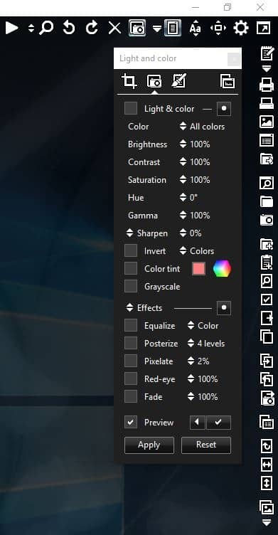
The Light and Color tab has controls for tweaking the brightness, contrast, saturation, hue, gamma, sharpen, grayscale, etc. There are a few filters such as equalize, posterize, pixelate, red-eye adjustment, and fade that you can use to add a cool effect to the picture.
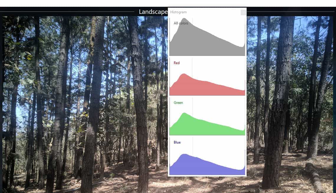
The Text and drawing tab is home to a plethora of editing tools from select, text, watermark, shapes, fill, color picker, and more. Clicking the Histogram icon opens its own panel. You can create a new image from scratch using Xlideit Image Viewer.
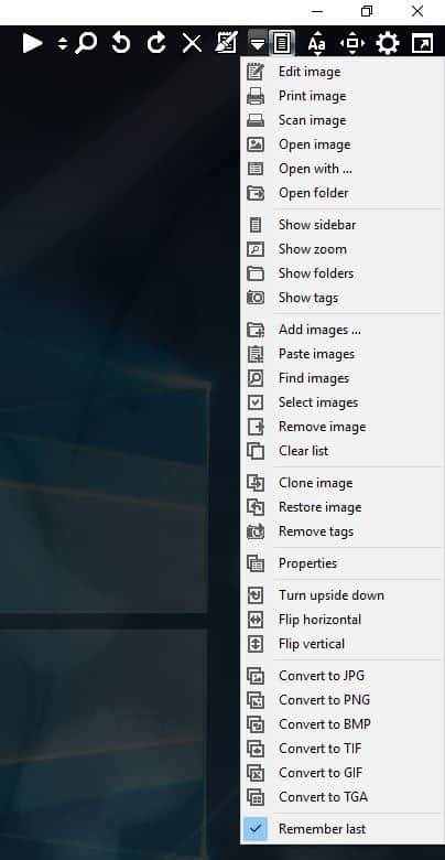
Click the Tools icon (downward arrow icon) on the toolbar to bring up a long menu. Use it to edit, print, scan, open an image or a folder. Toggle the sidebar, zoom, folders, tags. add, paste, find, select, remove, clone or restore images.
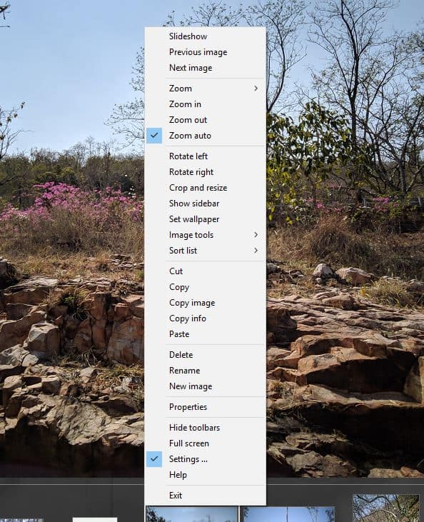
Right-click on an image to view a context menu with various shortcuts.
Other options in the Xlideit Image Viewer tools menu include viewing the current image's properties, a flip tool, and ways to convert photos to JPG, PNG, BMP, TIF, GIF, or TGA image formats.
The icon with the camera on it removes metadata tags from photos. Use it with caution as this isn't reversible, you may want to backup your photos before editing them. The program has many ways to sort the picture list: by name, file date, file size, image date, image size, width, aspect ratio, file type, camera tag, image tag, etc.
Xlideit Image Viewer can be used to view the following image formats: JPG, PNG, BMP, GIF, TIF, PSD, JPEG, JPE, JFIF, RLE, DIB, TIFF, TGA, VDA, VST, ICB, PCX, PCC, WMF, EMF, WEBP, ICO, CUR, ANI, OLD, NEW, LNK.
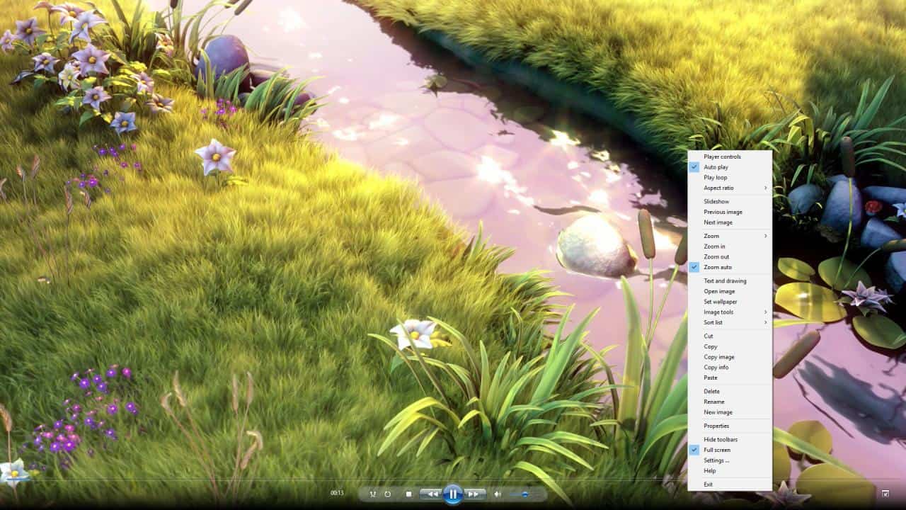
The program can also be used to view video files in the MPG, MP4, WMV, AVI formats, or to listen to MP2, MP3, WMA, WAV audio files. It supports viewing documents in the PDF, HTM, MHT and RTF formats.

Note: The video player only worked in full screen mode during my tests.
The program is open source. Xlideit Image Viewer is light on resources, and has a useful set of tools for editing photos. The video and audio player are bonus features to have. It's impressive that the program packs all these features in a 3MB package.













Can’t use software I can’t pronounce because they’ve given it a ludicrous name.
What a logical reason to not try this software. I’d love to know some of the other policies you follow in life.
@wateroffa ducksback
Ha.. We need more folks here as you, to help curb these “funny” folks who talk in silly, extreme, absolutes.
@pd
Ha.. We need more “funny” folks here as you, as I’m a huge fan of reading silly, extreme, absolutes. You should do standup comedy. Seriously!
Thanks, Ashwin. This is one of the Image Viewer that’s worth giving a try. I personally am a huge fan of IrfanView (but I didn’t like how it has problems with animated gifs with transparency) and I’ve been using nomacs ( https://nomacs.org/ ) for years, which is really solid and great in my opinion. I do need and use image editing features, especially trivial ones. However, I remember experiencing some slowdown with nomacs which made me to venture into more image viewers, which you were reviewing mostly. I didn’t like majority of them, however I must say this one looks promising and I like it so far so thank you for this one.
I do recommend nomacs to my friends and everyone, because Windows 10 “Pictures” image viewer sucks and lack of gif support is terrible.
I am happy with the way I can set up Xlideit, there is a lot to customize there, so I will give it some time to play with it. I am also happy that it is recently updated too (unlike the past application that I tried and you reviewed – PhotoQt – which I didn’t end up liking because it was slow and a bit buggy for some reason on my system)
I do like how fancy the interface of Xlideit is, the transparency and being able to see my other windows. Also easy F11 to go in and out of fullscreen mode. I like it so far very much.
I must comment that I was pleasantly surprised with Xlideit that it runs on an embedded browser. I actually had pictures saved in bunch of .html and .URL files and Xlideit actually loaded both .html files and .URL files. I can actually easily turn this off by pressing CTRL + W or click on the top left corner and disable “Media Files”
Looks quite good for now to me.
Thanks, Clairvoyance.
I was intrigued by your comments about “nomacs” and checked out the Image Viewer “nomacs” and gave it a try.
I have consistently favored Image Viewer “MassiGra”
( http://www.massigra.net/massigrahelp/currentver/about.htm ).
The motivation for continuing to use MassiGra was the unparalleled perfection of its “simplicity, high functionality and outstanding energy savings” (other Image Viewers critically lack the performance what MassiGra is able to do).
But nomacs is certainly great!
The features required for Image Viewer is substantial, and every one of them performs well.
It has as much or more functionality as MassiGra and continues to have active support in open source projects.
It can also be translated into other languages.
I’m going to introduce nomacs to Japanese users.
nomacs:
Official Support (GitHub) | https://github.com/nomacs/nomacs
Features | https://nomacs.org/features/
Download (Systems and Versions) | https://nomacs.org/download/
Tutorials | https://nomacs.org/category/tutorials/
FAQ | https://nomacs.org/questions-and-answers/
How-to-translate-nomacs | https://nomacs.org/how-to-translate-nomacs/
Postscript: My system environment
Windows 10 (x64) Version 1903 (build 18362.836)
For image editing purposes, my favorite is “IrfanView”.
And when I need more advanced features, I use darktable and GIMP.
darktable | https://www.darktable.org/
darktable | Wikipedia
https://en.wikipedia.org/wiki/Darktable
I’m using “digiKam” for the Archives in the image.
digiKam | Professional Photo Management with the Power of Open Source
https://www.digikam.org/
digiKam | Wikipedia
https://en.wikipedia.org/wiki/DigiKam
The UI looks confusing with all the identical colored icons, reminds me of the idocy Windows 8 and 10 (at the beginning) were pushing with all icons looking the same, until it took them 8 years (since 2012) to realize how ugly this is and how people find it confusing and therefore avoid using the new Apps.
Same with this.
I will stick with IrfanView forever, because it just works perfectly and it has a setting for everything in case I find something not to my liking therefore I can fix it.
The icons do not look the same, just like these letters do not look the same despite they have the same color; and while IrfanView is a handy tool it looks like straight out of Windows 95.
Hmm?
https://i.imgur.com/WlawRWi.png
How exactly does this look straight out of Windows 95?
Also I didn’t know that how old/new an UI looked was an important factor for how useful an application is. If something isn’t broken, why fix it? Notepad hasn’t changed at all and I don’t see anyone complaining it looks old.
Libre Office still hasn’t fully implemented a Ribbon UI and that doesn’t make it any worse.
UI fads come and go, solid software just works regardless of how it looks.
I use 7-Zip even though the icons on the UI haven’t been updated in probably 15 years, but that doesn’t stop it from being a decent tool serving me really well in handling archives. WinRAR also looks like it’s “Straight OUTA COMPT… I mean Windows 95”, does that mean I should not be using it?
Do you understand how shallow your comment makes you sound? I love change and new things, I was first to upgrade to Windows 10 when it came out in 2015 and can you imagine how disappointed I was with the default Picture Viewer tool? It was so bad I had to use a 3rd party one, that’s how I ended up using IrfanView and I still use it for that reason.
Just because the new Picture viewer on Windows 10 looks “modern” (still debatable), it doesn’t make it better.
@The Equestrian
Thanks for that image of IrfanView, as I think most people would agree that it indeed looks dated, as so many have said before (old topic).
Yet as you don’t see it that way, then perhaps you’re blind to such design aesthetics. But no matter, as you can still learn the reality of this topic, such as with the Psychology of Aesthetics, Color Psychology, and Psychology of Design.
Also, your assertion here is moot, as Addy T. never said anything to the contrary:
“I didn’t know that how old/new an UI looked was an important factor for how useful an application is”
If fact, Addy clearly said “IrfanView is a handy tool”.
Furthermore, for you to say “Do you understand how shallow your comment makes you sound” shows that you have some issues with discerning reality, as there was nothing shallow there.
In short, it looks like you got triggered over nothing.. Perhaps you’re drinking too much coffee or something?
@BOB
He clearly says it looks like it’s outdated like that’s a bad thing. Most people use image viewers just to see images, the rest of the UI is pretty much irrelevant to them.
I’m looking at this tool in the article and it just looks minimalistic for the sake of minimalism. Also developing monochrome identical looking icons is a lot easier than developing colorful icons with gloss and gradients, that’s why that trend fell into a bit of obscurity since around 2012 when Windows 8 came out. Immediately as I installed Windows 8, my first impression is all the visual changes were ugly, they looked flat, hard to distinguish and overall they had the feelings of early Alpha placeholder assets that somehow made it in the final version.
The whole idea of sharp corners and simplistic icons just gives the impression of an UI that has not been developed past the point of basic functionality. That is the stage the Windows developers work on until it’s feature-ready and then they create a more beautiful UI with colorful icons with gloss and gradients, edges get round and it’s now ready for consumers.
As you can see, Microsoft admitted that from the user feedback, they found out that people hated the flat monochrome look of everything and things are coming back to the old style of XP/Vista/7. They even updated the app icons to look like that too. New app software also has rounded edges, shadows, gradients. Even their most updated program – MS Edge now has a lot of this stuff implemented, which is the main driving factor for what is currently a trend within Microsoft.
Just wait and see how in 2-3 years Windows 10 will slowly become less ugly and start looking like what Windows 8 was SUPPOSED TO BE in 2012 – an improved version of Windows 7, in terms of visuals and functionality.
The mistake that was Windows 8 in terms of visuals got transferred in Windows 10, but they are slowly correcting that mistake. The sad part is many developers like the one who developed this image viewer tool fell for the fad and soon their program will look outdated compared to Windows 10 which will be back to being colorful and possessing UI depth.