YouTube launches new design to a worldwide audience
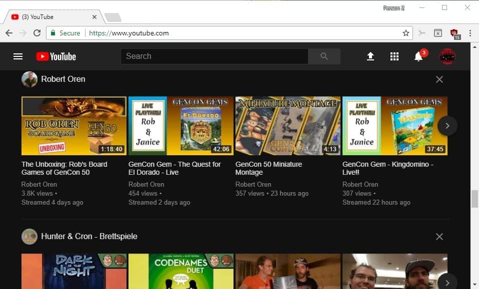
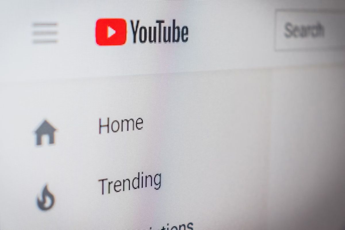
A new design is being rolled out to YouTube's worldwide desktop audience right now that brings Google's Material Design style to the video portal.
This new design has been available to select users but today marks the global launch of it to users from all over the world.
Our new look applies Material Design to YouTube and delivers a fresh, simple and intuitive user experience that lets content shine – because there's nothing more important than the creators and videos we all love to watch.
YouTube users who don't see the new design yet when they load the site may enable it by visiting https://www.youtube.com/new in their browser of choice.
The page checks whether the old design is enabled already; you may activate the "go to YouTube button" to enable it if it is not.
YouTube new Material Design layout

Google points out three core new features of the desktop version of YouTube:
- A clean design that puts content and creators front and center.
- A dark theme that you may switch to (the default is a white theme).
- A new framework that helps build features faster.
If you want to enable the dark theme, you need to click on account, and there on dark theme to turn it on.
The new design hides the library and subscriptions menu if the YouTube window's width is below a set minimum. You may show it with a click on the Hamburger icon in the top left corner, but it goes away whenever you click elsewhere.
If you display the side on a widescreen monitor, you may notice on the other hand that YouTube uses a lot of whitespace between elements.
While most of YouTube is redesigned, some areas of the site are not. If you open the Settings for instance, you will notice that they still show up in the old design. If you have selected the dark theme for instance, you still get settings with a white design.
Now you: What is your take on the new YouTube design?






I am completely incapable of commenting, as the comment box for me to comment is gone. I can look through the comments, I can reply to comments, but making my own comment, impossible.
I haven’t been able to view a single video in Firefox since the redesign about a week ago (Aug-Sept 2017). It just sits at the first frame and then suggests restarting my device.
Chrome does not experience the same issue
All i know is that the new version uses more CPU and i don’t like that, and the new version isn’t using VP9, one of my laptops it’s VP8 Vorbis i think and the other is something MP4, i control this with add-ons. i prefer the old version.
hi guys!
Is there any chance to disable this piece of crap?
I’ve tried few advices out there… but none of them worked since an option to return to the old one is not there anymore.Correct me if I’m wrong
thanks in advance
For me, the search bar is a bit too big :( Feels like it’s cutting the top of the video off.
Have a Stylish global dark theme anyway. So the new youtube design comes down to larger thumbnails on the subscriptions page, and I don’t really like it ;-)
Love the dark theme, but material design is just terrible. So much double spacing and unnecessary white space make navigating lists and such unnecessarily annoying. I’m not trying to wear out my mouse wheel scrolling here. I realize swiping on a phone makes this not an issue, but do we really need to sacrifice desktop utility for the sake of mobile?
Youtube’s new design may be nice but what a pity it requires a Youtube account to be activated.
I was surprised when I realized that the userstyle I used for Youtube would no longer appear : niet, nada, nothin’ !
That was ‘Youtube Dark Gray’ [https://userstyles.org/styles/101409/youtube-dark-grey]
I was rather annoyed facing that white immaculate Youtube screen (otherwise immaculate is a nice concept).
I discovered a new userstyle built for the new Youtube screen, one version for people like me who don’t use Youtube’s new design, another version for those who do in order to enhance it.
Hence, I now use the Youtube DeepDark userstyle [https://userstyles.org/styles/135831/youtube-deepdark] which is fantastic, IMO, and works great with latest Youtube interface.
I still don’t have it! When I go to youtube.com/new its says new design coming soon. Is there any way or trick to force it?
You missed the most sensational bit: the Android app now supports vertical videos. Thanks to all the idiots who keep making them.
I use an extension called dark mode in chrome which darkens all webpages so youtube has been dark for me for a long time anyway.
Been using it for a while now (I was a beta tester). Now normally I’m not really a fan of Material Design but in this case they did a great job! I love the new design! I do hope they’ve improved the speed a bit though as there were some lags (esp. when clicking one of the buttons underneath a video) in the beta.
With my version of Chrome Version 61.0.3163.59 (Official Build) beta (64-bit) the background is White.
That’s because you need to turn on black theme manually. Upper-right corner, click on your profile icon and turn on dark theme from that context menu.
For older browser users like me, this new design doesn’t even work because it says “your browser isn’t supported”. So I’m happily using old design (quite rarely land directly to youtube.com anyway).
Same here, I like dark themes but except for some tutorial linking there I rarely use youtube.
I don’t login, so probably can’t view all the changes/differences. Whatever has changed, the content pages are “heavier, or busier” to the extent that I’m noticing frequent video stalls. Audio keeps playing but, as the comments load and related videos thumbnails column is being populated, video is a stillframe. Video “quality” is (only) 480p — I haven’t requested otherwise. OK, now selecting 720p and “theater mode”. The frequency of stalls seems about the same, but the view is spoiled by a glaring white searchbox atop the (dark-scened) video. Ooops, “UP” arrow icon doesn’t retract the top bar in which the searchbox is displayed, it take me to a different page (uploads)…
Will this take effect on streaming apps like Roku also? I absolutely hate the current YouTube app on Roku. It is the pitts.
Hard to make the current YT Roku app any less functional. It is so dumbed down that it must qualify for gov’t assistance. Not to mention its memory leaks require rebooting the Roku often (when the app itself isn’t crashing on HD vids).
Google REALLY needs to hire some Adult devs.
Dark themes are a PITA to my older vision. Black background around a black window frame, another keyboard centric dev plot to kill the mouse.
Hint to theme devs, how about some lighter themes that don’t include brilliant WHITE.
This design made my favourite addon Youtube Plus die
Use this script instead: https://github.com/ParticleCore/Iridium
It’s from the same author as Youtube Plus but for the new Youtube design. Oh and in case you use YT+ on Chrome, you should uninstall it (or use a userscript). Author sold it to a 3rd-party and they injected ads into it: https://github.com/ParticleCore/Particle/issues/528
If you see the new youtube look then click on your profile and select restore old youtube, and Youtube Plus will work again.. it did for me.
I had to disable the uMatrix extension in Chrome in order to play a YouTube Material Design selection. I am new to uMatrix, so this may be selectively resolvable.
I use “Change Colors” version 2.144 extension to give the Font size and style I like, as well as font and background colors. This is far more satisfactory than the Dark theme choice to me.
I have been seeing this layout for several months now
Yeah, A/B Testing
It’s sort of funny to realize the amount of greenhouse gas emissions saved worldwide from just turning google.com background to black.
@ Anonymous
To be more precise, Black background energy-saving works for CRT, OLED/AMOLED, Plasma and LCD using LED backlighting(= eg LED TVs) monitors/screens/displays.
……. It does not work for LCD monitors/displays.
.
https://www.scientificamerican.com/article/fact-or-fiction-black-is/
https://www.howtogeek.com/131823/htg-explains-does-black-wallpaper-save-battery-on-your-mobile-devices/
I like it (: The dark theme is really nice.
Not my cup of tea. If all sites used black backgrounds it would be acceptable, but it’s usually necessary to increase the brightness in order to discern the content properly especially where it concerns fonts which are barely lighter than the background colour.
That in turn makes switching to a site or a page using a white background which is much more common, too bright. So when I come across one I tend to use NoSquint Plus to disable the background and then change the font to black.
Also, fonts which a barely lighter than the background colour always give me the impression that the site is trying to hide something by making the text difficult to read.
Don’t like dark themes either.
If this were a good idea, then magazines and books would have black pages with lighter color text. But they don’t. Despite hundreds of years of printing books!
I suspect this is not the reason books are printed with black ink on white paper. Imagine the cost of ink if you chose to do the converse. For an LCD screen I prefer a light gray font on a darker blueish background.