Restore classic Google logos in your browser
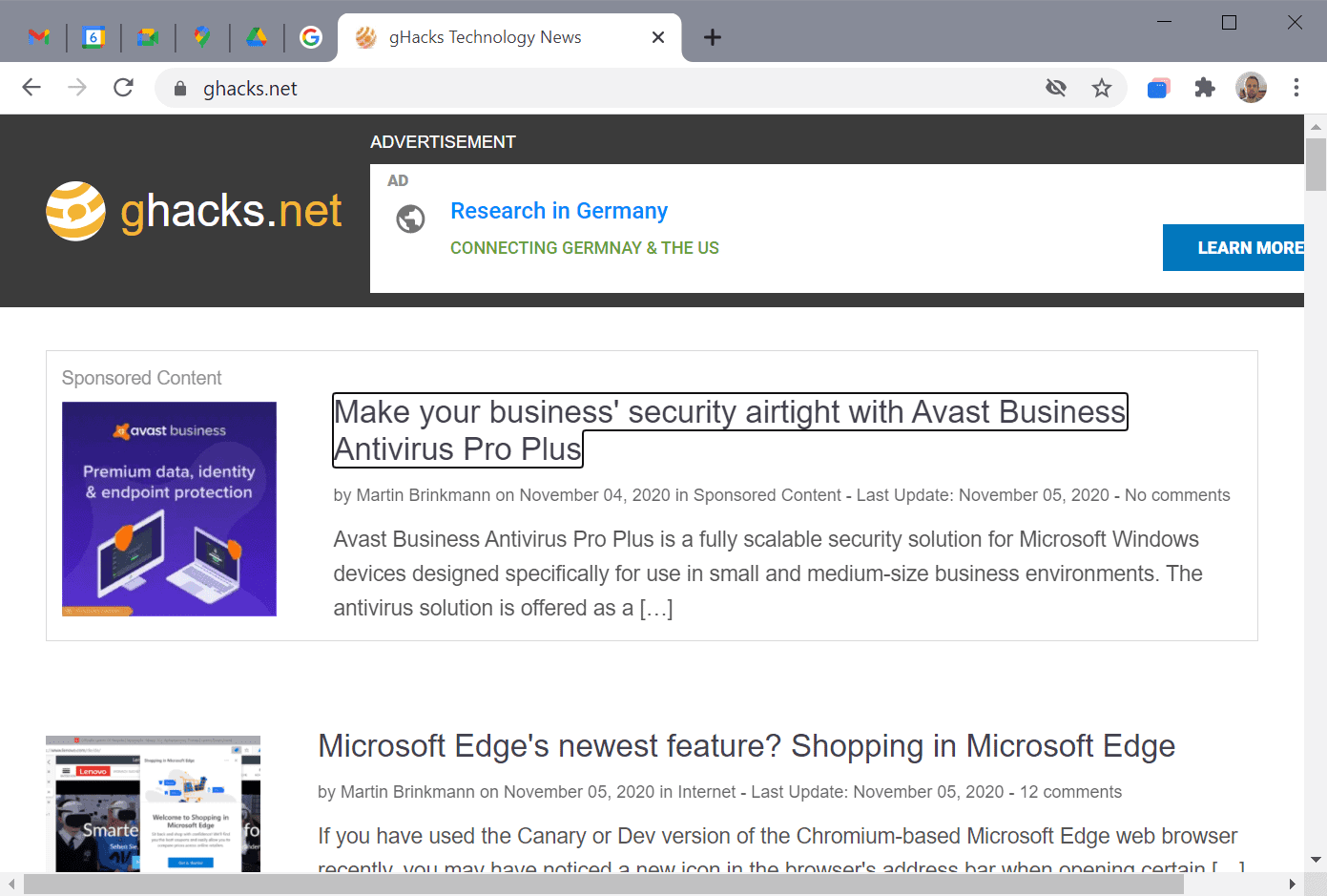
Google started to roll out updates to the site logos of some of its most popular services including Gmail, Google Maps, Meet, Calendar, and Google Drive the other day.
The logos are displayed when the site is loaded but also in the browser's toolbar when the site is pinned. In Chrome, it may be the only thing that is displayed if too many tabs are open as it reduces site information in the tab bar to the site's favicon.
As is the case with any change, some users like the new logos while others dislike them. If you analyze why users dislike the new logos, you will come to the conclusion that the majority finds them difficult to identify due to their similarities, especially when pinned or reduced to the single icon, e.g. in the bookmarks bar.
Take a look at the following screenshot, especially on the pinned icons in the tab bar of the browser.

Here is another screenshot that zooms in on some of the new logos that Google uses for its services. The services from left to right are: Gmail, Google Calendar, Google Meet, Google Maps, Google Drive, and Google Search.

If you'd like to restore the classic icons for Google services like Gmail, Calendar, and Drive, then you may use a relatively new extension for Google Chrome and other Chromium-based browsers to do that, and an extension for Firefox.
Restore old Google icons is a new extension for Chromium-based browsers that is one of these set and forget extensions. Just install the extension in your browser of choice and reload any Google service that is open in a tab at the time.
The extension requires access to the Google sites that it changes the site icon for, namely Calendar, Docs, Drive, Mail, and Meet.
You will notice that the classic Google service icons are restored when it is reloaded, regardless of whether the site is pinned or displayed in a normal tab in the browser.

The Firefox extension Classic Google Icons provides the same functionality for the Firefox web browser. Just install it and you will notice that the icons of Google services are restored to the classic version.
Closing Words
The extensions restore the classic logos of major Google services. Whether it is a good idea to install an extension just to get the old icons back is for everyone to decide individually. If you mix up these icons regularly, it may be worth the installation.
Now You: What is your take on the new Google logos? (via Winfuture)









Bless you for this fix!!
I never pin links like that, so I doubt this logo change will ever be an issue for me. I access all my links from my bookmarks. Also, I have set my main bookmark page as my Home page, which is also set to open when the browser starts. Thus I can simply access and see my bookmarks in a full, listed view in it’s own tab. I never use toolbars to access my links, as there’s no need for them with my method.
I use gdrive and gmail and i really like the new icons. I don’t care about the other icons.
I can’t possibly get excited about Google logos. Some day (I hope not) people will be wearing Google underwear.
When I saw the change I went wtf. Are they bored or just dumb? In a world full of scammers, they best idea is to switch icons. Switch the interface too, and the brand logo, everything. Add more complexity and randomness so people cannot guess when the change is real and when they are being scammed.
Who thought having the same colors for every icon was a good idea? Graphic designer nowadays are completely unskilled.
The new logos look like something from 2010, weird but OK I guess. I doubt anyone will care and most won’t notice. Do they now?
Love the first pic, Google ( “Be evil”); Avast, a privacy disaster data scraping app with AV thrown in for kicks (Business Avast? How funny!) and Chredge Shopping (Google again, double evil in this version.)
I think older Google logos are better.
If you don’t need favicons:
/* 1030: disable favicons in shortcuts
browser.shell.shortcutFavicons, false
/* 1031: disable favicons in history and bookmarks
browser.chrome.site_icons, false
/* 1032: disable favicons in web notifications ***/
alerts.showFavicons, false (default: false)
https://github.com/arkenfox/user.js/blob/master/user.js
When I tried to send reply it showed error 403 forbidden or something.
Change is inevitable. After a couple of weeks we don’t even notice it and get used to it. This is life :).
Don’t really care about any of the icons beyond Gmail. The older one is a lot better looking than the new one. And even though I don’t really care, the older Calendar icon makes way more sense than the new one (“6” what?). Google just wants its multicolor stamp on everything.
Nothing about Google stuff looks good anymore.
“6†what? – 6th day of the month (today), exactly the same logic as on the old calendar icon.
Actually, the icon is/was usually static, simply displaying “31” (so, yeah, I forgot that in some cases it is/was dynamic–haven’t really used Calendar much in the past 6 or 7 years, so all I’ve been seeing is the static one).
@Jim Vanderbilt
The icon updates daily?
@ULBoom
Yes.
But only if the page is loaded / reloaded. If one opens the calendar and leaves the computer for a week, the icon will probably not switch numbers every midnight but only once when the calendar is loaded again.
The new Gmail and Google Drive logos are fun to play with full screen. Interesting derivations far away from the original can be made with your favorite image programs.
Life is too short to worry about that.
Yes, the favicons are difficult to identify in the screenshots above. I changed the background color to black (Download, Paint, fill-color) and telling the icons apart was no longer a problem.
(Change your BG color to gray and other favicons will have the same ‘problem’)
The old logos looked out-of-date, were not related and had a homemade touch, sort of unprofessional.
I love the new logos, congrats to the designers and once more Thank You to Google for making Chrome more fun to use.
Remember when Google Search favicon was a blue square with a white “g” inside? And before that it was some other square with probably a white “g” inside and the square was colored in Google’s colors.