First look at Google Chrome's UI design refresh
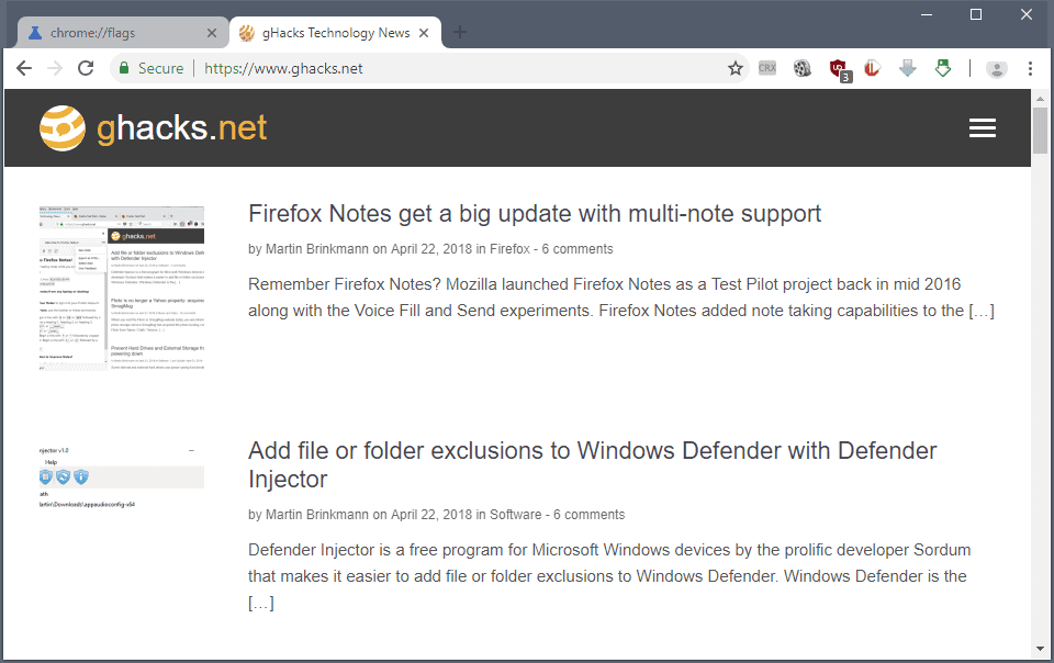
Users of Google Chrome Canary, the cutting edge version of Google's web browser, have a chance to get a sneak peek of a user interface design refresh that Google may plan to launch in all versions of Chrome eventually.
The feature is hidden behind a flag currently but that is a common practice by Google; the company uses flags to hide future features from the general population. While there is no guarantee that features will land in Chrome one day, it is often the case that Google uses experimental flags to prepare the wider release.
Chrome's user interface has not changed all that much throughout the years. Google started a Material Design refresh of internal Chrome pages in 2015 and the process is still ongoing. The company changed the design of the Settings page in mid-2017, and the flags page in the end of 2017.
Google Chrome's UI design refresh

The screenshot above shows the new refreshed Material Design front user interface of Google Chrome. The very first thing you may notice is that Chrome's tabs are slightly rounded now instead of sharp edged.
Tabs retain the rounded look even if you create a tab overload situation in Chrome when you open too many tabs so that each is displayed without any site indicator (as Chrome does not use scrolling in the tab bar).
The tabbar itself has a white background now. Inactive tabs are displayed with gray text on a gray background, the active tab with gray text on a white background.
There are other changes:
- The design of the New Tab button changed to a plus icon.
- The Chrome address bar has round edges, and its background is set to gray and not white anymore.
- The profile indicator was moved from its original position near the window controls to the main Chrome toolbar.
How to enable the design refresh
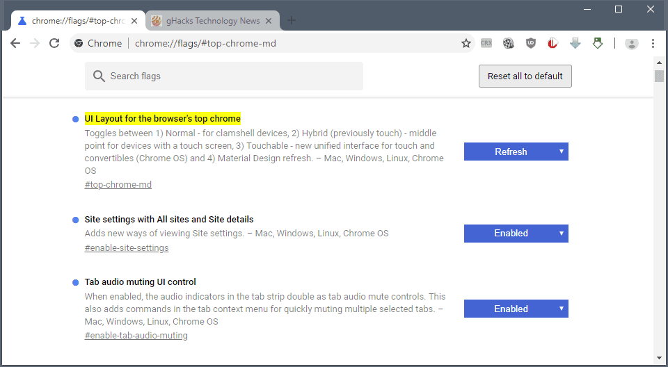
You need to run Chrome Canary (version 68 or later) on Windows right now to enable the refresh. If the design refresh is not pulled again, it will become available for Mac or Linux as well in the future.
- Load chrome://flags/#top-chrome-md in the Chrome's address bar. The address opens the experimental page of Chrome.
- The preference UI Layout for the browser's top chrome determines the user interface design. Click on the menu next to it and select Refresh.
- Restart Google Chrome.
You can undo the change at any time by setting it to the default value. Other values that are supported:
- Normal -- clamshell devices.
- Hybrid -- for devices with touchscreen.
- Touchable -- new unified interface for touch and convertibles.
- Auto -- unclear.
Closing Words
The UI design refresh of Chrome is a work in progress. While it is likely that Google is going to launch a refresh of the design eventually, it is possible that it will look different from the first version that popped up in Chrome Canary in the past days.
Mozilla, maker of Firefox, moved away from rounded tabs with the release of Firefox 57. Firefox users who want curved tabs can check out Photon Australis, a collection of userstyles for Firefox that changes the squared tabs of the browser to curved ones.
Now You: what is your take on the new UI design?












Looks like they wasted a ton of space at the top. That dark backdrop can be cropped to the bare minimum. My screen real estate is more important than Chrome’s design teams dreams.
Seriously, this?
What’s the point of making a change just for the sake of it?
The new UI looks bland, unimaginative and dated. What exactly did you improve?
Chrome’s signature trapezoid tabs replaced with something that looks like a Firefox from 2012; prominently round, gray omnibar in combination with semi-rounded bordered tabs and sharp single-line tab dividers; like, how does this make any aesthetic sense?
I’d always welcome any UI change if it results in a better experience/aesthetics/usability, etc. but this is simply a big, BIG step back.
chrome 69 looks terrible – how to get it to look more like it was before version 69 made it all worse:
chrome://flags
#top-chrome-md
NORMAL
#enable-tab-audio-muting
ENABLED
#omnibox-ui-hide-steady-state-url-scheme-and-subdomains
DISABLED
this undid a lot of the damage they did.
hopefully these flags stick around
I created a YouTube tutorial on how to get the new design :)
https://www.youtube.com/watch?v=SDmUNDP4Tgg
Now that is irony….
If Firefox developers are allowed to shamelessly steal and copy, Google Chrome dev team does have the right too.
So the Firefox crowd is to be forced to swallow their own medicine
Must suck to accept that ;)
Clearly I’m missing something because I’ve changed to refresh and relaunched twice and it still looks the same?
I don’t understand what’s “Material Design” about this redesign. All the parts that are faithful to Material Design, have been like that before.
The rounded tabs and address bar completely break with the straight edges of Material Design.
And the near-invisible new-tab-button completely breaks with the really prominent, generally layered above buttons in Material Design.
Like, I get it, the new-tab-button looks kind of awkward there, you don’t want it to be the focus of the eye.
And triangular tabs are not Material Design either, which they couldn’t make rectangular along with the address bar, as they then might’ve actually gotten a copyright notice from Mozilla.
But you know, just don’t call it Material Design then.
Doesn’t do anything for me on Mac High Sierra, Canary Version 68.0.3405.0
I change the setting and it still looks the same.
Ironic really that the so-called “inferior” browsers offer all this customisation and more without all the hassle.
With chrome its take it or leave it and we google decide how a browser should look.
Number one browser in the world and it cannot even offer the user such a simple choice.
Sorry state of affairs indeed.
Browser interface contains tabs,URLbar and this is unlikely to change.
It looks convincing. Ok, I’ll install it and use it sometime to reminisce about the old Firefox.
Great
Let’s play a game: which browser am I using?
We are literally going full circle.
Firefox and Vivaldi. Best duo since Electra Woman and Dyna Girl.
Great. Now you can’t tell which one is Chrome and which one is Firefox. In the future all web browsers will have the same interfaces.
Looks awkward since the rounded interface in the experimental UI contrasts heavily with Windows 10 and other Windows versions (where the interface is more sharp)
Also, compared to the softer light gray on Chrome’s current UI, the whiteness used after enabling Canary’s experimental flag is quite blinding and less easier on the eyes, especially during nighttime browsing.
Finally the borders of the tabs should be more slanted. A curve followed by a vertical line downwards followed by another curve doesn’t really look natural. A curve followed by a slope followed by another curve would look a lot better.
Should “Chrome is just a Firefox clone” then be the new motto of people who pass judgement on first glance ?
I like the light coloured tabs on dark background concept. Other than that, I prefer Firefox’s default theme (Photon), but that’s just personal tastes. I actually removed the tabs bar on Firefox, so nice light tabs on dark background I don’t even get to see and my “Photon” UI doesn’t look anything like the default one. I’d argue it looks less good, but it’s superior in all other ways for my needs and doesn’t look half bad at all, so I don’t care.
Also I prefer the old Chrome tab shape than these oddly curved ones, but that’s again personal tastes and since I’m not using Chrome until hell freezes over, my opinion doesn’t matter.
I like the new design but don’t really care for the profile button wasting space in the address bar. Since I only sign into Chrome Sync once every month or two I would like to be able to hide it in the Chrome menu. And when is the empty space above the tabs going to be removed if the browser window is not maximized?
In Chrome Dev, if using the flag, the new UI layout can be enabled in the address bar but the tabs and new tab button still have the old UI.
“https://s17.postimg.cc/4s6voiujz/UI_Layout_in_Chrome_Dev.png”
I get something that’s in between your screenshot and older look. It’s pretty much the new look with older style tabs: imgur.com/a/H1rK9eb
Ugly regardless. That rounded address bar looks horrible. And the tolbar instead of being gray it is now white. As if the previous UI wasn’t bright enough. This is also coming to Android Chromium, btw.
I just installed the theme I use in Chrome Stable into Dev and it’s more better!
“https://chrome.google.com/webstore/detail/silver-carbon-aero-theme/apjkmgldmoagjjjjfmhlahffiofpcipo”
Screenshot:
“https://s17.postimg.cc/to0bbsz5r/Partial_New_UI_with_theme.png”
Google are just messing with Mozilla’s heads now haha.
Alpha male google developers stepping on toes.
Looks like Opera before the redesign.
even martin uses ublock for ghacks :( also new chrome style kinda sucks. you cant even see new tab icon.
Just in Chrome Canary and just for that screenshot ;) I don’t use the browser that often.
The probably should write “Chrome” somewhere in the corner or so.
You could have told me it was FF and I would not have bat an eye.
It looks nice. I never liked the material design..it looks tacky like a cheaply made webpage kind of look. But the difference is that this is a webbrowser not a webpage.
I’m also not a fan of this kind of design but I ended up enabling most of the material design features in chrome://flags. I did this because I want to get used to Chrome’s material design now rather than get frustrated later on when Google officially rolls out these changes to users.
That makes sense if you’re intending to continue using Google software. Personally, I don’t use much of Google’s offerings anymore, so my exposure to their design aesthetic is limited. Fortunately.
I don’t think it looks nice to begin with, but I agree that it’s also made worse by the “material design” aesthetic.
Finally chrome catches up to firefox’s Australis, a few more years and maybe they catch up to Quantum…
Chrome has some nice improvements security-wise that Firefox still doesn’t have but Firefox has always been where the fun is at, even UI-wise. Australis was cool and this sounds like an ugly bootleg.
@Jessica ….Does the Mozilla representative or Mozilla developer say.
So, how does it feel Jessica now where the Chrome developers also get inspired by an element in Firefox and not the other way round this time?
If Firefox developers are allowed to shamelessly steal and copy, Google does have the right too.
Must hurt to be pwned by Google :D
Must hurt a lot?
What security improvements are you talking about?
Hey Jessica, security-wise improvements aren’t all of the picture, you should remember that Chrome is the most used browser so black hats target it more than anything else – even if there’s no doubt that their sandboxing work is pretty good compared to other browsers (but Firefox is catching up and even using MEMORY SAFE Rust for some parts of their engines – Stylo and WebRender and …).
I can’t say it looks good at all. But I guess I will have to roll with it when it’s officially released. Of course it’s possible that they will make adjustments before the final version. After all, since its launch, Chrome’s UI hasn’t evolved that much, the changes are so subtle that many non-tech-savvy users probably haven’t even noticed them.
And people say Mozilla copies Chrome with the Firefox UI…..
Maybe Google has been thinking it would be only fair if for once they are the ones to rip of stuff from the competition. Is only fair.
It’s not the tab shape that matters, it’s that Chrome was the progenitor of putting tabs on top and everyone copied it.
Of course everyone made their own tabs:
Chrome’s were like real folders
Firefox’ original ones were rectangles without the last pixel that gave them a slightly curved look
Opera 13 started with tabs similar to the original ones of Firefox, but slightly more curved
Edge is just all about ugly blocks an squares and … ughleh
Actually Opera, back when it was still Norwegian and innovative, invented tabbed browsing.
https://www.google.com/search?safe=off&biw=1423&bih=674&tbs=cdr%3A1%2Ccd_max%3A12%2F31%2F2008&tbm=isch&sa=1&ei=2N5NW8aBDcTKwAKWkLLoDg&q=opera+tabs&oq=opera+tabs&gs_l=img.3..0j0i24k1l6.23078.23964.0.24312.10.9.0.0.0.0.116.698.7j2.9.0….0…1c.1.64.img..1.9.696…35i39k1j0i67k1j0i30k1j0i8i30k1.0.bJzIpj5YVtE#imgrc=0Patd_a58RZ7LM:
Tabs on top precede Chrome if you ignore the standard OS title bar and menu bar widgets.
@Jessica I personally looked it up:
https://www.google.com/search?q=tabs+on+top&biw=1366&bih=633&source=lnt&tbs=cdr%3A1%2Ccd_min%3A%2Ccd_max%3A12%2F31%2F2008&tbm=isch#imgrc=HlIEOzEv4CTKYM:
This is a custom search set to show only results prior December 31 2008, about the time before Chrome showed up.
While it’s true that the concept had existed long before Chrome, I’m pretty sure Chrome was the first browser to implement this feature and frankly it’s a very good one. For one, it allows you to click on tabs by dragging the cursor to the top edge of the screen while still keeping your focus in the middle of the screen and not having to look away. Whereas on Firefox 3.6 and prior, you had to focus your eyes on the tabs so you make sure you click on them on the first try.
Also from design philosophy tabs on top looks like the tab contains the address bar and the page content inside itself, whereas if tabs are below the address bar, it feels as if the address bar is absolute and it adapts to tabs when being switched. Hard to explain really, but tabs on top is the way to go.
What do you mean by “tabs on top”? Do you mean the tabs are above the page contents? That was common before Chrome existed.
Do you mean the tabs are on top of the title bar? Well, then, I know who to blame for that bit of nastiness.
I don’t agree. The address bar right now shares horizontal space with navigation buttons, add-on and user icons that are no directly related to the page in any fashion so there is not a single reason for them to be below the tabs. This way looks that every tab has its own set of icons wasting resources they shouldn’t.
Nothing exiting to see. No improvement of the bookmark manager?
That’s my first, fast take too. Too busy to run around messing with meh.
Try https://ggather.com or https://www.gettoby.com/
Thanks they look great!
Mozilla called and wants the australis interface back.
haha.. yeah. And all the simplicity and minimalism lovers and haters of customization – who never ever had an issue with Mozilla adopting Chrome elements for themselves – are now complaining because Google is “ripping and stealing now” :D