Firefox 19: new tab strip design incoming
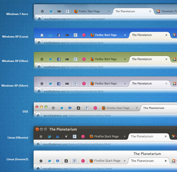
Australis is the name of the new default Firefox theme that Mozilla has been working on for quite some time. The decision was made to release the update gradually, with some updates already in the browser, while others still waiting to be delivered to it. One of the next Australis-related updates comes in Firefox 19. You may have already seen how the new tab bar will look like in mock-ups that Mozilla designer Stephen Horlander released a while ago.
The new tab strip or style will ship with Firefox 19 if development runs along smoothly. You'll immediately notice the soft curves around the active tab that connect to the tab bar. Mozilla wants to do away with the rectangular shaped tabs that current implementations of Firefox use.
Separators are barely visible on the new tab bar, a big change to how current versions of Firefox separate tabs from each other. Note that not all that is shown on the mock-up above will be implemented in Firefox 19. Only the new tab strip with its curvy active tab and new appearance will.
The core idea behind the change is to move the active tab into the focus of attention by highlighting it and adding the curvy borders to it.
Will the new layout work with tabs on bottom as well? That's one of the questions that I can't find an answer for right now. Mozilla is only showing tabs on top mock-ups, and it seems that we will have to wait until the feature hits the Nightly channel to test this out.
It is also not clear if the change will be mandatory or optional. It is however likely that the new design will be added to the browser automatically, and that users will either have an option to turn it off, or at the very least, install legacy themes that use the old tab bar design.
You can follow development on Mozilla Wiki and this bug listing.
What's your take on the redesign? Something that modernizes the look and feel of the browse, or another change that is not really necessary at all.
Advertisement







I like the new design because it’s the same across platforms,and as for the tabs they look like the chrome ones,but I’m not worried as long as Firefox UI keeps being configurable,when it’s not going to be,then I’ll worry!The funny thing I like is when I see people complaining about the tabs and see it as a reason to change the browser!
I like that the new design because it’s the same across platforms,and as for the tabs they look like the chrome ones,but I’m not worried as long as Firefox UI keeps being configurable,when it’s not going to be,then I’ll worry!The funny thing I like is when I see people complaining about the tabs and see it as a reason to change the browser!
This is the kind of crap that caused me to move to Palemoon — Firefox with the good stuff and without the frivolous stuff.
Check it out at http://www.palemoon.org. You’ll be glad you did.
Yeah the whole rounded corners thing is so 1990’s.
We’re dealing with square or rectangular monitors here, curving in UI is just wasted pixels.
And with Win8 square is the new rounded-off.
Unless you have 4 inch screen, a few pixel lost for rounded corner is no big deal. Surely beat over having UI like Metro, or whatever they’re called now.
Actually this new UI has already landed in Firefox for Android, and the tab bar looks something between 33% and 50% too tall on a smartphone screen.
i see – it’s like chrome, but uglier.
firefox still has some advantages for me as a browser, but these advantages are dissipating fast. chrome is now noticeably faster when i work in my CMS and that really is the most important use of a browser to me.
so while i type this in firefox – more out of habit than anything else, i welcome this new half-wit design, that will surely prompt me to switch to chrome completely much faster than i would have therwise.
I really hope that they will continue tabs-on-bottom cuz this is really important to me. By the way, if Firefox keeps eveything mimicking Chrome, what’s the point of using Firefox?
I hope they will make it optional.I don’t like Chromish Tabs at all.
It may look that Australis tabs are bigger and taking more space, but doesnt it look that they’re shorter so when they overlap they take same space as before? Seems so in my opinion if u know what i mean
Now grab a link guys:
http://people.mozilla.com/~shorlander/files/australis-designSpecs/australis-designSpecs-windows7-mainWindow.html#sectionTabs
Thanks KM, nice link
So use current tab padding curve cutaway & next tab padding overlap to create optical illusion of larger tab. clever! :)
My mistake on the vertical space loss I mentioned (so used to driving maxed window tabs on top you forget its not the norm, 16 vertical pixels mean a lot on a small resolution).
I also like compact design. This looks as though I will lose vertical space compared to my current setup (win7 classic design, Tabs on Top with Navigation Toolbar). Fading out seperators is good as eye is drawn to icons. Increased emphasis on active tab good, losing horizontal space bad.
Looks like it takes up more space. Anything that takes up more space I do not want.
Barf, just plain Barf.
IMHO: ugly. Reminds the design of Chrome browser which delivers a sum of aesthetics close to zero.
Firefox 19 ? That leaves 18-19 weeks before having to clean up that mess with scripts, which is fortunately one of Firefox’s great features.
I love their new theme.. Hope they implement it soon and also fix their firefox for android. And maybe add a server side conpressiob to their android app something closer to silk browser than opera mini
Theres always Stylish scripts to change these UI stuff in Firefox.
The extremely powerful tweakability of Firefox.
The core idea behind the change is to move the active tab into the focus of attention by highlighting it and adding the curvy borders to it.
They never post what it would look like under the Windows Classic theme.
What does it look like?
It’s already implemented in Thunderbird 15, and I’m trying to revert it.
It’s perceptively larger, I don’t like overlapping tabs, inactive tabs don’t seem like tabs, and it’s yet another way to mimic Chrome.
Good thing there’s the theme “Firefox 2 for Firefox 4 and above”:
https://addons.mozilla.org/en-US/firefox/addon/firefox-2-theme-for-firefox-3x/
I use this theme for TB:
https://addons.mozilla.org/en-Us/thunderbird/addon/classic-tb2/
I’ve got it! … sort of.
I took the tab css from the theme, tweaked it a little, and put it in my userChrome.css file.
Still needs some finishing tweaks, but it’s good enough.
I considered this before, but I decided against it because I like the message pane toolbar buttons.
If there’s a Thunderbird equivalent of TotalToolars for Firefox
http://totaltoolbar.mozdev.org/
I’d be happy to take the link!
(By the way, it was reviewd at Ghacks:
https://www.ghacks.net/2009/12/02/customize-firefox-toolbars-with-total-toolbars/
)
I’ve used this one for TB:
https://addons.mozilla.org/en-Us/thunderbird/addon/classic-tb2/
Another change that is not really necessary at all.
I’m many-tab user, TabMix Plus and Noia theme are my choices, and I don’t need tab redesigns at all.
Yay, looking forward to this change.
I wish they would implement and develop further OneLiner addon with this design. This design looks great, but two rows are still too much for me. :/