This Could Be Firefox's New Design
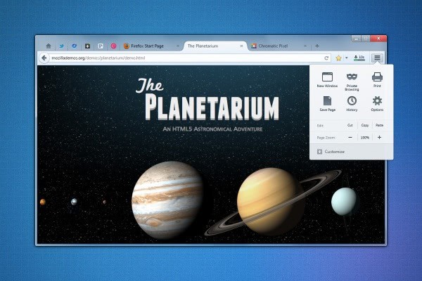
Changes that are made to a web browser that you are using on a daily basis can have a devastating effect. We have seen this happen several times in the past when Mozilla made changes to the design of the Firefox web browser. Especially the move from Firefox 3 to 4 caused an uproar, with part of the userbase still rejecting to update to any version beyond Firefox 3.
Probably the two biggest changes in recent times where the removal of the status bar, and its replacement with the add-on bar, and the new Firefox single button menu that replaced the standard menu of the browser.
New mockups posted on the Mozilla Wiki website show how Firefox could once again receive a visual overhaul, which in turn could again alienate part of the browser's user base. It needs to be noted that mockups are not final designs, and that nothing is set into stone just yet.
Firefox Australis
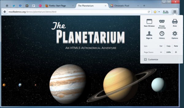
Probably the biggest change that you will notice right away is the missing Firefox button. The button has been moved down to the address bar of the Internet browser. The new panel menu displays popular functionality, like private browsing, saving pages, and offers a link to the options menu.
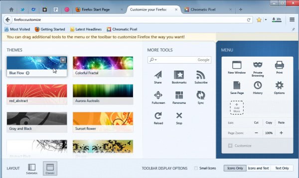
Unlike in Chrome, where everything is fixed in position, Mozilla plans to provide Firefox users with customization options. The new customization page opens in a tab in the browser, instead of a new window like it is currently. Here it is then possible to customize the new panel menu. It is for instance possible to drag and drop icons on or off the menu, or one of the toolbars directly. Keep in mind that this is a mockup, and that icons and options are missing from it as a consequence.
It is also interesting to note that themes are displayed in the customization tab. These background themes can be applied to the browser directly. The customization options become available under firefox:customize.
There are also options to change the layout to display tabs in a sidebar instead of the top, and to switch from an icon only menu to icons and text, or only text.
The missing title has not been mentioned yet. If things go as planned, Mozilla could do away with the title bar, and display page titles only in the browser's tabs. One issue here is that larger page titles cannot be displayed in full anymore.
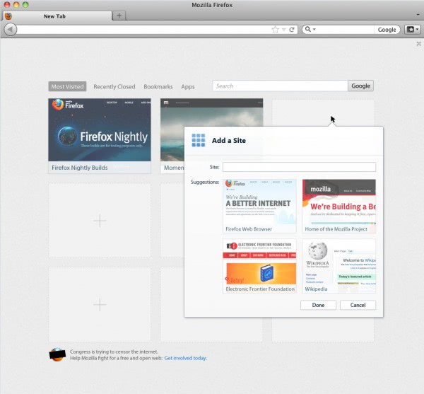
Additional mockups have been posted that highlight changes that are not related to the Australis design. An update for Firefox's new tab page is planned, that is, among other things, allowing users to add their own sites to the display. Firefox will even suggest websites, likely based on popularity. It also features additional links, to the recently closed websites, bookmarks, and apps, as well as a search option.
Last but not least, the new translate option of the browser. Firefox translate will be more versatile than Google's implementation, offering to translate all or a selection of the current page. Options to always and never translate a language or a language on a particular site are provided.
What's your take on this design change? Step in the right direction, or something that is making things complicated? (via Sören)
Advertisement










It looks like a cross between Chrome and Opera. I like it…
I bet that just like me, there are others who are waiting to get chrome version of noscripts extension and extension that lets you focus to a tab by hovering mouse on it to move completely to Chrome and enjoy the speed it provides.
The latest and greatest, the NEXT new thing, there are the designs that win competitions, wind up in art shows and museums because they LOOK good. Firefox is a browser designed to be used. ANYTHING intended to be used and not just looked at succeeds on its ability to satisfy the functional needs of the user. It’s too early, given that the designs are “mockups” not connected yet to functionality to determine if the new design WORKS or if its just another frustrating experience with something that is appealing to the eye but doesn’t quite live up to much beyond the initial visual appeal.
Not unlike more than a few relationships in which hormones are in full gear before the brain has been duly engaged. The Edsel comes to mind as does the M1A2 Abrams Tank for which changing the oil requires removing the engine. It might’ve been quite attractive as well up until that point.
Firefox, stealing all of opera’s ideas since…..well, forever.
For those who thinks Mozilla is getting rid of the search bar (at this stage):
http://i.zdnet.com/blogs/05-04-2012-12-34-53.jpg
I like it!
Everything looks great. I’m a little concerned that there’s no search-bar because I use this heavily. But hopefully that’s just cause it’s a mockup and the search-bar will still be present in the final version.
I’m fine with how Firefox looks right now. Firefox can be configured to look different, like FF 3. I got used to the FF-Button and can live with the addon-bar. The tooltip where a link leads to is still something I can’t get used to. The status bar was perfect for it.
I even moved the tabs to the top, although I struggled first. I had to move the mouse a little more, so it was harder to switch tabs.
What I don’t like about the mockup is, that there’s too much space above the tabs. Currently the tabs “touch” the frame of my monitor. The mockup wastes space. I just hope it can be modified or will change before it is complete.
The mockup reduces the available space for tabs due to buttons on the tab row, hope those can be moved into the same row as the address bar. Don’t like that the tabs are so rounded.
There’s no search bar in this mockup, when this is an attempt to remove it, the settings should allow an easy way to set the search engine for the address bar.
Well the problem is that FF devs hear that FF5 looks like FF11. FF versions don’t come with an optical change, so users ask why the version number has increased. Sometimes things don’t get better with an new GUI. Users hate it, it’s bad in terms of usability or it looks bad.
Whenever Firefox comes with an new design users might look into another browser (what I really recommend, try alternatives for any browser you might use), so it might damage Firefox. I could stick with the current design.
I absolutely love it Martin, and glad to hear that it will be made available for all Windows systems, as I will not be upgrading to Windows 8
It’s obvious from the replies that FF has gone way off course with letting people keep their customizations. FF needs to find a way to make their changes behind the scenes so that people can keep their customizations and still have the changes needed. FF did that for many years and need to remember where they came from. If people wanted a different browser there are many to choose from. FF needs to get back to being FF.
One more proof that beauty is in the eye of the beholder :) It seems that I’m the only one that thinks that the new design is kind of ugly :)
If you’re stuck on the old design try Pale Moon. It’s a Windows-only build of FF that keeps the old menu and status bars.
Personally I think the new design looks too much like Chrome. They need to do something to give it a different personality. Functionally it looks good.
Agreed, it reminds me greatly of Chrome as well. I do worry about Firefox becoming more and more homogenous with other browsers. On the one hand, that’s good, because hopefully things will render properly no matter what browser you use, but it does get rather boring if the UIs are pretty much all the same, so that you lose any real awareness of what browser you are using.
It looks amazing, to say the least. All the more reason why I use FF UX Nightly, to take advantage of some of the new features being implemented into this great Browser!! :)
The new design looks better than the one now.
Please start collecting the various tweaks and extensions I will need to combat this latest aberration or the user interface.
One of these days, hopefully before it becomes irrelevant, Firefox (which I generally love) will actually put all their energy into what matters: getting the underlying browser performing fast and developing unique helpful features. All their theme work just copies everybody else’s UI and butchers things like the status bar. What a waste of resources.
Seems cool and useful compared with the current interface. I like the design that put the download button on the right of address bar.
But I don’t like they removing the status bar. I use the status bar very often,so when I need it I often use the firefox engine in Avant browser instead.
I sau the twitter icon on this UI. I hope these icon will be movable.
Don’t really care about it too much, but nothing gets tech editors and the user base more riled than GUI redesigns for better for worse. I do like the new menu GUI, looks intuitive. Also the Tab design look too much like chrome which is bad.
@Martin If you don’t like that firefox button why not just switch to the old v3xx menu by right clicking the toolbar and select menu bar, you can also re-enable the addon bar by doing the same.
SEE>
Before: http://oi41.tinypic.com/142rot5.jpg
After: http://i43.tinypic.com/2vij8n4.jpg
It’s one more plan of unneeded changes.
I’m happy with the old design, I dislike even hiding old menu button in current FF design, and I don’t like browsers with tabs upside at all. So, I don’t want any of this Chrome-like eye candies.
It would be better if they work more on speed and memory improvements, and leave design as it is.
As long as NASA Night Launch– the most awesome theme evah– is maintained, I’ll only follow the development of the default theme with a mild curiosity. That’s one of Firefox’s clear advantages among browsers; there are a ton of REAL themes available to drastically alter its appearance.
Quick shot of my Fx at the moment: http://min.us/m6K2d7uHQ
The new tab page looks great! The design looks good too.
They sure do, huh? The folks @ Mozilla have got their act together! :)
I like the design. But the tabs look too much like Chrome!
If indeed the above design becomes final with those trapezium tabs, Firefox will also have become a browser which completely lost its own personality in the quest of competing with others.
I wonder how it would look with tabs on bottom (which Chrome doesn’t allow in it’s UI). The customization tab looks cool and the design is nice albeit yes I tend to agree is kind of chromish, and I’m not a fan of trapezoid tabs! (but tabs aside is ok). Perhaps is just me, but just like personas themes are integrated in the customization tab, a set / pack of colors for the UI elements could be included too (Either way, nothing you can’t do with userChrome.css). I hope the old toolbar bar is still available.
btw for those curious as me, here’s the link for the planetarium demo of the screenshot:
https://developer.mozilla.org/en-US/demos/detail/the-planetarium/launch
I meant the menu bar, not the toolbar.
I think that looks beautiful! It Looks comfortable and relaxed. Martin – to clear this up – are these changes for Windows Eight? Or something that will be applied to W7 also?
looks like it’ll be for all operating systems :)
https://wiki.mozilla.org/Firefox/Features/Theme_Refinement_and_Evolution_%28Australis%29#6._User_experience_design
I do not think that you will see operating system restrictions with the new design. At least nothing that I heard of yet.