New Microsoft.com website launches
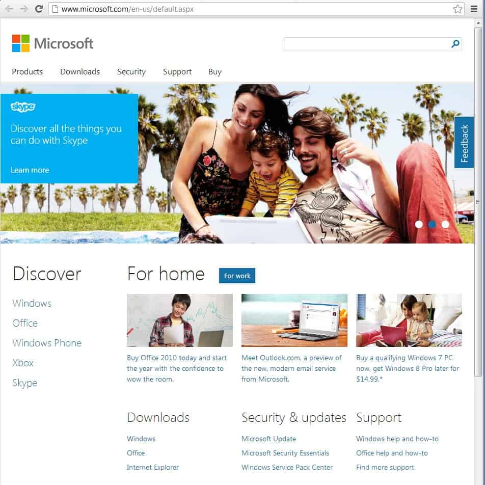
Microsoft back in June 2012 launched a preview of the upcoming Microsoft.com website which looked fundamentally different from the old homepage. Today, the preview design went live on microsoft.com. If you visit the website right now, you will notice a clean looking site with less clutter than before.
The responsive design adapts to any screen resolution you display the homepage in. This is a fluent process that happens while you increase or decrease the size of the browser window. The dominant element on the new homepage is the large banner that is advertising Microsoft products and services. Right now, it is teasing Bing it on, Skype and Visual Studio.
It is interesting to note that designs differ depending on which web browser you use to access the Microsoft homepage. The above homepage is displayed to Google Chrome, Internet Explorer 10 and Opera users only. Firefox and Internet Explorer 9 and previous users see an entirely different design.
The design not only looks different, it also is static and not responsive like the design displayed when you open the web page in IE10, Google Chrome or Opera.
The top of the page is nearly identical though in both designs. The search is displayed prominently here, as are the links to products, downloads, security and buy. The first difference is the distinction between home and work on the Firefox and IE9 page. While you can switch between work and home on the IE10 and Chrome design page as well, it won't change the teaser banner at the top.
It is not really clear why Microsoft decided to launch the site with different designs based on browsers. It is because of technical restrictions, market research or something else?
What's clear though is that the new Microsoft.com is definitely cleaner and easier to navigate than the old homepage. Have you been to the new homepage yet? Did you see one of the two designs above, or yet another one?
Advertisement













I changed my homepage from my msn when they forced the new POS on me. the new site sucks like a neutron star.
Thank goodness for this release, I absolutely hated the old website.
Arrival was default “home use” screen, few clicks in and got an invite for feedback survey. Not a big fan of the layout, bit of a scroll.
When the world was a fixed 800×600, I was told good designers made sure everything you needed to see was there in front of you when you landed, without you needing window scrollbars. I think that approach concentrated the mind to improve the design. Sadly, these days, relative positioning or not, its all scroll scroll scroll…
Maybe it’s just me, but it kind of looks like a scam site….
I just want to make website like http://www.QLXchange.com exactly can you help me
And they still kept cluttered dropdown menu? ://
Yes. I opened the page with Opera and it looked just like your second screenshot. However, all I see on my screen is the top portion of the page. I have to scroll and scroll to get to anything useful. It’s like that on a lot of websites these days.Open a page and there is a full screen or three-quarter screen ad in a blast of knock-you-on-your-a_ _ color. I think it’s because they are designed for small devices. On desktop screens it’s overwhelm times two.
The content of the graphic depends on whether you click Home or Business. But I’m getting static-width pages in opera, ff and IE9, regardless of window or maximum state of the browser, on a 22″ screen.
In all, I think it’s a pleasing design. With its boxy links, the era of Win8 is upon us. I also took part of their survey, and they are very much interested in the appeal and navigability of the new site design.
It’s a nice design. I like how when you first enter the page the first image they display is “Bing vs Google”. I thought that was funny.
I viewed the MS site using IE9, Pale Moon ( is = Firefox), and Maxthon (tried both rendering engine). (All browsers are running the latest version/update.)
All rendered the MS page same as shown on your first screenshot above. :)
Then I closed and relaunched the tabs on Pale Moon and Maxthon (Chrome-mode). Now they’re both showing the page shown on your second screenshot. Weird.
(On Maxthon-IE mode, it’s showing what’s showing on the first screenshot.)
Maybe it is an A-B test then?