What a centered Start Menu means for users in Windows 11
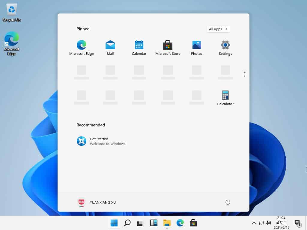
Windows 11 was leaked earlier this week and new features of the upcoming operating system are showcased on social media sites and blogs. One screenshot, which you may have seen published everywhere, shows the new centered Start Menu and taskbar layout of the operating system.
It appears that users of the operating system may align the Start Menu to the left and right as well. The classic version has the Start button displayed on the left side, and the icons that are pinned and the programs that are open next to it on its right side.
A centered Start menu and taskbar is not entirely new. Programs like CenterTaskbar or FalconX provide similar functionality to users who install the software programs. A core difference between these third-party applications and Microsoft's Windows 11 taskbar design is, that the Start button is centered as well in Windows 11.

One of the ideas behind displaying the icons on the taskbar in the center is that it improves accessibility. Instead of having to move the mouse cursor all the way to the left, icons are now reachable in the center.
One of the main differences between a centered and a left- or right-aligned layout is that the centered icons are not in fixed positions. When you open a new program, all icons are realigned on the taskbar to keep them in the centered position; this means, that the Start button will not be in a fixed position either, as it will wander from its position on system start to the left whenever programs with taskbar icons are opened, and to the right when programs are closed that are not displayed permanently on the taskbar.
Windows 11 users who open just a few programs during a workday or at home may not see a lot of movement, but this is not the case for users of the operating system who open and close lots of programs.
Granted, this is not a critical change that is going to delay taskbar operations by much, but it may still impact a user's workflow negatively.
Windows 11 users who prefer the left-aligned taskbar layout can restore it easily, at least in the leaked build.
We will know more next week when Microsoft will reveal the next version of the Windows operating system officially.
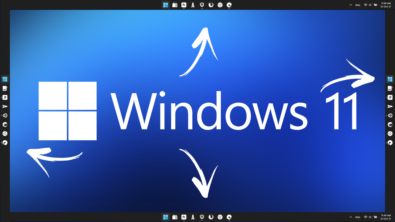
Now You: what is your preference in regards to the taskbar? Left, centered or right? Small or large buttons? Bottom position, sides, or top?








classic shell/open-shell galore
I don’t know. I have impression that everything is dumbed down. For dumbed down generation dumbed down windows.
Absolutely it is dumbed down like crazy but there’s a certain class of dumb people who find nothing wrong with it, they can’t even seem to notice missing functionality.
@meee i totally second that
I take it that your impression is a dent in your head. You should see a doctor about that ASAP.
“it improves accessibility. Instead of having to move the mouse cursor all the way to the left, icons are now reachable in the center.”
This is not an improvement, it’s worse. When the start menu is at the bottom left, I can click it without needing to even look at it: I only have to move the mouse in that direction. A fast and imprecise movement suffices, since the corner of the screen keeps the pointer over the start button.
If the button is somewhere around the center, then I have to take a look, locate it, and move the mouse there being careful that I’m not clicking a bit too much to the left or to the right.
So yeah, the distance may be shorter in straight line, but it takes more time and cognitive load.
Well, being that you are slow to learn new positions, then that’s your problem.
Having it in the center and learning new positions is better.
At least my girlfriend can certainly confirm that with me.
@anon – i agree. an mouse flick or touchpad flick without even bothering to see.
@shoddy – bah, imaginary 2d aint 3d
What’s more worrying is they’ve removed the option to show taskbar captions.
Hopefully Stardock and the like will provide an app to restore that option.
First time I saw the Win11 picture(s) I thought I was looking at a Chromebook.
Perhaps you require eyeglasses?
I would be happy if they just brought back features that worked better in the past, and fixed what is broken now.
For example, in thumbnail view, flat folders were better than the dumb angled folders we have now. Also, the start menu was better in 7 and even XP. Also, the auto-hide taskbar feature has always had issues, where if that worked proper, I would use it.
From reviews I’ve seen, so far it’s merely Windows 10 with a shiny new layout.
That’s exactly what it is. I did not like it at all.
While Windows retards scramble under the table for some crumbs from One Microsoft Way, Linux has both Desktop Environments and Window Managers, all completely customizable.
I’m so glad I left Windows behind a long time ago.
@sasha
So by definition, you are a Linux snob. Good for you! My drug dealer is also a Linux snob, and she seems happy too.
Personally, I’m glad I stayed with Windows, as the software I’ve used with it has made me filthy rich.
And now that I’m rich, I switched to Apple. If you come to my estate my butler will throw you some crumbs through the gate.
If MS is requiring me to have a MS account to use it then the can go to you know where.
There making a huge mistake trying to move the OS from software installed on device to one where you have to rent it via a thin client interface.
Larry Ellison of Oracle has been promoting this for 30 years. Bill Gates was totally against this idea.
It means we will need to keep using Start10, Startisback, Open-Shell to fix Microsoft’s failed UI/UX. Now we might need another… TaskbarIsBack…They learned nothing since Windows 8 till now. We just want a regular start menu like Windows 7 and all the mobile/smartphone bloat and annoyances stripped out. Desktop operating system only please!
well MS has decided not to allow local account with Win 11…you have to have MS account or it wont let you install it.
@DEAN:
“MS has decided not to allow local account with Win 11…you have to have MS account or it wont let you install it.”
Winaero has some workarounds on its website, here:
https://winaero.com/how-to-install-windows-11-with-local-account/
I rarely use the start menu and when I do I can just press the ‘windows key’ and get on with life.
Any ui that goes manic by moving/floating elements all over the screen like in the new Win 11 start menu, totally destroys second nature muscle memory orientation.
I’ve been using a button mouse on an x10 mouse remote to navigate Windows versions for the last 15+ years. Without the learned muscle memory this device would be useless.
So too Microsoft’s moving target of a start menu requires too much attention to where the menu is NOW to justify its new brainchild.
Installed win 11 on a non-uefi 2008 white macbook with a core two duo processor.
Windows 11 said you need TPM 2.0 and secure boot in order to proceed.
A Youtube fix is available that replaces the appraiserres.dll file in the source directory of the install media. Works fine. No further install issues.
My opinion of the new start menu in entirely unfavorable. Though the alignment is easily returned to the left of the taskbar from the taskbar settings drop-down menu.
Classic start menu from the Ninite installer website doesn’t even show up after the install.
The default taskbar is bright white with the default lite theme–like looking at marshmallows floating in a glass of milk.
Performance of this bootcamped macbook is equal to Windows 7 leading one to think that Microsoft’s big aim here is obsolescing dated–yet still competent hardware, and moving the desktop ui further still towards portables.
> My opinion of the new start menu in entirely unfavorable.
Your opinion is entirely unfavorable?
Hmm, looks like some parapraxis is at play here.
Honestly Martin you know nothing about accessibility and you should not talk about the subject if you are so clueless. It makes accessibility worse. You clearly no nothing about the design principles of Windows 95 or what is Fitt’s law of usability, how XP improved the Start button to follow it in the bottom left corner.
Honestly Jeff M.S., you know nothing about Martin or this site, thus you should not talk about it, as you’re completely clueless.
Your silly, extreme criticism is way off topic and delusional. Martin simply described what that centered Start Menu is, and beyond that he just said:
“Granted, this is not a critical change that is going to delay taskbar operations by much, but it may still impact a user’s workflow negatively.”
If you want a comprehensive dissertation on this topic, then this is obviously not the place for that.
Yet if you’re just a crazy troll trying to stir up trouble here, then no matter, as you’re still delusional and clueless.
I think one point that needs even more attention, and many people get it:
Yes, I use Open Shell and Quick Launch also. However; we can discuss/agree/argue about these small UI things, but they are a (possibly planned) distraction form the real issue: user control of the O/S!
See my post in “Windows 11 leak gives us a glimpse of Microsoft’s next version of Windows”
https://www.ghacks.net/2021/06/16/windows-11-leak-gives-us-a-glimpse-of-microsofts-next-version-of-windows/#comment-4497475
I titled that detailed post “Windows Power User Call to Action”. Here in the early days of a new Windows version, we must make ourselves heard. We must rally to keep MS from taking away even more user choice. And arguably save MS from itself.
If you believe users should have the option to control their own systems, please speak up! Yes, they will test the waters, but if we don’t lie down they will listen!
If you want to control your “own” system, then make your “own” computer from scratch, with your “own” GoodMeasure OS, and never access the web.
That’s your only practical option to truly “own” your system.
Thanks for the response, mythos! And you are obviously correct.
I guess I see a lot of nuance in this matter. I see the user control issue as a continuum, not black and white. I know I am not going to get everything I want.
So I see it as a choice:
We can lose even more user control, which is likely with a new version of Windows being officially announced in a few days.
Or we can reject defeat-ism and preemptively rally to retain as many rights as possible.
I am just arguing for us to be asking the right questions and for some push back IF it comes out that MS is trying to push the envelope even further away from users. If they want good headlines, they SHOULD even be making it a little better.
However; GoodMeasure OS has a nice ring to it! You made my day! Thanks for that…
@GoodMeasure
I agree. You explained that well.
You seem to be rational and concerned, yet not an extremist nut. I appreciate that.
BTW, I just bought the domain goodmeasureos.com and copyrighted the name GoodMeasure OS. So if you want those, you’ll have to pay me the big bucks!
Seriously though, you bring up some good points.
Over the past 20 years, I’ve been a writer for some rather large software companies, mostly involving security.
I started with marketing and technical writing, but then branched out to writing mission statements, policies and goals, including the title of CCO.
As such, I’ve always pushed for ethical practices among my peers, which was often welcomed, but not always implemented.
That said, without going into great detail, this is the sum of what I’ve learned, of which I think should be of most interest to you:
Over the years, there’s been a trend to give the CMO the most power within a corporation. With that power, they tend to partner with 3rd parties who have little to no ethics, who can “deliver the goods by any means”. Furthermore, with the help of lawyers, the company can get away with all sorts of profitable shenanigans, under the protection of plausible deniability and more.
These are just some things to consider while “asking the right questions” and targeting what to “push back”.
I also did much work for a large international conglomerate based in China, which is a completely different story I can’t go into much, as any corruption was either very well hidden from me, or there was none. Yet even without corruption, there was likely some overbearing control from “the party”.
@mythos
I almost closed this tab, but saw your response! I wonder how many good responses are missed here at ghacks. And a thoughtful response it was. Thanks so much! Another rational individual in the room! Though, admittedly, ghacks might not be the first place one goes to seek rationality.
You have an interesting story. Your comments about marketing are fascinating. In a corporation’s never ending search for growth, the institution itself starts to sink deeper into its own magical thinking, which is the providence of marketing.
I am not a corporate insider myself, but have noticed the rise of marketing. The more we are isolated by technology, the more susceptible we all are to believing what we want. And marketing is poised to fill the void. If you have ever read the comic strip Dilbert, which I see as a pessimist’s lighthearted commentary on human institutions, the way marketers are portrayed is classic.
I will keep an eye out for your comments when I occasionally read Martin’s writings. And I will start saving up to get my GoodMeasure™ rights back. Cheers!
It doesn’t mean anything because even in this probably fake troll build to deceive people, you can set it to the left.
I mean, the event is set to be in a week, only 7 days and people are making comments and coming to conclusions when this build is so suspicious and weird. Do people even remember how early win10 looked like win8 and then final release was different and nice? well, expect the same result here.
10X elements are being bring but if you see this build you will see only a shell replacement rather than a new version with new real features that even matter. That’s why I say Troll build… are people sure it doesn’t have malware or connects to weird IPs or something?
I am also sure even if Microsoft released something like this (not looking as terrible as now, more like what 10X looked and not this with win10 preview insider builds with some weird shell with icons on the middle), they will probably also change from center to left depending on the device you started it for first time.
Just the TPM issue to install should be enough for people not to install this but they force it and want LTSC builds and all that like if this was final version… so dumb and crazy. The Masters OS developers of backwards compatibility, they still include a bunch of useless crap from win3 and IE11 and all that executables and all, but somehow they don’t offer good support because TPM and CPU needing other features found only in 2015+ cpus.
So even if real, people shouldn’t think this is like a final version or anything and if fake, people should just wait for 7 more days to really give an opinion about next version of windows whatever is called.
The windows11 name looks more like to please the ones bringing a bunch of theories rather than a realistic name.
Left, small, bottom + Quick Launch taskbar on center :D
I’m guessing that this is to make the OS more tablet or mobile device “friendly”.
I wonder… What will happen to the “Show Desktop” button (you know, the almost hidden one at the end of the task bar (after the notifications center) that will clear all windows and show the Desktop?
It means I’m staying on Windows 7 longer than 01/09/2029. This does not fix what was broken in Windows 8 and 10.
Why the taskbar is now so freaking tall? Also, I noted the option to reduce icons size (to make it shorter) is gone.
So, we finally start to see laptops with 16:10 screens only to Microsoft increase the height of the taskbar?
I use FalconX, and IMO it offers the best of both worlds. I like the Start button, search and virtual desktop buttons on the left. I don’t use them all that often to be honest.
But with that setting the taskbar shortcuts (with jump list items) work like a dock. It looks really nice.
I’m reasonably glad with what I’ve seen from Windows 11. It will allow us to keep the W10 Start Menu and I love the new icons and the rounded corners. :)
People don’t know anything about architectural or ABI or whatever real changes in the new OS version and arguing about icon placement instead… It’s beyond ridiculous.
What is the use of changing use interface frequently like this? Rather performance gain need be addressed, IMHO.
The reason of changing the UI frequently is keep a majority of users from becoming expert users.
If everyone became expert users then they’d realize how messed up Windows really is.
Had this argument recently with my daughter who likes the Win8/10 UI. It’s fine till you accumulate thousands of files and have to learn how to do file management.
The Win 7, 8, 10 versions of file suck majorly with the 3 position arrow tree. Stupid, stupid, stupid.
You click the arrow next to the folder and it expands it and ou end up all the down the tree every time.
You hane have to scroll all the way back up to the select the folder so the the folder contents appear in the right side window.
A huge waste of time and really irritating.
I long for the days when there was a plus and minus sign to expand and collapse folders. So much so that I had to find a third party app to do file management.
+1
I have been using Open Shell (and its precursor) ever since I moved past XP. Plus I have been using Quick Launch also. Both to save space and as someone mentioned: Muscle Memory.
Two major points I agree with that others have made…the long time ‘muscle memory’ means you know where the Start button is. Bottom left.
Plus if the Start button will be moving around in the ‘new’ centered menu, forget it. Didn’t I just see Ashwin proclaiming the value of a software to KEEP all your desktop stuff in the same position? So saving 4″ on my monitor of moving my pointer to the bottom left instead of center…. is voided by having to search now for it in the center menu.
As an older person so many things I see nowadays are ‘new and improved’…well they’re new…but not improved. Actually worse.
fun comments to read… everyone has their views. just lately i gave win10pro a good run….worked it hard and delved into it…a change here, a tweak there….toughened it up as best i could against spying, etc…. this was all done on a separate win10 pc. finally, I just went back to my win7Pro and it was like a breath of fresh air…fast and smooth and everything where it has been for years…i run all browsers off a flash drive and sandboxed…plenty fast….no updates for years and zero problems…and my choice. sometimes i feel that change just for change sake comes from lack of real innovation. a new windows was always something to look forward to…days gone by for sure. just an old fart stuck in the past and relaxing and enjoying it.. my best to all….Clas
Do we know yet if Windows 10 will automatically morph into Windows 11? If not, one will only get it if one wants it. Therefore no worries.
MS copies Linux? Again? Why, for an additional 0% market share? I used KDE neon for almost a year until they implemented this (not sure if it’s a Plasma thing or not.) It could be bigger, I suppose, big enough to span all your desktops at once, maybe.
As long as you can move it around and resize it, fine, but a start menu that moves itself around is beyond annoying. Do not MS’s phone poking kiddies realize users tend to open things in the middle of a screen and likely would prefer their work to not be obliterated by something that should never get in the way?
Making the task bar, panel, whatever name they want slide icons to the middle is fine, docks are common in Linux but really don’t add anything except another place to put open/close buttons, same as multiple panels. Will the icons swell, too? Maybe ten Mac users will migrate because of it. Instead of 16×9 screens we’ll start seeing 9×16 screens, just ‘cuz.
Zero creativity these days, just steal stuff. Why not call Win 11 “Waylandia” and design it for a 11×11 screen?
Linux distros have some truly bizarre special effects, spinning desktop cubes, dripping windows, exploding windows, blowing in the wind windows, squashing windows, bouncing windows and the phone gui called gnome. Are these next? Probably, just ‘cuz.
This makes sense if youre a RTL user, not so much for LTR, so this accessibility is being driven by a RLT dev.
Again MS, lets ignore the other 50%
Centered Start Menu doesn’t change much for me. Centered Start “Button” and taskbar icons on the other hand, changes a lot, in a bad way.
Placing the Start Button in the center means that you are now forced to “aim” for it if you are using the mouse. With the button all the way to the left you don’t even need your eyes to click it. Just shove the cursor all the way to the corner and click. It’s impossible to miss. Same with the close button on maximized windows. This is why I don’t like macOS’s interface. It forces you to aim for that little tiny close button every time.
Centered taskbar icons are also annoying. One of the first things I do on a new Windows install is disable taskbar combining / collapsing. I switch between multiple open programs and windows constantly (often 10 or more) so having them in the center makes far more sense than having the icons I basically press only once per session. 7+ Taskbar Tweaker has been a godsend for me and it’s one of the main reasons why I consider Windows desktop to be far more practical than other OS desktop interfaces.
Earlier this year, Jensen Harris, ex Microsoft exec, even highlighted the magic of the corners using Fitts’ law of design usability, which makes the repositioning of the Start button even more perplexing. Video link: https://www.youtube.com/watch?v=f52N1eZxF3E&t=531s
And see an example back from Win95 as to why such placement (also visual) is important: https://youtu.be/3wbnf87dGms?t=83
The rest of the icons being centered have my full understanding (I’m using CenterTaskbar myself), again because of Fitts’ Law (and because there can be only one button in (each) of the corner(s) :)
Microsoft has been actively ignoring good UI design principles since XP.
Why should i care about Start Menu and not for huge perfomance progress
with light modern apps at 64bit and easier installation for beginners with
much less telemetry setting and questions? Or at least making DirectX better
and making some kind of gaming mode when someone wants to play a game
with smooth performance and fps.
It means another idiotic shift towards a mobile-first approach in UI design. For people using Windows over the last few decades, muscle memory dictates that the Start button must be on the bottom far left. Anything else is just change for the sake of change, emulating bits of the macOS design (they wish!), and pretending that a laptop or big desktop should be operated in the same way as a tiny phone.
“They wish.” Yawn. Nobody needs your condescending and Apple fanboy’isms. Contrary to what you have been brainwashed into be-LIE-ving, Crapple is NOT the best thing since sliced bread. Get it? Got it? Good. ;)
I agree completely with your mobile first comment. Attempting to unify the computer experience and the tablet/phone experience forces compromises and limitations on both groups. While I’m flexible enough to accommodate different positions of the start button, I don’t want the taskbar on the bottom. Or the top, for that matter. Documents and source code get longer vertically, not horizontally, so I like to maximize my vertical space.
Not so sure about MS copying Apple. Apple allows moving the dock to the side. The bottom/center placement is just a default. As a relatively new owner of a M1 Mac Mini I can say that both platforms have definite advantages. When using the Mac I really miss menus on the application windows and easy window management. I’m forced to use the mouse too much, and I’ve also had to buy utilities on the app store to get some very basic features and decent mouse control.
As for change for the sake of change, I think it’s fundamental to the business model. So much of our economy is driven by change. Change itself is the product. It’s usually not better. Just somewhat different. There’s no better way to make money quickly than to get people to do the same thing they already do somewhat differently.
For users of an ultrawide screen this is a great feature!
It is more convenient when the button that performs certain functions (for example, the “Start” button) is always in the same position – so you always know where it will be. When the button “floats” to the right and left, every time you have to aim at it again, looking for it on the taskbar, while now you can almost without aiming move the cursor to the corner and know that you will “hit” it.
Apple uses this centered position for his taskbar so it’s most probably a patent Apple clone copy.
Especially the fact that Windows 11 promises that during the workflow the taskbar positions will change when extending the number of the open programs, this position adjusting does not feel good to me.
This because with every opening of a program you have to reconfigure your automatic feeling where the program is your needing at the moment, so it’s going to be a constant searching for the needed program.
This is an extra distraction I think I do not need.
At least Apple allows you to move it.
It means I will use StartIsBack++ FOREVER! That’s the best program for a Windows computer nowadays.
I agree. It’s the perfect customizable launcher.
I just hope Open Shell still works with it as i doubt the developers would want to put in the effort needed if these changes call for a major rewrite.
I was using StartIsBack++ before upgrading to Windows 11 and after that it stopped working completely. It’s like it didn’t even exist anymore.
Originally, I started using StartIsBack++ because the Start Menu on Windows 10 would stop indexing and the newer programs I installed, did not come up in the search results. StartIsBack++ fixed that. But in Windows 11 that is no longer a problem so I kinda don’t need it anymore.
Second that. Open Shell makes Windows desktop usable. A start menu any size you want, what a concept!
Any fixed-function icon (Start menu button) that moves around is a usability problem.
I appreciate the article’s idea that having to move less in order to get the mouse cursor to wherever the Start menu button happens to be from time to time may be desirable, but it is absolutely not desirable at the expense of the increased cognitive load of having to figure out where the Start menu button is this time.
Consider website and app red/green, ok/cancel, yes/no, etc buttons. Each site/app does it a little differently. How many times have you clicked in the wrong place because a color was different, or the yes/no were reversed with each other compared to the last webpage/app on which you clicked, etc?
A key precept of usability is consistency and predictability. No, the Start menu button should not be “centred” – it should always be in exactly the same place.
It would be better if you prefaced your post with “For me”. I disagree with your post completely *for me*. Predictability is irrelavent unless you’re someone like a support tech having to figure out other people’s configuration. For myself, I want the configuration I want, and I will make that fairly consistent on the various devices I use. On computers I want my taskbar on the left side because I prefer to save vertical space for my applications. I don’t care if the Start button is at the top or bottom or in the middle as long as it doesn’t move around randomly.
Keep your condescension and virtue signaling to yourself. Nobody here is impressed by it, kiddo. The man made some excellent points.
What it really means: Open-Shell will be more popular than ever.
You and everyone else are forgetting that there is an option to return the start button and pinned items back to the left side: https://i.imgur.com/db9UxT1.png
This doesn’t matter if all the options we love are missing from the taskbar.
Definitely, my setting will be everything to the left. Since the times of Windows 95, Microsoft has trained my muscle memory. If I want to open the system menu and run applications, I move the cursor to the lower left corner and click. I cannot imagine that I would change a habit (especially under duress). I will rather change my system to Linux than get used to looking for the start menu icon somewhere in the middle of the taskbar.
It will look much better if Microsoft makes taskbar completely transparent and move only start menu button to the left of the screen.
“What a centered Start Menu means for users in Windows 11” ?
It means lets copy from macOS as much as we can and maybe will will become Apple.
Amen
Gnome and ChromeOS also have centered icons. Also Windows has a taskbar, MacOS does not. They don’t really look that similar to me.
Copied from macOS.
I hope you enjoy your Apple.
For me it feels a bit like the Start Screen in Windows 8 – big, bulky and taking too much space.
Start Button working on the left works, because it used to be the odd button out. It was last in Windows Vista and 7 with the Start Orb when the button stood out from the rest of the pinned custom buttons on the Taskbar.
Since Windows 8 and Windows 10, the button looks very insignificant and if you don’t have previous knowledge and experience with Windows, operating systems and computers in general, you would have no idea you’re supposed to click the window button to invoke some rather important menu.
I also think being on the middle will confuse older people who are used to the menu being in the bottom left corner of the screen and will only cause problems rather than solve anytihing.
I’ve seen those programs that put your pinned items in the middle of the taskbar, but I never understood why. For me even from an aesthetic point of view it’s pointless and ugly – neither is it beautiful, nor it solves anything.
In my opinion it’s just one more of their stupid experiments that they will probably forsake once they hear the general consensus that people like how things were. And I kept saying this since 2012 and Windows 8 came out – don’t fix what isn’t broken. Windows 8 should have released with the exact same UI that Windows 7 had and only add the under-the-hood changes that make it more secure and more modern. Same should have happened with Windows 10 – same UI as Windows 7 – Aero Glass, gloss, gradients, shininess and if they want to modernize the look so much, they can add new themes, like those 3rd party themes on DeviantArt that worked up to Windows 8 and stopped working in Windows 10 and people will be free to choose which theme they want to use – flat, solid and blocky or rounded, glossy and transparent.
The only things I’m happy about in Windows 11 are:
– they are making the corners of windows rounded again, I’ve been waiting for this since 2012’s abomination came out
– they are making icons colorful and with gradients and depth once more, not ideal looking, but better than the monochrome, flat and boring ones still present
Well put.
It looks like they’re trying to copy MacOS with the centered layout.
I ended up installing Windows 11 on top of my Windows 10 and it’s OK, I like the rounded corners, the gradients, depth and color on the icons, but right clicking the taskbar only has one option right now – Taskbar Settings, everything else is gone.
I set up very easily the start button back on the left side and it’s almost the same – Windows 10 that’s no longer ugly.