First look at CCleaner 5.0's new interface
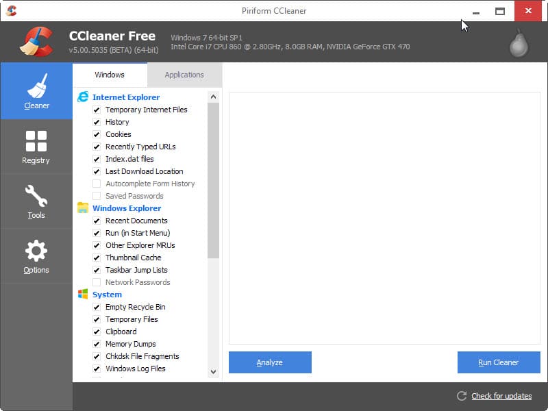
Software interface design changes, or entire redesigns, are often controversial updates. It happens that visual updates are disliked that much that users move to alternatives instead. We have seen that with Firefox's Australis update in recent time when users moved to alternatives such as Pale Moon after the update.
A first beta version of CCleaner 5.0 has been released yesterday. CCleaner 5.0 is the upcoming version of the popular temporary files cleaner and system utility for the Windows operating system.
The build that Piriform released yesterday includes only the new interface and none of the other changes that the company plans to ship in CCleaner 5.0.
The beta installs over the current version of the program on Windows if it is installed on the system. It does not seem to be available as a portable version right now and the provided version won't interfere with portable versions of the program if available on the system.
When you start the beta of CCleaner 5.0 for the first time you will notice immediately that it is using a flat design now that seems to be very popular these days.
If you have seen preview builds of Windows 10 you may have noticed that Microsoft uses the design in many programs and locations of the operating system.
The beta version of CCleaner 5.0 includes only the interface change as mentioned earlier. This means that it is generally not recommended to upgrade to it in productive environments as it has nothing new to offer apart from this.
Piriform plans to release the final version of CCleaner 5.0 at the end of November. The company has not revealed any of the new features that it plans to ship with this major update.
Interested users can download the beta for Windows from the official website.
Now You: What's your take on the interface redesign? Good move or bad? Why?












The “Flat” GUI looks out of place on Windows XP. The impression I get from this change is that the developer is cheap and weak, unable to design a product that is good by itself, without conforming to “trends”. One option would be for them to maintain two interfaces, but I wouldn’t want to the authors to be distracted from perfecting the program’s true function.
Most people seem to have accepted the explanation that flat somehow significantly reduces power consumption. That is BS. Windows 95 and all subsequent releases with the classic theme had simple, efficient 3D emboss effects. Any system in use today, mobile or desktop, is at least several times more powerful than computers in those times. The flat design already has borders around buttons and checkboxes. It is ridiculous to say that choosing a different color for them, so that they stand above the background, would add any complexity at all. And drawing second border or a copy of the text line to indicate sunken, disabled items would have negligible performance impact. Just install Windows 2000 on a real computer with correct drivers and tell me that is slow.
Not bad Martinn. I like the new Windows 8.1 design.
After reading the above contents, I conclude that Piriform has ‘telegraphed’ us that a CCleaner version will be coming to Android or iOS soon.
OMG… CCleaner v5 “Ugly Edition”.
Practically, they kept the layout of the old GUI and just improved the graphical elements. All the functions are still where they were supposed to be. I find it a logical step. It doesn’t take more than 10 minutes to adjust to it. I don’t see why so much hate.
The new interface is crap! It looked better before. I hate this windows 8 look!
Whats a good replacement for CCleaner?
Or I guess I could go back to a previous version.
Hi LeeD…
You can use Wise Disk Cleaner Free >>> http://www.wisecleaner.com/wisediskcleanerfree.html <<< … it's FREE.
I don’t care about the design. CCleaner cleans well and I only care about that.
how can i switch to old skin / theme please?
i hate this homosexual flat design, sorry.
I really hate the flat GUI!! And look at the Windows / Applications tabs… sure they must got it wrong, or?! If you click on Applications the tab get white, BUT the Windows tab get one pixel larger?!
I was at a Developer conference a while ago and one of the guys that designed the “new” Windows 8.x / 10.x flat design was there. During the questions one guy asked “Hmmm… there is a lot of tiles, very many tiles!? Can you make them round?”
Hehe…
Hello,
I personally hate the new design. When I last updated my free version of CCleaner, I thought this new “flat design” was just a way Piriform would get people to upgrade to the payable “Pro” version. In other words, I thought this ugly design just concerned the Free version… and that the payable Pro version looked like before.
The interface is just horrible in every way possible, nobody likes this flat design trend, it is ugly simplistic and just plain nasty , make it back the way it was .
Hi astaldi…
You are right & i agree with you… “make it back the way it was” ….
hate any design similar to windows 8 ! ccleaner could add a button to select all or deselect options. that would take a lot less effort to tick all those options ! they should spend their try on quality not a ridiculous appearance !
I’m not a fan of the flat look either, but it makes sense for CCleaner to go that route…as most folks on windows systems, makes sense to integrate interface to fit in with that.so that it is easier for customers to use. Keep in with the big names….
I only wish they’d give the option of using different themes/skins for those who like to be a little different. Shouldn’t be too tough for them to do and would please a lot of existing customers too.
Software is a bit like clothing, I think we want it to do the job but also look the way we feel comfortable with. so please designers, remember not everybody want to dress as though they only shop at Target.
this is no way a dress, this is a microskirt..
look SO POOR, not simple, but POOR, if i would not be a year-by-year user of CC, i would not know, what is main menu, and submenu and so on..
flat is gay, unfortunately…
Hate the flat win 8 look it has addopted. Just upgraded and was shocked by how ‘basic’ it looked on my win 7 rig. Think a nother Os is in my future or I need to seriously research UI tweaks/hacks/addons if I ever go win 10. Sad. Xp still had the best looking interface imho.
Put me down for detesting the “flat” interface. Looks ugly as sin – although I wasn’t aware of the power consumption issues another user posted. Great. I detest iDevices of all manufacturers, and now “real” computer users are getting the fallout.
I’ll just go back to CP/M…
-1
I hate this new GUI. Everything is flat and the colors are extremely bad.
I really hope that PiriForm let us change the GUI in a next version – inlcuding back to the v4 one.
If not, I change to a tool where I don’t need special glasses to recognize the buttons, tabs and functions.
Flat design is the way to go… gradients are ugly.
Pierre…
En vez de usar el “link” que te envié, Google la palabra SOLUTO y busca la pagina que es para Windows OS. Me imagino que tienes Wins 7 o 8, es lo que debes hacer. Luego instalas el programa SOLUTO y ella se explica por si solo. Es muy fácil y te va ayudar bajar tu “boot-time” por mucho. Hasta Luego……
Gracias, lo haré cuanto antes
oh damn! the interface hurts my eyes with too much white background. I also hate it, why making it like a touch interface? -,-
Yes. Thks !
Good to know that all is working fine for you. If you have any questions just let me know. I have a question for you. Do you live in France by any chance??? I live in Puerto Rico. Have s great day……..
Soluto : no entiendo bién la pagina. Me parece tratar de moviles mas que de PC. No encuentro el programa
Asà que hablas el Español mejor que el Ingles…… es bueno saberlo. Instala el programa SOLUTO que mencione y mira ver si es de tu agrado. Ese si te va a reducir tu “boot time” por mucho. Inténtalo …….
Defrag is done. There is no real difference with system startup time.
Thks
Yes, in suburbs of Paris
I speak better Spanish than English
PiriForm Defrag or Defragller…. is an excellent tool. I was using MyDefrag V 4.3.1 which is quite good but it takes to much time defragging and it also quickly scatters files all over the HD and you will have to defrag more often. PiriForm Defragller is much better and won’t do that and you can defrag once a week if you want. It will bring your boot time down and all your apps will run much faster. Try the “Boot Time Defrag” and it will defrag your files that are loaded which can’t be defrgagged while Wins OS is operating. They will be defragged before Wins OS boots. Use the “Run Once” option and it will defrag your HD the next time you boot your PC. It will take a few minutes so be patient…… enjoy…
Yes, first time it’s very long
It all depends what amount of files, programs and info you have on your HD. After you defrag see if your boot time has improved, it should boot much faster. My boot time before using Defragller was around 48 to 53 seconds and after using Defragller it’s down to 28 to 31 seconds. This is also possible because I also use SOLUTO to “delay and remove” apps from starting at boot. This will bring down your boot time dramatically. Check it out HERE >>> https://www.soluto.com …… Have fun and let me know how it all works out. By the way, SOLUTO is very easy to use (it’s FREE) and it is self explanatory so just give it a try and you will have to experiment a little so don’t let that frustrated ……. enjoy & let me know how it all works out…….
Thanks
“System Monitoring
To enable automatic system monitoring:
Open CCleaner, then click Options > Monitoring
Select Enable system monitoring.
By default, CCleaner will check your PC every 8 hours and take action if cleaning will save more than 0.5GB of hard drive space.
CCleaner will display a balloon notification in the system tray asking if you want to clean your PC.
Note: When automatic monitoring and cleaning is selected, CCleaner will use the settings in the Cleaner section to clean your PC.
Active Monitoring
Active Monitoring allows CCleaner Free to monitor your installation in the background, for any updates or new releases, so you don’t have to worry about keeping up-to-date.
We recommend you keep this enabled, but if you’d prefer CCleaner didn’t monitor your system, you can turn off Active Monitoring by following these steps:
Open CCleaner, then click Options > Monitoring
Disable System Monitoring by unchecking Enable System Monitoring
Disable Active Monitoring by unchecking Enable Active Monitoring.
Click Yes when the confirmation box appears
CCleaner will no longer appear in your system tray after closing.”
All is OK and thks for this detailed answer
I am trying the Piriform defrag tool
Hi George + MIchael
Unfortunately it doesn’t work : it is still launched at system start
Below screenshot
http://pix.toile-libre.org/?img=1416231883.jpg
Uncheck “Activer la Serveillance” …. you have it checked. See if that works. I know that in the latest version 4.19. 4867 you can do that. I can see in you screen shot that it is checked. Try it and see what happens. Let me know what happens.
Yes, that works and thks a lot for this detailed answer
Fixed.
It works unchecking the last case “activate monitoring” at the bottom of the screen
There is a warning if you do it
http://www.piriform.com/docs/ccleaner/ccleaner-settings/changing-monitoring-settings-ccleaner-free
Hi Pierre
Go to the Options and you will see Monitoring and you can enable or disable it. Just uncheck “Enable System Monitoring” and it’s done. That’s what I did and your issue is done.
There is an automatic startup at system start : nobody asked it
I haven’t found the option to desactivate (in fact it doesn’t exist)
Intrusive program (more important than the interface, I think)
Are you the same “Pierre” as above? If so… I’ve already told you that you can control Start Up behaviour for this program in the settings. How it is possible for you to claim “it doesn’t exist” is utterly beyond me!
CCleaner Free v5.00.5035 [BETA] [64-bit]. To NOT run CCleaner64.exe at startup:- Uncheck the box “Run CCleaner when the computer starts” and as George says the box for system monitoring too
It doesn’t work… it’s unchecked, still starts when Windows starts. :(
The horrible Fisher-Price look makes me nauseous.
You need to disable the autostart as well.
Hi Pierre
AUTOMATIC STARTUP??? Not a good idea. Maybe you should check the Monitoring feature….. you can opt out there.
Ccleaner starts automatically (icon and process ccleaner64.exe) and it doesn’t depend on an option which doesn’t exist.
If must close it manually if I don’t want to execute it (or uninstall it !).
It was no so some versions ago (it doesn’t date from beta 5.00)
I also do not like the dull FLAT look
they sud include winapp2.ini by default. or there sud be an option to sliently download this ini file.
the GUI doesn’t meet my standards, therefore the program is sub-par and must be trolled
Martin,
What’s with the site making me wait to post a comment? It keeps saying I’m posting too quickly even after I wait a minute or more before clicking the submit button.
Hm it is a native WordPress protection against user’s posting comments to fast. It should go away automatically after a while. Sorry that I cannot be of more help. If it persists let me know and I try to find a way around this.
Isn’t a protection against automats ?
Yes but there are false positives, rarely but it happens.
Until users of mobile devices get better battery technology, flat UI designs are here to stay. They put far less strain on the graphics subsystems, thus longer battery life. Convergence dictates that everything gets them. Once Windows 7 stops working my desktop UI will become sooo boring without all the ‘eye candy’.
Thank you mobile users. This is all due to your insatiable need to carry everything in your pocket. Great for info consumption, but ‘real’ productive and efficient ‘work’ (content creation) still requires a decent keyboard and mouse. Except for gaming, the fun of using a desktop is being drained away.
So it’s just the GUI, a face-lift, that has changed??? I don’t like the looks at all and if there isn’t any new features mentioned so what’s the big deal??? It look’s so FLAT, they can name it the “PanCake Model”, and boring and it seems that they are trying to make it look like Wins 8 (which is a FIASCO) or something like that. Why are they trying to ‘fix’ Ccleaner when it’s not broken??? I have to say… leave it like it is and don’t spoil a good tool which many are using and have expressed thousands of time just how GREAT it is….. If it’s not broken then why fix it…….
It looks like something made for toddlers by Fisher-Price.
George; this particular Beta release includes GUI changes only BUT, according to Piriform’s info page, more features will be introduced prior to the final release:
“This build includes just the interface change. The other features will be coming over the next week, with a final release build at the end of the month.”
Hi brightspark…
That’s great news…. Then there will be others features to the final release. Thanks for the info. I guess I read through the review a little to fast. What’s your opinion on the ‘new face’ ???
Following the UGLY way windows is going. Whoever came up the new flat-plus-ugly-color in BIG sizes should be deported to somewhere off-world, to be followed by those who said, “Oh, what a good idea,” and pushed it onto the world. WHO wants to look at that all day?
Personaly i rather like this kind of interface
Hi Pierre…
I seems that you are of the very few who like the new “Face lift” Ccleaner is receiving. But really don’t you find it boring??? And what about the colors not to mention that it looks so FLAT. Of course if you have a touch screen & Wins 8 you might be a costumed to this scenery but I still think that it’s just to FLAT and no color to it. I have rename it “The PanCake Cleaner” … just a joke ……
Software companies often seem to change things, just because they can, rather that to make them better. This is one of those cases. Why?
I suppose they are fighting for market share. A repackaging is a well known, cheap & highly effective marketing tool – sometimes it can be nefarious such as the chocolate bar manufacturers hiding price increases by reducing the weight of the food item & hiding the change with visual trickery & small print. . I can think of some rather good recent GUI improvements ~ such as Malwarebytes, but my biggest annoyance is the fashionably black interface which is often the default skin these days.
Increased extra wasted screen real-estate padding = like the giant bag of potato crisps that after opening is only 1/2 full
Some Priform programs such as Ccleaner have become intrusive : they run all the time and there is no way to exit, only to close windows or the icon
The only way would be killing the process
Pierre. That isn’t true! In CCleaner one can control program behaviour in the various settings tabs. If your CCleaner “run[s] all the time and there is no way to exit” it’s a CCleaner clone or you haven’t looked in settings.
Yes, that’s right.
I closed it with the small icon (version 5.00)
Thks
I try it again
Version 5 beta takes up more screen space with larger gaps between text. This is annoying. The flat look is nice. Growing the window, apparently for touch use, is pointless as there was plenty of space for touch before. I hope they remove the padding that was added between elements so that it returns to the same window size of previous versions. I use a touch screen 14″ laptop. The larger touch-oriented redesign is stupid.
The BIG question : Will the new version be compatible with CCEnhancer.
I am trying the beta & it has the CCEnhancer extras in there that I had before I went to the beta version.
I can confirm that as well.
Liking the flat looks as long as it not box oriented design (think the start screen).
The “flat” look is horrible. It looks very basic and cheap.
The Windows 8 style, which is what this is, looks like everything is made for toddlers by Fisher-Price. I want a product that doesn’t look like I purchased it from the toddler section at Toys R Us.
I agree 100%
Hi Martin
I’ve just tried the beta & it isn’t just a new interface [in a way]
In Options > Cookies… the left pane makes more sense – shows the website address of the cookie
I haven’t explained that well! But worth a look
The new GUI also uses colour in a better way – more “at a glance”
Interesting, thanks Michael!
Flat is ugly (as is brown – the latest color fad), but as long as it’s functionally equivalent to past versions, I can live with it.
Yeah! Down with flat! Up with…wait what does everyone mean by flat here?
“Flat” as in solid colors everywhere, no beveled edges, no use of color gradients to make things look 3D. The change from Windows Vista/7 to 8.x, for example. We spend 30 years getting from green screens to true color, and now the trend is to make things flat again with simple solid colors. iOS and Android are starting to follow this trend (ecch!), with Windows 8 and Windows Phone leading the way.
Gotcha. Appreciate the detailed response. I see what you guys are getting at now, and it it is definitely a thing with current and forthcoming Windows versions.
I really hope this “flat” stupidity will be over soon.
Couldn’t agree more…
Piriform is also testing a cloud version of CCleaner/Defraggler (https://www.agomo.com/).
Why does everyone want to follow the looks of Windows 8 / 10?
I think it stinks. (Just my .02¢.)
But if it still does the job (which is questionable to me), that’s all that matters in the end.
I… don’t know. Something about the redesign just doesn’t sit well with me. It just looks too ‘flat.’
Yeah, I agree, when will the “flat” trend EVER be over?
Completely agree. I don’t like all those “flatliness” at all.
I don’t mind redesigns. What seriously pisses me off is the unnecessary padding everywhere.
^^ +1
We get higher resolution, so what do next generations of Windows do – stick with small notifications or unsizable windows or windows that don’t remember size and place (think of events, services, scheduler etc – these could all do with a redesign), add fat detail bars to explorer, big fat ribbons etc (yes we can tweak things, turn some things off). And padding everywhere. And then Windows 8 and its touch – apps that weren’t windowed, big text, etc etc.
It’s almost a parallel to CPU: back in the dark ages code had to be as efficient as possible, but as processing power grew (moore’s law), coders got “sloppy” … I still remember the days of the 5k challenge (building a website in under 5k – winners included a retail site with shopping cart!!). Not saying code has to be compact, was thinking more along the lines of efficiency.
Then comes higher res on smartphones/tablets, so now building common/universal interfaces over multiple devices (desktop/smartphone etc) get even bigger and more padding (touch for fat fingers) .. and everything becomes big fonts, huge buttons, padding etc and I want to know who is responsible for unleashing the flat UI on the world. This flat padded UI is invading everything – calibre for example, when it unveiled v.2 now only displays 20 books on my res when it used to display 28 (or something like that). Think Australis for removing small icons (to unify design over platforms and fingers) etc.
I’m not a UI expert, but I find it interesting that Lolipop has made a lot of changes with layered shadows and removal of some “flatness”. IMO, it help to make it more intuitive.
+1
I do believe MS is to blame for the flat GUI, as I believe it was in Hotmail/Outlook we noticed everything looking flat and bland and so damn ugly. It was a preview of what was to come just to get us used to the changes to come in their o/s like Metro tiles. Now everyone follows suit as if they set industry standards. Much like all the hype behind Windows since version 1.0 only to find out MS sets the standards and if we don’t upgrade/downgrade our hardware to their specifications we are limited in what we can do.
Like no point in purchasing/building a souped up system with 4+ RAM, if the o/s won’t support it. I recall back in the 80’s when MMORPG’s were really big but though some kids go on and on about their ‘fly’ this and uber that. As long as they only used Windows XP 32b, they were limited like the rest of us. Then there was no point in purchasing XP-64b as not many programs and even MMORPG’s support 64b architecture.
Since when does a software company get to dictate industry standards for hardware? Who is to blame for idiotic labeling for industry standards that no longer make sense. ie Class 10 SD Cards that go way beyond what the “10”, stands for, VGA then SVGA, the XVGA then they ran out of letters and ??? Or how Apple decided, in their world 2G doesn’t mean two gigabytes. It will stand for second generations.
Or how when people were being introduced to the 1080p standard the iPhone’s couldn’t do 1080p in both camera or visual display so Apple created a new term for an old word and with good marketing gave people less but made them think they were getting more. It wasn’t until the current version of the iPhone (6) that the camera and display are capable of handling 1080p, all the while tonnes of other companies have been giving it away and supporting it 4 years earlier.
Which is why I stand behind companies who are now beginning to go beyond the dictated limitations like utilizing CUDA cores which breaches the MS set limitations.
Least we forget MS trying to force everyone to upgrade to touch screen hardware….
As long as it keeps doing a good job then I am not overly bothered what it looks like. Keep up the good work Piriform.
All these ‘new.designs just create more empty space and .. Fluff! I want to get in.. Do my task.. Get out. Not just this one, but many, many sites just look. Childish!