Bing Redesign Part 2, Boosts Social, Relevancy
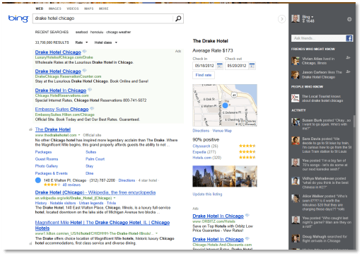
If you have been to Bing recently you may have noticed the new minimal design of the search engine when compared to before. This move was apparently only the first step in the redesign of the Bing search engine.
The Bing team has just announced that it will be rolling out the second part of the planned redesign of the search engine in the coming days for users from the United States.
Users from other countries can switch to the U.S. engine on Bing to use the features. It is not clear if and when this redesign will launch for localized versions of Bing as well. On a side note: If you ask me, Bing's U.S. focused policy is one of the things that is keeping the search engine from gaining any sort of visible traction in other countries, and especially in countries where English is not the native language.
Update: Note that the article provides information about Bing's redesign efforts in 2012. The current version of Bing has a two column design that displays search results and important information in a wide column and related information in a column to the right. End
The new Bing introduces a three column layout, that feels shifted to the right, by quite a bit. The main column remains the same, and the new columns that get introduced are the center column which Bing calls Snapshot and the sidebar.
Snapshot, according to the announcement, "brings relevant information and services related to your search to you right on the main results page". This may include maps and reviews, or options to make reservations at a hotel from the results page. These services and information can be first party or third party, as Bing is cooperating with businesses for that.
The sidebar on the other hand, that is the dark area that you see on the screenshot above, is reserved for social. Good news is, Bing has removed the majority of social information in the main search results. It is however not really clear if the sidebar will be displayed to all Bing search engine users, or only to users who are logged into their Facebook account, and have linked that account to Bing.
With the sidebar, logged in users can "post a question to get help from [...] Facebook friends", friend suggestions that you may want to ask, people you may know, and also see their activity feed right in the sidebar.
What's your take on the redesign of Bing? I personally could care less about the social integration, and hope that it is only displayed to logged in users.
One interesting take away is that test users seem to find Bing's search results more relevant than that of Google. Google beat Bing by 4% in a first study conducted in January, while 43% of users preferred Bing in a more recent study, while only 28% favored Google results. This study has to be taken with a grain of salt, as we do not know anything about methodology for instance.
Still, this goes in line with my own observations that the quality on Google is deteriorating. Your take? Lets discuss it in the comments.
Advertisement










Thanks Martin for this news. I read it also this morning on a Dutch Tech news site and there are lots of comments from readers on it. So it is quite a popular topic of discussion.
Personally I do not like this new Bing design. I am interested in excellent, relevant search results. Also I like to have the possibility to search in an specific time range (more flexible range than currently available). All the rest is for me clutter.
I would not mind, if the social bar only pops up if you log in to Bing, and have connected your account to Facebook.