To Much Whitespace On Google+? Reduce It!
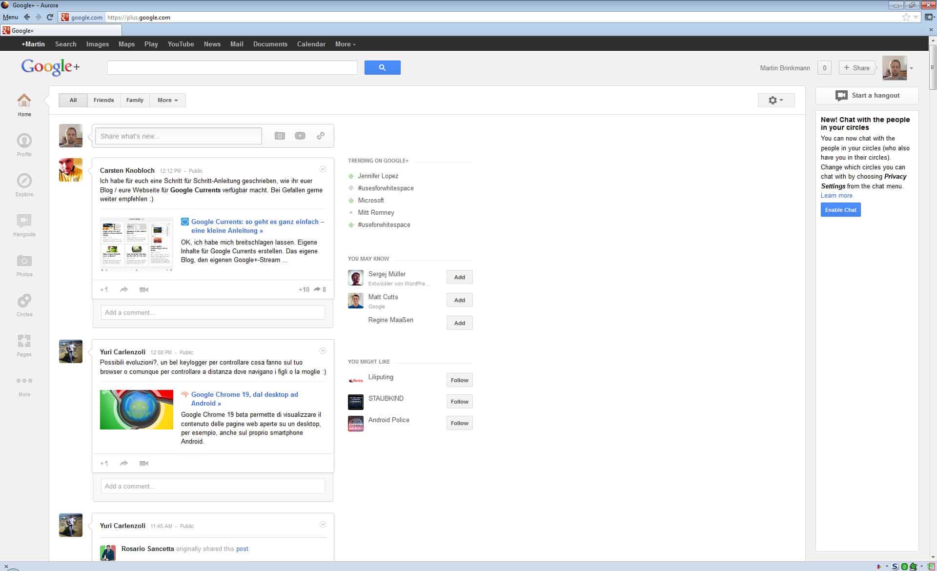
If you are already seeing the new design over at Google's social networking site Google+, you may have noticed the vast amount of whitespace on the site. This is especially apparent if you are using widescreen monitors and have the browser window maximized on the screen.
The big issue here is that both sidebars have a fixed size, and that the middle content area is dynamically resized, which basically means that the wider your browser window is, the larger the content area is.
The content in that area is however not dynamically resized like the content's box, which causes the large whitespace area.
The image above shows the new Google+ layout on a 1920x1200 computer monitor in maximized mode. Lets take a look at some of the solutions for this issues.
Fix Google+ Whitespace
Google+ Center Posts Stream - This userscript centers the stream on the Google web page, which may make the site more usable for some of you. It does not resolve the whitespace issue though, it just shifts the content a little bit.
G+ Whitespace Optimization - This is a style for the Firefox Stylish add-on that resolves the whitespace issue completely. It widens the content box so that all of the space on the site is being used for it. While that resolves the whitespace issue, it may stretch text too far out which in turn reduces the readability.
Whitespace Remover for Google Plus - This Google Chrome extension centers the stream just like the Google+ Center Posts Stream userscript does. The same developer has created a Firefox add-on that is offering the same functionality as well.
Closing Words
It is not really clear why Google made the decision to use that much whitespace in the content area. While it is likely that this space may get filled up eventually, it is something that the company should address in the near future as it is a usability issue.
Update: The extension is no longer needed as whitespace has been filled with contents on Google Plus.
Advertisement










Here is another option called “Balanced Google+” which centers the stream content on the page.
https://chrome.google.com/webstore/detail/pbdcnhfmdhhlmfcpkidgjeknhdgiinia
Much better than making the left gray and the right white.
would please sent to me photos for 8.7magnitude of quake at tsunami warning thank you very much
omer ali mohammed
thank you very much for your services
I don’t care if they’re going to announce something. I just want to be able to read the stream without the clutter. If something (as yet unannounced) is going to appear and fill up a lot of the page in the future every time I want to see the stream, this is no consolation. I really do just want to be able to look at the stream.
I sure have noticed way too much white space on Google + and it’s ridiculous!!
Time to fill in the blanks!!
It is not the first time Google change something just for the sake of it. If that space is to be filled with something yet to be announced then that thing better come very quickly. Otherwise it looks very unprofessional.
I guess it’s possible that it is either …. a gap for ‘something yet to be announced’….. or …. a ‘bug’. I usually like most of what comes out of the Google stable, but the regular interface for Google Reader, for example, looks awful on a 1366 x 768 laptop screen, and look at the first incarnation of their GMail App for the ipad.
I would say the problem isn’t so much whitespace as the presence of useless clutter. I would like to get rid of both columns to the right of the stream content and have the stream content fill up the slack. If I want to know which of my contacts are available to talk, or start a hangout, or search for trending content, I’ll go looking for it. Having it on screen all the time makes the stream content–the reason I keep coming back to Google+–look like an afterthought. This hideous mess makes me feel like I don’t want to use Google+ any more.