What the leaked Windows 9 screenshots reveal about the operating system

Screenshots of Microsoft's upcoming operating system Windows 9 leaked yesterday on the German website ComputerBase.
Microsoft calls this build Windows Technical Preview and the build number is 9834 (Windows 8.1 is 9600).
It is interesting to note that the 9 is missing in the name. While that does not have to mean anything, it could mean that the operating system will be launched under a different name after all (simply Windows for instance).
Microsoft plans to release a public preview build of the operating system at the end of September. While September 30 is the most likely date, it has not been confirmed by the company yet and it can happen that the build is made available at a later point in time.
The screenshots provide us with a closer look at the current state of development. It is likely that the feature set is similar to the one of the preview version that Microsoft will release later this month.
The first screenshot displays the new desktop start menu. While that is great for users who did not upgrade to Windows 8 because of it not being available in the operating system, it is quite different in several aspects.
Note: A hands-on video leaked earlier today. It is from another German site and concentrates on the start menu exclusively.
The start menu combines desktop programs, folders and apps on the left side with Start Screen tiles on the right. While it is likely that users can modify what is being displayed here, it is unclear if there will be a switch to only display desktop program links in it.
It appears possible however to pin tiles to and remove tiles from the start menu.
Another difference is that the shutdown button is not at the bottom of the menu but at the top next to the username of the logged in user.
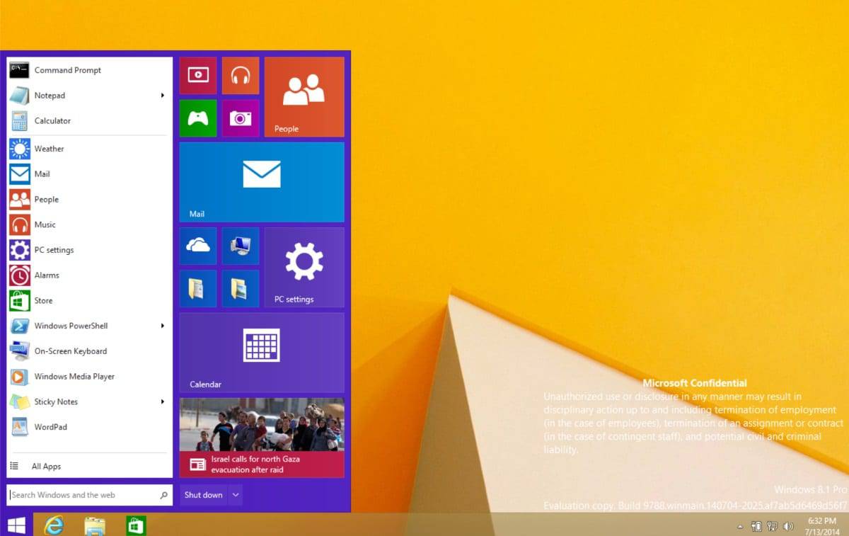
A right-click on an app on the left side displays the familiar menu that you get on Windows 8.1's start screen as well. You can open or uninstall apps using it, or pin/unpin the app to/from Start or the taskbar.
Several other Start-only menus have been moved to the desktop as well. PC Settings, a configuration menu that is only available on the Start interface in Windows 8.1 is now available as a window on the desktop. The same is true for the store interface which also runs in a window yet.
It was clear that the Start screen interface would not simply go away for mouse and keyboard users. Microsoft's compromise appears to be that it moved several Start-only features to the desktop. This includes a start menu that displays live tiles and programs like the store running as windows on the desktop.
The PC Settings screenshot that shows the settings running in a window indicates that there won't be a unified Control Panel available unless Microsoft plans to move all Control Panel applets to the PC Settings window as well (which is unlikely).
Another feature that has not been removed completely from the preview is the Charms Bar. The taskbar and start menu properties window refers to it which means that it is still part of the operating system.
While Microsoft could remove it at a later point in time, it is unlikely that it will do so after the preview gets released. So, it is likely going to stay even on non-touch systems.
If you have watched the video embedded above, you may have noticed that the animating tiles can be quite irritating at times. It is unclear if you can disable the live tile functionality directly. What you can do however is reduce the size of the icon to get rid of it.
Conclusion
Windows 9 will introduce some changes for desktop users including the return of the start menu. It is too early to tell if Microsoft's main effort was to move important Start-only features to the desktop or if there will be substantial new features as well. We only know of one so far, a multi-desktop environment.
If remains to be seen if the changes go far enough to convince companies and users to upgrade to the new version of Windows.
What's your take on this first preview? A step in the right direction or not what you expected it to be at all?


I went from Windows to a Chromebook. I use it so much not that my Windows machines are gathering dust. When I do go back to the Windows machine I have to spend so much time installing updates, etc. and realize how uncomfortable Windows really is. The Chromebook starts in about 7 seconds, ready to go. I no longer care about which version of Windows is next.
Yes well, some people use PC for more than browsing interwebz.
That is true. I am one of them. I read so many negative articles about the Chromebook, and some positive. I realized that that the positive reviews were made by users who don’t mind change and learning something new. I made it a goal to use the Chromebook as my only machine for what I do.
I have a small website business with about 10 clients. I now use an online editor to create the pages, and add code when I need to. Clients can login and work live on their sites as well. Google Documents has taken the place of Word, Sheets works as good as Excel for my purposes. I can use Word online if I need to, and hardly do. I not had a problem finding apps that do the same things that I need instead of software.
I use a 24 inch monitor and wireless desktop, extending the screens to both when I am working. When I am on the road I unplug two things and I am off with the 3 pound Chromebook. It always starts in 7 seconds, and no annoying updates, antivirus, etc. This is the best $200 laptop I have ever had in 20 years. Video is a pleasure to watch. I have not tried to edit video, which I don’t do. I understand that there are no great apps for doing so. However, I don’t think anyone would have a pleasurable experience editing video on a $200 laptop.
I share folders in my 200 Gig Google Drive with clients. They can add the text that they want on their websites easily to a shared document, share pics that they would like to use, PDF files, databases, etc. So this has been my experience. It more than exceeds my expectations for what I need to do. Did it take some time to learn to work in a different way? Yes. I’m glad that I did. Now if you do just need an inexpensive laptop to browse the Interwebz you will be extremely pleased with a Chromebook over a Windows or Apple machine.
Microsoft better have more interesting things to show in regards to Windows 9 on September 30th besides this.
The continued obsession with F###ing tiles will make a full end of MS.
Can nobody talk sense to these people?
They have given you the option to remove them. No pleasing some people.
customers can by not buying/using.
So please if you don’t like it don’t buy/use it.
A Windows lover :?
Agreed. It gets uglier and dumber every time. It’s like a childs toy
Elegance has left the building
Oh man, it still looks like toy OS.
If I may ask, why did you upgrade if you just want something that plays games and keeps your stuff?
Long as it plays my games and I keep my stuff. I lost so much stuff in my last migration. My backups were incompatible with the new OS.
Truthfully, I’ve always used so many third-party apps to get what I want that I might as well buy a Chromebook, strip it, and put a distro like Linux Mint LTS on it. Recently, I made a decision to buy a tablet with financial aid at my college bookstore and had a chance to buy an ASUS tablet with Win 8 or a Samsung Galaxy Tab with KitKat and I chose the latter – that’s how excited I am about Windows anymore. :)
This is exactly what I’d expect from Julie Larson-Green. A kaleidoscope that makes the user dizzy.
Dark window borders fail in monochrome without the ability to change Window Color and Appearance (like Win 7) . It’s still broken in Win 8.x. I hope they at least fix that.
Challenge denied on my end. Still waiting that the gui hype ends. I’m more interested in security/kernel related changes, as long as it’s unclear if win8+ bitlocker encrypted and other elements are maybe compromised I’m not upgrading. They talk a lot about gui changes that can be done with external tools and doesn’t matter, but not a single word about fixes and security changes.
https://www.schneier.com/blog/archives/2009/12/defeating_micro.html
http://it.toolbox.com/blogs/managing-infosec/hacking-and-breaking-bitlocker-24253
I saw a lot of tools on the darknet to crack almost every win8.x security feature (emet, alsr, and such), so there really is no reason to upgrade. Don’t believe the hype guys! ;)
There are alternatives to Bitlocker for disk encryption. I thought about formatting non-OS partitions with Ext4 and using encryption tools available for Linux/BSD. Then using Ext2fsd in Windows to r/w but I never got around to trying it.
Kernel level protection is best achieved with Applocker. However, it was removed from consumer available editions in Win 8. It’s an Enterprise only feature now. If this is still the case with Win 9 I won’t be upgrading.
i like this solution much more than what they tried to shove down our throats with win8 at first. much less instrusive than the start screen and i actually only see the stuff i want to see, instead of being overfowed with icons everytime i dare to hit the windows-key.
what i saw you also have the option to go straight to the start screen when pressing start, so those who are ok with that abomination can shut up too.
so as long as we can delete all the tiles if we chose to and as long as there will be informative tiles for stuff like weather, mail and calender, i think we’re heading in the right direction.
see ms? all we need is a little choice! now give us the option to show folder size in explorers details view and i’m ready to upgrade as soon as you are!
They could set this up so that it is dynamic while leaving manual config hooks.
IF BATTERY=TRUE AND TOUCH=TRUE AND KEYBOARD=ACTIVE THEN STARTSCREEN=TRUE
IF BATTERY=TRUE AND TOUCH=TRUE AND KEYBOARD=INACTIVE THEN STARTSCREEN=FALSE
IF BATTERY=TRUE AND TOUCH=FALSE THEN STARTSCREEN=FALSE
Naturally, you would need to define the variables but you could carry these out for all applicable scenarios to dynamically assign the optimal layout automatically using WMI conditions without too much trouble.
agree with the mouse beeing better detection then Keyb.
But First option should be false and 2nd true
You would be better to switch mode on mouse input being detected rather than keyboard.
You can leave out “IF BATTERY”
It’s gonna be perfect. I love the flat and squared design and now a nice start menu came back. The ability to disable Start Screen, too. Also, I see some newly designed icons. Miam! Miam! Can’t wait.
This is exactly what windows 8 should have looked like from the start. It still has both the Modern UI and Desktop but the Desktop can take advantage of live tiles yet remain functional.
I am hopeful that Microsoft will this time install the correct UI for the hardware available, so only where touchscreens are available will the Modern UI option be used. I quite like the Desktop with the new start menu complete with live tiles for non touch devices. I think it will work well.
After Windows.Hate disaster Windows 9 will be a catastrophe, unless :
1. Direct in-place upgrade conserving configurations, Applications and data from XP, Vista, 7, 8 to Windows 9
2.Installations/upgrade options : Just Desktop, Just Metro, Both, with options to remove/add Windows components (desktop, metro)later.
3. Windows 9 should be free to everyone.
It appears at the moment one has to choose between a Start Screen
or Start Menu and I would like the option of having both being active.
Having something like clicking the start button launches the Start Menu
as depicted in the new rendering while the keyboard Windows key
could launch the Start Screen as it does now in Windows 8.1.
I am living quite comfortably without a Start Menu but I
do understand the demand for its return in some form.
I have created toolbars for frequent folders, apps, etc.
I personally like the bipolar personality of Windows 8.
The Start Screen is not a start screen for me but
rather a notification screen updating me when
I am not actively working on my system.
No doubt this release will have improvements internally
as Windows 8 was faster and more secure than windows 7.
All in all, for an initial preview inviting feedback
I would say Microsoft is on the right track so far.
If you have created “toolbars for frequent folders, apps, etc.” you have recreated your start menu.
So you do miss it.
When i’m not active working on my system I’m either away and then the screen will be locked with probably the screensaver active or display out, or the system will be off.
Still can’t understand the need of annoying live tiles when trying to find an application of which i forgot the name.
The live tiles are only a distraction, and the one delivered with the system are already ads (Travel, … )
I kind of find it a good compromise. I never moved to Win8. This seems like a good one to switch too and will of course have many under the hood changes that will, I assume, be for the better :)
I don’t have a problem with Windows 8.1 as it is but this should help with enterprise adoption. It will also increase exposure to the App-X universal app ecosystem. Sandboxed app distribution that doesn’t rely on MSI? That is a tremendous advance for Windows users in the enterprise. This would be really slick when combined with SCCM 2012 R2 with the self service app store. I could see a unification between App-V and App-X with more Click2Run options as well.
From a security perspective, Windows Runtime apps are significantly better. Least privilege may actually be a reality for many companies where it was thought to be impossible. Frankly, least privilege is viable for most use cases right now but it will be EASIER to achieve that with apps installing and being able to run under the user context.
From my own perspective, I would like to be able to pin live tiles to the desktop background. They are what widgets should have been to begin with. I imagine enterprise live tiles that display trending content from Delve or even ticketing management and operations apps. Win32/64 isn’t going away with the need for legacy support but we can safely say that they ARE legacy and not the future.
I don’t think there will be many choices. After looking at the MSN.com preview changes to their news website, it looks like an effort to duplicate Win-8. I sent a comment to them saying I thought that it was a step back in readability and ease of content access. The reply said, “We appreciate input from all our viewers. Microsoft feels that the merging of content into touch screen technology is inevitable. Microsoft is working to be ahead of the curve with this respect and have products and services in place to optimize customer experience. When office and business customers migrate toward full touchscreen capability to join the home and mobile users experience, Microsoft will be waiting, ready to provide the content you have grown accustomed to.”
Now those were corporate comments regarding a website, but it seems to me it’s become an overall strategy with the OS as well. Once they merge the OS, online MSOffice, One Drive, and tiles/apps, then the users will be forced to follow. Basic business practices show that companies thrive as long as they provide what the consumer wants, and once they move in another direction then the consumer will find other sources. I would have thought Microsoft learned their lesson with Win-8.
I really am baffled by the stubborn insistence of Microsoft that touchscreen is the inevitable future. I don’t know anyone who uses a touchscreen outside of a mobile device, and nobody’s going to sit at their desk rubbing their fingers all over their monitor in an enterprise environment. Touchscreen doesn’t make my life any easier when I have a mouse and keyboard plugged into something, it just means I have to lean across the desk more to press things that I could click with the pointer while reclining in my chair. I do not see the upside to it at all, outside of some artistic applications. I don’t know anyone who has said their customer experience has been improved by being able to smear their finger across the screen whenever they want to scroll through the start screen.
I wouldn’t say they are ahead of the curve so much as trying to shove everyone up the hill.
i agree with johnmwhite. when i am at home on my desktop, i want to kick back in my comfy chair and do my computer thing. i dont want to be stretching my arm out to try to use a touchscreen…i just cant relax and do both at the same time. the mouse works great and i am ambidexterous with it. so a no-go for me.
Is that all? Meh…
Looking at that Start Menu screenshot makes me realise just how much I don’t miss it and much prefer the Start Screen instead (even from someone who prefers traditional mouse & keyboard, non-touch screen and normal non-metro desktop applications). So I’m glad they have the option to switch between the two.
However, this is what they should have done from the beginning. The back end structure of the Start Menu items is still the same, so I don’t understand why they didn’t just allow users to switch to a ‘classic’ style Start Menu if they decided they wanted to (and also having a Start Button), instead of them having to download third party programs.
I agree with the other posters though, for people who don’t like (or have a use for) ‘Modern’ apps, the twin environment Frankenstein-like system, with stupid flat icons, is a bit of mess. I preferred it when Microsoft were primarily an engineering company, lately it seems like they’ve been infiltrated and have become a dictatorship style consumer-focused marketing company like Apple. The plus side at the moment is that we still have the option to ignore ‘Modern’ apps if we chose to, but I admit the possibly that they could be looking to phase out traditional desktop software and instead replace it with subscription based ‘Modern’ app rubbish (probably with built in ads as well if the pre-installed Windows Apps are anything to go by) does concern me. How much longer will they continue Windows Live Essentials for example?
I know my post sounds anti-Microsoft, but I do actually like Windows 8 a lot (just not the Metro app or cloud based future side). :)
i had high hopes for windows9, i’m rather deflated….
I never cared much about the Start Menu issue. What I don’t like about 8 is all the Metro stuff, the loss of options, the mess it made of Explorer (which started in Win7 btw), What I’ve always loved about Windows is the multitude of software that is available for it, software not created by Microsoft, and the Os’s versatility, which allowed me to customize my system to suit myself — and not Microsoft. When they began to take that I way, I lost interest in upgrading.
Dear Microsoft:
If you want customers to move up to newer versions, give us some options that we like.
Sincerely,
Disenchanted
P.S.
Subscription? No.
I had no interest in Windows 8 even after trying it for a while. I’m really drawn to this though. I’m not so keen on the apps been part of the desktop version of Windows but I realise that’s just the old skool in me. What they have here is an ingenious comprimise.
There was a previous leak that suggested the next Windows would be subscription based, this would explain the other rumour about Microsoft giving it away too. It also just occured to me while looking at the article; what if the reason the version doesn’t read Windows 9 is because as a subscription based OS they have no further need for customer facing version numbers therefore it would just be known as Windows. It still seems a bit like far fetched speculation and I can think of a few reasons why it might not be viable but it ties in at least partially with the other rumours.
I just don’t understand Microsoft’s interest in that particular primitive “flat icon” styling. Are they planning to amaze us with a new interface later? This newer version just seem to be not quite as flat with newer beveling and text shadowing. They badly need to break out with some type of new look and styling.
i agree. metro might be ok on phones and maybe tablets, but it looks a bit childish and can get old real quick. there is absolutely no need for an interface like this on a desktop or touch-less laptop and even on one with touch input i’d prefer _not_ to smear my whole screen all the time.
especially in a work environment anything metro is just retarded and that is where ms has historically been the strongest, but even windows server got the metro treatment, i don’t know if i should laugh or cry.
but waiting for a new style is delusional, i’m sorry to say. like i said, on touch-based devices metro makes sense and for better or worse, that’s where we’re heading. i also don’t see what other UI-design would work better on touch as well as desktop. the problem is that as soon as you change _anything_ for desktop users, there will be a big uproar. we saw it with vista and then again with 8. it almost seems like a shock therapy: users are presented with some new and questionable concepts and hate it. by the time the next version hits, the flaws have been mostly ironed out and the users aren’t shocked anymore by the different design. they might even have become used to the design and features and the next version does stand a chance with consumers.
Vista problem wasn’t its design, actually I remember seeing many people excited with the glass theme instead.
I agree with ACow. It’s a such a jumbled mess, Microsoft don’t seem to know what to do.
Hopefully, uninstalling all the metro apps will make that part of the menu go away…
So they basically took the desktop environment and put it on the same screen with Metro elements to create this Frankenstein-like atrocity. Whoop-dee-doo. How can you even do that with all the money they have? It doesn’t solve the problem of the complete dichotomy of the two environments. At this point, the system needs a complete graphical revamp to make it stylistically consistent.
And yeah, I know it’s an early tech preview, but after seeing Win8 in action I’d say it’s not out of the realm of possibility for them to push this ungodly clusterf*k into production.
My opinion exactly,minus the f bit at the end.