There is a new font in town: Aptos replaces Calibri in Microsoft 365
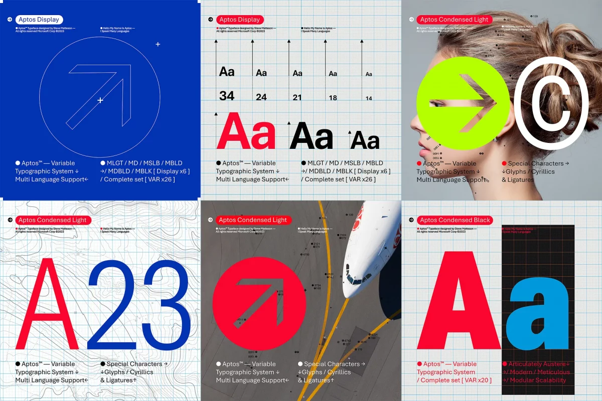
Calibri was the default font in Microsoft Office applications. Microsoft announced this week that it is going to replace Calibri with Aptos. Aptos was formerly known as Bierstadt, one of the five fonts that Microsoft commissioned back in 2021 as the potential replacement font for Calibri.
Calibri replaced Times New Roman as the default font in Microsoft Office in 2007. Microsoft described Bierstadt in the following way in 2021: "Bierstadt is a precise, contemporary sans serif typeface inspired by mid-20th-century Swiss typography. A versatile typeface that expresses simplicity and rationality in a highly readable form, Bierstadt is also notably clear-cut with stroke endings that emphasize order and restraint."
Microsoft had several intentions regarding Calibri's replacement. Besides improving the display of text on monitors with high resolutions, the fonts were all designed to be available via the cloud across Microsoft 365 apps.
Microsoft added all five fonts to the drop-down font picker of Microsoft 365 and asked for user feedback.
A Microsoft Design post on Medium by Si Daniels confirms that Aptos is the new default Microsoft 365 font. It was the font that "resonated most" according to Microsoft. The designer of the font, Steve Matteson, renamed Bierstadt to Aptos "after his favorite unincorporated town in Santa Cruz, California, whose widely ranging landscape and climate epitomizes the font’s versatility".
Aptos will start to appear as the default font in Microsoft Word, Outlook, PowerPoint and Excel for hundreds of millions of users. Microsoft plans to roll out the change over the course of several months.
Aptos is a sans serif, which means it is "easily readable" and "bold, well-defined, directive, and constrained" according to Microsoft.
Microsoft 365 users may continue to use Calibri, if they prefer to do so, as the font remains available. Users who want to keep Calibri as the default font, or any other font that is available, may consult Microsoft's support website for instructions on doing so.
Now You: what is your favorite font? (via Born)


I don’t have any problem with what font Microsoft chooses as long as it improves readability. I think we all have endured terrible choices of fonts and wondered who thought this was a good ideal.
Calibri is fine, it’s easy on the eyes. As far as I can see, Word and Office suite programs are able to query system-installed fonts anyway, so you can have as many or as few fonts as you want.
The only thing that ever bothered me is the distinction between lowercase letter “L” for Lima and uppercase letter “i” for indigo – if both of those letters look the same in your font, it’s technically a pretty shitty font.
Due to coding, I’ve gotten pretty used to Courier New, I’ve set Courier New to my system OS on one of my Windows computers, it passes the “Lima/Indigo” test a little better than Calibri, but could still be better. It’s also monospaced, which works really well for file explorer files/folders cataloguing/sorting.
Weirdly enough fonts is almost a fun topic for me, if anyone has any good fonts they’d like to mention, I would be very interested.
Microsoft fonts have a very bad reputation, especially when it comes to Asian fonts. Even if they ask for a vote on new fonts, users in Asian countries are forced to use the same ugly fonts as before. It would be better to have the Noto font used in everything from Windows to Office. Besides, I don’t understand why they are implementing a new font when they have Verdana/Georgia, which are exceptionally well-reputed fonts made by Microsoft. Furthermore, Microsoft’s design team seems to be using Macs and doesn’t seem to take into account how fonts are rendered on Windows (e.g., horizontal strokes are thinner than vertical strokes, curves are not smooth).
Probably Skeena and Tenorite.
“The Verge” has an interesting take: “Helvetica is the most famous example of this type of “grotesque san-serif” font, and Matteson has contrasted Microsoft’s Arial font here, too.”
Shall we prepare for a new Windows OS font?
The default Windows font (desktop, start menu, title bar, etc.) has been “Segoe UI” for ages.