Firefox 64: add-ons manager redesign
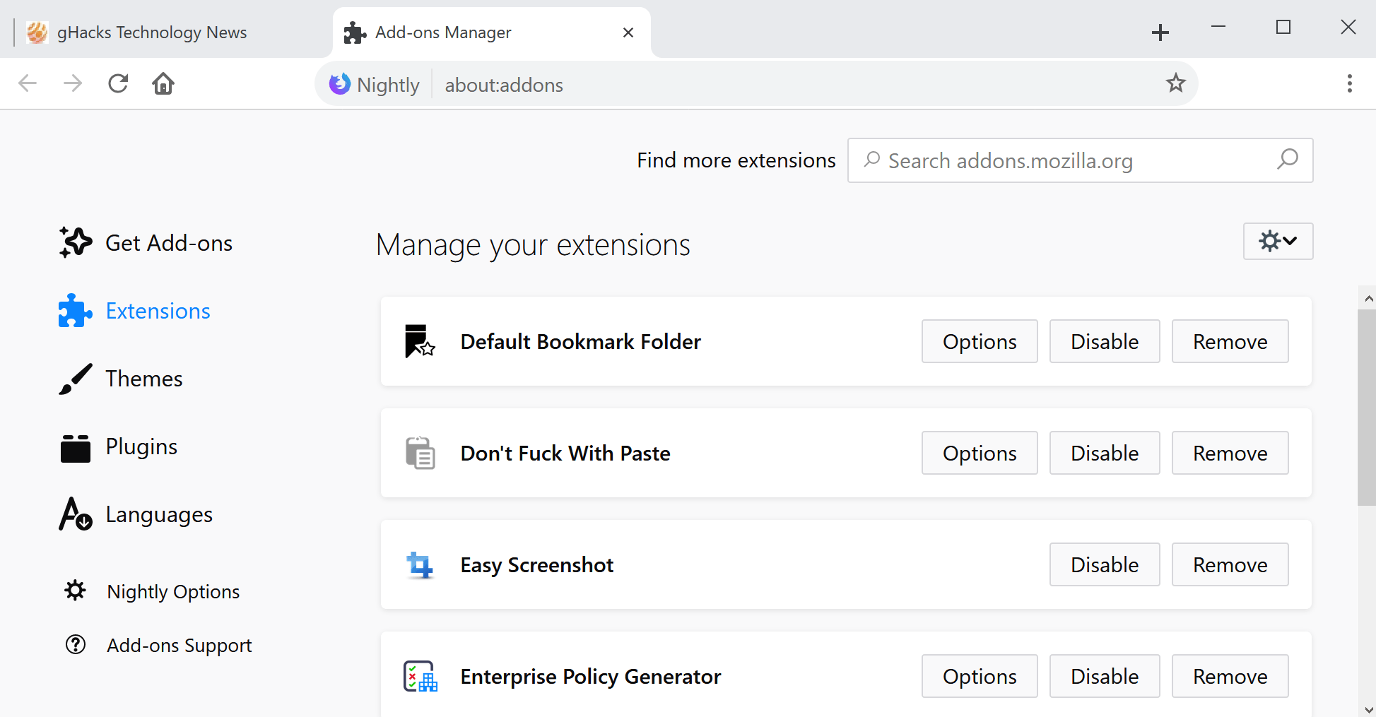
Mozilla launched a redesigned add-ons manager in Firefox 64 Nightly the other day. Nightly is the cutting edge development version of Firefox that receives features first before they are moved to Beta and then Release versions of the web browser.
The add-ons manager is Firefox's internal tool to manage installed browser extensions. Firefox users may use it to disable and uninstall add-ons, and to configure options if provided.
The add-ons manager lists add-ons, themes, plugins, and languages separately for easier management.
The following screenshot shows the new add-ons manager that Mozilla plans to introduce in a future version of the web browser.

When you compare the new design of the extension manager with the old design, you will notice that the new design is not that different from the old.
The biggest change is that Mozilla's designers added items as cards with space between them whereas the old manager displayed just a dotted line between entries.
It looks as if fewer add-ons are listed at the same time because of the design change but since this is the first implementation of the feature in Nightly, it is possible that adjustments will be made.
What you may notice, however, is that the add-ons listing requires more horizontal space to display all content on the screen. I can display the old add-ons manager on one half of the display on my Surface Pro 4 device without losing any functionality or having to scroll; this is not true anymore with the new add-ons manager as it adds a scroll bar to the page and does not display the "remove" buttons or the settings button anymore because of the new design.
I would like to see an option to display a compressed version of the add-ons manager instead of the default to display more extensions at the same time on the screen.
The only other change, as far as I can tell, is that the settings button has been moved from the left side of the search bar to a new location on the right side below it.
It holds the same options as before, e.g. to install add-ons from file or to check for updates.
Closing Words
The redesigned updates manager is not a major change and it is good that Mozilla does not plan to remove any functionality from it. Some Firefox users may dislike the new manager because individual elements take up more space on the screen which reduces the number of elements visible at the same time and may even lead to some horizontal scrolling.
Now You: Do you use the Firefox add-ons manager?










I do use the addons manager.
You said “The biggest change is that Mozilla’s designers added items as cards with space between them whereas the old manager displayed just a dotted line between entries.”
I don’t see a dotted line. I just see a regular line.
Google bankrolling MozCo obviously comes with ‘conditions’, just sell out already and put Firefox out of it’s misery.
Google management couldn’t be any worse than Baker, Beard and the other ****’s at the helm.
Really, the merger of Mozilla with Google is immiment, so you can save development costs.
I heard that Mozilla said due to their telemetry not many people are using the Firefox browser engine anyway, so the only logical conclusion is to slap a Firefox theme on Google Chrome and be done.
Firefox 70 will be the final release.
Why is every company making their UI dumber and dumber
Because the devs get dumber and dumber themselves…..
When I grow up I wanna be just like Chrome!
“Correction: Some of this stuff will ship with 64 but there is more expect to land by 66.”
comment by Dave Townsend (Mozilla): https://www.reddit.com/r/firefox/comments/9owrz3/firefox_64_addons_manager_redesign_ghacks_tech/e7xxwcw/
Oldies but Goldies :-)
https://postimg.cc/4KSjhpz6
PS: it is not All-In-One Sidebar, but a fork designed for Palemoon and Basilisk (I’ve give a try and it works) https://github.com/FranklinDM/TGS/wiki/Features
I like the new add-ons page but it needs some work. Definitely a work in progress. On my desktop it’s only using some of the width and the margins between the cards are way too big IMO, which makes the extensions use up too much vertical space. In FF I can see 16 extensions, with Nightly I can only see 12 and I’m using a 1920×1200 monitor so… what’s up with that? And is there any reason why the version number is not on the card? There’s more than enough space for it.
I figured out some css for the add-ons page, it’s working in the dev tools on my desktop, but I don’t know the @-moz-document address for the add-ons page, anyone know what it is? The only one I know of is for the dev tools, so I can modify the font family and size.
.list > .addon { margin: 2px; }
.list-view-heading-inner { width: 1200px; }
.addon.card { max-width: 1200px; padding-inline-end: 12px; }
https://i.postimg.cc/254rhCxf/Nightly-New-Add-ons-Page.png
https://i.postimg.cc/j5cT3v9g/Nightly-with-CSS.png
I hope this “redesign” never happens. It’s a big step in the wrong direction.
The new add-ons manager redesign is very nice in my opinion.
Martin, where you get the Chrome theme for Firefox?
Here you go: https://www.ghacks.net/2018/08/29/install-a-material-design-inspired-theme-in-firefox/
> When you compare the new design of the extension manager with the old design, you will notice that the new design is not that different from the old.
I am afraid I would disagree on this subject. The current design makes use of the entire screen, whereas the new design seems to be optimised for mobile displays as it utilises only a small fraction of that screen estate. Descriptions are completely gone.
I am also not quite sure what I should think of https://bugzilla.mozilla.org/show_bug.cgi?id=1489296 either
> We’re making some changes to about:addons prior to a re-design in 2019. This meta is for those changes.
does not sound too promising. What’s next for the re-design? Rounded tabs ;)
This isn’t really a problem that needed fixing and it looks odd in a typical widescreen monitor, but I guess this might something geared towards mobile. However, Firefox on android has been in maintenance mode for a while now.
“The add-ons listing requires more horizontal space to display all content on the screen.”
And this is a major gripe I have with all browsers, starting from a few months ago. I first noticed it on Firefox when it switched to Quantum, and soon it appeared as if there had been a worldwide conspiracy to change (and break) the way all browsers worked.
One fundamental feature of browsers used to be that you could redimension them any way you liked, and the webpage elements would rearrange themselves to fit that shape. Aesthetics might have been affected, but all you needed was to scroll down to find what had previously been on the right hand-side. Not anymore.
I used to be able to have two windows side-by-side on my screen. Typically, a wide one for the browser, and a narrow one for the password manager. Logging into sites was easy.
Now, I find myself constantly scrolling horizontally (which you should never need to do), or, more often, unfortunately, switching between the browser and another program’s window, which is hidden underneath.
This has considerably disrupted my workflow. Anyone noticed something similar ? Any explanations ?
Waste of vertical space is also a problem. Scrolling vertically come easier than scrolling horizontally, but it still should be kept to a minimum. Its seems everything is designed nowadays to be displayed on a phone screen, with all the necessary cuteness associated.
Why do we need a frame for each extension ? We don’t. It’s pretty, but it wastes space with abandon. If people need an extension manager, it’s for, ahem… managing extensions. Which suggests they have dozens of them. Which means they need to be packed more tightly together, just in order to be seen. And found. And dealt with.
I too noticed this on my new computer yesterday when installing Firefox Developer :)
Not sure …but I guess I like it, its a more defined line between this and the next installed add-on
“Some Firefox users may dislike the new manager because individual elements take up more space on the screen which reduces the number of elements visible at the same time and may even lead to some horizontal scrolling.” Took the words right out of my mouth.
Martin Brinkmann how do I activate this theme that you are using? Or is it a third party theme?
“https://www.ghacks.net/2018/08/29/install-a-material-design-inspired-theme-in-firefox/”
Well the new trend in tech today is if it’s not broken,break it
Not only in tech, mind you.
And still they refuse to return the version numbers to the main add-on overview… Gah!
Instead of doing this (and bookmark previews) they should rather leave RSS support and bookmark descriptions in as features.
Mozzilla redesigns everything to resemble crapware.
Is it just me @Martin, or does your screenshot look like it’s running in Chrome?
Here it is: https://www.ghacks.net/2018/08/29/install-a-material-design-inspired-theme-in-firefox/
Nah, it’s Firefox with a material-like toolbar theme. I think he made an article about it recently if I’m not mistaken.
That company makes that design! What’s it called? I can’t remember. The card-based design, what’s it called? Mental Design.. Imperceptible Design.. no.. Immaterial Design maybe? It doesn’t sound right, so no. It’s on phones as well.
Anyway, that’s what this “new” design mozilla came up with rminds me of.
I still remember way back when I used a Stylish userscript to make the add-ons manager vertically compact so I could better manage my 30+ extensions. Ah yes, way back… in 2016.
Seriously Mozilla, you could have fit two more extensions (50% more!) on that screen even with that spacing, but you just had to give the space to a huge search bar and title text.
How I can remove the new notification after each saved bookmark please?
Anonymous said: “How I can remove the new notification after each saved bookmark please?”
Yes, that is INCREDIBLY annoying, isn’t it? I dislike it intensely. Fortunately it can be removed by adding a line to the userChrome.css file:
#editBookmarkPanelImage, #editBookmarkPanelFavicon, #confirmation-hint { display: none !important; }
Just in case this is unfamiliar to you or anyone else who comes along here later: open Firefox and click on the three horizontal bars in the upper right corner to open the menu, click on “Help” and then click on “Troubleshooting Information.” Then next to “Profile Folder” click on the button that says, “Open Folder.” Now close Firefox. In your open profile folder if there is already a folder called “Chrome” the next step can be skipped. Otherwise, in a blank area of your open profile folder, right-click and choose “New” to create a folder, and name the folder “Chrome.” Then open that new “Chrome” folder and right-click and choose “New” again and this time choose “Text Document.” Name this userChrome.css
Almost done…now double-click on your newly-created userChrome.css to open it, and then copy and paste this into it:
#editBookmarkPanelImage, #editBookmarkPanelFavicon, #confirmation-hint { display: none !important; }
Click “File” and then “Save” and then close the document and then close your profile folder. Restart Firefox and bookmark something–that incredibly annoying, stupid new bookmarking notification should be gone!
Thank you.
I can remember you Martin writing about a really great addon called “slim add-on manager”
https://www.ghacks.net/2011/03/28/firefox-4-slim-add-on-manager/
I have myself used for many years the really great addon called cleanes add-on manager.
https://www.ghacks.net/2012/06/01/display-more-add-ons-in-the-firefox-addon-manager/
and I have used it for many years can maker(‘s) upgraded it may be (or both) for us?
I have just now again searched for them ad the Add-ons for Firefox (en-us) website page but or maybe I have overlooked them or they are given a different name.
Also, I have searched for something similar but sadly enough I had no luck to find anything even similar. Do you Martin or anybody else knows a WebExtension – Add-on who can display more Add-ons at the same time on the same page?
Hi,
the bugzilla ticket is #1489296. As you can see in the dependencies there are still nine open tickets, it’s not yet finished. ;-)