How to disable tooltips in Windows Explorer (File Explorer)

Tooltips are small popups that display information about an item or element you are hovering over. You may have noticed that they barely reveal information of relevance (if you hover over the start button in Windows 7 the tooltip reads Start) but may be an annoyance at times as they may overshadow underlying items.
It is unfortunately not possible to disable tooltips in one central location and be done with them. While it is possible to disable tooltips in Windows Explorer on Windows, it seems impossible to disable all tooltips on the system.
If you add third-party programs to the mix which all use their own implementations and controls, you can be fairly certain that you won't be able to disable all tooltips any time soon in Windows.
Tip: Firefox users, check out how to disable interface tooltips in the browser.
Windows Explorer tooltips
The screenshot above shows a typical tooltip in Windows Explorer. While some users may find the information useful (you can customize what is displayed by the way), you will notice that the popup window hides three file names while it is displayed.
It is thankfully easy to disable tooltips in Windows Explorer and File Explorer (introduced in Windows 8).
- Open a Windows Explorer window on the system.
- If you are using Windows 7 or earlier, tap on the Alt-key on the keyboard and select Tools > Folder Options.
- If you are running Windows 8 or newer, select File > Change Folder and Search Options.
- Switch to the View tab in the Folder Options window.
- Scroll down until you find "Show pop-up description for folder and desktop items" and uncheck it.
- Click ok and the tooltips are gone in Windows / File Explorer.
To get them back, simply enable the preference again using the method described above.
If you prefer to use the Registry, that is possible as well.
- Tap on the Windows-key to open the Start Menu / Start Screen.
- Type regedit and hit enter.
- Confirm the UAC prompt that is displayed to you.
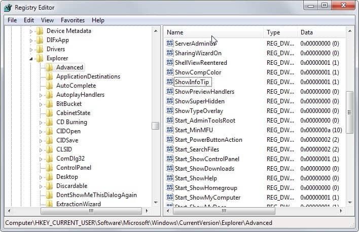
- Navigate to the key HKEY_CURRENT_USER\Software\Microsoft\Windows\CurrentVersion\Explorer\Advanced
- Locate ShowInfoTip, double-click on the preference and change its value to 0.
- Restart the PC, log on or off, or restart the explorer.exe process.
Now, if someone finds a way to disable the other tooltips in Windows, that would be great.


I’m having the same problem. What possible use or good is a pop up window tells you what you already know or what is already being displayed? Windows 10 is the single most useless and worst pile of reeking garbage that microcrap has every unleashed on an unsuspecting world. They put all of these ridiculously useless “features” in it that just clutter up the screen and slow it down to a molasses type crawl and then force updates on it that occasionally trash and disable it entirely while apparently accomplishing nothing useful. The world can only hope that some day they’ll self destruct and go out of business forever, hopefully taking google with them.
Windows 10 has lots of annoying, frustrating “features.” They’re evidently a bunch of narcissists who think they know what’s good for you better than you do. “Tool-tips” is one of the most annoying. My cursor hovers over a file, a popup comes up showing me what’s in it. What, you think I can’t read the frigging file name I put on it? Morons. However, I’m going to treasure and share the explanation: “It’s for the blind.” Of COURSE it is. What? Hey – how about two versions of Windows? One for dummies and one for people who don’t want or need all that crap.
Mac isn’t perfect, but yeah, windows sucks.
All that hover-over stuff is so annoying. Not just file manager, but basically everything, including web pages. You want to get your mouse in place to click your next target while maybe you are still reading or deciding, and poof, your view is covered up. Highly annoying.
Then on the other hand, if you want more information on a file or on a web page, and you think “hey, I’ll try hovering” but the pop-up info almost always disappoints. Hover over the menu button and the hover-over note will say something idiotic like “this is the main menu”.
People argue that this is for blind people. If so, why is it so big and obnoxious? Why not invisible or tiny then?
It seems to boil down to young programmers trying to be cool, not wise UX designers designing the websites and apps.
WINDOWS SUCKS
All my life, I’ve been haunted by those d^mded tool tips in Explorer. I, the (I guess not so) Great Wizard, never realized that a mere five lines below “Hide protected blah, blah, blah” is the answer to my prayers.
Martin Brinkmann, I am humbled in your presence. You ARE da man!
I have done the recommended on my new $1000 Dell and all have failed.
thanks!. I’ve disabled the stupid thing several times over the years but never remember what it is called so I can disable it the next time.
Yes, the Start tool tip is quite useless, but for other items it can be quite useful for versions numbers, and other dynamic information. I wonder if toggling off tool tips will disable those of us who choose to use the Aero desktop features? The one that displays mini versions of the programs launched that are docked on the taskbar.
Much of your insight is helpful to many of us, but it doesn’t apply to everyone of us. Much like that suggestion you made a while back to speed up Chrome loading. I should of logged out of Chrome and Google before trying but the damage is has been done. Since adding the fast switch to the Chrome, it did take off 4 seconds to the load sequence but it leave Chrome working as if no extensions have been loaded or for that matter, no plugins either.
When typing searches instead of simply searching from the URL bar, it opened the default search engine home page and we had to retype everything there. Even the weather, calculator and converter functions stopped working. But removing the switch doesn’t fully return us back to the way things were. Because Google tracks our behavior and patterns, though I have all my plugins back, search results don’t show a sampling of images along with the other search results anymore. Only search results show and I must go to the image link directly to search for images now. Maybe over time Google will learn my pattern again and give me results with images and video links as before. *sigh*