This Could Be The New Default Firefox Theme
The last major changes to the Firefox default theme data a while back to the Firefox 4 release. You may remember that Mozilla overhauled the browser interface, for instance by removing the status bar, replacing the menu bar with a single menu button or moving tabs by default on top of the url bar.
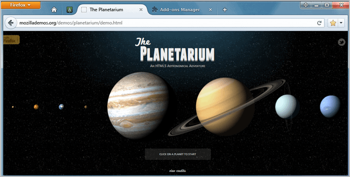
Mockup screenshots of a new default Firefox theme have been uploaded by Stephen Horlander to his Mozilla website. The new user interface goes by the name of Australis according to the file names of the images on the ux presentation page.
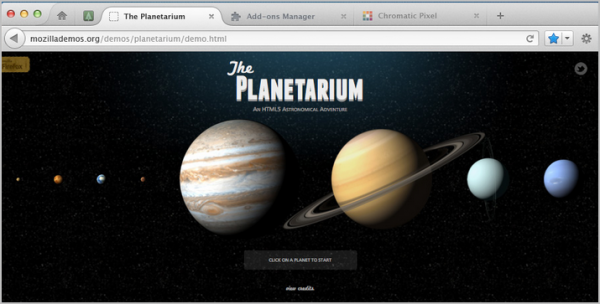
The majority of screenshots show the Apple Macintosh version of the new theme, while only two show how it would look like on PCs running the Windows operating system.
The following mockup shows how the new theme would look like on Windows versions of the Firefox browser.

The next how it would look like on a Mac.
Interested users find all mockups on the presentation page over at Mozilla.
A major change is the integration of the Firefox menu button in the tabbar. This moves the first tab to the right of the interface. The active tab is now displayed with rounded corners, while all other tabs are displayed directly on the background of the web browser and not on an inactive tab background.
A Deviant Art user has created a theme for the browser that mimics the mockup. The theme is only available on Deviant Art and not on the official Mozilla website. Interested Firefox users can download them theme from this page or at the official Firefox Add-On repository over at Mozilla.
No compatibility information are provided on the page. It is likely that the theme is compatible with all versions of Firefox that use the new menu bar button, which would mean all versions from Firefox 4 on.
How do you like the new theme? Let us know in the comments. (via)
Advertisement







What’s with this obsession with Chrome UI? I like minimalism but only if I’m allowed to arrange UI elements myself. Chrome’s UI is downright bare-bone anarchism, Firefox took some useful elements and blended into version 4, why go so far as to emulate the whole look?
It was bad enough I had to sought out status-4-evar addon to bring status bar back, now the they are going for the while slick tab thing? Thank, but no thanks!
I think change to a new theme will make old theme from Firefox 4 – 5 stop woriking or error, add-on developer doesn’t like it, they must spend more time to update their theme.
Maybe, some developer will stop developing Firefox add-on, that is so bad.
Phfft I hate it.
Sweet Mother of Calliope, is there nothing *important* going on in the tech field today?
Personally, I don’t give a rat’s ass about themes. I’m more interested in how each new version of this browser manages to screw up my add-ons, and why Firefox can’t deal with the problem.
“I’m more interested in how each new version of this browser manages to screw up my add-ons”
I’d be interested to know what add-ons you’re using that new Firefox versions are screwing them up, considering most add-ons are already compatible with Firefox 6 and above and the recent changes in Firefox versions have had negligible effect on add-ons? My guess is you’re just a troll, or someone who last used Firefox a long time ago and is talking out of their hat.
i like it.
some things not, but course we can change this.
@Martin Australis “Works with Firefox 4.0 – 8.0a1”
@kalmly Doesn’t Opera look like Chrome now the way that Firefox has been accused of looking like/copying?
I dropped FF for Opera when FF 4 came out. Nothing here makes me want it back.
For and firefox 4 or 5 users you can still use the menu bar by right-clicking the top of the browser and selecting it same goes with the addon bar.
Like a haircut, you love it and once at home you start putting that hair back your way :)
I think this default theme looks very much like Chrome’s, and I dislike Chrome’s graphics, so I’m not in a hurry for this one and, when applicable, I’ll give it my touch.
I think these rounded tabs look terrible. They take up a great more space than square tabs and if you don’t use tabs on top, which I don’t, they look even worse.
Granted these are only mock-ups and soapy’s rendition is pretty good, but I sincerely hope th UX team has a revelation before they do anything stupid.
At the end of the day, the UI is just a bunch of CSS, so anything they decide to do, can easily be undone in userchrome.
&1 (+1 has been getting on my nerves, lately)
+1.
I nerver think about that : |
“I think these rounded tabs look terrible. They take up a great more space than square tabs and if you don’t use tabs on top, which I don’t, they look even worse.”
I they do it, they will ruin Firefox.
This theme is availible at AMO: https://addons.mozilla.org/en-US/firefox/addon/australis/
Thanks Ben, added to the article.
Thanks Martin Brinkmann for this great Website/Forum, it is very interesting and very good. Cheers!
Some Add-Ons do not work with the latest Firefox #5.0: It is best to get Firefox #4 and then just use that until you get an Automatic Update which will change #4 to the earliest version of #5.0: your Add-Ons will mostly function properly with this Auto-Update.
The “Padlock” feature that Leslie was talking about (which for some utterly incomprehensible “reason” the Mozilla Geeks decided was not necessary to have in Firefox any more) is available here:
https://addons.mozilla.org/en-US/firefox/sea
Something else all Firefox users (and Thunderbird Email users) should know about is an amazing utility called “MozBackup”. This program is indispensable once you find out what it can do:
http://mozbackup.jasnapaka.com/
Not bad, but I remain Noia fan anyway :)
Leslie is correct, the Geeks at Mozilla need to get in touch with the real world at least every once in a while!!! Hey Mozilla Geeks – there apparantly is actually a “real” world!!!
As long as I can keep my old FF3.x UI, I’ll keep Firefox. The day it won’t be possible, I ‘ll toss FF out.
They appear to have done away with the search box. Please, please keep this separate from the address box.
Nothing interest, this theme like a copy of Google Chrome.
Firefox is Firefox, not Chrome, Firefox 4.0-5.0 theme is good enough.
And it is not official, just by a developer of DevianART. I don’t think Mozilla will see anything good on that theme. But it still is a good choice for some user who want to change Firefox look.
If they continue to change interface, I will not update Firefox with every new version.
As always the Linux version is an afterthought. Besides I don’t know if this is any better than the current offering…and the star icon is not in the url bar anymore?
I’m guessing the star icon will now also work as a drop down bookmark menu. They’re trying to make the interface take up as little screen space as possible, which is good in my opinion — I like minimalistic interfaces, as long as usability isn’t lost somewhere along the way. Why does it have to look like Chrome, though? What is it with Mozilla’s obsession to copy everything Google does?
The star icon was embedded in the location bar taking minimal space, and we already have dropdown menus for bookmarks, in several possible ways. There is absolutely no space saved by this action. Oh, two characters in the address bar. Wow, what a massive improvement.
This will require an addon probably. I like the star being where it is now.
Also the Chrome interface copying must stop. I used Chrome for a while, and now whenever a new window is created in firefox, it *looks obscenely like Chrome*. To the point of being barely distinguishable.
I am tired of these guys messing around with the interface. Yet again it will probably mean I have to search for addons that restores elements that I want – such as a padlock. I know all of the arguments but these geeks have got to realise that real people are using this and constant changing of the UI is not useful (think of elderly people).
No need to fret. These are just mock-ups of ideas and probably won’t ever get implemented. Note the title of the article says “could”.