Google rolls out new Google Maps color scheme

If you use Google Maps, chance is that you have noticed that the service is using a new color scheme. The change is still rolling out to users on all device types worldwide. Announced in October 2023, Google claims that the new color scheme helps "reflect the real world even more accurately".
Core color changes include that roads display in gray now and the new blue tone of the routes. You may also notice that the color of water bodies and forests have changed as well.
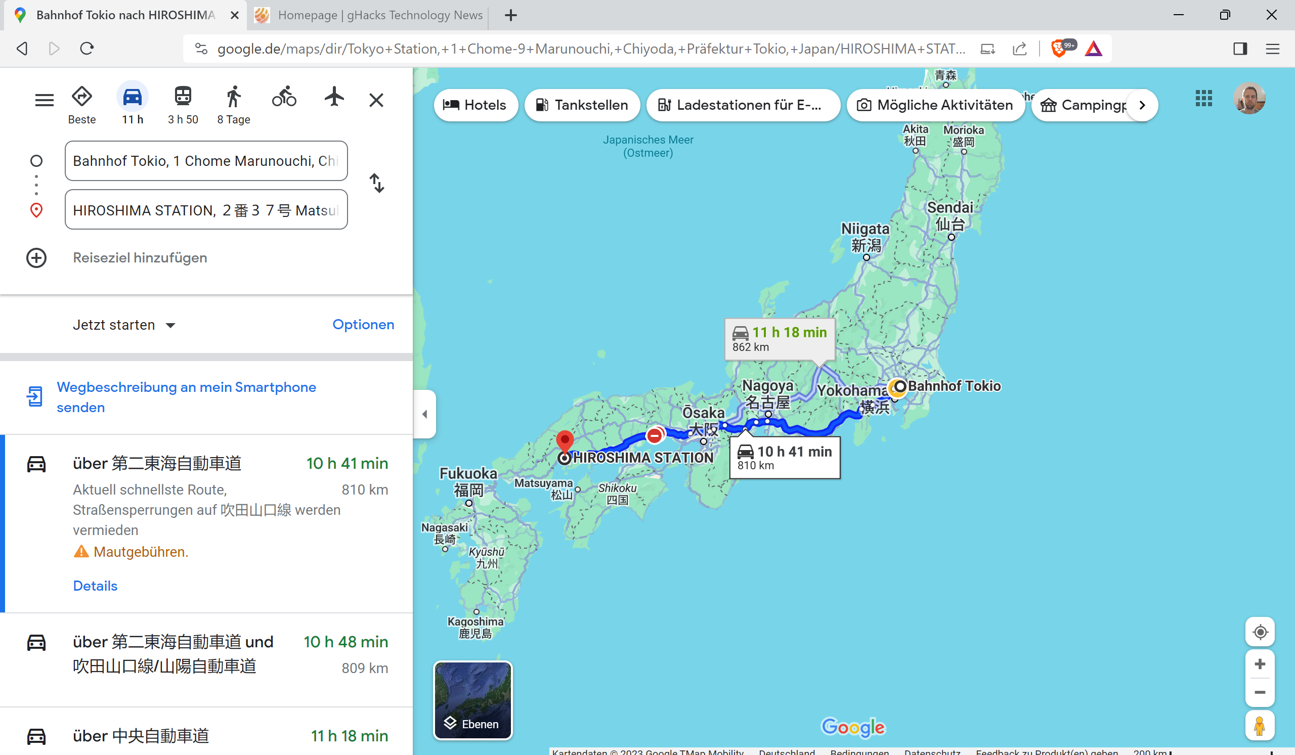
Streets especially look different. Previously streets were displayed in yellow on Google Maps, with the exception of routes.
Google packed more details on the map. You may notice that the visibility of traffic information is improved under the new color scheme.
Color changes are often not welcome by part of communities. It is not different this time. Criticism is not unsubstantial in some cases, however. Some users claim that maps are not as easy to read as before. Especially the new color of roads makes them less visible than before, according to some users.
Another complaint leveled against the new color scheme is that it makes the maps look washed out.
Since the new color scheme is rolling out, some users may still access the old Google Maps. This option is going away, as there is no option to restore the old color scheme once the changes land. For now, users may try and use different access points, e.g., the app, the web version, or the web version in Incognito Mode, to see if any of these still use the old color scheme.
Some users feel that Dark Mode is now offering better contrasts and colors. Google Maps' apps use the system's default color setting by default, but users may change that in the settings.
Just select your profile icon in the Google Maps app and then Settings to get started. Tap on Theme and select one of the three options: always light, always dark, same as device.
A link to modify the navigation color scheme is also provided. It too offers automatic, day or night options only and no further customization options.
Now You: what is your take on the change?














Nope. Terrible. Not everyone is a developer with an uber-expensive monitor with his/her nose mere inches from the screen. What about those of us who don’t have perfect vision? Making everything similar grey hues is impossible to read, especially on Android Auto when you need to glance quickly at a map. Google once again “fixes” something that isn’t broken. Nice. ?
In the past seven years, the designers at these large tech companies have destroyed every web service. They lack both taste and talent. I wish we could go back to 2016, when web sites didn’t look to be designed for people who are blind and obsessed with ugly rounded corners.
There is no longer any information density. On a 1440p monitor, all sites looked to be magnified by 800% and displayed content as you scrolled down rather than all at once.
Hopefully nothing will interfere with overloading the display with indispensable way points like Central Hair & Wigs Shop, Herman’s Fine Sausages and Royal Court Trailer Park.
In short: I’m not a fan. Switched to Bing map instead.
I am pleased with the new Google Map decisions and my US house picture updated to 08-2023. Viewing with latest Windows 11 Dark and Chrome.
New color scheme sucks!