Google tests new position for New Tab button in Chrome
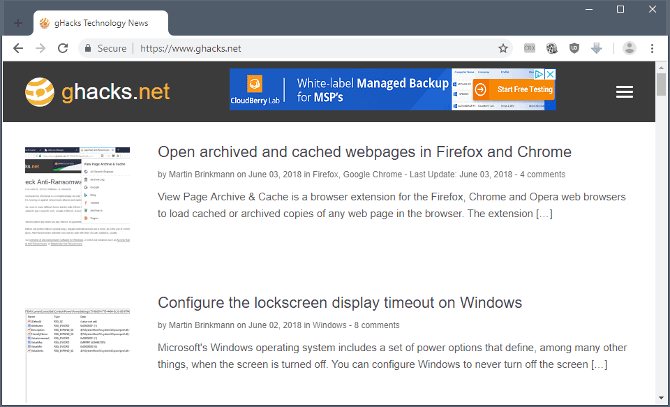
If you run a developer version of Google's Chrome web browser you may have noticed for some time now that Google moved the New Tab button of the browser to a new position.
All modern web browsers display the New Tab button on the right of the tab listing. While the design of the button may be different, you may get a plus, an icon, or any other symbol, it has been at the right of the tab bar for a long time.
Chrome Canary changes that as the New Tab button is displayed on the left side of the tab bar.
Note: I'm not sure if my system has been selected for an experiment by Google or if the change has been applied to all Chrome Canary installations. It seems more likely that it is an experiment to gather data on usage and find out if moving the button to the leftmost position is beneficial or problematic.

Google Chrome Canary is the cutting-edge version of Chrome that uses Chromium as its core but gets extra code that Google provides.
Google tends to launch new features and experiments in Chrome Canary first before it moves the changes to Chrome Dev, Beta and finally Stable versions of the web browser.
Considering that Canary is the cutting edge version, features get tested in Chrome Canary frequently that don't always land in the stable version of Chrome.
Moving the New Tab button to the left of the browser interface is a huge change because all major browsers on desktop devices use a different position for the button and have been using the rightmost position on the tab bar for display for a long time.
I went through an adjustment period in Chrome after I noticed the change in Canary. While I do use Ctrl-T most of the time to open new tabs in browsers, I sometimes click with the mouse instead.
I found myself moving the mouse cursor to the rightmost position in the browser's interface time and time again at first before realizing that the button was not there but on the leftmost position instead.
Closing Words
The moving of the New Tab button to the leftmost position on the tab bar in Chrome is definitely a major change that many users may have problems adjusting to should Google move forward with the change.
Now You: what is your take on the change?











HOLY F..K!!!
This is insane. What are they smoking there at Google?
Any way to undo or disable this?
Since it’s related, I’m not a fan of Chrome’s new default titlebar. In the current stable desktop version of Chrome the titlebar is a shade of gray that’s pleasant on the eyes. In the Canary version the color chosen for the titlebar is a blinding white. I really hope this changes before the final release.
Go to the store and pick a nice theme.
https://chrome.google.com/webstore/category/themes?_feature=5stars
Thanks for the link but I’ve noticed that third-party themes appear to lead to an increase in resource usage when using Chrome.
You could actually create your own theme which has only the header image replaced to minimize resource usage.
I’m not going to get into how to do that. There’s ample info on the web on chrome theme creation.
I’m clearly in the minority, but I would not touch Chrome with a barge pole. Every time I’ve ever looked at it, it feels basic, and “whisks” me back to about 2004….2006 at best.
It’s a privacy violator, and a resource hog and there are plenty of Chrome variants, though they too are far from perfect.
But that’s only my view! If you enjoy a Google product……… enjoy.
Greetings. Tell me how to make such a header color as in the screenshot?
https://cdn.ghacks.net/wp-content/uploads/2018/06/chrome-canary-tabbar.png
UPD: In Google Chrome.
I can see the logic insofar as the left would be a constant position while to the right of the last tab depends on how many tabs there are, therefore requiring extra time to locate the button each time. I mostly use the keyboard for this reason but I rarely use Chrome because I dislike the UI so much.
Is new tab even necessary?
You can create a new tab to the right of any tab. Right-click on any tab and then pick new tab. Presto … a new tab to the right.
In fact, just right-click the tab bar and pick new tab or click on the “hamburger” and pick new tab.
control t is a quick way too.
It’s ok, that will drive more Firefox adoption from people angry at the new Chrome team! WIN!
Changes for the sake of changes. Do Google engineers have too much time on their hands?
Since I use Ctrl+T, Ctrl+Shift+T and Ctrl+W instead this doesn’t affect me one bit. But the placement is kinda counter-intuitive – if the new tabs always appear to the right of old tabs, why should the button be on the left side? Are they so desperate to differentiate themselves that they are willing to make a stupid decision?
Its not going to work. The button is too far now.
This is horrible if you want to open a new tab next to your current active one, which happens to be at the middle of the tab bar: imgur.com/MSb54My
You have to travel kilometres with your mouse!
Right-click the active tab and pick new tab. The new tab is to the right of the active tab.
RMC, New Tab – thanks! Now I can ignore their ‘improvement’
It’s not so bad, Yuliya, as long as you remember to pack a lunch. ;-)
The first thought I head was that it was with the new tab button on the left farther to reach for the new tab button, so no convenient.
But maybe I have to get used to the new position on the left and the workflow for reaching for the new tab button position on the left is even better than the now, with the new tab button on the right?
I would really like to see that statistical set of numbers on that!
There’s two factors playing into this:
1) It’s always in a fixed position, so you don’t have to look.
2) On Windows, you don’t normally have a panel on the left or at the top, on macOS and most Linux desktops you at least don’t have a panel on the left, so when the window is maximized, you can fling your mouse cursor to the screen edge/corner and still be on the button, therefore making it much easier to hit the button.
On a touchpad, however, it’s not as easy to fling your cursor, it’s more important to have the short path, which is why this really should be configurable, like it is in Firefox.
“Chrome Canary changes that as the New Tab button is displayed on the left side of the tab bar.”
========
Wow! Such innovation Google!!
And it’s only the beginning! There are *dozens* of other potential innovations Chrome can borrow from Tab Mix Plus *alone* (which is still working just fine in Pale Moon and pre-Quantum Firefox ESR and which lets *me* choose how I want to array my Tab Bar buttons).
New? Pff, that’s where it was in Opera 8 and 9.
Hi Martin, I read lots of your articles from android chrome. Is there a way to disable Marfeel? There’s no way I can leave comment without switching to desktop mode.
Hi leo, there is no option to disable Marfeel but if you use Firefox, for example, you get a different mobile site version that supports leaving comments.
A sensible idea, but since Google focuses so much on the convenience of the interface, especially at work, why have they removed Chrome Home? I don’t get it.
In Firefox Developer edition (61) there is a space at the left of tabs bar. Is it for a future use as you describe ?
You were always able to put the New Tab button to the left in Firefox, no need for that extra space to be there. Just go into Customize-Mode and drag the little Plus from the right side of your tab bar to the left side.
Yes, thanks, it has disappeared, I don’t know how, but after a customize
Pierre, I don’t know but is not the space there in all editions of Firefox? I think it is more for making sure you can drag and drop the window around as it is quite difficult without title bar.
No, it’s not in the stable/release (60)
Is the browser window maximized when seeing the empty space?
When the browser window is maximized I’m not seeing the empty space in FFv60 or in Nightly v62. When Not using a maximized browser window I am seeing an empty space on the left end of the tab bar in both. On my desktop I never use maximized browser windows and because of that I’ve been using a userchrome entry to remove the space, I’m pretty sure since v57.
.titlebar-placeholder[type=”pre-tabs”] { display: none !important; }
Screenshots:
https://s33.postimg.cc/aak7vokun/Firefox_with_Userchrome.png
https://s33.postimg.cc/f97qa8bsv/Firefox_without_Userchrome.png
It is this flag that you have enabled: chrome://flags#uifood
https://www.xda-developers.com/enable-google-chrome-new-design-chrome-flag/
Not necessarily. That flag, #uifood, is not available on Chrome Dev, but the flag: “chrome://flags/#top-chrome-md” when set to “Refresh” in Chrome Dev on Win7 will move the New Tab button to the left end of the tab bar. When the flag “#top-chrome-md” is set to default, the tab bar on my install, still looks like the tab bar on Chrome Stable. Personally, I don’t care for Any of the new tab bar UI.
Who knows what Google is doing with flags on all of the Chrome builds. The default for the #uifood flag could very well say “Default” even though the reality is it’s enabled for some people. It’s like the button for the site isolation flag #enable-site-per-process says “Disabled” on my installs but it is actually “Enabled” in both Chrome Stable and Dev, for me. Apparently the word “Disabled” is just a euphemism for “We will do whatever we want regardless of what we say”. Or maybe “NeverYouMind”. ;)
Screenshot of Chrome Dev using flag > #top-chrome-md > Refresh:
https://s33.postimg.cc/a0u5s6jrz/Chrome_New_Tab_Button.png
https://s33.postimg.cc/dx7ho5x1r/Chrome_Dev_Default_Tab_Bar.png
Thank you for this, I don’t like the new new tab button position so this was helpful in reverting it.
I enabled it yesterday. The new “New Tab” position has been tested since at least last week though.