A look at Windows 10's Anniversary Update Start Menu
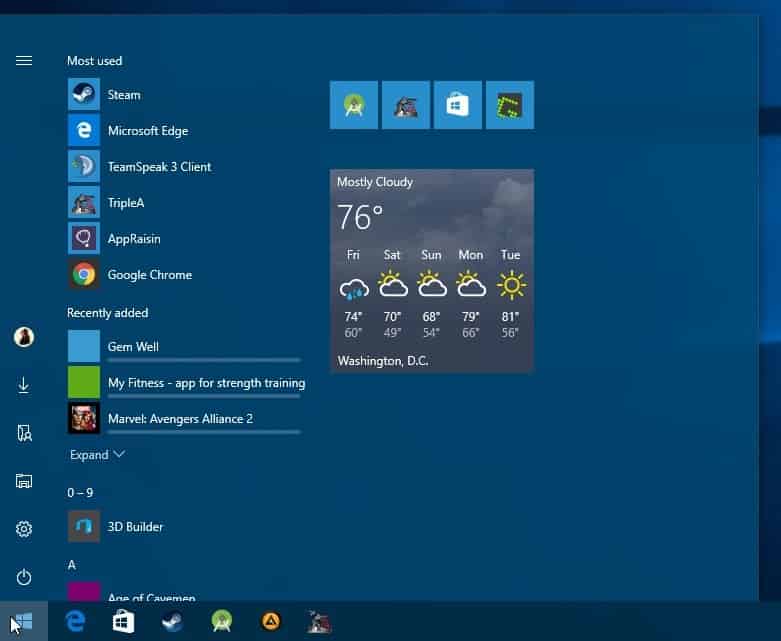
Microsoft revealed during the Build 2016 Conference it held recently some of the improvements and feature additions that would come to Windows 10 as part of the operating system's Anniversary Update.
The start menu was mentioned by Microsoft explicitly as a feature that needed improvement. While it is still several months until all Windows 10 users will get the new Start Menu of Windows 10, today's Windows 10 update for Windows Insiders reveals what Microsoft has planned already (it is a massive update for desktop systems that introduce Windows Ink, Cortana improvements and a lot more).
Microsoft revived the start menu from the dead in Windows 10 but changed it as well so that it resembles something that is best described as a mix of the Windows 7 Start Menu with the Windows 8 Start Screen.
The start menu is divided into a left part that lists often used and recent apps and programs, and core system options such as settings or the power options, and a right part that displays tiles in various formats.
Anniversary Update Start Menu

Please note that things may still change as Insider Builds are preview builds that don't necessarily reflect the final product.
The overall layout of the start menu has not changed all that much but you will notice that it is divided into three areas now instead of two.
Microsoft added the system links such as power or File Explorer to a small bar on the left. These are accessible all the time now which they were not previously, for instance when you select the all apps option of the start menu.
The options are displayed as icons only though with information about individual items displayed when you hover over them. This may take some getting used to time before you know which icon does what there. You may click on the menu icon at the top however to display icons and titles.
The second feature addition is that Microsoft removed the "all apps" page that you needed to click on to browse all start menu items.
These are added below the "most used" and "recently added" listings in the middle column of the new start menu.
Basically, what it enables you to do is browse all start menu entries without affecting the system links of the left column or the tiles on the right.
It means however that you may see links there directly that you may have no use for. Since the listing is sorted in alphabetical order, you may see items such as 3D Builder or Alarms & Clock at the top which you may have no use for there.
It would be better, in my opinion, if Microsoft would provide users with customization options there to make the listing more useful.
Also, and I may be the only one who wants this, I'd like to see an option to turn tiles into text links.
Microsoft plans to release the updated Start Menu with the Anniversary Update that is likely coming out at the end of July or beginning of August.
Now You: What's your take on the changes?








Since the start menu update, which I could care less about, the one thing I can’t help but notice is that my wallpaper is now at least 50% dimmer than before with no way to lighten the image back to where it belongs.
On my Asus laptop, the fn key with F5 or F6 lowers or raises the screen brightness. Perhaps if you check your device user manual, you have a similar function available to you. It’s also possible your power options are set for maximum battery life, so your screen brightness is low.
I don’t use start menu for very long time. I use toolbar on Taskbar.
https://i.imgur.com/dxjGzPB.jpg
One press on >> and every programs is ready to be launched.
https://i.imgur.com/HUFfdd1.jpg
The most used programs are pinned.
Not sure I quite understand all the hate. I use Win 10 everyday. I barely use the start menu for anything. Does anyone else?
It is still leaps and bounds better than Windows 8.
I had tried it for the second time, and it’s still buggy — my apps would freeze up, so i rolled back to 8.1. I never experienced a MS’s famous “blue screen” on my 8.1 Pro :)
The start menu I can live with, looks like we have to swallow what they feed us anyways.
The tiles look a bit like the unity desktop in Ubuntu, MS probably took that design and tweaked it a little.
Also there’s no Explorer file icon in the taskbar for whatever reason and the photo app crashes which has been a reoccurring issue.
Other than that, everything works so far.
Martin mentioned that he would like to see tiles be able to display as a text link instead. I agree in that small tiles should not show just an icon but should also display the text, or allow text only for what app the small tile represents. Icons only on small tiles looks stupid..
I never liked the Windows 8.1 start menu and used Start 8 until Windows 10 preview. This start menu is much better and i’m used to it. Now they screw up the whole start menu again and it is a mixture of text, icons (without name) and live tiles. It’s a mess and I really hope they give us the option to use this start menu or i’ll be moving to Start 10. There are lots of inconsistencies in the UI which should have been fixed long ago.
Nice! My reaction is like… http://i.imgur.com/KVgpeZb.gif
Mine: http://i.imgur.com/JwHqloP.gif
I think all the fuss concerning Windows Start menu is due to the fact that Microsoft has its idea of what a start menu should be and bargains to get users to adopt its concept. The company wants a menu which integrates in its philosophy of a universal interface together with tiles which would combine users’ choices and theirs in the scope of mixing ad/application revenue with users’ tasks. Microsoft is of those companies who bend only when they realize flexibility has proven inefficient without anticipating or at least taking into consideration what a majority of users have always made clear : a simple, intuitive and non-bloated start menu.
Let’s face it : Microsoft is not on the line of its customers, I see not one fact, behavior, policy which would lead me to believe the company is in any way committed to the users better experience. Not one. Dictatorship, tracking, paid licenses enduring nevertheless advertisement inflation (Win10), an OS in the trend of squeezing exponentially the user’s ability to set his own choices … Ethics and intelligence can be two different things but to endure a company needs at least one of the two. As it is now Microsoft is bound to vanish, they won’t make it that way eternally.
That’s the problem. They need to stop trying to decide for us, pay attention and give us what we want. The Redmond Mafia is not a customer-centric company and they haven’t produced a quality product since Windows 7. They lack ethics and intelligence.
Oops!
I’m having big problems on my system with apps that are contained in sub-folders. When I click on the drop-down triangle, the top-most icon spot is blank, and the icon that should be there is displaced way down the list, overlaying another app icon maybe 5-6 spots down. Wow.
A few folders work… Seems like those with just one or two icons. I have some apps installed that have 4-5 icons and every single one of those drop-downs is a mess!
Gonna try a couple of re-boots before I start messing with the folders themselves… There are two places:
/program data/microsoft/windows/start menu (this is similar to the old “all users” tree) and
//appdata/roaming/microsoft/windows/start menu (this is similar to the old “this user” tree).
Yikes. On my system this didn’t work too well.
Anybody else seeing anything like this?
Regards,
Mr. Joey
“I’m having big problems on my system with apps that are contained in sub-folders”
You can thank the ignorant masses for keeping us in 1995.
Hello Mr Spinoza,
If this can comfort you : you’re not the only one enduring Windows 10’s chaos.
What will not comfort you is that 100% of Windows users free of worries have NOT adopted Windows 10.
Sincerely yours,
Tm Hawack, member of the Windows 7 community.
RE: “Anybody else seeing anything like this?”
No because i refuse to use an OS that’s under constant development, that’s more interested in adding new features than fixing things, that’s going to constantly have problems.
Hi Mr. Joey,
You should have never installed Windows 10 in the first place. :)
Yours truly,
Windows 7 :)
The APPS and Cortana must be put where the sun does not shine. Give users a real start menu.
Classic Shell is free and can be easily installed from ninite.com.
If you don’t mind spending $5, Start 10 from Stardock.com is excellent. It puts back a 100% Win 7 style start menu and has a lot of other nice features as well.
FYI Classic Shell’s menu is also 100% Win 7 style. More like the original menu in fact than Stardock or StartIsBack ever since they released version 4. Stardock failed to implement some of the original menu functionality like keyword search for Control Panel. Classic Shell has also kept up with the times and updated their menu to incorporate new ideas and new technologies like high DPI, touch keyboard etc.
IMO it looks horrible.
once I spoke to a windows seller years ago because I wanted windows vista start menu (I loved it) and he told me: that is not possible. I made him angry till the point of saying: “well, if you don’t like it, than don’t use it. put your computer on the trash can and make your own operative system, with your own taste.”
this is what I say to all of you complaining about the start menu. microsoft has the right of ruining their OS, so don’t complain, just build your own operative system.
Just one problem. Windows is not open source software. Good luck trying to design your own OS, Khidreal ! :-))
I look forward to seeing your alpha release in circa 2026.
Anyone would think Windows was the only OS in the world, you live a very sheltered life.
All you people who whined about Windows 8 have created your own purgatory here. Personally I think the Windows 8.1 Start Screen was excellent. Windows 10 start is far far worse and it gets worse with each insider build. Terrible. Why do I need a hierarchical folder system on a quick “program launcher”. Why do I need to be told which apps I use the most. I ALREADY KNOW WHICH APPS I USE MOST, THEY ARE PINNED!! All I need is the “All Apps” link somewhere out of the way and lots of room for icons and tiles. I now have less room. Another step in the wrong direction. Wonder how this will affect me as I “use start full screen”. Horrible.
Good analogy. Neither one of them are very smart. Both of them have dishonorable intentions. Both have earned being hated based on their unacceptable behavior.
“Personally I think the Windows 8.1 Start Screen was excellent.”
There are at least 4 or 5 other people on earth who agree with you.
@Finvana
Well either Windows 8 wasn’t as bad as the internet hate groups told everyone or I’m a really fine salesmen.
Take your pick.
Windows 8/8.1 or 10 have not stopped people from buying computers. They complain and they still buy. I’m pretty sick of hearing the complaining though. All this whining about start menus. My god. It was old years ago. Now its just reached other worldly levels of stupid.
MS is like Obama. They haven’t learned that no matter how much you try to work with the other side they will still hate you.
@Ashrak007 I also work at a computer shop and your statements are really hard to believe.
@Ashrak007, Seeing as Windows 8/8.1 was the only version of Windows available to OEMs for 9 months it’s hardly surprising you sold a 1000+, Microsoft officially ended sales of all but the professional version of Windows 7 on the 31st of October, 2014. That left customers with no choice of what version of Windows a machine came with until Windows 10 was released.
And FYI new doesn’t always mean somethings better, or that because people don’t like the new thing that they lack knowledge or information, that their stupid, or that their morons, it may actual be that the new thing is not better, but as someone who seems to prefer insults over grownup debate i guess it’s understandable that you find that notion difficult to understand.
“Only ignoramus’s who cannot learn new things complained about it.”
You liked it, so anyone who doesn’t is an idiot incapable of learning. Gotcha.
You’d be surprised how many… I work in a computer shop and I’ve sold Windows 8/8.1 machines to 1000+ people. Only ignoramus’s who cannot learn new things complained about it.
I get old ladies all the time who love love love Windows Vista and won’t switch to 7 if their life depends on it. People are stupid and don’t want to change anything. That’s it. Period. MS needs to stick to something and ignore morons. All these changes are just going to turn more and more people off.
Why should I learn a new thing, if the old thing is perfect for me? It’s just unnecessary to learn things we don’t really need, moreover what we dislike!
I think you will like having windows 10 start menu in full screen, like windows 8/8.1 has. go to options on the start menu > personalization > start and check use start menu in full screen.
you should now ONLY have the tiles showing and a small left side bar where you click to shut down the computer, etc.
What was wrong with the old Start menu? Why change something that was easy to use just for the sake of changing and “improving” things? Don’t fix something that wasn’t broken in the first place.
If/when i decide to move to Windows 10, first thing i’ll do, is to find a good Start menu replacement.
They changed it because they wanted to leverage their 90% market share on desktops to gain market share with mobile devices, something they’ve now said is not their focus, basically it boils down to Microsoft seeing how much money Apple and Google were making from mobile devices and perceiving them as a threat, seeing peoples increasing usage of Apple & Google devices as something that would make it more likely for them to choose Apple & Google product in the future instead of Microsoft products.
Nothing was wrong with the old start menu. But they didn’t change it because they thought it was broken. They changed it in order to employ their new monetization methods into the OS. If you remember, it started with the “start screen” in Win 8.0, which was forced on the user at startup. That screen, by default, was loaded with giant icons of MS products, like Skydrive, IE, Bing, links to Office 365, etc. Stuff they wanted to FORCE people to see every time they turned their PC’s on.
Most glaringly, it added a Microsoft store to that screen, in hopes of doing what Apple did, using the OS as a captive audience marketing platform. They wanted a piece of the ‘apps’ pie. No such thing existed in WIndows, and I dare say it wasn’t wanted, but they insisted on trying to force it.
Only after much public outcry did MS add back a (so called) start menu in 8.1, but still insisted on the tiles and captive advertising in the OS. Win 10 has only made all this stuff worse, IMO, with all the data tracking “telemetry” and literal ads right in the OS.
The pinned tiles can’t have jumplists, why not, if the old menu had them? No way to change how many most used items? The small tiles have no text labels. Now even the awful icons lined up vertically have no text labels! You can’t freely sort the left side shit.
Every few months they fool around with the UI instead of focusing on functionality, usability and consistency with all 3 inputs – mouse, keyboard and touch. I don’t see how it beats Classic Shell’s multi-column All Programs layout which is the 95-XP style for displaying all apps. If your app isn’t in the most used list, the user clicks All Programs. Simple and scroll-free.
On the right, the good old Classic Start Menu even has expanding folders for directly accessing stuff inside the folder. And yes it has folders inside All Programs but that’s the fault of the individual app developers for putting shortcuts inside folders. You can organize All programs in any way you want directly from File Explorer. Move the shortcuts out, rename them, delete the folders. Once it’s organized and always sorted by name, you get a really clean classic menu. Unlike this mess which keeps changing every now and then and leaves the user feeling like he absolutely has no say in anything, nor any respect from Microsoft.
Don’t even get me started with search which WORKED in the classic menu and now the Cortana powered shit doesn’t work half the time and is determined to show me web results and Store results.
This has been going on with everything. They take apart what used to work, start from scratch and call it innovation. They expect people to love it after the way they treat users?
People do not complain because they can’t handle changes. They rant because it is never an improvement with Microsoft – just rearranging stuff differently with something missing, broken and some things added.
RE: “Unlike this mess which keeps changing every now and then and leaves the user feeling like he absolutely has no say in anything, nor any respect from Microsoft.”
That’s what Windows 10 is though, it’s well known that Windows 10 is a work in progress and will remain that way forever, Microsoft can and will change things throughout the life of Windows 10 and with no way to refuse those updates (longterm) you’re going to have get used to that.
I’m normally too busy doing work on my computer to notice that nothings changed on it for 6 years, in fact I’m glad nothings changed on it for over 6 years because having to get used to something that’s changed would mean I’m wasting time getting used to something instead of earning money.
People get bored of everything remaining the same and want something new. But the new functionality should be delivered without disturbing the consistency of the previous releases. This is what Microsoft does not understand. They make changes that are inconsistent across releases. So in the long term, it becomes very frustrating.
“Don’t even get me started with search which WORKED in the classic menu and now the Cortana powered shit doesn’t work half the time and is determined to show me web results and Store results.” – just disable cortana – she does not does a damn thing anyway – and you are free from that.
microsoft is losing their way, yeah, since windows 8 MS is having a lot of complaining because they bet a lot on changing the UI. if you look in the past, windows vista was a lot different from XP, but yet, if you know how to use a XP, you know how to use Vista. same happens with Vista & 7. but then MS took the next-gen step *cuff* and built W8, totally different from windows 7. it’s like re-learning the OS again. in some ways the changes were good, but in others it was bad because now you don’t have half the customization you had back in W7. but, globalization is all about that: buying the same things, using the same things, having the same things, work with the same things… and the problem is that you can’t stop globalization.
MS has completely lost their way. Classic Shell FTW.
What an awful mess. I hate menu systems where the items can change position from day to day on their own. Is there no way to configure the menus manually?
You could use system menu replacement.
No there does not seem to be a way.
They made it worse. What a joke!
imo, the new start menu sucks in comparison to the former start menus, and I think the anniversary update doesn’t address any of the issues. The only thing that’s nice is having live tiles there, but then again, I would rather be able to put them on my desktop a la widget style.
When you click the all apps, it should take up your whole start menu with apps, including the area with the tiles. Similar to how it was in Windows 8, just smaller. Also, you should be able to pin apps at the top, not have to create tiles.
It really annoys me how I have this “recently used apps” section, and then all this unused space below it.
Honestly, I do not believe Micro$haft is capable of doing anything correctly any more. Everything they produce in an OS is an insufferable piece of trash now. I think they may be approaching the point of no return in terms of disaster recovery and irreversible damage to their reputation. What I find so amazing about all of this situation is they seem to be trying so hard to distance themselves from Windows 7, which is undeniably the most successful OS in the company’s history. It’s like digital genocide or cutting off their nose to spite their face. Rather than taking something wildly successful and making it better, they are replacing it with something totally disgusting and defective.
I absolutely agree.
+1
This world needs more competition. Microsoft is over. I paid for Win 7 and MS Office 2010, but I will not pay for any Microsoft products in the future unless drastic changes are forthcoming.
Ditto That
I agree
+1
if you don’t want to waste that space below the recently used apps, just use the start menu in full screen mode (like it is on windows 8/8.1). the live tiles are a lot bigger and the start menu is less bloated.
in reply to “a la widget style”, widgets are from the “stone age” already and they can consume a lot of resources. back to the past month I had windows 7 and I was using a widget from yahoo, to display several information. that widget was using 100MB of ram, which is already a considerable amount of ram for mini applications. I believe that live tiles are much better, since you waste almost the same amount of resources having 1 or 100 live tiles.
I never cared for having a full start screen, but I managed to deal with it through 8, I prefer it not taking up my whole screen in case i’m watching something.
I didn’t want a widget, I wan’t it in a “widget style” meaning I can put the live tiles on the desktop. Also, apps can consume a lot or a little resources regardless, it depends on bloat and coding/compiling. i’ve had a sidebar for XP that consumed next to no resources, though sadly that program has been abandoned. But I think I remember Rainmeter consuming next to nothing.