Google to replace black menu with Chrome OS app launcher like menu

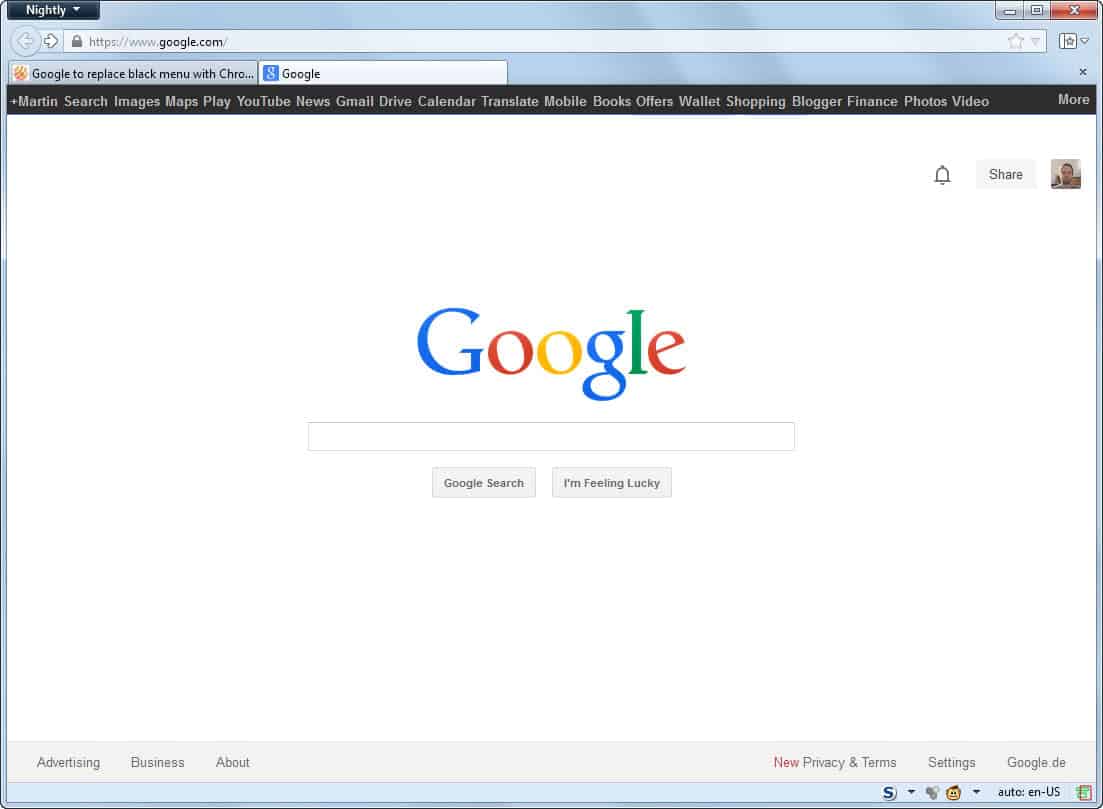
If you do not like the black menu bar that Google displays on top of most of the company's properties to interlink between them, now is your time to rejoice as the company confirmed that it will replace it with a lighter design.
We all know that Google is constantly tweaking and A-B testing new designs and features. Most of them land in an archive of sorts and are never rolled out, while some are rolled out to all Google products and for all users who visit the sites and services.
Some Google users have noticed that the company has replaced the black menu bar with a lighter version for them. First sign of the new design dates back as early as February 2013 when it was first reported that Google may launch a new grid-layout menu on its properties.
The core difference between the black menu and the new grid menu is that the latter consists of a single button that displays core Google properties on click, and that you can scroll down to the "more" section instead of having to click on the more link to get there.
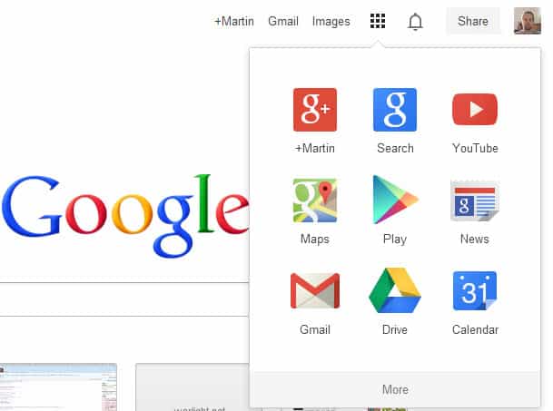
Google Plus Daily reports that the new design will be visible on several Google products, including Google+, Gmail, Search, Blogger and others, and likely also on YouTube.
That the change happens has been confirmed by Google+ community manager Justine Rivero. According to her comment, it will be rolled out over the coming weeks for all users.
Users who are switched to the new design are introduced to it via a small notification message that is displayed right underneath the new light bar. It reads:
Welcome to the new way to find your favorite Google products.
Click the grid to have a look.
The change moves all links pointing to Google products to the menu, so that users will have to click one more time to switch to a different Google service, provided that they used to click on the black menu bar as well to do so.
The design looks similar to the Chrome OS app launcher as it is using the same grid and layout, with the exception of the find bar on top that is not available in the new grid menu that Google will roll out.
It is interesting to note that some links are still displayed directly when you enable the feature in Chrome. It is not clear if this will also be the case for the new menu bar.
Closing Words
Is it a good or bad change? That depends largely on how you made use of the Google menu bar. If you have used it actively, you will now have to click once more to access Google products that you want to load in your web browser of choice.
How to restore the Google Black Bar
If you like the black bar that Google displayed for quite some time on top of its web services, then you can get it back with the help of browser extensions and user scripts.
Google Black Bar Returns is a free userscript for Firefox and Google Chrome that adds the black bar to all Google websites again. Chrome users can install the script right away:
- Click the install button and download the script to your system. You receive information that Apps, extensions, and user scripts cannot be added from this website. This is normal and no need to worry.
- Load chrome://extensions/ in the web browser.
- Drag and drop the downloaded script to the extensions page to install it.
Firefox users need to install the Greasemonkey or Scriptish extension first. The script can then be installed directly in the web browser.
The black bar links to several Google properties such as YouTube, Gmail, News or Google Drive. While it is not a 100% copy of the original toolbar, it is offering that toolbar's main functionality and that's what counts in the end.


This change, part of the seemingly unrelenting march of “less is more” design aesthetic simply sucks. It has very little to do with what users want, and more with shoehorning their objectives.
I fear I may have to hack an old-school 2-frame page with my own bar at the top, saving links to that local page as “hoogle” or something like that. Pathetic. And of course, there’s no option. No, we don’t want to give people options…
Go see “The Cruise” movie with Timothy Speed Levitch. Google goes with the grid system–very “anti-cruise.”
I’m hoping it won’t be long before an enterprising web designer will publish an extension that will enable users to customize the new app grid, different users use different Google products, they should be able to arrange their controls based on their individual needs and usage
I think the new launcher is stylish and convenient, ok so it does involve an extra click – and many more to reach your Google Groups page, so there is room for improvement IMHO
How can you acknowledge that it takes more effort to use, and at the same time call it ‘convenient’? Form over function != good UI design.
I don’t like it. How about the fact that when you click for the app launcher (which, by the way doesn’t launch any apps) and then More, a scroll-slider-button appears, but that if you move it to the top of the range IT DISAPPEARS!
Freakin’ disappears, requiring another mouse-move and click to bring it back.
Where else in the whole world does a control – that you are currently using – disappear from the display?
Careful, Quiddity – you’ve become a pawn within the masses of unpaid crowd-sourced beta testers.
I like the new Grid launch function in the browser, that’s cool. but it “feels” like they forgot to add Google Play all access app to that…
I can launch Google Play music from the Grid launcher that is in my win 7 taskbar. but I would prefer to launch it form the chrome grid launcher.
any ideas ? or is this too new to complain about yet ? lol
Thanks for reading,
Dave
How do we tell Google that it sucks? Where are they looking to get feedback about how the change is received, or do they even give a hoot?
In CS: 101 the “UI Design” section is chock full of very sensible imperatives that include: Don’t increase the work a user must perform to achieve any given operation. Apparently, Google slept through that lecture. Oh and don’t get me started on the colorless ‘Flat UI’ stupidity – indistinguishable screen elements that make the user experience like driving through a thick fog with white-on-grey and grey-on-white and whatnot. Gah!
Agreed with all the previous complaints. These “improvements” always involve more clicking and clicking and clicking. And, the crayola-colored icons are just insulting. I am not 3 years old. I can read a drop-down or a tool bar. If they are twiddling their thumbs over what to do with themselves why don’t the Google-ites do something constructive – like feed the impoverished with all their dough? Seriously.
i can’t stand the new UI. i’m a user who has firefox / iceweasel set up to clear its cache, and of course i never sign in, so i guess i’ll be getting used to this annoying “welcome to the new way” pop-up just like i got used to the annoying and constant “install chrome” pop-up that went on for months or years. except now i won’t be clicking on any of google’s additional services.
if i want to visit google news or something else, i’ll be doing it the elite way: by typing it into my search-disabled address bar. and if i don’t know the address, i might just have to do a search on ixquick.com
test… (do i have to be assimilated into the borg to post a message?)
GOOGLE, How can you help? Let me tell you , it is not by constantly changing things like your e-mail set up, and your “Front page” (google.com) which has been my home page up until now. I already go to Bing for maps in English. Now you want to train me, like some lab animal, to hit new buttons, to find things that used to be right there on google.com. What gives with you people?
I like the new grid menu.
Any userscript or userstyle that would decrease the height of the panel that includes it (and the search box and the live-link “Google” logo)? The space above the also-too-large “Google” logo could be trimmed a few pixels.
Is there any way to get back the black bar – its very inconvenient to go from one click to 2 – also the calendar opens and closes gmail.
You can try this userscript. It adds the links to the top on Google again.
http://userscripts.org/scripts/show/113067
One more Userscript, “Google Black Bar Returns”:
http://userscripts.org/scripts/show/179402
Martin, don’t you want to write a separate post on topic?
Thanks for the link. I have added the information to this article instead.
Is there ANY way to get it back to the black bar? not only does it take two clicks for something that used to take one….even if I put my calendar on the frequently used tab I have to open a new tab for it otherwise it opens calendar and closes gmail….Also why am I missing the black bar (got no notification) and none of my co-workers do? Very annoying with google’s constant changes to a system that works as is.
I hope so. I am so unhappy with this. I had tried the new look many months ago but couldn’t stand it. Now there is no way to get the old bar back.
It’s a stupid move. Like Microsoft they are now beginning to make their products increasingly and needlessly complex. The menu bar was simple and streamlined. They should allow people the option between the two. It’s a stupid stupid stupid forced change.
As I function with words, I find a distinct disconnect within the extra nanoseconds it takes to figure out what someone, a team, a competition, a winning proposal, etc…thinks is a graphic representation of a single word. The “extra click” is just insult heaped upon this injury.
At this instant, my response to this change has been succinctly stated by the title of track 7 on Godsmack’s “Faceless” album.
Regards,
Deirdra
PS. The time stamp is many hours off.
Totally agree, hate this lame update beyond words.
the upcoming UI is not helpful but is beautiful
the upcoming UI is not just helpful but also beautiful
Very stupid solution, instead of 1 click they made 2 clicks…
and very innoning too,damn to this change
Thank you. At last someone who feels the same way. I’m still looking for a way to get the old one back.
Agreed entirely I am starting to like google less and less with their so called “improvements”
Exactly. It seems Google is just a bundle of bad design decisions this year.
I have been searching all over (with Google, ironically) to figure out how to disable these new UI mistakes. The detached Apps page and the new menu bar are the same kinds of “What were they thinking” as Gnome3, Unity, and Windows 8. In other words: Stupid.