Chrome's New Tab page puts focus on Google Search

Most web browsers display a selection of popular sites that you have visited in the past when you open the new tab page. Some give you control over the websites displayed here, while others do not. Firefox users can for instance pin sites to their tab page to make them permanently available there, while Chrome users can only remove pages from the list that they want removed. And Opera users, they even get extensions for that page to fill it with dynamic data.
It appears that Google is currently experimenting with a new tab page for its Chrome web browser that moves away from the rather messy design that Chrome users currently have to deal with.
When you open a new tab page in Chrome right now, you get a representation of eight websites you visit frequently, bookmarks at the top, an option to switch to apps instead of websites on the page (a setting that Chrome remembers), options to browse recently closed websites, and a link to Chrome's web store.
Chrome's new tab page displays a Google search form prominently on the page, and below that either the most visited sites or apps.
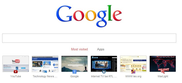
What feels a bit strange at first is that a click in the search box redirects your request to the browser's address bar automatically. Once you know that, it does not really make sense to display the search form on the page as you can as easily click on the address bar instead to start the search from there.
The new tab page is only available in Chrome Dev builds right now. To activate it, you need to switch a flag in the experimental section of the browser. Load chrome://flags in the browser and locate the flag Enable Instant extended API. Click on Enable to activate it and restart the web browser afterwards to load the new configuration. You have access to the new tab page from that moment on. To disable, simply open the flags page again and click on disable this time to do so.
Adding a search to the new tab page does not make lots of sense as it is easier to search using the address bar directly. The best explanation that I can come up with as to why it has been added to the page is as a visual help for inexperienced users to search faster.
Advertisement


In my About:Flags this option Enable Instant extended API is Turned Off….
But I still have the ugly useless Google search box on my new tab page.
Can any one help me remove that dam thing?
Google have announced their reasons for this development on the Chromium Blog.
Actually I think it SUCKS!!!! Why? Because I got used to EIGHT pages being directly accessible from the home tab and now it’s been reduced to just SIX! WHY????????????????????? If anything, I think they should have added 2 more and let people customize them. This design needs is moving in a good direction with the search bar upfront but if it’s at the expense of 2 tiles then I think it’s a mistake that I hope will be fixed soon.
I think that it would be really good for full-screen users, i mean you can’t access the address bar in full Screen.
The best new tab feature for me in Firefox is the blank one!I always know what I want to search!
Not for me.
After cleaning Chrome’s cache I lost
Google’s new Tab page thumbnails and I haven’t found any way to restore them.
Looking at the “Top Sites” sqlite3 file the thumbnails column is empty.
I have re-installed Chrome with no change.
I have deleted both “Top Sites” & Top Sites-journal file. Still no change.
Chrome Version 24.0.1312.40 beta-m
Ahh. That looks like a good change. Especially for people who ‘search’ for direct URLs. It also looks complete / nice for me.
Some people even google ‘google.com’. This way they directly go to the page instead of searching.