Google Rolls Out New Search Interface
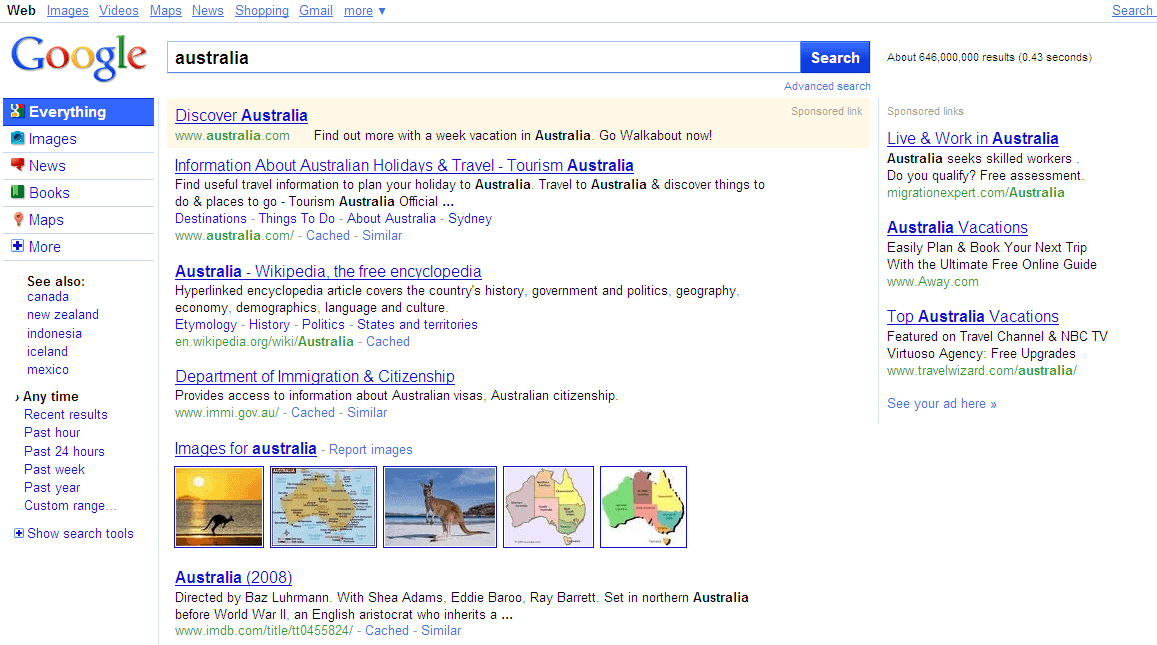
A recent post over on Search Engine Land suggests that Google will be rolling out a new search interface - or more precisely search result page design - to selected users later today.
The effort seems to have originated in the analysis of the current search results layout which is everything but coherent and has been a major point of criticism lately.
The new search results layout will use a cleaner design with a sidebar added to the left side on the page. The left sidebar will always be visible, and seems to have originated from the advanced search options which currently have to be expanded to make them visible.
The sidebar will make use of colorful icons for permanent listings at the top, and a dynamic lower part that display content depending on the choices the user made.
A selection of the video link for instance will display filters for playtime, date of publication or quality while the selection of images will display image related filters.
Google New Search Interface
The default entry point for most searches is Everything which will display the standard mixed search engine results. The Google search engine will guess the most appropriate mode, a search for Mercedes videos will therefore display the video mode as the default entry point; again with the option to switch to another mode.
It is likely that Google will roll out this new search interface to all users eventually. What's your opinion on the matter? It will likely be another difficulty change for Google users who lately had to endure the new Google homepage design with the fading links.
Update: The search interface has changed again in recent time. You will notice that the left sidebar has been removed from Google Search, and that you find some of the options displayed on the left sidebar at the top of the search results page instead.












I notice you don’t post the publication date of articles on your site. When your content is so much about “the now” not having a publication date makes it hard to tell how current the information is that I’m reading. Of course it’s up in the URL, but if you put it on the page, that would certainly be useful.
The date is actually displayed after the article in the author box.
Ah! Thanks for your reply. Yep, I didn’t see it there at all. Dates and authors are well placed after the title or at the end of the text, which is a standard editorial practice— not after a bunch of other links and social-networking buttons. Viewers like me tend to filter that stuff out!
Really irritating. The new display places too much space between each result, while it looks ‘cleaner’ because there is less on the page, that is exactly the problem, there *is* less on the page so I have to do more scrolling to see what before use to fit on my one page.
Why are they copying bing? I deliberately got rid of bing because I didn’t like this layout.
I like the new search interface. It’s feels more tidy and better looking.
that’s Bing-ish