How to restore the old Google Chrome design
Google started to roll out Google Chrome 69 Stable to all supported systems yesterday. The new version of the web browser arrived in time for the browser's 10 year anniversary.
While Google's release notes are usually short and not very descriptive when it comes to new features or changes, it is different this time around thanks to the anniversary.
The company published an article on the official Chrome blog, Chrome's turning 10, here's what's new, in which it highlighted some of the changes in the new version.
Chrome 69 is one of the few releases of the browser that makes modifications to the user interface.
First up, Chrome has a new look. You can see it across all platforms—desktop, Android, and iOS—where you’ll notice more rounded shapes, new icons and a new color palette.
Tabs changed on the desktop to highlight website icons more.
We changed the shape of our tabs so that the website icons are easier to see, which makes it easier to navigate across lots of tabs.
Chrome users who upgrade to Chrome 69 will notice the interface changes right away. The edges of tabs are rounded in Chrome 69, the profile icon was moved from the title bar to the main toolbar, and the height of the titlebar has been reduced even further in the new version.
Update: Google removed the flag from the browser in Chrome 71, released in December 2018. There is no option anymore to restore the old Chrome design.
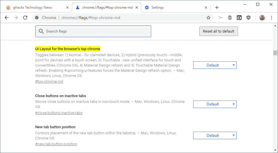
Chrome 69: the new design

The screenshot that you see above depicts the new default design of the Google Chrome web browser on desktop operating systems. The screenshot was captured on a Windows 10 machine and the layout and design may look slightly different on other operating systems.
The screenshot below depicts the old design of the user interface.
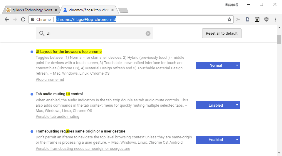
It is possible, currently, to restore the old user interface in Chrome. The option to do so is powered by an experimental flag; these flags may be changed or removed at any time and it is unclear for how long Chrome users will have the option to restore the old UI layout.
Here is what you need to do:
- Load chrome://flags/#top-chrome-md in the browser's address bar. The flag is still available if the experiment UI Layout for the browser's top chrome is returned as the first result on the page that is loaded.
- Activate the menu next to the flag and set it to Normal.
- Restart the Chrome browser.
Note: You can experiment with other UI layout options, e.g. touchable or hybrid to pick the one that works best for you. Just remember that these options may be removed by Google at any time.
- Normal - for clamshell devices
- Hybrid (previously touch) middle point for devices with a touch screen
- Auto, unclear, likely automatic selection.
- Touchable - new unified interface for touch and convertibles (Chrome OS)
- Material Design refresh
- Touchable Material Design refresh.
Now You: Do you like Chrome's new design?







after las chromium update it doesnt work anymore (top-chrome-md doesnt exist). any solution? :-(
The problem with updating to an older version, the next time you open Chrome again it auto updates to the latest version.
I uninstalled and downloaded an older version of chrome off of https://www.slimjet.com/chrome/google-chrome-old-version.php#cmtx_form . you just have to make sure that you don’t put your credit card information while using an older version of chrome because there may be vulnerabilities.
Chrome sucks! Looks like a new stupid team arrived….
I like simple design without useless effects. Google Chrome is a poop again :(
I hate the new version, give us the option to bring it back.
Go for http://www.centbrowser.com It’s identical to old chrome’s design but it’s so fully bursting packed with so many great features, including the old chrome’s design! I dumped google for good and all the other stupid browsers altogether. I am really amazed what cent browser has to offer!
omg its really sucks..plz help me to restore old version.. i hate hate hate this tabs..
now i cannot switch it back, google is driven by a bunch of arrogant bitches at this point
This change sucks. The old TAB design was a lot better on the eye, and the new design is horrible. I really hate it when changes like this occur as mandatory.
NOOOOOOOOOOOOOOOOOOO! I restarted my computer this morning and saw the horrible looking tabs, went to change it back, and found out that as of version 71 you can’t! I may be switching browsers…
I mostly just don’t get why they removed the highlighting in the drop down menu of the adress bar.
Are there so few people now that use multiple windows?
Having the a titlebar above the tabs acknowledges the need for one to grab when moving a partly obscured browser window and/or when several tabs are open.
Yet they’ve made it so narrow that it is extremely difficult to use! It doesn’t make sense to me – perhaps i’m missing something?
And now, as many here have recently pointed out, they have removed the possibility of a fix.
Why?
It doesn’t work! There is no normal option!!!!!
That’s because they decided to remove it.
Jeez I hate the way these aholes feel entitled to f*ck with everything because they feel entitled to.
YES it’s “free” but ONLY because they are harvesting OUR demographic data. Don’t you LOVE the way the liberals attribute authoritarianism to the right while feeling that if they complain about it, it’s ok if they use it.
what?
I highly recommend this theme: https://chrome.google.com/webstore/detail/android-theme-holo/afpbcnnnpeghomcikfmedchkmobidmlc?hl=en-GB
Just so people know, this does not work as of the latest version of chrome. The setting shown in this article no-longer has these options available.
Sorry, but this article is useless. It is not restoring real old Chrome design! Yes, tabs are not so rounded as with “Default” option, but that is all. Still not the same as the “OLD” ones – the were longer, lighter inside and with a darker thin edges. Visually very friendly to recognize one next to each other. This is not it… and the new design is just a mess to look at.
This article is helpful until Silly Google decide to take off your rounded corner, I think Google knowing that the old user find a way to keep there UI, but they don’t want It because of maintaining in the future. Just Sucks, Google shouldn’t change It brutally.
HATE IT. And more importantly hate having changes like this jammed down my throat. It’s enough of a hassle for a solo practitioner… but Google (and all developers) should experience what happens at a non-techie company when every employee is suddenly met with something that looks foreign to them, with no notice. It is absolute, utter chaos. How would you like it if your children suddenly looked like strangers to you (don’t answer that -you’d probably welcome that…) but for a typical non-tech business user a sudden UI re-design can be just as disorienting. It’s ridiculous, it’s clueless (on your part Google) and it’s completely avoidable. STOP DOING IT.
I switched to HTML view in desperation. It is fairly hideous, but is not setting off a migraine headache for me so far.
People at Google seem to be spending their time on meaningless changes like fonts and colours. Whatever they did to it, the new design is giving me horrible headaches. I actually feel sick every time I look at it.
Also, the fix no longer works.
I don’t like the new Chrome features! Bring back the “OLD”!!!
Thanks
This didn’t work at all, I’m stuck with this garbage! The new look sucks!
It’s clear that the chrome dev team have nothing better to do that twiddle with tab changes… duh.
One thing that does bother me is that on the main page when I open Chrome it used to display screen shots of the sites that I have visited most often. It still shows those sites – but now it only displays the site’s (small) favicon instead of a recent screenshot. For sites that have no favicon this is a default ‘page’ icon. ‘At a glance’ the list of sites is now worthless. The screen shot was a MUCH better way of showing the sites.
It’s things like this that show how inexperienced the product management team (and the developers) are at some software companies. It is incredible (lacks credibility) that someone made this decision to secure an improvement (unless, of course, there was some copyright issue involved). It is truly mind-boggling that a company as big and as successful as Google can make such seemingly short-sighted choices (and display them on the front page of its flagship product) and claim to be a leading light. If it was a copyright issue then an explanation of this would have helped ease the pain. So – was it a failing of product management or of marketing?… take your pick.
Oh well, it gives the little guys an opportunity.
Have you figured out how to fix this? I really hate those new icons and haven’t found a solution yet
New icons show a facebook Icon that is NOT MINE Think I may have to go back to the
microsoft browser,
Hate new design! Tried your suggestions. Didn’t work! Want my old Chrome back! I didn’t even change it… I just “looked to see what was new” and they did it automatically. I think google is pernicious anyway, but it’s easy. Well, it was. Now it’s awful like the rest!
Not going to lie; the new Chrome appearance is GARBAGE. Not going to use it for as long as I can. Chances are they will remove the option for Chrome to look like it did before the garbage update, but certainly going to use it until they do remove it like idiots.
Google. If you happen to be reading this, know that I’m probably not the only one who hates the new design. Take a hint please, and make multiple appearances optional; sort of like themes are, in the store. That way, people can just choose what they like and dislike, and have more options in general.
Who knows, maybe you can even sell them to users. I personally would pay (a reasonable amount) to keep the appearance I like, so who knows, maybe you could make sales to your customers, AND make them happier. Anyways, thanks for listening to me ramble and grumble.
thanx
I hate the new tab design more than words can say. Not the least of which, most of the themes make it much harder to tell which tab has the focus.
It’s as if Chrome developers didnt look back at the design of older firefox browsers and notice their “new” design is exactly like old firefox tabs.
So sad to watch Chrome screw up their UI/UX. The old tabs are perfect. Exactly how they should be.
I found this myself, but didn’t bother to try it since the options didn’t seem relevant. I guess I didn’t read closely enough… :P
The new design makes it really hard to spot which tab is the currently selected one.
Hate it. Why is it that everything “new and of the future” is round/softer and harder to navigate through? It looked way more professional with the previous layout. The very reason I use chrome is that is is: simple, sleek, quick, and easy to navigate through.
And, why not keep the old interface as optional through and through (glad this little fix is still available, but still). And this is not a phenomenon pertaining just to chrome.
Thanks for showing us your little trick.
First version of Google was exiting. My very low spec desktop back then in 2008 suddenly was capable again to browse the internet with it in a fast way, unlike Firefox. Our children were really happy again.
Today for me it is very fast and without any glitch. Too bad I pay the price with my privacy.
By managing two user profiles, one with maximum privacy setting and addons, comfort my self I am protected a bit :-)
Waterfox is way better in privacy but a bit slow.
WHAT? What the hell are you talking about? The question was “how do you like the new UI?”
One improvement that I like – when the browser has several tabs open, and I want to “grab” the browser window and move it (via mouse drag and drop), sometime there was not enough space between the last tab and the “-” icon for window minimization. Now there seems to be clear space there to click on without fear of opening that last tab or minimizing the window by accident.
>This new design marks the beginning of a new era – Chrome is now more than a browser, it is >the primary interface of the web, and is finally grown up enough to be used by the masses with >no problem.
>Give it a year and users around the world will no longer think of Chrome as a browser, but simply >as THE interface to the (Google-)Web.
You are funny. Hope you’ll get better though.
“With a smarter Chrome, you will be able to do more than just look at a webpage. Imagine searching on Chrome for a singer you just heard, and having Chrome show you not just their bio, but also their upcoming concert near you and where to purchase tickets. With AI, Chrome will also better understand what you’re trying to get done, and help you do so faster. Vacation planning typically requires juggling multiple tabs and open documents. But as Chrome evolves to better understand what tasks you’re trying to get done, it can help manage all this complexity for you as you switch back and forth between hotel research and booking flights.
When we first launched Chrome, Sundar said: “We think of the browser as the window to the web.†A decade later, it’s still the tool people use to access all of the websites and applications that help them do what they want to do. As Chrome heads into the next 10 years, we want to expand that window—so you can see more and do more.”
https://www.blog.google/perspectives/rahul-roy-chowdhury/happy-10th-birthday-chrome-best-yet-come/
This is not restoring old Chrome design. Tabs are much shorter then before and it is very easy to close tab or maximize browser.
Old design is terrible, I close by accident several tabs, but restoration is even worse.
Do you know how to really get into old Chrome 68 design?
Thank you ! Really don’t like the new Firefoxy Interface
I love the new interface design. It fixes a few quirky issues I had with the old one in Linux(Specifically the Mate desktop environment). And the new layout of the preferences makes perfect sense. Didn’t have to “get used to” much at all.
The old browser let me change users in the upper right hand corner. That option is now gone and I have to go deep into settings to change users. Not liking that at all.
???? You don’t have to go deep in settings. The button is next to settings. I am glad they finally removed it from top. It was weird there.
I am surprised that so few people realize what this step means. Almost no positive comment on the typical news websites. So just for the record and everyone reading this article in the future:
This new design marks the beginning of a new era – Chrome is now more than a browser, it is the primary interface of the web, and is finally grown up enough to be used by the masses with no problem.
All complex functionality has been put in the background. Cross-platform integration has been perfected. The design has been dumbed down.
Give it a year and users around the world will no longer think of Chrome as a browser, but simply as THE interface to the (Google-)Web.
This update separates the wheat from the chaff. It marks the defeat of Microsoft, Apple, and Mozilla on the Desktop.
They won’t be able to keep up. If they dumb down everything like Google does they will actually lose users because there is still a large group of users that wants a browser that doesn’t patronize them. If they don’t follow suit, they will have to cater to an audience that doesn’t make much money. MS and Apple don’t care – their browser is only a supplement. Mozilla will have a problem.
I just don’t like it visually. I hate rounded modern designs and prefer slick angular ones like the old tab design. My only problem is the aesthetic this update brought, it’s absolutely hideous. The tiny white space that’s between tabs now instead of the triangles created by the sloped ends of the old tabs reminds me too much of texture clipping from my time spent in level design which triggers the shit out of my OCD. All the other visual changes are more than welcome, I just despise the new tabs…
Must be my middle age eyes I just don’t find the new UI freiendly to my older eyes. I have been using Edge more lately and it just is better visual wise for me. Personal taste I guess but I don’t like the new Chrome.
I don’t know how it looks on Windows, the screenshots don’t impress me. I don’t care how it looks on Windows anyway. I tried it on Ubuntu with its new Yaru theme. It looks amazing, well done.
So… new Chrome looks like Firefox while Firefox has been trying to look more and more like Chrome…
lol the irony
Thanks for this, the settings change did the trick for me. Honestly don’t get this constant push to flatten everything and remove contrast. Making it harder to see what is the active tab is not an improvement.
This one makes the active tab so active it nearly hurts my eyes, but never wonder again what is the active tab:https://chrome.google.com/webstore/detail/best-red-black/lafkbidjcnembklpjdfejcamongmidpd
Nice combo with dark new tab: “No external network requests. No analytics. No tracking. No bullshit” https://chrome.google.com/webstore/detail/dark-new-tab/mnjmegebbljjhpljjfjmkhgmokpmdbpo
Go to the app store and get yourself a theme. There ae many good free ones which will make the current tab stand out.
Have a look at this one …
https://chrome.google.com/webstore/detail/amber-autumn/jepomfdbncpkkdagpejdacpaphmlimhj?utm_source=chrome-ntp-icon
Ha, I discovered this the other day accidentally in an attempt to make the new interface slicker. Still, good advice. And while I’m here: This site is such a huge bag full of goodies, thank you for that.
Agreed. Martin and his crew do a great job of picking up information and releasing it in an easily digestible form. Certain commercial entities could take a lesson from this … if they cared to. I
GHacks is one of my daily go to sites to read what’s happening out there.
IGHacks also allows people to vent their frustrations. However, there’s no guarantee this will result in any sort of response from the target of their frustration. As “they” say, the tail does not wag the dog.
Change is a fact of life. Don’t complain. Adapt to it.
I have only one complaint. It told me Drop Box could interfere with the functioning of the browser.
It’s up to date and I see no issues so far.
@pHROZEN gHOST: “Change is a fact of life. Don’t complain. Adapt to it.”
I’m sure that you didn’t intend for this to sound defeatist, but that’s how it comes off to me — “You’re doomed and there’s nothing you can do about it, so just give up now.”
Change always incurs cost. If the benefits a change outweighs the cost, then people will accept it and often even celebrate it. If the cost outweighs the benefit, then fighting the change is the correct thing to do.
To simply accept change no matter what is to prevent progress.
This new Chrome layout looks a lot like Firefox.
Interesting…
Chrome’s latest UI is change for changes sake. Nothing appears to be more efficient or have any improved functionality. In fact, the rounded address bar seems counter productive, and may have been included because someone in marketing or engineering thought it would look cool. I thank Martin for the tip on how to restore the more efficient “older” UI.
Yup useless gimmicks and fads to appeal to the mentally retarded slush mouthed morons running around like depraved drug junkies chasing after this kind of shit so desperate to feel special about themselves. A bunch of drooling fad obsessed loser animals.
i hope this is satire
I like the new Chrome design. Also I have noticed an improvement in speed rendering images.
good for you, I hate the new UI and I’m looking alternatives to chrome
Well, there’s a browser called Pale Moon and it has the old chrome ui theme. The only problem is that recently, Pale Moon logged me out of YouTube via an error. What do I do?
The problem is, sooner or later you will be forced to use this new horrible design. It happened back in the past when they moved from the gradient based UI to the flat one. It worked only for a few versions to switch back.
If enough people complain or stop using Chrome then there’s the hope Google will get scared and re-evaluate their Apple-inspired “we know what you want better than you do” arrogance. It happened with Windows 8, after all — Microsoft learned some humility and took a very big step back.
cute, go start your “revolution” back at /pol/ idiot
Yeah, but Google isn’t Microsoft. They know better what’s good for the users.
@Chronius
That’s sarcasm, right? Right?
No Microsoft didn’t step back at all. In fact Metro (now called UWP) apps are more rampant in Windows 10 than they ever were in Window 8. And as for the return of Start Menu, it’s just a reworked Start Screen and Tiles Screen in a small window in the bottom left. It’s funny that Nadella gives the appearance of overriding all of the Steve Ballmer efforts, but the truth is, he is continuing with them.
@Michael Mouse: “Microsoft learned some humility and took a very big step back.”
It wasn’t that big of a step back — I still have to do everything I needed to do with Win 8 in order to make it tolerable.
No use getting used to switching to the old UI, they might remove it at any given time.
Well we’ll use it while it lasts
and now they did…
Damnit. Why does Google take options away from people? On that note why is Google seem to filled to brim with blithering idiots?
f’n idiots at google, they are all evil