Opera Neon: a new concept browser for the desktop
Opera Software revealed a new concept browser called Opera Neon a moment ago both in a life stream and on the official Opera Blogs website.
Opera Neon is a prototype web browser that "envisions the future of web browsers similar to the way concept cars predict the future of automobiles" according to Opera Software.
The browser has been built from scratch, and you will notice right from the start that it does things differently than other desktop browsers (including Opera browser for the desktop).
Please note that it is powered by Chromium under the hood.
But first the specs. The initial Opera Neon browser is only available for Windows and Mac devices currently. It cannot be installed or run as a portable version either at this point.
Opera Neon
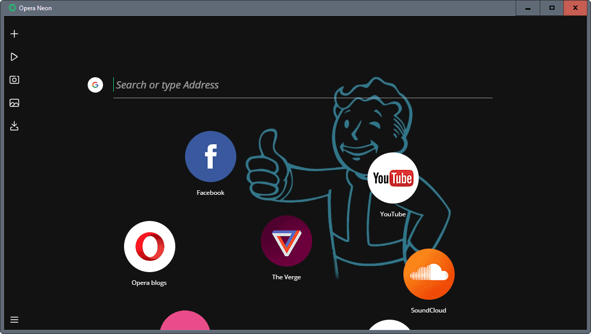
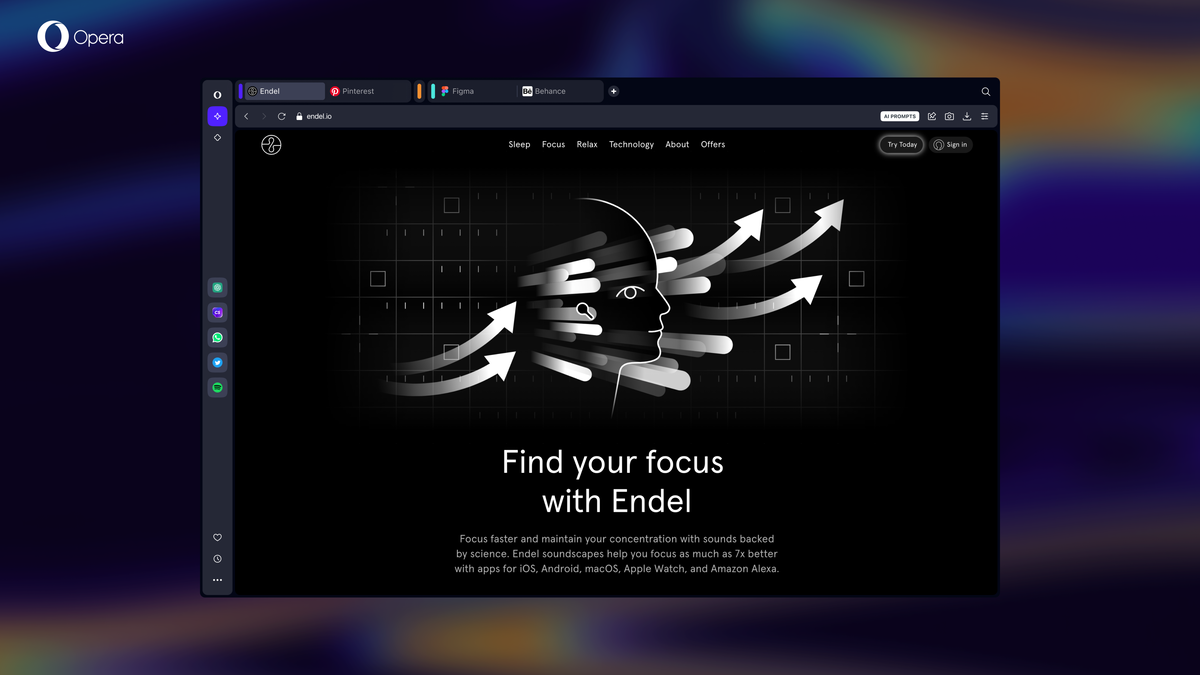
The interface that Opera Neon uses differs from that of other browsers. There is no visible address bar or tab bar for instance when you start it up for the first time.
The screen that opens uses the device's desktop background as its background, and displays a search and address field at the top, and below that round icons that link to popular Internet destinations. You can drag any open tab to the interface to create a new favorite, and remove existing links from the page by hovering over them and clicking on the x-icon that appears next to them.
The only other interface elements are on the left side in a panel of sorts. The menu is listed at the left bottom corner, and the five other icons there do the following:
- Open the start interface again to load a new address or one of the favorites.
- Player, a media player.
- Snap, a screenshot taking tool.
- Gallery, which holds previously created screenshots.
- Downloads, the downloads history.
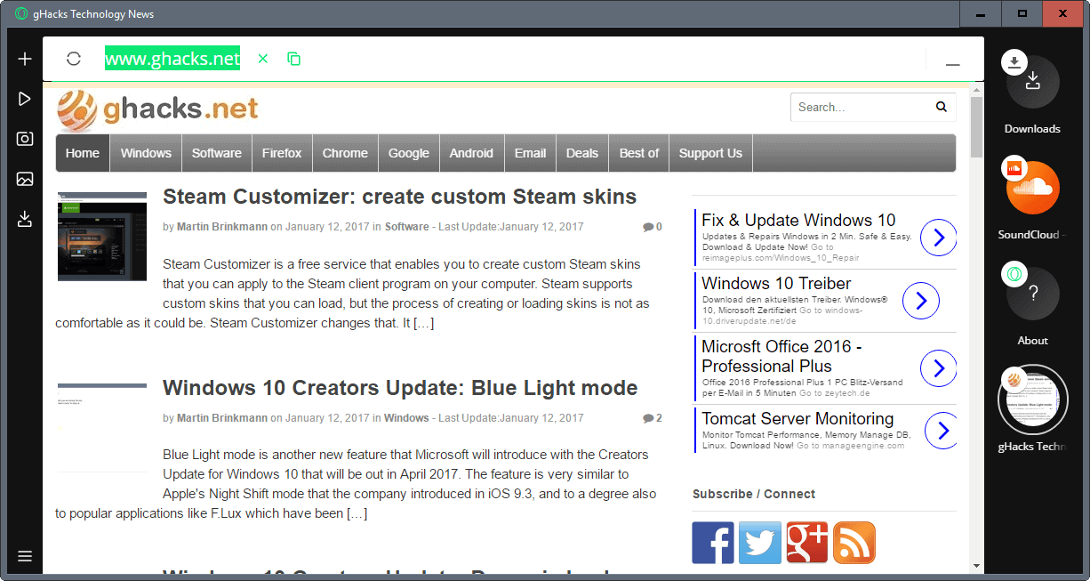
Sites that you load open in an overlay on the screen it seems. Once you open at least one site, you will notice that tabs are displayed at the right side of the Neon browser window.
The browser's focus is a representative icon for the site, and not the site's title.
Opera Neon uses an "intelligent system" that manages tabs automatically. Often used tabs are pushed to the top, and less often used tabs are moved to the bottom.
The browser supports several other features of interest. Videos that you open on sites like YouTube are picked up automatically by the Player component. You can click on those videos to use the video pop-out functionality of Opera Neon to watch the video while browsing other sites in Opera Neon.
Opera Neon supports a split-screen mode that allows you to display two pages next to each other on the screen.
Settings are provided, but they are limited. While you get most of Chromium's settings, and advanced settings, that is all there is available right now.
Closing Words
Opera Neon is surprisingly fast and responsive, and it uses a different interface than other desktop browsers.
While that is interesting, you may also notice that it offers little in terms of customizing the interface. In fact, you cannot customize the interface at all, if you don't count setting a different desktop wallpaper on your device.
Neon does not support extensions, or advanced configuration options that browsers such as Firefox offer.
Considering that it is an experimental browser, it does not necessarily have to offer those.
Now You: What's your first impression of Opera Neon?










Made in China? No way, unless you doesn’t care your bank account info, your GF photo….
Offline Installer for windows:
http://download1.operacdn.com/.private/Opera_Moment_Developer_1.0.2459.0_Autoupdate.exe
Aren’t you the one who informed AskVG? Thanks a lot! :-)
User interface research is good but as expected from past experience, ultimately after playing with it for a while it’s just a gadget. Fancy appearance gets trumped by good tech and convenience features that are readily accessible. In other words, user experience trumps good looks and fancy animations.
Neon does have some focus on user experience, but the main value it brings comes from the looks. It’s good that there is research in all fields; what I’m trying to say is that it’s not something that would make me switch browser. Should an appearance be attractive enough, I would want it to be brought back to my browser of choice rather than me making the move.
I’ll still be looking how user interfaces evolve this year, sounds nice.
I really, really like it. I wish they’d bring over extension support from Opera. I’d totally use this full time if they did.
Opera Presto used to be my favorite web browser. I came here expecting to feel nothing but contempt… but this does look curious. Might have to try this one, once they get the ball rolling on some extra features.
I agree with the person who compared this to Maxthon Nitro, which was lightning fast and very minimalist. I actually really like this. It isn’t very customizable (as others have pointed out), but I do think that for the browser to function as it was perhaps intended, customization may have to be tossed out. That said, bookmarks and a bit more security (like built-in HTTPS everywhere and/or tracking protection) would be great.
I was aiming at installing this ‘Opera Neon’ when I realized the only installer available is an on-line one (2.3MB). No off-line installer for Windows OS yet made available for Macs. I dislike on-line installers, I avoid them and the software they hold as well. A pity, I would have liked to test Neon by myself.
Why do some companies make it hard (Google Chrome for instance) or impossible to find a full off-line installer?
ya, same with OneNote. i never bothered with it cuz MS never offered an offline installer…
Sounds rather like Microsoft’s Windows Active desktop from 1997. That was a roaring success.
To view all internal pages in Opera’s Neon Browser type in chrome://about in the Omnibar.
To use bookmarklets with it add your top ten as search engines. Give each one a keyword. Type the keyword in and press enter to activate it.
Example
Name: Scroll To Bottom
Keyword: sb
URL: javascript:window.scrollTo(0,99000000);
Since Neon doesn’t have a bookmark manager you can use the search engine example above for bookmarks too. I suggest you only do that to your most visited pages. It would take hundreds of hours to do it with all of them. You can also add chrome:// URLs as search engines too. :)
They don’t even have an offline installer. Bad privacy practise. Not trying it.
Try this
Windows – http://get.geo.opera.com/.private/Opera_Moment_Developer_1.0.2459.0_Autoupdate.exe
Mac – http://get.geo.opera.com/.private/OperaNeon.dmg
;-)
Are you limited to that one page for favorites/bookmarks?
I have a large number of bookmarks arranged in a hierarchy that I use frequently. The traditional tree control in a sidebar as in Palemoon or Firefox supports this very well. I don’t think this Opera Neon design would work for me.
The only way to use bookmarklets with Neon is add them as a new search engine. Type in your keyword and press enter to activate the bookmarklet, I suggest using only use your most used bookmarklets since it would take forever to add all of them. Type in chrome://about to view all of Neon’s internal pages.
Example
Name: Dark Theme
Keyword: d
URL: javascript:(function(){var newSS, styles=’* {font-family:arial !important; border-color:#111 !important; background-image:none !important; background-color:#111 !important; color:white !important;} :link {color:yellow !important;} :visited {color:lime !important;} hr {display:none !important;} input {background-color:#ccc !important; color:black !important;}’; if(document.createStyleSheet) { document.createStyleSheet(“javascript:'”+styles+”‘”); } else { newSS=document.createElement(‘link’); newSS.rel=’stylesheet’; newSS.href=’data:text/css,’+escape(styles); document.getElementsByTagName(“head”)[0].appendChild(newSS); } })();
Congrats Opera. It’s a great design concept, I really like it! Since it’s a concept / prototype it’s okay that features like add-ons are not supported.
it appears to do what a broswer shout do – let you browse quickly and efficiently
no extra rubbish like hello & pockets & extensions & addon which is no bad thing
May try it for a giggle
So it’s Opera Coast for desktop.
It’s useless without extensions
From what I read Opera Neon seems attractive, sober, elegant as a black dress.
But what about privacy, security? Caches, cookies, managed? OK, it’s a concept and as such hardly a prototype. I’m impressed.
Me too. Opera was the first to have tabbed browsing, and I had actually used it at a time when tabs didn’t exist in the other browsers. Neon sounds like a groovy concept.
@hirobo: No, Opera was not the first browser with tabbed browsing. The first browser was the InternetWorks browser.
1. Remove/hide the chrome. Check. 2. Offer one view with no customization. Check. Goal: look different from every other Chromium-based browser.
Now, I’m not saying this is a bad thing. When you’re not doing much, it’s easier to be quick and nimble. Frankly, though, this just looks like a skin/theme for any basic browser–no real need to promote it as a concept. It’s something that could be offered with Firefox as an add-on (theme and/or extension)… well, could *HAVE BEEN* offered if XUL et al were still on the table.
However, it’s good of Opera to try “new” things.
Yandex had this thing in their browser a year or two ago, at some point it even defaulted to it. They had them somehow integrated together with the main browser, because I remember the installer almost doubled its size at some point. Very basic and limited. I don’t know who these interfaces are targeted at, but apparently, in Yandex’s case, nobody liked/used it so they completely ditched it. I think pretty much everyone grasps the notion of tabs and how useful they are in the current state. It’s not rocket science and having them placed in the order that you chose (I didn’t know they are automatically sorted until I read this article, it’s not a good idea to move my tabs around, I know well enough where they are) speeds things up, a lot.
No, this is the reason why triangular wheels are still a niche.
I am a heavy user of triangular wheels. I couldn’t live without them and I can’t leave the parking with them.
Is this coming from the original Opera company or the one that got sold off to the Chinese?
It comes from the original Opera company that is bought by a Chinese company.
– Definitely agree with moving everything to the sides, or better yet, letting the user move around large UI elements such as the tab bar or the address bar. Bars or whatever these elements morph into, let’s call them blobs. Ideally, a browser would let users setup 2 customized UI: One for portrait screens, one for landscape.
Screens are too large and not high enough, so vertical UI is good for those “landscape” screens. Text is the main blocker, since it’s horizontal, and the main text user is the URL field. But ditching the URL field is insecure, I wouldn’t like a browser to remove it for all users, by default.
– Seeing the desktop background is nice too. I spent some time finding good ones, might as well give it screen time…
– I don’t like bubble tabs ATM, they feel kind of messy to me.
– I suspect Neon is fast because it has no architecture to support add-ons or customizability along with many removed parts. Otherwise Opera would have advertised a new technology and not only a new UI.
I don’t want to list too many negatives for now since I like the initiative.
I hear Firefox could be getting an important UI update this year too, or the next, I don’t know.
It’s impressive, very innovative at first look !
But I can’t imagine using such an interface for an efficient workflow.
Reminds me of maxthon Nitro
it is indeed fast but thats what you get if you strip everything the core features of a browser needs
first impression? ill give it 6/10 for now