This is the new addons.mozilla.org style that will go live soon
Mozilla plans to release a new style for addons.mozilla.org (AMO) when Firefox 48 hits the stable channel which, if things go as planned, will be on August 2, 2016.
It is rather surprising that Mozilla neglected AMO for the most part. The last major change that took place on the main hub for all things Firefox add-ons dates back to 2011.
Surprising, because one of Firefox's greatest strengths is its add-on ecosystem and the extensions that are created for the web browser.
On a personal level, I like Mozilla's Add-ons website more than Google's Chrome Web Store as it offers better filtering options.
There is a "new add-ons" and "recent updated add-ons" filter for instance to find out quickly what is new or updated, something that Google's store has been lacking for years.
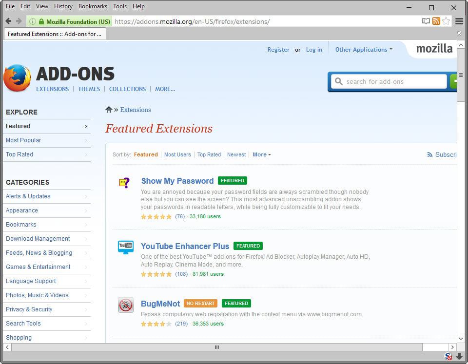
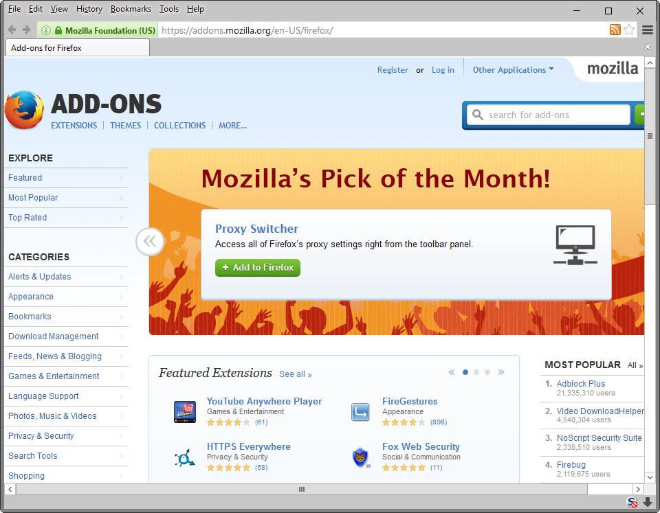
Old addons.mozilla.org design
Before it goes away, here is the old design of the add-ons website.


The new design
The new design is a restyle of the old which means that the functionality is not modified in any way. All links and features remain where they are for the most part which means that you will feel right at home once the change goes live.
Note: The style may, and probably will, change before it is released. This is a work in progress.
Here are three screenshots of the new design that Mozilla plans to launch in August.

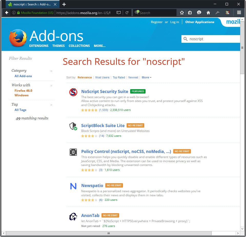
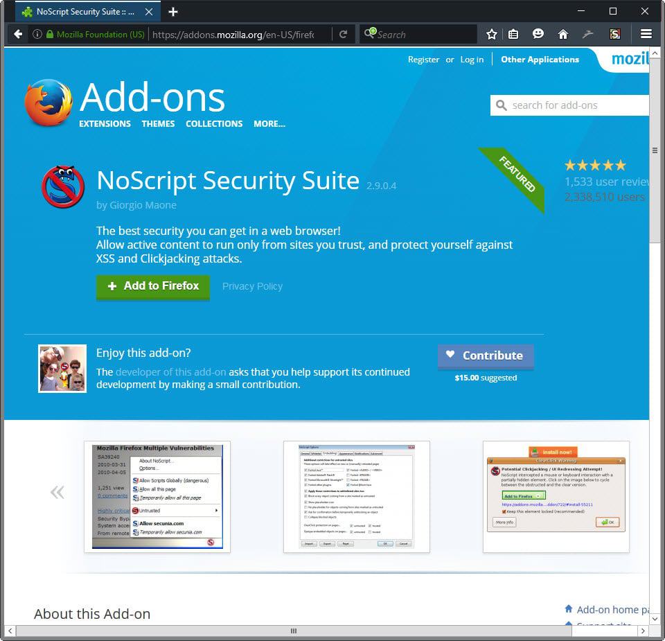
As you can see, all page elements and features are still there. Some may have moved a bit. Core changes are the color scheme that is used on the site, especially the blue header background is new.
You can open the style in an editor to list all the changes made to the site.
Test the new AMO style right now
Mozilla has made available a userstyle that Firefox users can install in the web browser to test the new AMO style before it is officially released.
- First thing you need is the Stylish add-on. Head over to Mozilla AMO and install Stylish in Firefox.
- Once Stylish has been installed, a restart is required to complete the process, you can head over to the official Userstyles website to install the userstyle.
The new AMO style is enabled automatically on your next visit of the site.
Removing the style
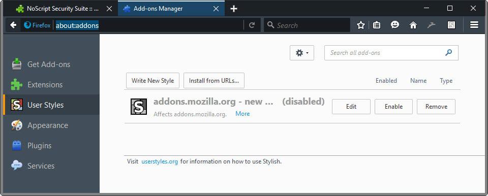
You can disable or remove the style at any point in time. To turn it off, click on the Stylish icon while on Mozilla AMO and there on the "addons.mozilla.org - New Mozilla Look" style to do so.
To remove it completely from Firefox, load about:addons in the browser's address bar, switch to "user styles on the left, and click on the remove button next to the style.
Now You: What's your take on the new style?






Somebody should go grab the current stylesheet for AMO, then post it at uso… call it Classic Theme Restorer for AMO or something (’cause you know there are going to be tons of complaints about “Hey! Where’s the old theme I’m used to? This is just too much! @#$%&*! Mozilla!!”).
Since I already know what extensions I want for a new install, I just use AOM to download and install them. It’s a lot quicker. Since AMO broke my bookmarklets with their new CSP, I go there less and less.
The blue banner seems a bit…bright and obtrusive. Otherwise – meh. It’s a stylesheet. I run uMatrix and often block stylesheets. No big deal.
Personally, AMO is only yet another form of app store that’s apparently better than other platforms in the market, such as less Internet censorship. A user still had better be careful when installing some (newly released) projects on AMO. Example, newbies often run into trouble uninstalling Yahoo Search Addon (solutions: for Mac users, https://www.youtube.com/watch?v=NHQoF0NfO6A ; for Win readers, https://www.youtube.com/watch?v=Nd9-El-ut24 ) and/or other risky addons, as there is a strong possibility that one would suffered from a hijacked Firefox.
Stylish addon? Doesn’t Firefox support user style sheets out of the box?
Yes, always has (even if some big-shots @Mozilla are now suggesting doing away with that feature… in support of forcing users to use an add-on, Stylish for example… even though that which makes Stylish work so well (XUL and XPCOM) is being removed… man, those guys @Mozilla are getting dumber and dumber).
That being said. Stylish is better, the best in fact. If you do any work with CSS/stylesheets, then you should be using Stylish.
I don’t see much difference, a bit more colors here and there but overall. I not understand why it needs to be changed, in the time they change this they had better removed the damn hello und social media crap stuff… :p
Well, matter of taste as always.
Cosmetics gives the feeling to users — and to consumers in the supermarkets — that the product isn’t old, that it’s up to date, that it remains fashion and in the race. Nowadays “old” is perceived in a negative way, everything has to be changed, always, perpetually, even if it concerns the “look” only. It’s the Gemini/Mercury symbolism (speed, short cycles) verses the Capricorn/Saturn symbolism (duration, long cycles), the Western and Eastern worlds. Hard to relax in theses conditions.
I always get confused when I see things like this. Was the old way broken? Were there a lot of complaints about the way it looked? Are there compelling new features that are being offered that will improve my ability to locate and install addons? Were there other priorities that were higher? Has anybody reviewed the bug list and made sure enough resources were assigned to fix and test solutions?
Or maybe they’re just trying to make the style more consistent with Firefox’s current UIs themselves.
Maybe there’s a limitation from Stylish but for me, to much of the site still looks like the old version.
They should also change some more things than only css.
A change from time to time is fine, specially if the good things are kept or improved. I have tried every browser and in the end, Firefox is still the one for me because of its add-ons. I fear that some of those which make Firefox unique (for me) won’t be there after the policy change about add-ons. We’ll see
Yeah, this will keep users from leaving as Mozilla slowly chokes Firefox to death.
The ‘new Mozillla look’ style, updated Feb 15, 2016, is a true cosmetic enhancement. Footer is still IMO way too thick mainly because of the .footerlogo (should be removed, takes vertical space for nothing), nonsense and annoying when using an “eternal scroll” script (even if autopagerize handles it). But overall, less squeezed, more fluid. Maybe a comparison between a Website design and office and even appartment arrangements, with the new approach (for some time now) to “compartments”, less formal, more intuitive.
I’ve removed my old home-made style for AMO and adopted this style. Nice work and nice find, thanks Martin.
Looks Ok. Good to see some productive activity from Mozilla.
Yeah, it was probably some unpaid intern’s work.