The Windows 8.1 Store is impractical
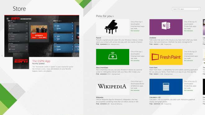
With today's Windows 8.1 preview release by Microsoft comes a series of updates to several core features of the Windows 8 operating system. Among them a store update that made the store less usable then before.
The original Windows 8 Store has deficiencies, like the impractical horizontal layout (at least for mouse and keyboard users), trial applications that are listed as free, or the colorful design thanks to Microsoft's decision to use an apps' dominant color as its background color in the store.
While it has its issues, it does provide me with important features that I require from stores. It enables me to search for all apps in the store for example, and sort them by date so that I can browse the latest apps released in store easily this way.
Windows 8.1 Store
Microsoft for whatever reason decided to change Windows Store significantly, and in my opinion, for the worse. When I open Windows Store now on a 1920x1080 resolution, I see a screen that displays seven apps to me.
The main store page lists featured apps, picks, top free and paid, popular and new releases here and while that may sound sufficient to users who are used to browse Google's Play Store or the Chrome Web Store, it is not nearly enough for me.
First, the categories are gone, at least from this screen. The only way to see what is new in a particular category is to right-click and select it from the top.
You are then taken to the category page listing popular apps, new releases, top paid and top free apps, plus an option to see them all.
So, if I'm interested in a couple of categories, I have to right-click, pick a category, browse it, right-click again, pick another category, browse it, right-click again and so on and so forth.
The popular now, new releases, top paid and top free categories have been limited from displaying 100 apps each to 40 each.
You may remember that it is possible to search in the Windows 8 store just by typing on the store front. This has been changed as well. Typing does nothing when you are on the store page unless you click first on the search form that is displayed on all store pages, or open the search charm instead.
Searches return a maximum of 1000 apps regardless of search, so that the wildcard * search that returned all apps available in Windows Store is not working anymore in Windows 8.1. Even worse: while it is still possible to sort by newest to display the most recent apps in store, Windows Store appears to not take this too serious anymore as it is displaying old apps here and no the newest apps, at least where a wildcard search is concerned.
The most likely explanation is that the limitation to 1000 apps is only returning results for those 1000 apps, so that the newest apps of the selection are displayed first. Those are however not the newest apps in Windows Store.
The results listing has been limited to two rows of apps, one less than Microsoft displays on other store apps listings and a lot less than in the original store. This is again great for touch users but not really great if you are using a high resolution monitor as you end up with lots of wasted space again.
Only the "see all" link of each category page listing lists more than 1000 apps. Every other listing is either restricted to 40 or to 1000.
Individual pages display all information directly, so that you do not have to switch between tabs anymore to display reviews or compatibility information. While that is great, it is diminished by the fact that you need to scroll horizontally now to access the information. Nearly a third of my screen is displaying white space now which could have been used to display all information directly on a single page so that there would not be any need to scroll horizontally at all.
Verdict
Windows Store may have improved for touch screen users but the display is everything but practical for desktop users. One could say that desktop users do not have many incentives to use the store anyway, as they find better desktop programs for all the things the store has to offer with a few notable game exceptions maybe. The point is, Microsoft needs to realize that the majority of Windows users are not using touch screens.
Advertisement










Would be nice I guess if it actually worked at all. Since installing the 8.1 Preview update I can no longer use the Store at all, it comes up with a white screen saying cannot connect at this time, try again later, but it never works.
No problem here–using Logitech M305 wireless mouse with horizontal scrolling enabled. In fact, I was pleasantly surprised to see the Store selections scrolling across my screen rather than down my screen (as was before). Looks like a favorable update to me.
Your immediate negativity wilt least get alot of clicks and trackbacks since people enjoy that sort of thing.
I do hope you watched the presentation demo of the store update, which explains the design reasons.
Touch isn’t prohibitively expensive anymore and its a nice complement to mouse and keyboard. Most users will purchased AIO computers with touch as standard, it will be a natural move.
We are pro users on this website but we shouldn’t let our decades old comfort zone stifle progression for everyone else.
Anyways, I’ll let you supporters rip me a new one. Thanks
I guess I should get out of my comfort zone, buy a 30″ touchscreen monitor and use windows 8 with all the glorious touch “future” to work.
GLORY TO MICROSOFT, OBEY!
Limiting usability for no reason isn’t progress.
As for touch screen prices, I’ve been browsing for a new laptop for my sister. It so happens that in case of two models where the only differentiating factor is that one sports a touch screen and the other one doesn’t, the former is 70% more expensive.
Let “everyone else” revel in this so called progression, but do explain to me why would I ever want a touch screen interface on my desktop PC with a 27″ screen that’s more than 70cm away from me. It’d be awesome if you could also present me with a scenario where full screen apps, the new start screen etc. benefit a server administrator using the newest Windows Server OS.
Touch is impractical on desktop systems, at least in its current form.