YouTube launches new centered layout: does away with sidebar menu

If you have visited YouTube today, or have been part of the beta test of the new site layout, then you have probably noticed that quite a few things have changed on the popular video hosting platform.
The two major changes of the new layout are that the sidebar menu is not displayed permanently on the left anymore, and that the layout is now centered and not aligned to the left site anymore.
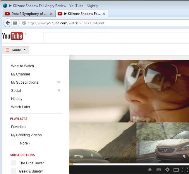
If you are signed in when you visit YouTube, you are taken to the What to Watch page right away that offers a mix of popular videos in the country you are living in, and below that the latest subscription updates.
The sidebar menu is still there, but Google has moved it behind the menu button next to the YouTube logo at the top left corner of the screen.
When you click on it, the full sidebar menu is displayed to you along with all the links that used to be displayed permanently on the left on YouTube.
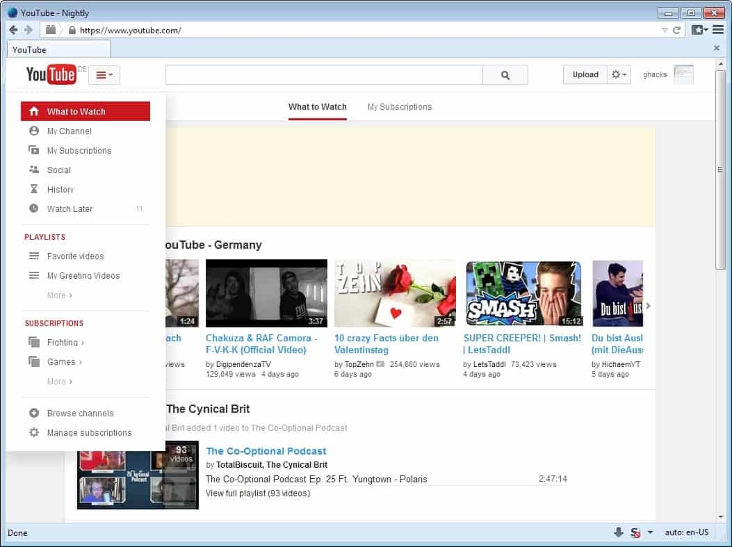
This includes Playlists and Subscriptions, as well as links to watch later, your history or your channel.
Here is a list of direct links that you can use to open these pages directly on YouTube without having to go through the menu to do so.
- Your Subscriptions: http://www.youtube.com/feed/subscriptions
- Manage Subscriptions: https://www.youtube.com/subscription_manager
- Your social feed: https://www.youtube.com/feed/social
- Your viewing history: https://www.youtube.com/feed/history
- Watch Later listing: https://www.youtube.com/feed/watch_later
- Browse channels: https://www.youtube.com/channels
- The YouTube dashboard: https://www.youtube.com/dashboard
- YouTube account settings: https://www.youtube.com/account
The channel page two has been updated. The main channel page still displays the channel owner's recent activity, upload, related colleagues and channels, and other information, but also links to the new playlists and video pages.
What appears to be rather strange is that the "all videos" listing only lists most recent videos by default, and that you need to click on the "all videos link" after scrolling horizontally for some time to get to a page where you can view all uploaded videos.
Closing Words
The new YouTube layout puts the focus on videos by removing the sidebar menu from view for all users. Users who have used the menu regularly to browse specific contents on YouTube will have to click more to do the same.
What's your take on the re-design of the YouTube website? Is there anything that you like in particular or dislike?
Advertisement


Why can’t I scroll down my left sidebar. When I try, everything moves up or down. It worked a few days ago, and now I can’t scroll down to see all of the channels I subscribe to…Not sure what is going on. Help
Why TF couldn’t they just leave it alone!? I can no longer scroll my subscriptions to see, at a glance, which channels has new posts or not. Making things less efficient is not good design. It’s stupidity!
The tree bars button does not work, all it does is move rest of the page little right
This is bloody awful! I have over 70 subscriptions and have to click ‘more’ to see them all rather than scroll down? Ludicrous! Who makes these changes? I’m on a 24″ monitor and high resolution so have plenty of room.
This new change makes it look like some kind of children’s app. Disgusting. Leave things alone for a change.
This is crap. Change for change sake. The option to permanently lock the sidebar in view should be there. I get things the way I like and some bored coder thinks he/she knows better. This is crap.
Don’t like the design. Should have had an option to pin the menu or collapse/expand with a side arrow. Some redesigns done for portable devices or just redesigning are not user friendly, they are user forcing. Allow for at least three outcomes, happy with new design, beholding to the old, wanting a flexible choice akin to one or the other with a compromise of design. But this is Google at the core, and if you can’t get sort in Gmail interface after years of consumers asking, what hope do you have for Youtube.
Why not just have an option to lock the sidebar like the old one, or keep the old layout with a hide sidebar option? This new version is utter garbage. I could not care less about the whole “centered theme” thing, I preferred the old version infinitely more than this. 0/10
How about an option for locking the sidebar on, maybe a check-mark on the bottom of the bar? I found it much more convenient to have it locked there, and I couldn’t care less about that “Centered layout” of this new one.
Update=
0/10
A few of my subscriptions do timely contests and one has to know when a video us uploaded to get to them on time. I relied on that left hand menu to show me when my subscriptions had a new video uploaded. I must admit I detest change. It’s like grabbing for sugar for one’s tea and getting a tube of toothpaste. I realize they are a business and need to keep their business profitable however I am still upset that this free service moved my menu without giving me a way to set it old style.
Not a fan of websites who can’t make up their mind/keep still.
Hopefully there is/will be a greasemonkey script to revert back.
Personally I’m increasingly using my tablet on the web; at least on tablets/phones we have the choice to not update the app.
Too many “suggested video” ad banners on the mobile app (ad blocker seems to work on the web version). Also have to do a few more clicks to see the video lists for channels I am more than 10 videos behind on. Which is a little annoying but meh
What the hell man… I had just become comfortable with the old layout, and i liked it.
This new layout is TERRIBLE.
I also have to say that it doesn’t seem as user-friendly as it once did either…
Absolute garbage. I’ve always hated “mouse-over, move mouse horizontally perfectly or the menu closes”-style menus because the god damn menus always fucking close on me unless I mouse over as far right as I can and then move it 2 pixels right to get to the next pane. It’s like playing those games where you have to keep the mouse inside the lines to reach the objective, only the objective is the channel I want to browse!
I wish they’d bring back the old sidebar where you had a scrollable, albeit small list box of subscriptions so you could quickly go to the channels you’re in the mood for to see the latest videos. Now I’m just annoyed every time I go to youtube and watch to see who has new content for me. Sure I could browse ‘My Subscriptions’ but some channels push so much content that I have to scroll multiple pages to find a video uploaded the day before.
I find my self saying ‘Google, wtf were you thinking’ more and more these days… They really need to get their shit together and start doing some proper QA before they do stupid crap like this. Everybody remember when they moved quality and annotations into a popup? It was bad enough when you had to change both every time you loaded a video, now I don’t even bother and just watch videos in 480p with boxes and text strewn across the fucking screen! Before people start calling me lazy, I don’t watch regular TV, Youtube is one of my primary sources of video entertainment and when you’re changing quality and annotations after every 5-20 minute video, it gets really fucking annoying. Especially when you’re a programmer and know how NOT to design a tedious UI(Remember settings and use as few clicks as possible, something which Google seems to regard as witchcraft).
With this new update i cannot seem to get rid of video’s in my feed, like stuff i don’t want to watch or stuff I have watched.
It is pretty annoying right now.
Just use this:
YouTube Options by SPOI
* http://bit.ly/19wGDQ2 | The “Google’s okay with it” version (in the Chrome store)
So if you don’t need the downloading thing, then by all means use the Chrome store one ’cause it’ll work even after Google stops allowing apps not downloaded from the Chrome store to be installed in Chrome.
Of course, you could use a Chrommium-based Chrome look-and-act-alike like the IRON browser or the COMODO DRAGON browser, which will always allow non-Chrome-store apps to be installed via the old drag-the-CRX-file-onto-the-extensions-page method (that Chrome is has done away with, or soon will… I’ve not kept-up).
Using YouTube Options, you can make YouTube look and behave pretty much any way you’d like; not only now, but also once the new YouTube layout finally rolls-out to you. SPOI is updating the app all the time: did it again just yesterday, in fact.
Sadly, the SPOI dudes are self-important, arrogant, draconian little pissants who can’t be told anything or worked with; are easily offended; think they know more than someone who’s been in IT literally twice as long they’ve even been alive, and don’t respect their elders.
But, hey, they sure are good programmers! [grin]
I could not more strongly recommend YouTube Options. It’s best-of-breed. Nothing else out there which purports to do what it does even comes close.
Sadly, the SPOI dudes know it, and ACT like they know it, thereby making them insufferable.
I can’t wait until they age into greatness being EXPECTED of them, instead of it marveling people because they’re so young. Once that happens, they’ll grow-up in a big-assed hurry. I was a prodigy once, myself, so I know.
Don’t worry. Their time’s coming. Tick, tock.
__________________________________
Gregg L. DesElms
Napa, California USA
gregg at greggdeselms dot com
Veritas nihil veretur nisi abscondi.
Veritas nimium altercando amittitur.
I got rid of my Youtube account. I didn’t want to but it’s not worth having if you also have to have a Google Plus account. :(
So now I need to do 2 clicks to see what’s up with my subscriptions? Stop trying to “mobile” everything google. A desktop site is a desktop site. I have 1280×720 of real estate to use.
I feel web design is going backwards these days as it now takes more clicks to get to my information.
Make a separate mobile or tablet site if you want to do that. It’s not hard to check for the user-agent.
Could not agree more
Agreed, agreed, agreed, Dan!
Wait… did I say I agreed? Can’t say it enough.
__________________________________
Gregg L. DesElms
Napa, California USA
gregg at greggdeselms dot com
Veritas nihil veretur nisi abscondi.
Veritas nimium altercando amittitur.
You Tube is a necessity for me. Google+ pages are never looked at, contain all duplicate material that you’ve already got on the YouTube menu of “Likes” and “Comments” and “Videos.” A total and complete waste of time to have it all repeated on Google+. Since you have to have a Google+ page to have a YouTube page, why doesn’t Google try to make it a little easier to understand the settings, provide more information on their forums to their users, and try to make it a user-friendly place. If they want to compete with FB or Linkedin, they are going to have to do a better job than this. To me it is useless. How about working on the actual videos you let people upload to YouTube? I’d say 1/3rd of my videos never or can’t appear in full screen mode, all the junk at top and bottom cut off the videos is again useless, and there are many times they just don’t play no matter what you do.
It’s become a pain in the arse to watch videos you are interested in and connect you with friends you have known for years through these interests. I really want my INBOX back, and my FAVORITES. Knew I should have converted them months ago. Google, you are a #FAIL in this social media genre. Give it up!
#IKNOWTHATFEELMATE Indeed. Google should REALLY give up on the social media business. THIS COMMIE-LIKE MADNESS HAS TO STOP!!! SIGN THIS PETITION NOW!
https://www.change.org/petitions/youtube-users-get-rid-of-the-google-youtube-connection#share
I WANT ALL OF MY FAVORITES BACK. not pleased at all!!
fucking terrible
I totally agree ! ! !
It sucks how my favorites are cut down to 100 videos.
The worst part of the layout is that the main menu bar thing on the top cuts off the top of the video a little bit. It also covers up a little bit of the Channel’s banner and display picture.
youtube has gone Big Brother and now requires your CELL PHONE number to open a youtube account.
What’s up with that?
Seems like only a few sites still let you post freely, such as ENENEWS (highly recommended.)
It is the worst to date. All of the new layouts have been worst to date since they started going from 2008ish?
THEY REMOVED ALL FAVORED VIDS OVER 100 – THERE’S A CAP NOW ?????? I CANT FAVOR MORE THAN 100 VIDEOS?????? WTF
I am a regular Youtube user and I guess I am in the minority here, though I sort of like it (my first impressions, anyway)
it seems “cleaner” to me … and I have seen alot of sites/programs go with a “Windows 8 style/’feel” ” and hated those … This layout change i like so far
Can they at least leave the filter subscriptions search on the sidebar so i don’t have to look through all my subscriptions to find someone.
It’s worse than the previous one, but It’s alright in my opinion.
Can’t really pinpoint it, but there’s just something a little off about it.
The new layout is pure garbage!!! They do this to annoy people!!! Its like Google + you have to have it… NWO
i like it. i’m just a very casual youtube user, i don’t upload stuff and i’m not even subscribed to any channels. i don’t need a menu that’s in-my-face and i’m happy with a simpler layout with more focus on the video itself.
for power users though it’d probably be more convenient to have an always-open menu, but i’m sure that at least on firefox there are addons and userscripts which can help out here.
It’s absolutely AWFUL . Isn’t there a way we can express this ?
Google: U MAD, FAGGOTS?
The word is ” angry “, not ” mad ” . . . . ignoramus.
And yes, I’m pissed at the new Youtube format or website, whatever the hell you want to call it.
TO: Greg
“Faggots?” Really? What… are you 12?
And have you been living under a rock, or something? You don’t see the socio-political trending? You still think it’s okay to use words like that? And/or to be a homophobe? I’ll bet you “gay” as a pejorative, too: As in, “that’s so gay.” Where have you been? How can you be so clueless?
And that’s just the “keeping-up with the times” argument. You don’t want me, trust me, to launch on your regarding the inherent morality and/or ethics of hating the LGBTQ community. And that’s coming from someone who’s straight.
Get a clue, Sparky. Find other words. Be compassionate. Remember The Golden Rule.
And, oh… by the way: Shame on you.
__________________________________
Gregg L. DesElms
Napa, California USA
gregg at greggdeselms dot com
Veritas nihil veretur nisi abscondi.
Veritas nimium altercando amittitur.
TO: Gregg DesElms
Free country faggot
obnoxiously stupid. can we get the old 2007-era Youtube back?
Yes. Give us the old YT back P-R-O-N-T-O pronto!!!
PLEASE!
It’s shit
#truth
True that.
I don’t like the “popular videos from [a YouTuber’s] country” being at the top on the What to Watch page because some YouTubers view that as annoying. I also suggest an option to load a user’s choice of a page on the sidebar that will load if signed in to YouTube.
Okay first they took away the channel grouping which they could have made it save locating and be able to be exported like the way sub lists can be exported now, I can live with out that but when they take out the side bar menu to make it more like this I wish that they just give the reins back to the users and give the channel grouping back to us even if we have to export the list to keep it if we go to another pc.