Windows 11 Start Menu is getting a new layout to organize your apps
Microsoft loves to tinker with the Start Menu, but most of the changes that it made have been rather controversial. Now, it appears the Windows 11 Start Menu will categorize your apps in tiles.
Wait, Windows 11 already supports folders in the Start Menu. So, how is this new? Well, no, the upcoming change is not related to the Start Menu's home page.Instead, it changes the appearance of the "All apps" screen.
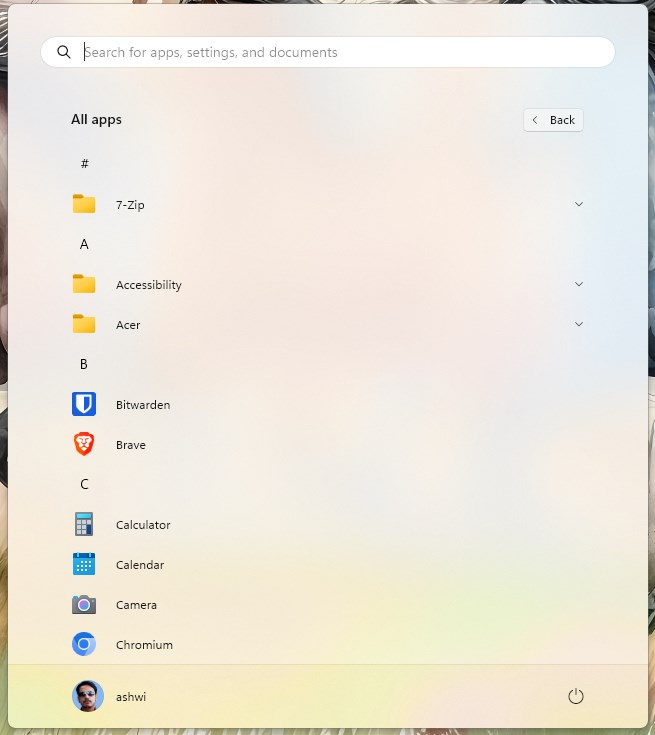 This is what the All apps section looks like today, it is kind of clunky, because it lists all your apps in alphabetical order, and you have to scroll down a list to get to a specific app. There is no keyboard shortcut to jump down the list quickly, if you type something like the first letter of an app, it simply inputs the text in the Search Bar. That said, finding an app via Search is the fastest way to locate it.
Windows 11's Start Menu will categorize your apps automatically
Here is a screenshot of the upcoming style, courtesy of Windows Latest. The Start Menu automatically categorizes the apps, by type. This change was spotted by PhantomOcean3 nearly a month ago, you can view a demo of it here. The leaker has also shared a demo of the new style, which you can watch here.
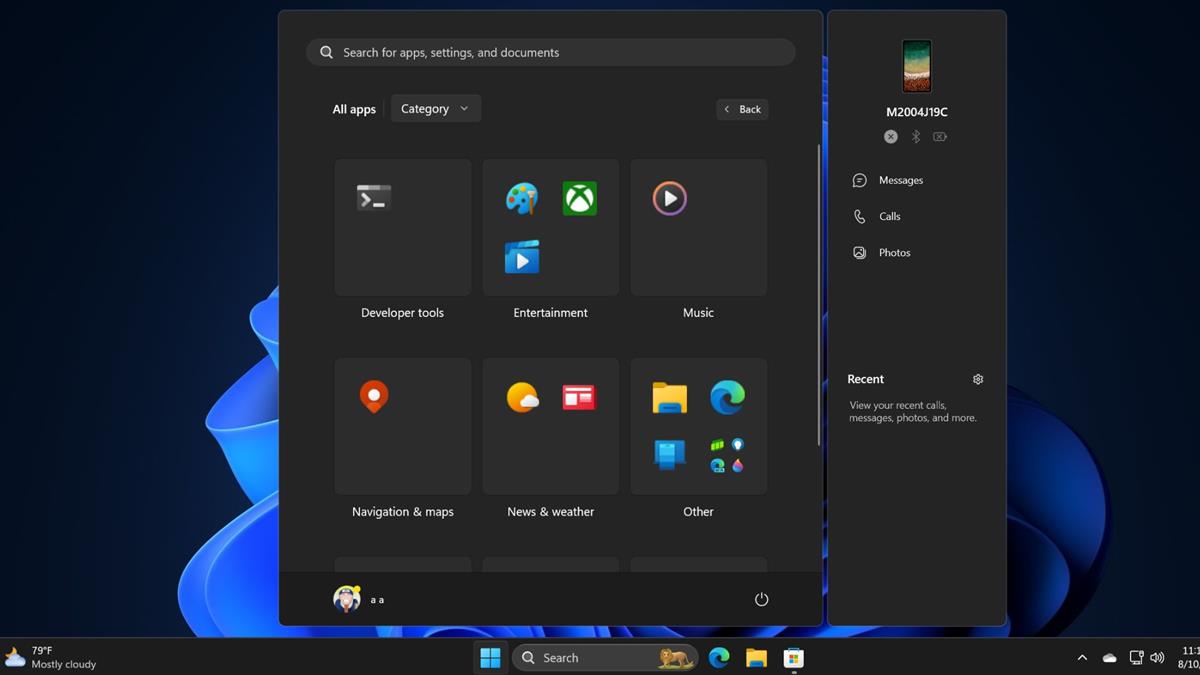
The new layout looks similar to live tiles that were present in the previous version of the operating system, but it is unclear whether these Categories will offer a richer experience, such as an unread badge counts for apps.
The auto-categorization of apps is nice, but the organization could be improved. For example, some apps are placed under a tile called Entertainment, these include Paint, Movies & TV and the Xbox app. But the Music app is placed in its own section, that's a bit odd. It would be nice if Microsoft allowed users to personalize the selection, similar to how we can customize the folders on the Start Menu's main page. The new layout offers a slightly better view, but the app labels, i.e. the names of the programs are hidden. One interesting thing about it is that clicking on an icon instantly launches the app, without opening the folder. It does require you to scroll down the page, but it's still a marked improvement over the current state of the list, but that's not a very high bar.
Microsoft is also testing a Grid layout for the All Apps page, which will group the apps by the first letter of their name. That's not particularly useful, as you would still need to scroll down quite a bit.
These changes to the Start Menu are being tested in the latest beta version (Build 22635.4010) of the OS in the Windows Insider Program, the feature is not enabled by default, which seems to suggest that it may not be the final design. The new layout could be available as part of the Windows 11 24H2 Update that is reportedly releasing this Fall.
In my opinion, the Category view sort of looks like the home screen on a mobile device. In fact, this is exactly what the iOS App library looks like.
What do you think about the automatic categorization of apps? Does that make the Start Menu better to use?







Create your very own–individually personalized–Start Menu using these 2 locations:
“C:\ProgramData\Microsoft\Windows\Start Menu\Programs”
“%USERPROFILE%\AppData\Roaming\Microsoft\Windows\Start Menu\Programs”
The most important update to this article should be: “How do I disable this?”
I do not think you can, but you could ignore it.
They need to stop nick picking with all of these pointless variations and simply give us back what we had with Windows 7. A usable desktop interface that may be customized.
Amen.
@Ashwin
Click start, click all apps, then click on the # character I see at the top of your list.
(Or what alphanumerical character is first in your all apps list)
That is the shortcut to navigate all apps quickly.
How many people do MS have working on this? Did they spend two billion dollars over 20 years to come up with this as the end result? I guess it doesn’t matter when you have a cash cow like Windows which extracts a computer tax from the world every year whether anyone likes it or not.
Bring back the Start Menu.
We hated the Start Screen when it was fullscreen in win8 and in 2024 we still hate it even if it no longer occupies the whole screen.
It’s time to let go of the entire Windows 11 UI and UX team. This is a group of incompetent individuals with no understanding of their tasks. When will new features that users have been requesting since Windows 11’s initial leak be added to the taskbar and start menu? Imagine if Microsoft had developer with any common sense.
If they like to mess around with things, they should fix that Windows 11 taskbar that’s all stuck
Why don’t they just bring back the Windows 10 start menu? Why did they even replace it with this abomination that they keep fixing?
Compared to Windows 9x/ME/2k/7 The W10 start menu is not good.
I don’t consider those menus significantly better than what W11 offers. W10 is perfect.
@Anonymous
Wrong, you could extend the functionality of previous OS start menus with 3rd party apps and make them vastly more useful. The Windows 10 one is not “perfect” by any means. It also has a vomit inducing animation which I couldn’t get used to after 5+ years of use.
You can turn off animations. I always turn them off.
Windows 8 all over again
Windows hasn’t stopped being garbage since Windows 8.
8 made it ugly and hard to use.
10 made it somewhat easier to use, but just as ugly.
11 made it slightly less ugly, but even harder to use.
Like going one step forward and two steps back.
While at the same time, Microsoft keeps stripping features and freedoms away from Windows, each version becoming less and less customizable. Like how they removed the Default Programs feature where you were able to set up which program opens which group of formats with one click, now it takes 20 clicks and it’s still not done.
Windows is garbage, people need to move to Linux. I was afraid for so long to move to Linux, because my previous attempts were failures – I couldn’t even get my drivers working properly, but now Linux has become so easy to use, I was surprised that I was able to make everything work, now I can’t imagine going backbl to that gilded cage Windows ever again.
Right now, I only watch from the side how Windows crashes and burns as it gets worse and I find some amusement seeing people complain about it, but never making the jump to Linux and acting like Windows is the only option when all they do is just watch stupid videos and play stupid games.
Quote: “This is what the All apps section looks like today, it is kind of clunky, because it lists all your apps in alphabetical order, and you have to scroll down a list to get to a specific app. There is no keyboard shortcut to jump down the list quickly,…”
I find that it isn’t so bad. You can click on any of the letters A-Z that serve as “headers” in that list, and a keypad-style list appears which you can use to jump further down. It reminds me of the old press-and-pop address book my grandmother used to have beside her phone.
Because of that, I prefer the current layout over this new design with the automatic categories.
In XP and 7, you had the same, except everything wasn’t oversized because their target audience then wasn’t imbeciles with 2 seconds attention span.
Nobody made a problem out of it back then, it was considered the good period, now it’s a problem, because their own UI developers are mentally retarded imbeciles who think everything must be oversized.
Agreed. Alphabetical order makes sense. I don’t trust how Microsoft would group apps. Who makes the call over there?
Uglier and uglier. Takes over the whole screen. But Windows 11 is like that. MS seems hell-bent on pushing people to Linux.
moreover Windows no longer attracts users in favor of Linux or Mac OS since the end of Windows XP and Windows 7 so I bet that Windows will disappear For all the PCs in the world and will no longer be mentioned in the PC market share in the next century of the earth
OMG, another W10 feature that comes back! And again the taskbar can’t be moved to the top, simply hilarious of course! Thanks for the article! :]
MS should just let the end user set the way the system looks, and only make changes to the OS that will fix issues. Haveing a default look is fine but why waste development resources changing it when there are other things that could be fixed that would actually make the OS better.