A look at File Explorer's Dark Theme in Windows 10 version 1809
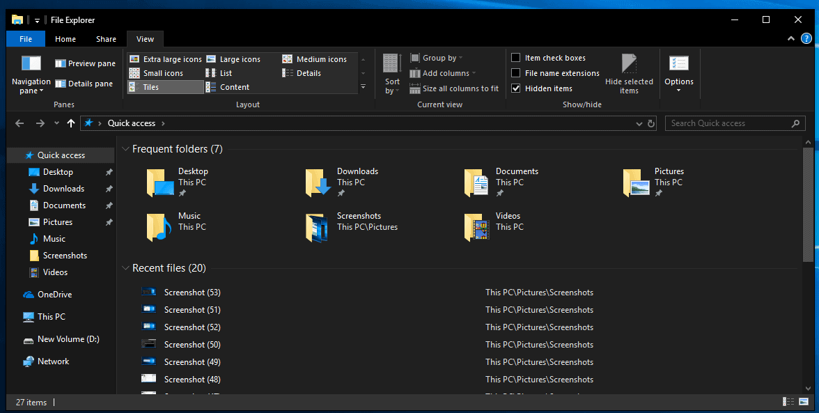
Microsoft plans to launch a dark theme for the built-in file manager File Explorer in the upcoming feature release for Windows 10.
Windows 10 version 1809 features an option to turn on dark theme support for File Explorer which changes the default light theme to a dark one.
Dark Mode has been available in Windows 10 for a while but enabling the mode did not apply to File Explorer. One of the top user requests of Windows Insiders was to add a dark theme to File Explorer.
The implementation was technical challenging as File Explorer uses legacy user interface frameworks that can't take advantage of dark mode APIs that UWP apps have access to.
File Explorer's dark theme

First thing you may want to know is how you enable the new dark mode in File Explorer. There is no option or indication in File Explorer itself that it supports a dark theme as it is controlled globally in the Settings application.
In other words: you enable dark theme support in the Settings and any application that supports it will switch to its dark theme automatically.
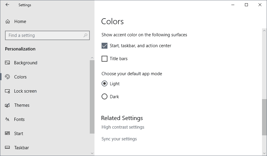
Here is how that is done:
- Use the keyboard shortcut Windows-I to open the Settings application. You may also click on Start and select Settings there if you prefer to use the mouse.
- Go to Personalization > Colors.
- Scroll down until you find the "choose your default app mode" section.
- Switch it from Light to Dark.
The change is immediate. You will notice that the Settings app loads its dark theme and that any other application that you run that supports the feature does the same.
When you open File Explorer afterward it is using the dark theme as well automatically. The dark background, from pitch black to dark gray, is used throughout the interface. Microsoft uses light gray colors for text currently and uses the same icon sets as in light mode.
An earlier preview version of File Explorer's dark theme used darker colors but Microsoft decided to change that initial color scheme to a lighter one based on user feedback from Insiders.
Windows 10 version 1809 will be released around September/October 2018 if Microsoft's schedule of releasing two feature updates per year for Windows 10 holds. (Too many? You decide)
Now You: Do you prefer dark or light themes? What's your take on Microsoft's File Explorer implementation?











Thanks. It saves my anxiety
OMG ! Even I…the most electronically challenged person alive, was able to follow your instructions and got what I was hoping to change immediately ! THANK YOU !! You made my day! Best wishes, Stephanie
Thank you so much. The black and white was killing my eyes.
Should have been done over 20 years ago. Those who do not understand have never been to light controlled high end graphic workstation rooms. Since PaintBox days nearly 30 years ago all pro graphic sys have black backgrounds. You are used to staring into a flourescent light box, your monitor, and after a few hours your eyes are dead. With black theme modes the work is much easier and can last longer. Not to mention less flicker. Or battery saving on laptops. Or many other benefits.
In future people will laugh at people staring into light boxes (monitors) for hours everyday and will say what morons. There are black (other color themes) theme forums for years with thousands of dark/black/color themes for years. Millions have been using them for years. Almost all my softwares are dark theme-able. On android, Substratum with tens of packages, like PitchBlack, turn the whole OS and major apps to chosen colors. If this is new to you, you are not very computer savy. Even if you can do half the languages I have coded in. Or a fraction dozens of graphic packages I used in big commercial projects.
The problem is this is too little too late. A true black or dark theme like the ones millions of use, applies not only to file explorer but other OS & GUI Kitlibs panels too. Coders joined the Black theme years ago after graphic workers as seen in sublime edit/atom/MS Visual Studio themes testify. instagram.com/worldcode/ and instagram.com/programmerrepublic/
Looking at a lightbox fr hours everyday is prolonged self torture. I will stick to my current black theme, this by MS is nowhere near good enough. Get extension “Dark Reader” for Chrome browser too. Good luck staring into a light half a day.
The entire “flat look” GUI is awful, in any bloody light or dark theme as far as I’m concerned.
Another example showing that MS has no UI/icon designers left. No one else does a black dark theme for a reason, it’s looks rubbish, hence everyone else uses shades of grey. As for the icons, just terrible.
It’s at least 1 more step in the right direction. Still trying to catch up to the XP/7 theme engine and advanced colour options though. Not near enough though to compare to my Win7 Placebo Ashtray setup. I’m a big fan of Photoshop-type dark grey. The pure black has too much contrast, so am very pleased with their choice of the dark grey instead. It would start to get close to catching up with XP/7 if/when they made the colour customizable – i.e. not just Light or Dark.
You’re absolutely right. Too black, too much contrast. We should have the possibility to customize from black to medium grey.
So much negativity…
I actually like it!
As others have pointed out, in my opinion this looks horrible. It’s below the level of some 3rd party themes available on DeviantArt (and these people have to work inside the boundaries set by Microsoft, while MS can change much more). Seriously, the colors are too dark, it doesn’t fit with the rest of the interface, icons look horrible. Very unprofessional, looks like a personal workaround rather than a new feature implemented by the developers.
Totally agree that this just is not sitting right……….new icons are needed, and a careful redesign that blend and balance well.
But honestly, why are MS even wasting time with this sort of thing. They have so many real issues to deal with regarding the abysmal quality of their updates, that this just seems mad to me to muck about with stuff like this.
Still on 1709 since VPN and miriad of other things don’t work on 1803, except telemetry, that always worked fine for MS. Congrats to you on being a MS fanboy promoter.
I think it looks chaotic. Too dark. The icons clash badly with it too, they need a whole new imageres.dll with icons suitable for a darker theme. That screenshot basically burns holes in my eyes. Blergghhhhh. Very unprofessional looking.
This is such a low quality effort, it’s hilarious: imgur.com/a/yIs6Hf0
All Microsoft had to do was to give the Classic theme hardware acceleration. Nothing more. Instead they decided the wheel could be better if it wasn’t circular. I’ve seen kids on deviantart with zero qualification doing better than this.
I prefer dark, but the built in file browser is far t unstable to use regularly, so while this feature is desirable, it won’t really effect any of us techy folk who use more capable and stable 3rd party file browser.
what is the one you use ? or the best one please, i’m interested to use a 3rd party one
explorer++