Chrome's Device Mode feature: emulate mobile devices quickly
As a webmaster, you not only have to make sure that the right contents are displayed to desktop users but also that mobile users are served correctly.
This can be a big issue considering that you cannot possible test all possible operating systems, browsers and screen resolutions these devices use, at least not without emulation or some software help.
One of the things that you want to make sure of is that the website displays fine regardless of screen size. It should display fine for visitors browsing the web with Apple's Iphone 5, with a Google Nexus device, a Windows Phone or an Amazon Kindle.
Google Chrome's Device Mode, available in Chromium as well, provides you with the tools to quickly emulate mobile devices in the browser.
One application is to make sure that the screen displays fine on the device, another to find out how well contents are delivered to the device.
Note: Release versions of Chrome may lack some Device Mode and emulation features. These features will be made available eventually however.
Start Device Mode
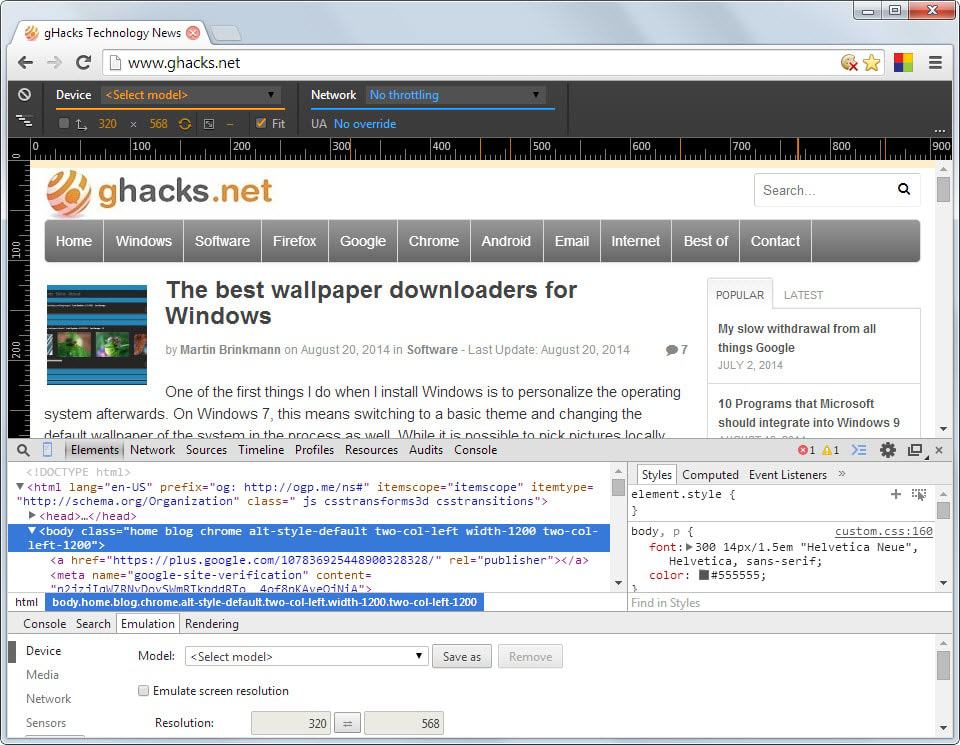
To start device mode open the Developer Tools first. You can do this with the shortcut Ctrl-Shift-i, or by clicking on the Hamburger icon, and selecting More Tools > Developer Tools from the context menu.
Here you need to select the device mode button which you find listed at the top left corner next to the inspector icon.
Once done, a new menu is displayed at the top, and you will notice that rulers are displayed vertically and horizontally as well.
You can use the device menu at the top to select a particular device you are interested in. Chrome will automatically modify the page to fit the resolution (which you can disable if you want).
Besides options to quickly switch between different devices, supported are a couple dozen devices, specific and generic, it is furthermore possible to enable network throttling to emulate slow connections, and to modify the user agent which is automatically changed when you switch devices.
Depending on the site in question, it may be necessary to reload it for proper results. This is for instance the case on Ghacks where I had to reload the page to display the mobile version of the site.
Another interesting option is the ability to quickly swap screen width and height to emulate landscape mode as well.
You can find out more about other features of Device Mode on the official Chrome Developer website.
Conclusion
Device Mode offers an excellent way of testing how website contents are displayed in various emulated mobile devices. It can be used to quickly test if the mobile version of a site works as intended, or if changes need to be made to display contents better to mobile users.








Funny, I’ve used the “inspect element” feature heaps of times, but never noticed that you could also emulate certain devices
Firefox has a similar feature called “Responsive Design View” (more presets for that mode can be added via the addon “More Display Resolutions”) that works best when used together with the extension “User Agent Switcher”, all minus the touch emulation.
That’s great to know, thanks for the tip!