Get a sneak peek of Firefox's New Design
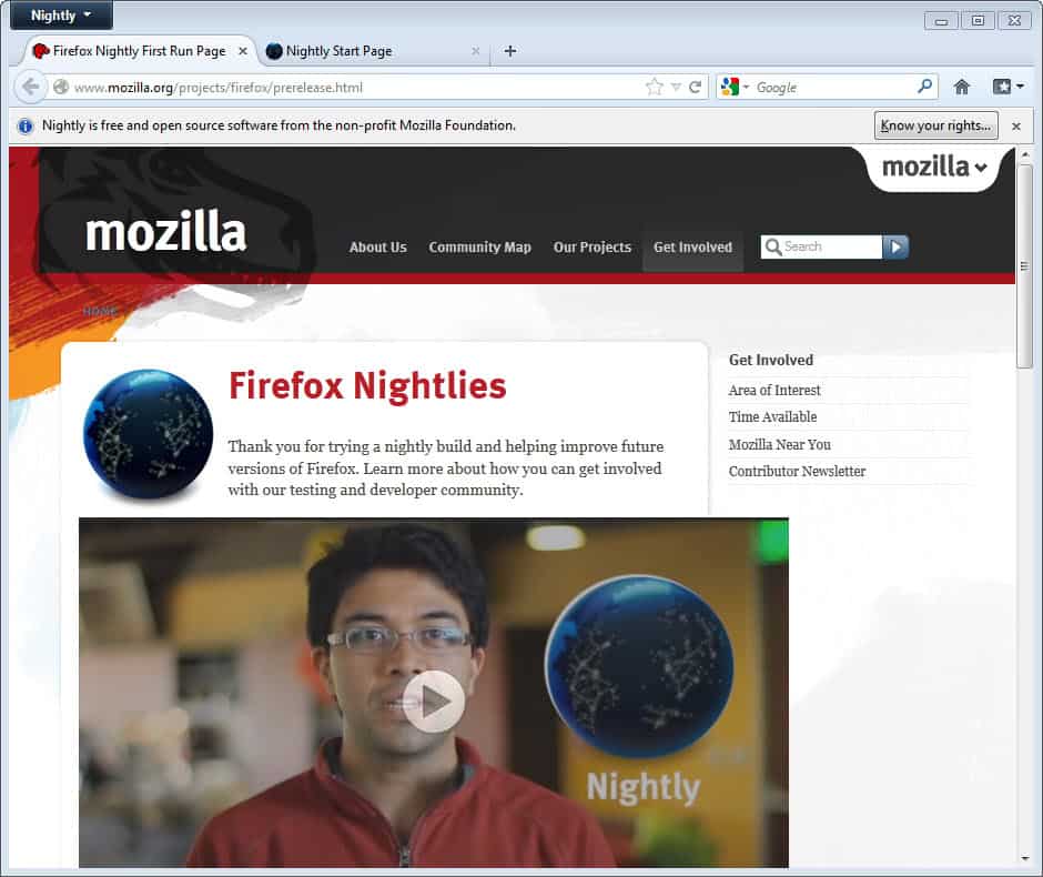
If you are following the development of the Firefox web browser you have probably noticed that some Mozilla designers are currently working on a new design, or refresh, of the browser that they call Australis. Up until now, mostly screenshots of the new design have been made available on designer blogs, while some smaller changes have already been implemented into recent versions of the web browser.
Windows users who'd like to get a feel for the emperor's new clothes can now download an alpha version with the design elements enabled. Firefox Australis is available as a portable version and installer, courtesy of Mozilla engineer Jared Wein.
When you look at the changes you will immediately notice many of the toolbar changes that the new design ships with. Most prominently are probably the tabs which now use rounded corners instead of rectangles. When you look at the address bar you will notice a number of changes. First, there is only a back button available, and the address field has been moved almost to the border of the window as other elements like the reload, stop or homepage button have been moved elsewhere.
The forward button will only appear if there is an option to go forward (that is if you went back at least once). The reload button and the history dropdown menu are now part of the address field, and the home button has been moved to the right of the search bar next to the bookmarks icon there.
Not everything that designer Stephen Horlander has created has been implemented in this alpha preview version of the new theme. You can check out the full theme design here on the designer's page.
Current Firefox users who can't wait to get their hands on the theme, but prefer not to install and use an alpha version, can instead take a look at the Australis theme for current versions of the browser that is implementing some of the changes in current versions of Firefox.
Closing Words
Design changes are often heavily criticized by existing users of a product, and it is likely that at least some won't like some or even all of the changes that Australis introduces. What's your take on the new design? Good move forward or too close of a Chrome copy?
Advertisement







Sounds like the majority aren’t liking the new interface. (seeing a few déjà vu comments)
I have a ‘whatever’ attitude about towards this.
The curvyness is the only thing I’m slightly bothered by, I think its a waste of space.
I agree with Roman ShaRP.
In the last years Firefox is too much unneeded design changes, and still problems with memory consumption.
I would prefer to see unchanged design (I use themes I like anyway), and focus on performance and resource usage instead.
pro-tip: this new theme is exactly that, a performance upgrade.
I would not leave FF 3.6 even though they no longer supported it. I was stuck with them trying to force the new FF builds on me. I found Pale Moon on one of these comment sections, checked it out and liked his mission statement. Pale Moon is a clone of FF 12, most of the extensions and add ones are compatible with Pale Moon and it is actually a little faster. The guru said he would keep the UI the same as FF 3 but update the behind the scenes stuff. Good enough for me. I even have my status bar back, Woo Hoo! It also comes in a 64 bit version.
Try it you will love it. http://www.palemoon.org/
This is the most ridiculous tab design I have seen in years among all the major browsers -including IE.. Too much rounded, too much slanted, too much out of place. It doesn’t even conform to Windows 7 environment, let alone other OSs and Windows 8 Metro style. While web sites, including Google even, are going after more clean-cut, grid style designs, this Firefox designer brings us the cheesy curvy tabs- voila!
The inactive tabs are impossible to read, the active tab is unnecessarily eye-catching, curvacious tabs, all in all, a mess. Together with the no-favicon-for-you address bar, Firefox jumps off the shark.
I really doubt if Mozilla pays attention to user feedback any more than their one designer – remember the world record breaking Firefox 3.6 and its intuitiveness, and compare it with today’s Chromified Firefox 1*.* who-knows-which versions. No identity. No community. Still memory hogging Firefox relying upon one designer who constantly tries to make it look like Chrome but not-so-Chrome: “Oh, Chrome has triangle has triangle shaped tab edges, let’s make it but make them curved, so it will be different(1)”. Stop messing with it; you are losing to Chrome not because you didn’t have ‘curved tabs’ but because Firefox still lacks the rapidness and quickness of Chrome, even if the latter uses much more memory.
One more thing: simple design does not mean stupid design. I really doubt the simple and beautiful the latest incarnations of the web developer tools are designed by the same as the auralis tabs and address bar do not even conform to these in terms of style and intuitiveness.
If you are like myself and do not like the New IE look switch to Pale Moon.
It has all of the good stuff of version 12 and the interface of FF 3.6.
Best browser that I have found. I hate these nightly builds. Leave good enough alone and like someone already said, work on the memory.
This build breaks a fundamental UI design rule that has been in-place since before OS/2 and possibly even Win286. I’ll have to dig out the book to be able to quote it directly, but the gist of it is you do not remove/hide buttons due to feature unavailability – that is why we have the concept of a disabled button state. Right now I can see the address bar flicking left and right as I click on different tabs, it just feels nasty.
Thee only thing preventing me from jumping to opera is that some important add-ons I use are not available for that browser as yet. But once they do, I will be gone.
Updates and changes just for the sake of it sounds like a Microsoft failing strategies. When I switched to FF I was so relived not to have to upgrade to more useless features like I had to with IE.
Now, it seems Mozilla is just following that same path. Why is there seemingly a new version every couple of weeks? Improved security is fine but ensuring job security for some developer/designer is really not needed.
Users can handle sharp edges, trust me. Work on the memory hogging issues instead. Please. I now use Opera or Safari when FF starts feeling too IE-like.
One thing is certain. If you keep improving something when when there is very little wrong with it in the first place, you will surely screw it up, eventually.
Mozilla should pay more attention to memory efficiency and other technical issues and stop worrying so much about the damn thing looks like. Let users choose their own skins. There are plenty of options out there.
They are paying attention to memory/CPU issues. They have teams of knowledgeable coders devoted to those areas (MemShrink and Project Snappy). All of these design changes have to pass muster, which is why they’ve landed and been backed out so many times.
Improving Firefox’s default, fresh-out-of-the-box appearance is a good thing, and in no way precludes our ability to tweak it to infinity with user styles, themes, extensions, etc. (I’m a long-time fan of the NASA Night Launch theme myself.)
I’m sorry but this still shows one glaring mistake most browsers and other apps make. The wasted space of the title bar is even more wasted now that it’s using a ribbon tab (ala the new Office layout).
The entire addressbar should be able to relocate there or else that’s another 10% of screen space gone. Also the add-on bar seems to still be hidden (hopefully not removed) so they’re adding dead space that shows no information and still not displaying areas where relevant and very useful tools can be placed.
There is no ribbon. Not all of the Australis design elements are in place yet, including the new menu icon. When that lands, the big “Nightly” button at top-left will be gone and the tabs will move up to the top edge (or very near the top edge) of the window.
As to what I see, I’ll have to use css scripts to get things back without fancy rounded useless cute little curves (why not little flowers included?) as any designer would suggest : sobriety. As for the back-forward buttons, idiot.
Gosh, what is this, a browser or a gallery ?
Is Mozilla trying to make Firefox look like Opera? Speed it up! Who complains about the looks?
The only difference I see from the current stable version is the rounded-corner tabs. Everything else Martin mentioned (conditional forward button, home button on right, reload button in URL bar etc) are already implemented. Of course, more changes might come (i.e. download popup button and removal of Firefox menu), but wow, people are complaining like it has got a complete redesign from top to bottom! Firefox is still the most customizable browser out there and it is very likely that it will remain customizable in the days to come. It’s not like Chrome or IE that whatever Google/Microsoft gives you you’ll have to use it with no choice. I don’t see anything to worry about this design refresh (I rather like the rounded-corner tabs).
Btw, the Australis theme mentioned in the article hasn’t been update for Firefox 12+. You’ll have to edit the install.rdf file or disable version check to install the theme.
Remember that it depends a lot on which version of Firefox you are using. I know some here on Ghacks are still on Firefox 3, for them, the changes are massive.
– If you enable the aero, the other tab’s text beside the main become illegible to read if you have dark background behind.
– The zip package is not really portable as it hijack your current firefox installation appdata.
Other than the sleeker but space-waste tab I don’t see any difference with regular 13 install.
Peak – mountain
Peek – glimpse
Sneak peek
Thanks so much, learned something new today.
I’ll stick with palemoon 64bit
http://i.imgur.com/boJTN.png
Firefox 3 is still the best. Seamonkey comes next
version 4+ is total crap for noobs, just like chrome and all the other garbage
https://addons.mozilla.org/en-US/firefox/addon/stratiform/
http://spewboy.deviantart.com/
I’ve been using stratiform for ages now. Not only does it tweak graphics, but layout as well; putting the tabs in the titlebar saves space for us laptop users :)
Enfin! Yes! A sleeker look! Phew! :)
BTW, your link at end of text to Australis brings to Vacuum Places article you had.
Thank God for Firefox being customizable. I have something taken from IE, something from Chrome in the end making my browser to look and behave just the way I like it.
I will ditch Firefox usage once Australis lands on Nightly. Nothing more to say. FF will lost its identity in my opinion.
In time of FF4 release, Mozilla went for competition for UI to get people’s choice but now they are forcing some stupid designer “Stephen Horlander” theme to whole Firefox user base. Ridiculous!
How much money Google offered to Jared, Dao, Frank Yan and Stephen to sink Firefox ship with such mediocre decisions?
Looks very impressive and promising. However, my concern is that Mozilla is not keeping up with the UX and Nightly updates, as the last one was on June 15th, which was several days ago.
As far as I can tell, a Nightly build means just that, Nightly updates, which have not been happening.
Just wondering if the Developers are all on vacation, or whatever their story is!