Firefox add-ons store has a new layout

Mozilla has updated the layout of extension listings on its add-ons repository. It's a redesign, alright.
For those new to Firefox, I'm talking about addons.mozilla.org, also known as AMO.
Regular readers maybe aware that I used to review Firefox add-ons regularly until a few years ago. Though I don't do that anymore, I still visit the AMO to discover new extensions, and keep myself up-to-date. I was doing the same thing today, but something didn't look quite right. For a second, I actually wondered if I was on the correct website. Whenever I visit the AMO, I immediately look to the left, to check when the add-on was updated, developer's page, support link, etc. It's sort of like muscle memory.
The sidebar wasn't there anymore. I was fairly certain that I didn't see this design a few days ago, when I installed the Tab Stash add-on. Silly me, why not just look at the Internet Archive?

I was right. Here is an archived version of the uBlock Origin listing on the AMO from July 25, which was three days ago. (Live link here)
This is the new layout, it shows all the information the older design used to, there's no problem with that.

But there are some issues. Like I mentioned earlier, you could just glance at the sidebar to learn more about an add-on, now you have to scroll like 4 times to get the same details. The wasted space on the sides could have been put to better use. BTW, this is on default zoom.
Anyway, what's new with the AMO layout?
Mozilla has not changed the way the add-on's icon, name and developer name are displayed. The developer's name is still clickable, to discover other extensions they created. (Refer to the above images)
The Recommended, and the "Available on Firefox for Android" badges have been moved below the add-on's name. You will find 2 new elements in the header, a star rating + number of user reviews, and the total number of users. Clicking on the star/reviews button takes you to the user reviews section of the add-on.
Mozilla displays the screenshots of the add-on directly below the header. The image viewer is newer, and shows the number of screenshots that are available. There is also an X button in the corner to close the gallery, which seems pointless because you can just click anywhere to dismiss the image viewer.
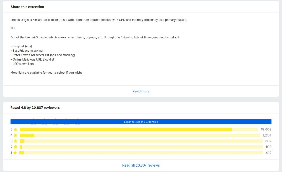
Next comes the description section, "About this extension". Nothing much to say here, this is controlled by the add-on developer. Let's move on. he next section shows the rating/reviews, it's the same 5-star rating system, only it looks a lot longer than before.
Following that, we come to the "Other popular extensions", which promotes other add-ons that you may like.
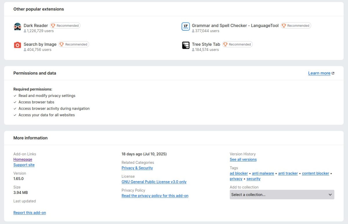
The Permissions and data section lists all permissions that an add-on uses. It is similar to the old design. Next, we have the "More information" panel where you can find the add-on's homepage, support site, version number, size, last updated, related categories, license, privacy policy, version history, and tags. The "Add to collection" menu is available here as well, which seems out of place. Wouldn't it be better if it was in the reviews section?
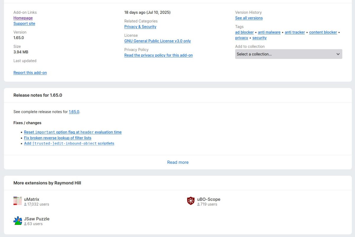
The AMO's last section of the add-on page displays the release notes of the extension. Though the new design is wider, it still has a "Read More" button to view the complete list of changes. And finally, we have the "More extensions by developer section".
Placing the "Other Popular Extensions" section above the permissions and details about the add-on seems like a bad idea. It would have been more appropriate to place the panel at the end of the page, or on the sides which are empty.
The old layout isn't perfect, it has some blank space in the middle, but that could have been used for something else, maybe to even relocate the release notes and "more extensions by the developer" sections.
Take a look at the old vs the new comparison. The blank space at the bottom is because the newer design is longer.
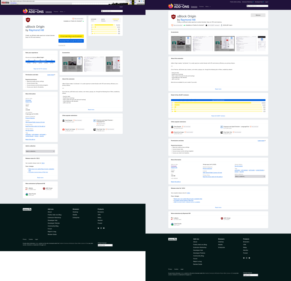
Here is a higher quality version, side-by-side comparison of the old vs new layouts (1.2MB image). I think the redesign looks similar to Chrome's Web Store.
What do you think about the new AMO layout?

And it still does not support Dark Mode?
Why Mozilla? DM support should be standard feature in 2025.
I shouldn’t even have to have addon for that, but since AMO is a “protected” page (whatever that is) i cant even force dark mode. It has been my biggest gripe with AMO for ages.
@R7,
> “(…) AMO is a “protected” page (whatever that is)”
// DISABLE WEBEXTENSION RESTRICTIONS ON CERTAIN MOZILLA DOMAINS (BOTH PREFS NEEDED)
pref(“extensions.webextensions.restrictedDomains”, “”);
pref(“privacy.resistFingerprinting.block_mozAddonManager”, true); // [HIDDEN PREF] — Disables mozAddonManager Web API
Much appreciated. I knew about the restrictedDomains pref and it was already in my user.js, but i didn’t know about block_mozAddonManager.
Now i dont have to burn my retinas out every time i visit AMO.
I use an temporary image enlarging addon called Imagus which works just by hovering the mouse over the image. But it doesn’t work on the new AMO site which means you have to click the screenshots to see what they’re all about. I think that’s a mistake because it takes time to click a pix which opens in a new window. I note that there’s an arrow on the right to display the other images, but it’s still not as fast as just hovering the mouse over them.
Still, at least Mozilla hasn’t jumped on the AI bandwagon yet although that may change at some time or another.
The main page looks terrible. However, once you click on a category, it looks fine. What is happening with all these companies? Can’t anyone design a decent webpage anymore?
“Mobile first”. FUuuuuuuu
I don’t even use Firefox. I went to the website to see what it’s like. I searched for an extension and opened its page. I was under the impression that it forces a mobile layout on desktop. I tried it on a Linux laptop with Brave browser. No fiddling with user agent or layout modes. So I’m under the impression that it uses some mobile or universal layout.
Either way, if I used Firefox, I wouldn’t be bothered that this happens. As soon as I can find my extension and install it, that’s all that’s important. I don’t think a great many people spend too much time on that website anyways – as soon as they install their extensions, they leave it. As far as I’m aware, Firefox also allows you to search for extensions from the browser itself so you don’t even have to visit the website.
@Allwynd, I have 1920×1080 PC screen and new AMO pages display perfectly well, as they always have…
> ” if I used Firefox, (…). As soon as I can find my extension and install it, that’s all that’s important.”
I guess you’re aware that extensions’ stores (at least AMO) do not prohibit an exactly same extension name to be used by different extensions, which leads to smart (or sleepy) developers (or copiers) to sometimes use an original extension’s not only name but code as well.
There’s also the fact that choosing the first extension which meets our requisites may not be the best choice, it’s like the absurdity of Google Search’s ‘I’m feeling lucky’). Seems to me having a look at all extensions which match our expectations is the way to go.
Generally speaking, the opposition between little choice without brain storming and a wide one leading to either ‘the first will be ok” or some effort to maximize the choice’s pertinence. “The first will be ok is by the way search engines handle user queries when their search results hierarchy are biased by other considerations than objectivity (in the very Google way).
For me it looks like this:
https://i.ibb.co/35GVRy2G/image.png
https://i.ibb.co/bc0RLKF/image.png
I don’t know if this is normal, since I don’t have a reason to visit this website at all, the layout on the bottom with the ratings being stretched from one end of the screen to the other feels like mobile layout on desktop. I don’t know if that’s normal, but generally looks kind of oversized. My resolution is 1920×1200, but I use font enlargement, not scaling, because it’s a laptop and text looks so tiny and strains to the point where I thought it could damage them permanently so I increased text size, so I don’t know if that affects the page in any way, but I’m pretty sure those rating scores aren’t affected by it.
As for installing the first extension, I usually check who is the author, for example for uBlock Origin I know it’s “gorhill” so I check that, which was the only extension I used for a long time. But I’m using Brave and since the news that Chrome disabled uBlock Origin, I did an experiment where I removed uBlock Origin and see if I can live without it and since I can, I no longer need extensions as long as my browser provides proper built-in content blocking.
I also think that browsing now is faster with no additional content blocking extensions. I think even on Firefox adding such extensions makes it a bit slower. Although I’m not sure if they have included a function to add filters without an extension.
IMO the layout is an improvement.
One slight disturbance in the ‘More information’ section: columns contain a number of labels calculated to distribute all labels divided by 3 in order to have each column with a similar height, but given some extensions have more or less labels than others can lead to a display which will have, e.g. ‘Last Updated’ title at the end of the first column and the date itself appear on top of the second column, which is not really appropriate as I see it. A title and its related link or value must be in a same column.
Not sure I’ve been clear :) Have a look for instance at [https://addons.mozilla.org/en-US/firefox/addon/ublock-origin/] :
‘More information’ -> Column 1 : ‘Last Updated’ is at the bottom of column-1 but the date is at the top of column-2.
Gee, a pic is worth many words sometimes …
Personal note: I’ve moved the Language Picker displayed in the footer to the top (left of the ‘Search bar’) with a position:absolute in dedicated CSS and have hidden the footer given it’s a bother at the end of page scrolling … French touch, French quality… French logic? :)
Anyway the gem if any is one thing, its box another, yet offering a diamond ring in a paper bag may be snob but not really elegant, is it?!
Internet enshittification continues unabated.
I kinda understand why they did it: they made the add-on store mobile friendly but now on my 1440p screen I open the same add-on page and I see like 40% less information than before, so I have to scroll violently to see what I could normally see in the past without scrolling.
God, I hate computer designers. Almost everything they touch eventually turns into utter shite.
“Rearranging the deck chairs on the Titanic”
Well said.