Google may replace the HTTPS lock icon in Chrome with a down-arrow icon
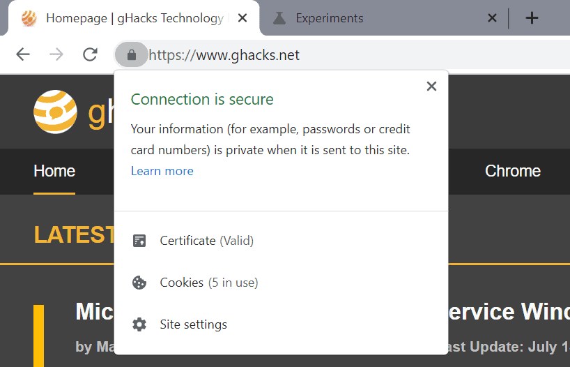
All major browsers display a lock icon or similar icons in the address bar next to the address of a site when the connection to the site is secure (uses HTTPS). It offers Internet users information about the state of the connection on a glance, and may help identify issues related to the connection state.
Users may activate the icon to display additional information in the web browser. Chrome displays whether the certificate is valid, the number of cookies that are in use, and a link to the site's settings.

The lock icon could be a thing of the past in Chrome in the future, as Google plans to run an experiment soon that replaces it with a down-arrow icon. The change will only affect secure connections, Chrome continues to display a "not secure" indicator if the connection to a site uses HTTP or improperly configured HTTPS.
The information that is displayed when the down-arrow icon is activated is identical to the lock icon information.
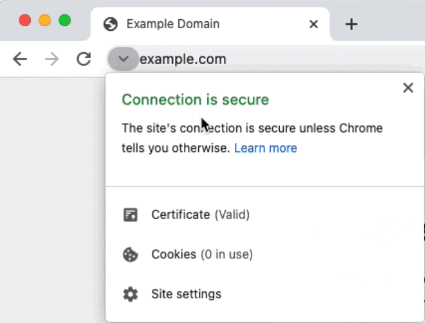
Google revealed yesterday that it will run the change as an experiment in Chrome to gather more data and use it to determine whether the lock icon will be replaced with the down-arrow icon.
The company explains that it discovered in a recent survey that most surveyed users did not understand the lock icons meaning. Only 11% of users identified the meaning of the lock icon correctly, while the remaining 89% did not.
The majority associated the lock icon with a site's trustworthiness and not with connection security. The lock-icon reveals the secure state of the connection to the site in question only.
The experiment will be run in Chrome 93. Enterprise customers may opt-out of the experiment using policies.
Google plans to inform its customer base if the lock icon will be replaced with the down-arrow icon in the web browser.
Chrome Canary users may enable the new icon by loading chrome://flags/#omnibox-updated-connection-security-indicators and setting the status of the experimental flag to Enabled.
Closing Words
Will Chrome users understand the meaning of the down-arrow icon better than the lock icon? It will cause lots of confusion in the beginning, as many users are trained to look for the lock icon specifically, especially when they connect to financial, state or medical sites.
In fact, part of the confusion surrounding the meaning of the lock icon could come from years of being told to look for that icon in the address bar.
Now You: do you think that the switch to a neutral icon will improve user understanding?








Apparently Microsoft will also replace the lock icon:
https://www.reddit.com/r/MicrosoftEdge/comments/qh7hb3/
.
The error will at least to more users indicate than when you click it someone more will be displayed.
arrow/chevron :-)
Most users who click on it by mistake will make it go away on purpose.
So much junkware in Chrome an obscure arrow that opens yet another notification will be quickly closed same as all the other ones. Yeah, most browser users are not very techy, they just want something to work without being insulted when they do something.
It looks like a download arrow or drop down. If the Googleonians wanted to do something useful, they’d fix that awful box and other pure garbage that shows up when you do download something. Brilliant to steal that from IE.
Protect users from their own stupidity then steal all their data. Chrome is nothing but flags and pop-ups, “Sign in” “Sign in” “Sign in.” Recipes? WTF???
If people are confused and don’t bother trying to learn, why not use this icon for insecure ?
Change for the sake of change. This adds nothing useful.
This is a totally “stoopid” idea. A downward arrow is an icon signifying downloads/downloading. What’s wrong with the padlock that has served its purpose well for years?
Bad idea. The lock makes more sense than an arrow. The arrow already means download to most people. This change means added confusion.
Now that’s REAL progress; Replacing one icon with another icon.. Pure GENIUS !!
/sarc <— Can we develop a 'sarcastic' icon. Think we need this more than the lock / arrow switcheroo!
Most people just browse. They are oblivious to the details behind the browser.
Let’s make it a happy face instead.
I suspect more users wll hover over the down arrow than the lock, thus discovering information they were not aware they could already access.
I think it makes sense because you need to click on that icon to get to cookies, site settings etc. HTTP(S) info is just one of many things you get when you click on the icon.
I usually don’t like these forced changes, but if the lock causes regular people to have a false sense of security (“This is a trustworthy site!”) rather than (“the connection is encrypted and this is not a spoofed site.”), then I have to agree with the change. Make http red, and https plain.
What I want though is an easy way to show the green lock back for those who know what it means.
Some people don’t understand what the lock icon means so let’s replace it with a meaningless arrow they will understand even less and just plain ignore. If they won’t click on the lock icon what makes anyone think they will click on yet another random arrow? They don’t care anyway, and we should be able to tell at a glance if a connection is secure without having to click an arrow on every site. This is really dumb and whatever developer thought of it should be ashamed.
Why do they keep tinkering with stuff that’s worked absolutely fine for decades??
Because it’s worked absolutely fine for decades. All this tecky wecky stuff has been mature for quite a while, all that’s left to be done is mindless tweaking.
Well if only 11% understand its meaning, it could not be that case after all…
Nonetheless I hate the drop down arrow as a replacement.
I have been waiting for this “down arrow” for two decades. FINALLY!!! Ooohh.
It won’t work any worse just because they change the icon, such change is hardly a problem. I more miss the old Chrome themes with gradients and solid, high contrast borders, which are now missing. You can install the Chrome Blue Classic theme from 2008 on Chrome and other Chromium browsers, but you can’t get the high-contrast borders back and this is what sucks the most, other than that, Chrome has remained visually the same throughout the years.
And now the big question is when it will land in Firefox?
@mike
You might think of it as a joke, but it‘s not:
„If even Eric–who heads Mozilla’s marketing team–uses Chrome every day as he mentioned in the first sentence, it’s not surprising that almost 65% of desktop users are doing the same.“
source: https://andreasgal.com/2017/05/25/chrome-won/
That’s a 2017 article, and he says he uses both. In 2017 I was using Chrome too.
That would be when the developers go home, open up their default browser, which is Chrome and see the change, then the next day at work they start implementing it into Firefox.
One thing for sure, the majority of people I tried to explain http compared to https either thought I was talking something geeky or didn’t give two hoots about learning.
However, for those of us who do understand, please bring back http and https! It is easy to understand (but try explaining to people on a fishing forum?). The lock is OK. A down arrow so you have to chase is not OK.
That said, end up on an http site these days and usually messages start opening, designed to scare the pants off people who don’t understand http.
Install “Suspicious Site Reporter” from Google at https://chrome.google.com/webstore/detail/suspicious-site-reporter/jknemblkbdhdcpllfgbfekkdciegfboi
Full URLs are back. Yes, sad, that you need an extension for a security related task. But yeah.