Windows 11 version 22H2: file explorer changes
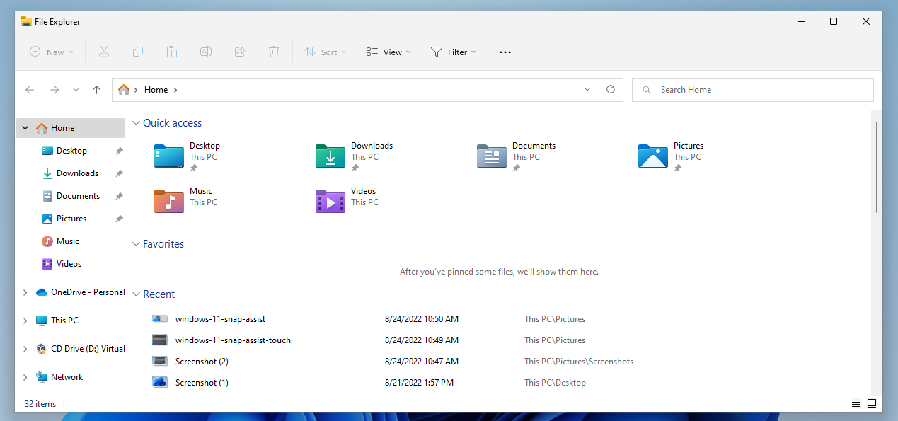
In the fourth part of the series, we are taking a look at the default file manager tool File Explorer and the changes that Microsoft plans to introduce in the Windows 11 2022 update.

Microsoft changed File Explorer in several key areas when it launched the new Windows 11 operating system in 2021. One of the most prominent changes was the introduction of the compact context menu, which File Explorer displays by default.
Tip: here are instructions to restore the classic File Explorer context menu in Windows 11.
The change was not the only one, as Microsoft streamlined the main toolbar of File Explorer, which resulted in many items being accessible only after an extra-click or two.
Windows users who had hoped that Microsoft would address these issues in the upcoming feature update will be disappointed. There are other changes though, and the following paragraphs highlight all the important changes in File Explorer.
File Explorer in the Windows 11 2022 Update
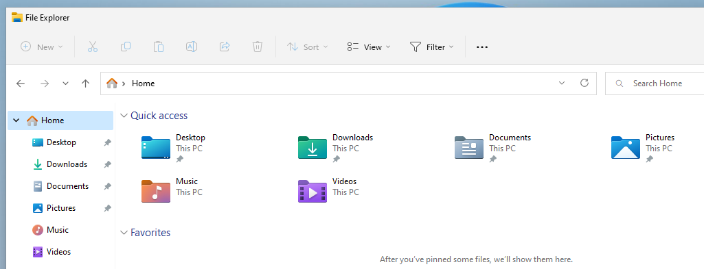
Several elements have changed when you open File Explorer. The homepage, the first screen that opens when you launch the file manager, may look similar on first glance. The menubar at the top is identical to the 2021 version, but the sidebar has seen several changes.
Quick Access has been renamed to Home, but the underlying function is still called Quick Access in menus. Microsoft replaced the star icon of Quick Access with a new Home icon to better visualize the change.
In the main area of the homepage, Folders has been renamed to Quick Access. It offers the same functionality, but has been renamed. Files that are pinned are listed under Favorites, a new section of the File Explorer homepage.
Files and folders may be added to the favorites via the context menu. Right-click on a file or folder and select the "add to favorites" entry to add it to the section on the homepage.
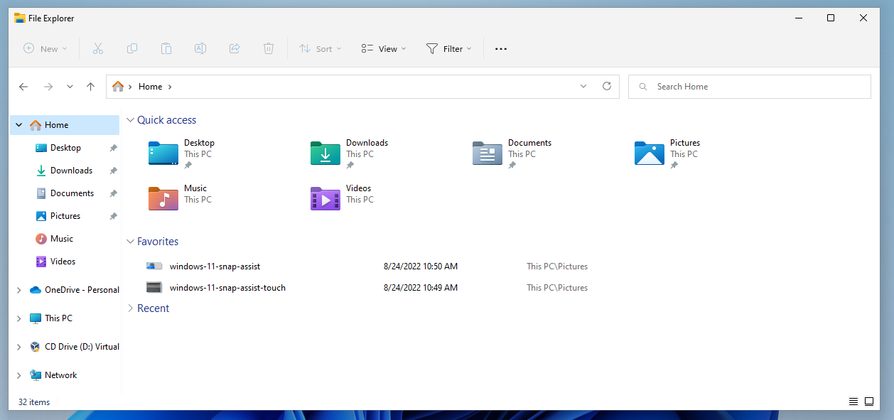
Favorites are displayed on the homepage but not in the Quick Access listing of the sidebar.
Search will find files and folders listed under favorites and recent files, even if these are not local files. Files hosted on OneDrive may be returned here.
Home is not the only available entry point when File Explorer is opened. Windows 11 users may open This PC or OneDrive instead.
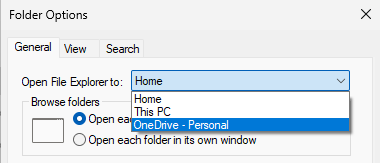
Here is how that is configured:
- Open File Explorer.
- Select Menu > Options from the main toolbar at the top (menu is the three dots).
- Open the menu next to "Open File Explorer to" in the Folder Options window to make the selection:
- Home: the default selection.
- This PC: displays Quick Access folders and all connected drives.
- OneDrive: displays OneDrive content.
OneDrive was missing in the release version of the Windows 11 operating system. Other file synchronization providers may add their services to the menu as well so that users may pick them as the start page when they open File Explorer.
Folder Options list another new feature in Windows 11 2022 Update. The option to display files from Office.com is enabled by default.
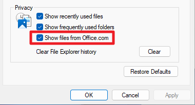
Windows 11 users who have no need for that may uncheck "Show files from Office.com" to disable the feature and remove file listings from Office.com.
Folder previews
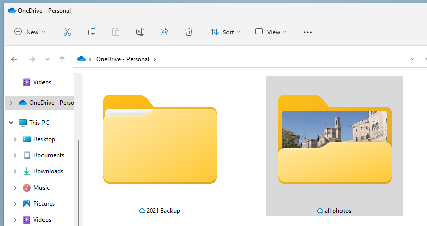
Then folder preview feature is making a return in the upcoming feature update for Windows 11. Microsoft launched Windows 11 without it.
Basically, what it does is provide a preview of the content of a folder in the folder's icon. If a folder contains images, one of the images may be displayed as a thumbnail in the folder's own icon.
Other file types may show up as previews as well. Applications show up as the default application icon, and Office documents as a preview of one of the documents. Other file types may not show up as previews at all, or with generic icons only.
Still, for Windows 11 users who use File Explorer to browse image or media collections, it may improve the experience.
Shortcuts and the context menu
Microsoft improves the full context menu shortcut in Windows 11 version 22H2. Windows 11 users can use the shortcut Shift-F10 to display the full context menu of the selected file, folder or drive.
In the new feature update, users may also hold down the Shift-key and right-click on an item to display the full context menu right away, bypassing the compact one.
Shift-F10 remains an option for keyboard-only users, but Shift-Right-Click is improving the experience for Windows users who prefer to use the mouse.
The compact right-click context menu displays a few new options when certain items are active. Fonts .inf and .cer files display a new install option in the context menu now to improve the installation process for these.
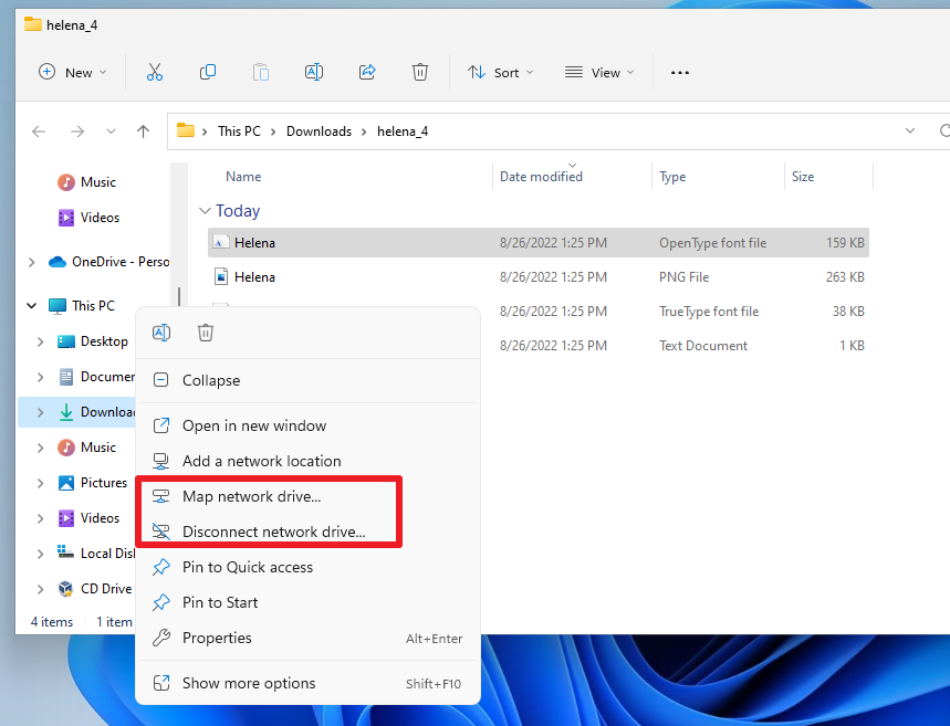
A right-click on This PC displays the new "Map network drive" and "Disconnect network drive" options, and a right-click on a connected network drive displays disconnect right away now in the new update.
The same options are displayed as well when you right-click This PC in the navigation pane of File Explorer.
Some items of the context menu have new icons.
The new keyboard shortcut Ctrl-Shift-C copies the full path of the selected file or folder to the Clipboard.
Other changes
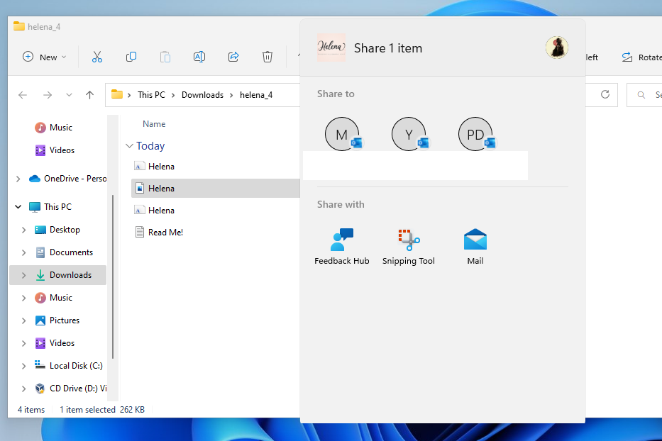
The Share feature, which is listed as one of the available options in the toolbar, may display contacts, nearby people and apps now. The share menu opens right after selecting share, making it easier to share to users or apps that content is shared with on a regular basis.
The available options depend on whether a local or Microsoft account is used, and which apps are installed on the device.
Tabs in File Explorer
It looks as if tabs won't be a part of the Windows 11 2022 Update, but will be delivered via a smaller update after the release of the first feature update.
Tabs are one of the main features that Microsoft has been working on for a long time. Windows 11 users may open multiple different folders and drives in a single File Explorer when the feature lands, similarly to how tabbed-browsing works in modern web browsers.
Closing words
File Explorer in Windows 11 version 22H2 gets a handful of new features that improve it. The new full context menu shortcut option, folder previews, or the option to display cloud provider content when launching File Explorer need to be mentioned specifically.
The update does not address the usability issues, on the other hand. There are still two context menus that users have to juggle between, and the main toolbar is still hiding options that were accessible right away previously.









I use Win+R to run explorer.exe and use command line switches to open a specific folder location. For example, explorer.exe /root, “drive:\folderPath” works great. With 22H2, there is no documentation on how to open one explorer.exe instance with multiple tabs. I have tried adding a comma between folderpaths or spaces, e.g., explorer.exe /root, “drive:\folderPathOne”, “drive:\folderPathTwo”. All the variations I can think of do not work. Anyone have documentation on 22H2 explorer.exe?
Still missing my favorit shortcuts :
alt+v+f
alt+v+h
Maybe they rewrite the explorer.exe from scratch using Electron framework ?
Can’t wait for the Microsoft release event where an african american/indian bisexual transvestite vegan teenager tells us all about these new amazing features.
For those of us in corporate environments who constantly access numerous network resources, bookmarks are a MUST. Tabs will be a great feature, but Microsoft should complete the web-like experience and add bookmarks, as well.
The only reason I use Windows is for work (the company I work for use Windows in the computers they give to the employees), but for personal matters I have used and will keep using Linux, whatever distribution (I use Debian with GNOME), have used it for many years and has never disappointed me.
Yeah, I might use OneDrive if it had 1 or 2 TB of free, ADFREE, storage and you wouldn’t spy/curate MY files. Until that day comes, I will not use OneDrive and I will not create a Microsoft account. I will also block/remove and modify everything you have incorporated into Windows 11 for YOUR benefit on MY computer. You can take your EULA and shove it.
Yes. it is insane that they give only 5 GB free of charge in 2022. Typical money hungry M$.
If someone wants just to backup some important files to the cloud, unistalling onedrive in every pc and replacing it with MEGAsync (MEGA at least gives 20 GB free of charge) or even Google Drive for Desktop (Google at least gives 15 GB free of charge) is a no brainer.
Why is it that each and every iteration of key GUI elements on Windows look worse than the previous one? M$ spend way too much time tinkering with the GUI and not enough time working on bugs and “real” productivity tools.
Though I think M$ wouldn’t know productivity if they fell over it.
At this point the developers (if you can call them that), are more like 3 year olds with a crayon than serious coders that can think outside the box and solve complex problems.
I am going to be a bit controversial here…but when it comes to the visual layout of the interface I actually prefer Win 11 to Win10.
Win 10 has all those tiles when you hit start, all downloading stuff that I wasn’t interested in.
I had to immediately install a shell manager to overcome all that noise.
Win 11 has a much more uncluttered feel about it out of the box.
As for the reduced functionality of the taskbar, that is a sticking point for me but ultimately not a deal breaker.
Maybe MS could bring back the functionality in an optional update…
Completely agree with @Anonymous and @Strigoi, W11 is a very low developped OS. Thanks for the article! :]
EXTREMELY underwhelming and disappointing. Microsoft don’t have a development department, this is just small tinkering, cosmetics. Compare to what KDE are doing..jesus christ, they do more stuff in week than Microsoft can muster up in a year. Even GNOME kicks more ass than this.
Microsoft continues to work on catching up to Windows 10 capabilities even after a year has passed. When Microsoft combined Windows 10 with their useless dual-screen operating system, 10X, they completely wrecked everything. The functionality of the file explorer has been so drastically reduced that it no longer has a ribbon, fast access toolbar, refresh, and many other features are absent from the right click context menu. They shouldn’t have ever made the public use this horrible alpha-quality operating system.
Why are the corners not rounded?
Because he’s using a virtual machine and doesn’t have GPU drivers. Rounded corners are drawn only when there are proper GPU drivers installed.