Windows 11 has a new Task Manager with a fluent design, here's how you can try it in the Insider Program
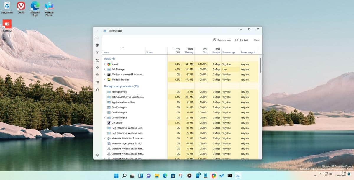
Yesterday, Microsoft released Build 22538 for testers in the Dev Channel, which brought a couple of minor changes to the UI. But it included something else which the announcement did not mention, there is a new Task Manager in Windows 11.
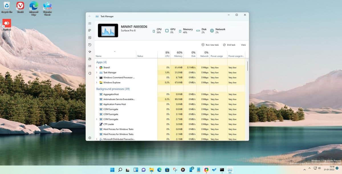
Users have been requesting the Redmond company to update the tool's design, to be in line with the rest of the operating system's theme. And it appears we are finally getting that.
Fire Cube Studios shared a screenshot featuring the program's new interface. The app has a fluent design, though it doesn't seem to support Mica yet. The leaker also posted instructions on how users can enable it in the latest Preview build. So, if you want to try it, we got you covered.
Note: You will need to be running the Dev Channel Build 22538 for the following.
How to enable the new Task Manager in Windows 11
1. Download the open-source program, Vivetool.
Note: Though it has not been updated for a long time, it works on the latest preview builds.
2. Extract the archive to a folder.
3. Open a command window as an administrator. You can use Command Prompt, PowerShell or the Windows Terminal.
4. Paste the following code in the command window.
vivetool addconfig 35908098 2
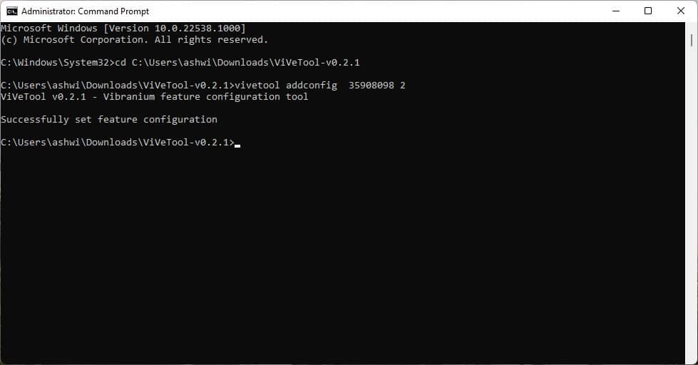
5. Access the Task Manager, and it will have the new interface with the Fluent Design.

6. Use the following command to toggle the alternate theme, which has a toolbar at the top.
7. If you want to enable the Dark Theme for the Task Manager, this code will toggle it.
vivetool addconfig 37204171 2
To undo the changes, use the delconfig command. e.g. vivetool delconfig 35908098 2
This will restore the old Task Manager. You will need to run the command for each config that you enabled, so if you tried all three styles, you have to remove all of those.
Overview of the new Task Manager
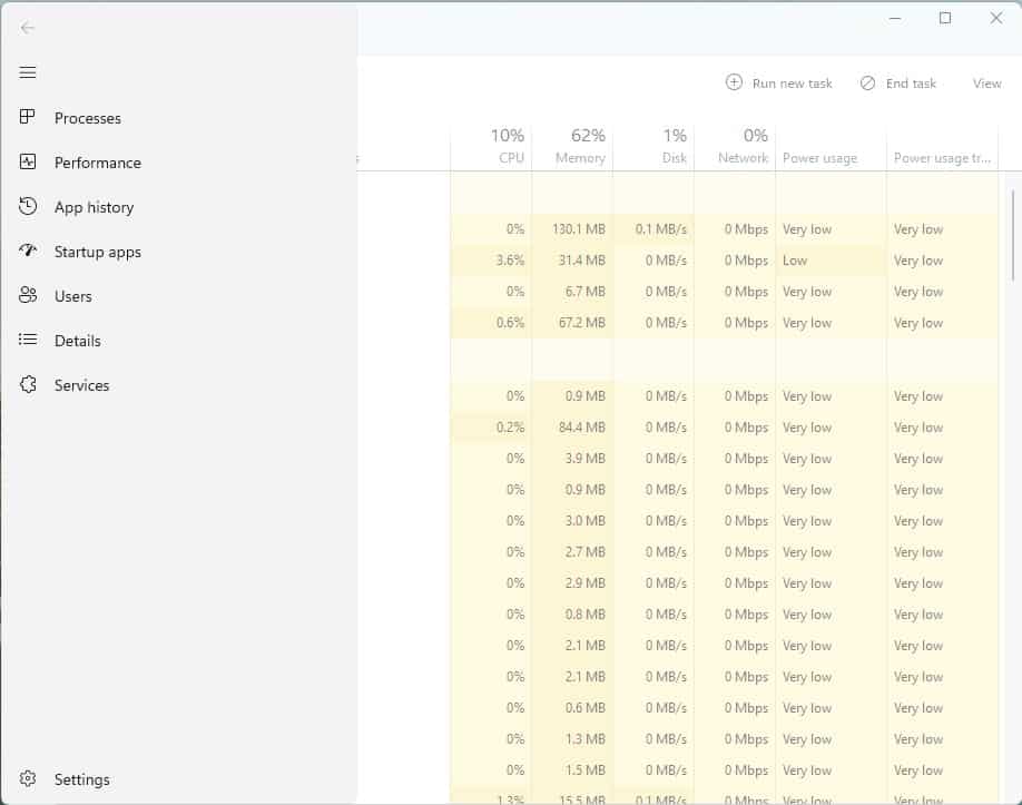
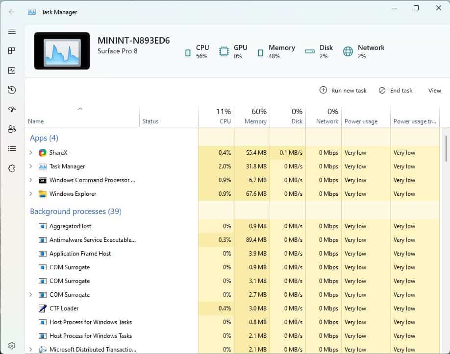
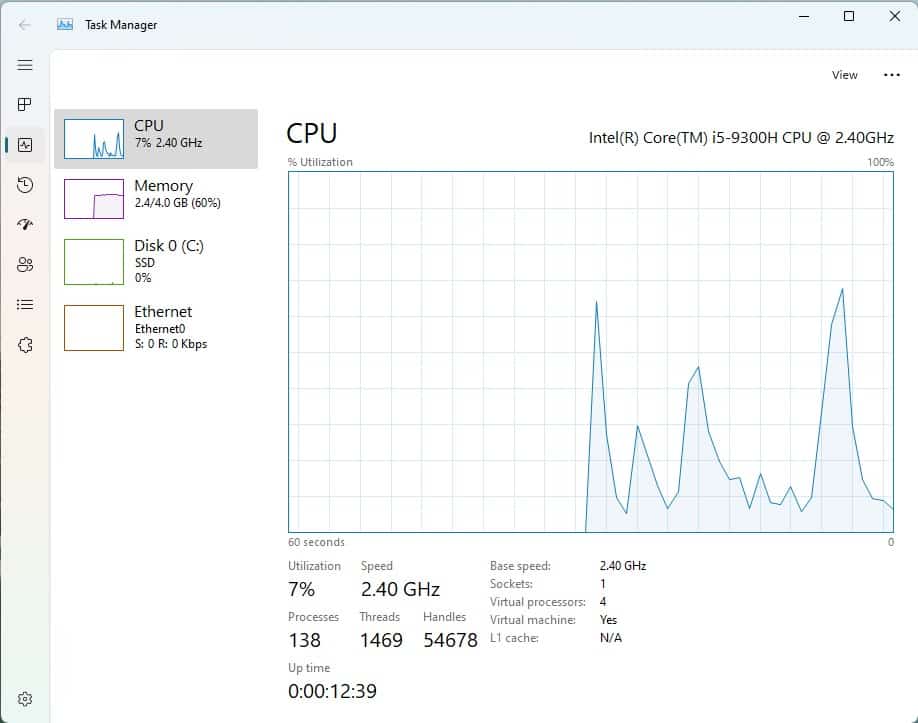
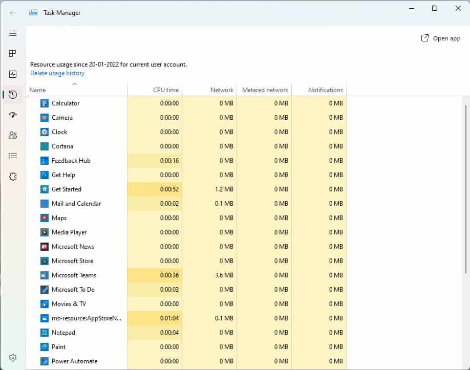
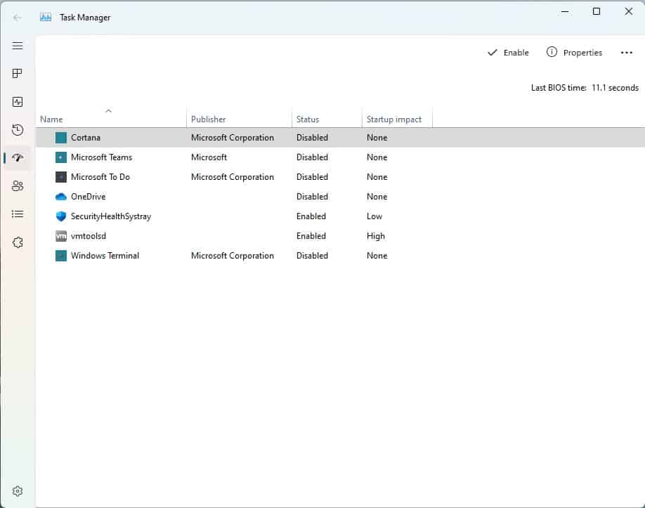
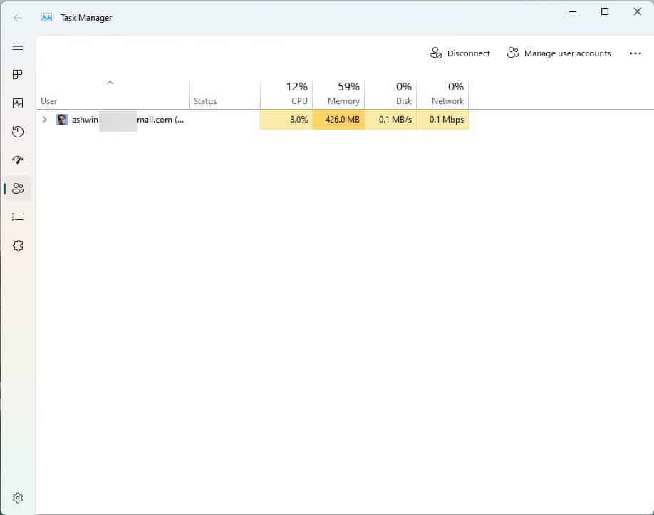
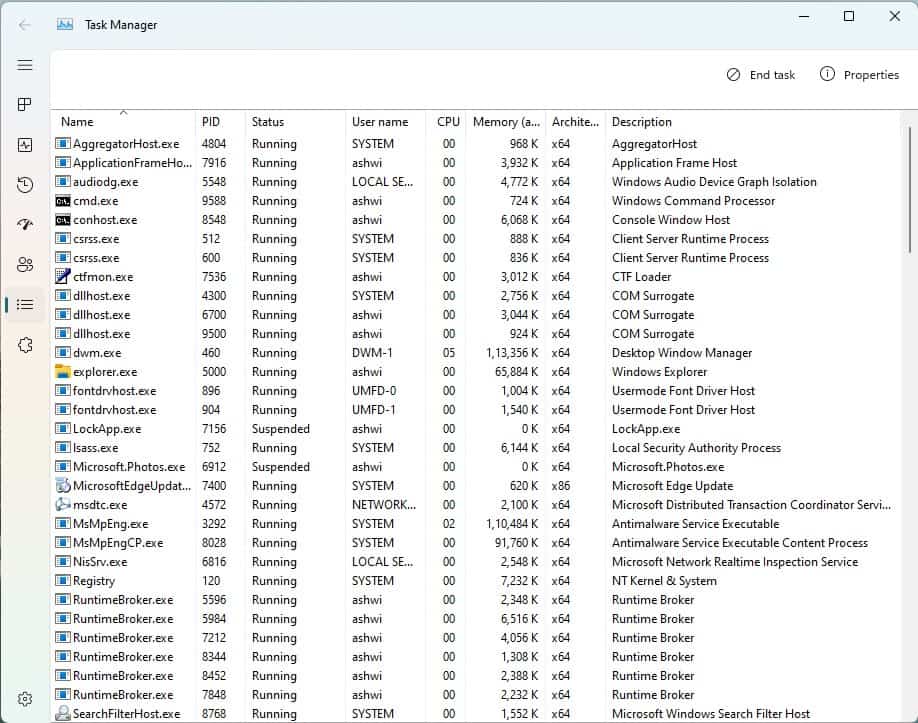
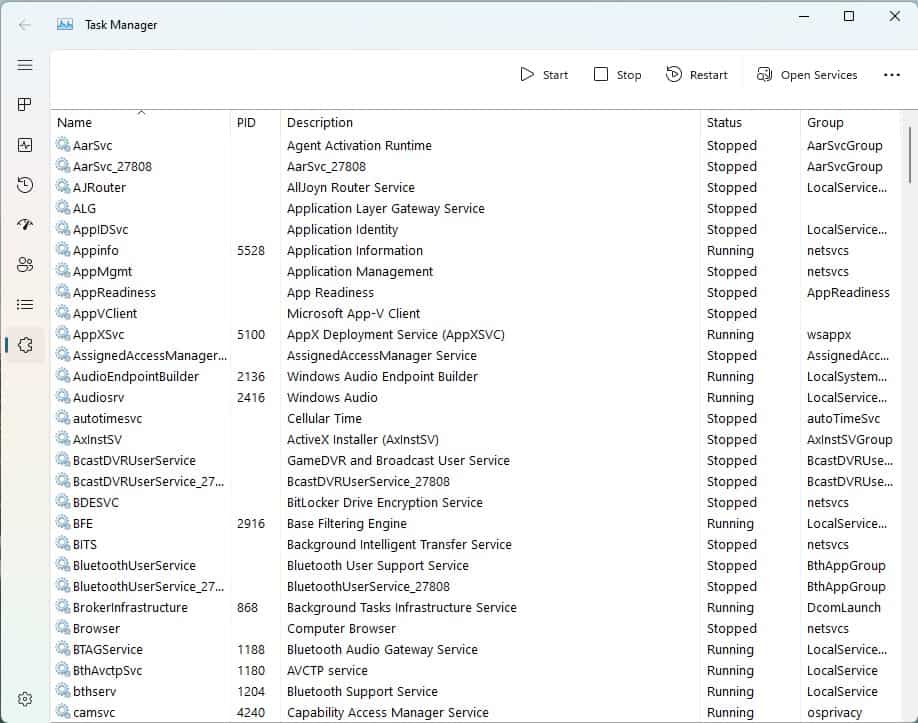
The app ditches the menu bar in favor of a sidebar, it houses the same options: Processes, Performance, App History, Startup Apps, Users, Details, Services. The tabs are functionally identical to the legacy Task Manager, and there is a new toolbar for each tab for accessing the corresponding options, e.g. the Services tab's toolbar lets you Start/Stop services quickly. The alternate interface, displays the computer's name, though it seems to be a placeholder as it identifies the system as a Surface Pro 8. The icons on the panel display the usage of the CPU, GPU, Memory, Disk and Network at a quick glance.
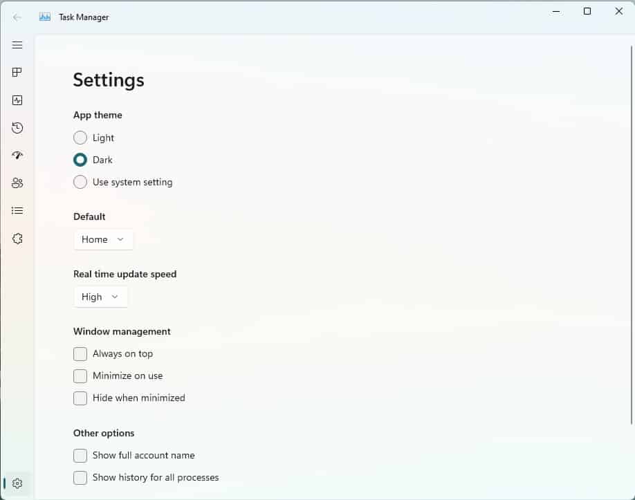
In addition to the tabs, the new Task Manager has a Settings screen where you can set the tool's theme color, and there are three options to choose from: Light, Dark or Use the system setting. Select a tab to be used as the default screen when you open the Task Manager. The other options in the utility can be used to set the Real time update speed, and the Window management.
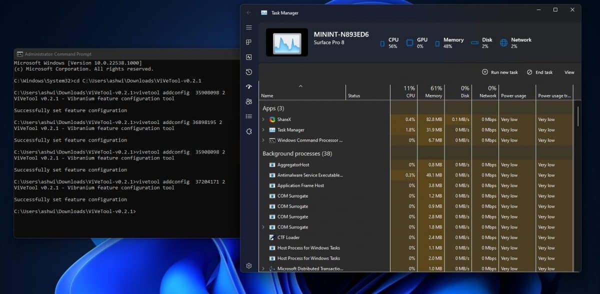
Should you use the new Task Manager? It looks cool, but I wouldn't advise using it at the moment, because it is slow, and I mean really slow. It's almost like a concept app, so you may want to wait for Microsoft to optimize its performance and announce its availability for Insiders. Maybe it will ship with the summer update, code named Sun Valley 2?
Do you like the new Task Manager in Windows 11?









in PowerShell or Terminal you have to prefix the commands with .\
or you’ll get this error:
vivetool : The term ‘vivetool’ is not recognized as the name of a cmdlet, function, script file, or operable program.
…
Ah Microsoft is up to its old tricks. The interface is so reminiscent of that of the Vivaldi Browser, especially in the compact icon-only mode. And it’s available in Edge, as well, with the expanding from icon when you hover modality, too.
Hooray for Vivaldi, Microsoft considers you enough of a threat to copy your design language.
Another part of Windows ruined. Hopefully Startisallback can undo this nonsense.
Now Task Manager will be bloated, slow, and fail to open like every other part of Windows they ruined with this horrible looking interface. Why do we need hamburger menus on a desktop OS? The tabs on the old one was perfectly fine; it didn’t waste ton of space.
I’d love to see someone create a better take on the Task Manager prior to Windows 10 upwards rather utilizing their own design concepts based upon the old task manager or System Explorer but that is pretty relevant to windows as a whole. The sad thing is that it just gets worse and worse.
It almost makes one long for Longhorn.
I still believe System Explorer was and is a vastly superior task manager to whatever Microsoft has come up with. It is abandonware now but still seems to work. I wish the developer stuck with it though.
This is exactly my thoughts. Not limited to the task manager of Microsoft.
Agreed! A lot of other task managers just don’t seem to come close IMHO. Yes I am aware of process hacker and process explorer but I am just more content using System Explorer. Too bad the developers never even released the source for it before they left.
I tried contacting them a few years ago but their email address also appears to be dead too.
feel like they’re trying to ripoff look from the new kde sys monitor.
There have at least 40 feedback mentions on the Insider Feedback Hub that Task Manager manager crashes when the performance tab is clicked in build 22538.
With this new interface, Task Manager still crashes on my computer with build 22538 when I click the performance tab.
Download the appropriate graphics card driver, which graphics card do you have? Also check the Ethernet driver …
I have a GeForce GTX 1660 Super with the latest driver, 511.23 – Release Date: Fri Jan 14, 2022.
Martin, you couldn’t be bothered show the Performance tab in dark mode? >__> Everyone who hates being blinded has been complaining about this for years.
MaArtin, you couldn’t be bothered show the Performance tab in dark mode? >__> Everyone who hates being blinded has been complaining about this for years.
Dark mode is the worst option for the eyes ever. My aunt works at optics services and she said that dark mode increases vision problems, eyestrain and myopia, as dozens of people confirmed tha abuse of the dark mode in their computers and smartphones. The best behaviour in her opinion is using the night mode of W10/W11 (to clear the blue light of the screen) or even glasses to reduce blue light. However dark mode should be only restricted to save battery in certain circumstances. :]
Your aunts opinion might have some truth in it. On the other end, my eyes actually hurt when trying to read black texts, bathed in pools of bright white light.
As always, it depends. How is the surrounding lighting solution? This has a more profound influence on how you are able to read text on different backgrounds. Not all color combinations being used with dark backgrounds are good. But some color combinations work surprisingly well.
Remember the days of your computer only having a 2 color video output on a 2 color screen? And that one of those colors was always black? The colors then weren’t the bad thing, staring into a CRT the whole day was.
Those colors were usually something resembling black (but not pure black) and a more pastel white instead of pure white. That didn’t cause nearly as much eyestrain as people make it out to be today as those colors were not chosen randomly.
It is my opinion that people watch too many computer screens of very varying sizes for far too long and that this is the actual cause of myopia, eyestrain etc.
Sure, that is not what you want to hear and probably don’t even believe. But if you feel your eyes starting to become uncomfortable to use, stop watching at a screen and go for around 30 minutes into your garden, or park, or anything else that doesn’t involve looking at any screen. You will notice very quickly that your eyes feel a lot better. And that over time your eyesight will improve somewhat.
I notice this myself, as a guy close to 50 and using helper glasses to watch computer screens for work. I just go and do something else completely for about 30 minutes or so. Not only does that give me ideas, those helper glasses are now used about 50% of the time. The rest of the time I can actually read/watch screens again without them.
Still, my opinion is about as valuable as your aunt’s opinion in these matters. I know what I have noted myself on my person. It won’t be true for everyone, but staring less at so many different screens will improve your life and you’ll get a stay of execution on any eye-sight problems you may have developed by staring at so many screens the whole day.
@Gerold Manders if you can, just try the “read mode” of Windows, it’s a good protection that should be enabled by default. You can adjust it to 50% as my father does. My father also always reads computer screens with glasses to reduce the blue light, and he has by now no complaint about his new work glasses. They were recommended by my aunt and the cost is not as expensive as I expected to be. Furthermore the higher problems of light screens are not from the light itself but the unnatural “blue” light that forces the eye too much. The more you read dark mode screen the more your eye will be unable to read light mode screens. Anyway, thanks for you opinion, it has some good points that I will speak with my aunt. :]
@John G
To be fair the ones using dark mode are using it in dark environment so it’s not the mode itself that cause vision problems.
There’s nothing like ‘blinded by task manager’ if they view it in well-lit environment.
@Anonymous some users live in darkness. I love vampire stories so much! :]
This exactly. Dark More is purportedly effective only on handheld devices with AMOLED screens since on AMOLED the true black color is achieved by completely turning off the backlight for the relevant pixels. But on PCs where saving power is not a factor dark mode is just something people use to give their PCs a dark terminal look for that hacker feel. Not only it causes eyestrain but also makes most icons which are typically designed for normal white mode really dim and fuzzy.
I think it’s a good advance, while waiting for the mica effect. Thanks @Ashwin! :]
That’s literally just the Win32 TaskManager inside a useless UWP frame/container. Wasted space, consumes more resources, especially memory and has an annoying splash screen which has no place on a fast machine which is capable of opening everything instantaneously. How lazy is this.
Sysinternals’ Process Explorer or Process Hacker.
I personally use Process Hacker nightly (https://processhacker.sourceforge.io/nightly.php).
I use SystemExplorer and ProcessHacker for more advanced view.
System Explorer is more user friendly for causal task and at the same time is very powerful: https://systemexplorer.net