YouTube Launches One-click Video Improvements
If you do not have the time or skill to edit your videos locally before you upload them to the popular video hosting site YouTube, you'd probably grew fond of the video editor that YouTube added last year to the site. While pretty basic in functionality, it can be used to correct a few issues with your videos. Features offered include trimming and rotating, as well as adding effects and exchanging the audio of the video.
YouTube has just announced a new feature that they have added for users who upload videos to the video platform. One-click video improvements are now available to all video uploaders. Videos get automatically analyzed by YouTube when they are uploaded, and users will now be informed if videos could be improved automatically.
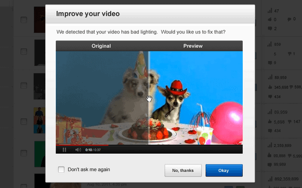
When you upload a video that could use a fixup, you’ll see a notification bar on the Upload page and in your Video Manager. Click the button to fix it, and you’ll see a side by side preview to decide if you want to accept the edits.
A preview of the optimized version is displayed next to the original. You can now click on the okay button to go ahead with the optimization, or click on no thanks to keep the video in its original form. Users who do not like the new feature at all can furthermore check the don't ask me again box to never be bothered by the new feature again.
According to the post on the official YouTube blog, the optimizer can fix videos that are either too dark or too shaky.
It is also interesting to note that the original video can be restored at a later point in time. Mobile video uploaders apparently won't get the notification right away. They do however see the suggestions when they open YouTube from a desktop PC.
Advertisement










ReX makes a good point about the audio situation – a lot of my music is fed from very poor quality cassettes and too quiet. I will be able to rectify that at some point, but I don’t have space/equipment/time at the moment.
“We detected that your video has bad lighting. Would you like us to fix that?”
That reminded me of Clippy.
On a serious note, they should have something like that that for audio, normalization would be greatly appreciated. More often than not videos are too quiet or too loud.