Netflix app for iOS gets a redesigned interface and new animations
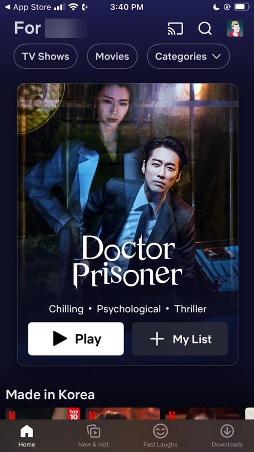
Netflix has updated its iOS app, to bring a redesigned interface. The animation effects in the streaming service's iPhone app have also been refreshed.

Netflix for iPhone gets a new interface
The image that you see above is the new interface for the Netflix app on the iPhone. For comparison, here's a screenshot from the previous version of the app. It was not bad per se, the design is actually similar to that of the Android app.
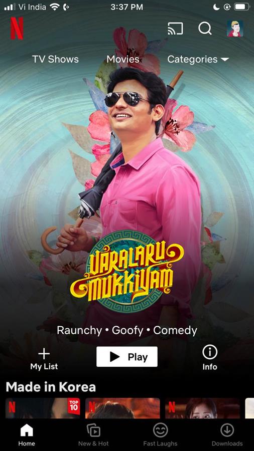
The new interface of the Netflix app for iOS no longer has a black navigation bar. The info button that appeared next to a movie or TV show has been removed. The top of the home screen now displays your profile name, e.g. "For John", to indicate that it is showing recommended content for the current user based on your usage (previously watched content).
The tabs at the top of the screen have a slightly different design, with a rounded rectangle borders. There is more to it than this. Selecting a movie or TV show displays some details about it, this function replaces the Info button. Netflix's Coming Soon tab is now called What's New, and displays recommendations for your profile.
According to the lead developer of the UI, Janum Trivedi, (who recently quit the company), the Netflix app for iPhone has a billboard layout with a lighting effect that users can notice when they move their phone. You may want to check this video that Trivedi shared on Twitter. 9to5Mac notes that this parallax effect is produced with the help of the accelerometer sensor on the iPhone.
Trivedi further mentioned that the app generates a wallpaper gradient based on the art (media card) that is displayed on the screen. The video demo also highlights how the card transition animations work, and they are interruptible, i.e. you can dismiss them mid-way.
Other improvements in the Netflix app for iOS includes new fluid animation effects. For example, when the app is launched, it displays a large card for a movie or show, as opposed to a nearly-full screen promo that the old version had. The animation that renders when you switch profiles is also different. Speaking of which, you can now access the profile section or the search function from any screen in the app. That should help with navigation, and content discovery. The update also adds support for haptic feedback in the app.
The new UI is available in version 15.14.0 of the app. Download Netflix for iPhone and iPad from the App Store.
Netflix is working on providing a similar visual upgrade to its app for Apple TV. It is not clear if the Android app will get the new UI, but one can hope. Netflix has recently been working on ending password sharing on its platform. First, it introduced Netflix Homes in some markets, hoping to make people buy subscriptions if they wanted to share their account with others. It was soon followed by a way to migrate shared profiles to a new account, and an option that lets you remove other users from your account. It even launched an ad-supported tier, called Netflix Basic, in some Countries.
Do you like the new Netflix interface? Yay, or nay?











Thanks @Ashwin for the article! :]