Google removes the navigation bar in latest Dev build

Google is constantly tweaking things, adding things and, most notably this week, removing things -- yes, we are all still bitter about the Reader debacle. Many of these tweaks are much smaller and quite a few involve the navigation bar that spans the top of the screen on most Google properties. Many of those tests have involved minor changes such as the color of the bar and the services that are listed within it.
The latest experiment, however, goes a whole lot further. This time around, Google has simply removed that navigation bar -- gone completely, leaving a very empty looking screen.
The change is only seen when using the latest Dev version of the Chrome browser, known as Canary. The latest version is 27..0.1441.2. Alex Chitu over at the Google Operating System blog tested the theory by experimenting with this within a Mozilla Firefox browser.
"To confirm that the experiment is limited to Chrome 27, I opened Firefox, changed the user agent to "Mozilla/5.0 (Windows NT 6.1) AppleWebKit/537.33 (KHTML, like Gecko) Chrome/27.0.1441.2 Safari/537.33" using this extension and the navigation bar was gone".
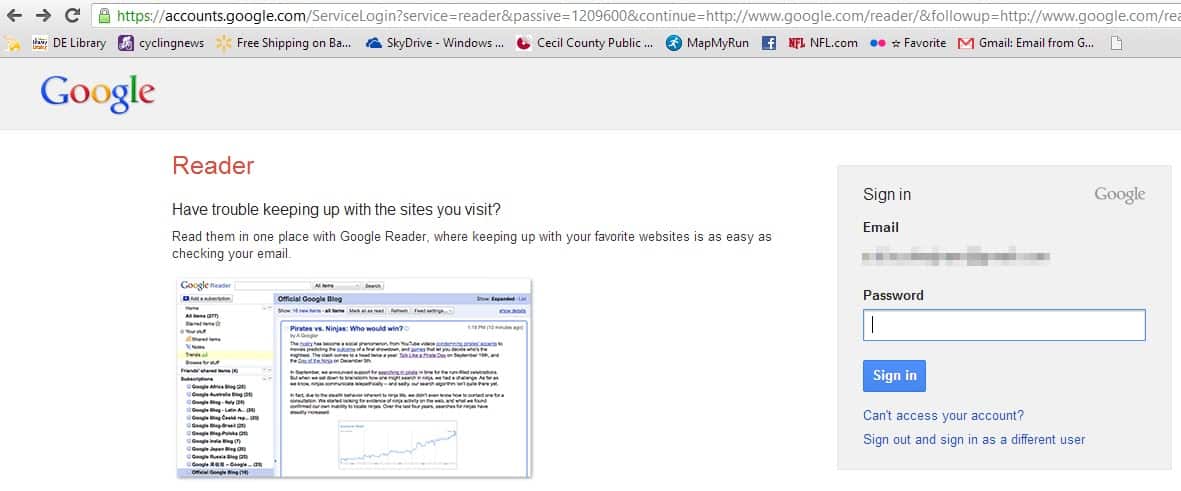
I fired up the Canary build and checked across several Google properties, including the company's search page, Reader, Gmail and a couple of others. All were displayed without the now familiar black navigation bar.
The Canary build of Chrome is frequently used to test things, and just as quickly as those experiments appear, they sometimes disappear Remember the Chrome OS running with Windows thing a while back?
I can not imagine that Google has any real intention of doing away with its navigation bar in future stable releases of Chrome, or across other browsers. The company simply needs the option too much because of its ability to send customers to all of its many services, where they will see, and Google hopes, click on its ads, which is really the big source of income for the Mountain View-based company.
Advertisement


After the removal of Adblock from Google Play and Google Reader, the next move is to get rid of the navigation bar. Google just wants you to stay on the sites it decides and feed you its adverts.
You can still the Adblock Plus APK from the web site.
By killing Reader (and driving me to reuse my almost-forgotten Netvibes account) I won’t be seeing their nav-bar anyway. I access Gmail via desktop email client, I don’t do G+, I use the Google Play app in my smartphone,I prefer Bing to Google Search, and Flickr to Picasa. Youtube, thankfully, does not have the nav-bar. Because of my growing distrust for Google, I’m slowly moving away from Google Maps and to Nokia Maps (aka HERE). There are just too few worthy “arrows” in Google’s arsenal, so to speak.
Heck, by killing Reader, I haven’t logged in to my Google account for two days now. Whereas before I was constantly logged-in because of Reader. That app is what’s keeping me in Google’s ecosystem for too long. Very bad move Google!
I don’t think it’s just the latest version. I have 27.0.1438.7 (of the dev channel), and the bar is gone for me too.
Yup, I’m using the same version. Gone for me too. Hope the replace it in some way soon.
I miss it.
Yup that bar is the bridge between search and other Google services.
Hope they bring it back in some form.
Remember one previous experiment where clicking the Google logo brings up a menu of links to other Google services, that looked nice to me.
I have never liked that black navigation bar, always thought it was the worst looking part of the page. The Google logo click style was better looking and cooler. I hope they bring it to the stable versions.