The Fox Gets Two New Logos
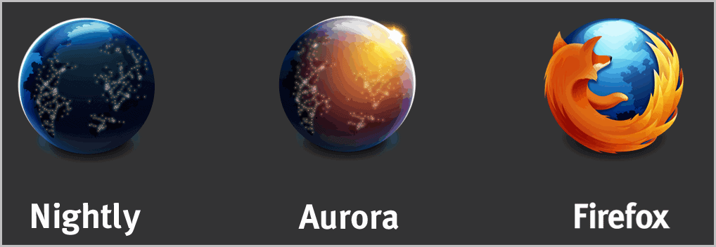
We have already told you how to switch between Firefox update channels to run the new Aurora builds of Firefox for instance, or the more frequently updated beta releases (compared to the Firefox stable edition).
It was only a logical consequence that Mozilla made the decision to create a logo and unique "About Firefox" page for every update channel (with the exception of the beta channel which for whatever reason has not received any love).
The new Firefox Nightly and Aurora logos look great in my humble opinion, even better, they now visualize the development phase from the dark nightly logo over the rising sun of the Aurora logo to the final and unchanged Firefox logo, which in all honesty looks a bit pale in comparison.
The Help > About Firefox pages have also been updated to reflect the new logos and changes.
Here is the Firefox Nightly About Firefox page:
The Aurora About Firefox page:
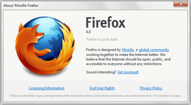
And as a contrast the standard about Mozilla Firefox page:
That's a difference like day and night, don't you think? The Mozilla designers should consider improving the standard Firefox about page, as it looks almost shabby next to the other two about pages.
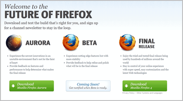
The download page gets a revamp as well. Users can now select the Aurora, Beta or Final build of Firefox when they go to the download page. Nightly versions on the other hand are offered on a different page on the Mozilla website.
The new download page is not life yet, and it is not clear yet if this will be the new download page for all users, or an additional page for interested users who want to run Aurora or Beta builds of the web browser.
Even if you are currently running Aurora or Nightly builds you won't get the new logos or about pages right now. It is however likely that they will be added in one of the coming updates. (via Soeren)
Advertisement








What will happen to Minefield and its logo? Will it stay?
I have to say that, although I have been a big Firefox supporter since its inception, I have never liked either the name or the logo.
I really don’t know what got into developers’ mind to call a browser Firefox which for like the first 5 years most people had no clue what it was for while Internet Explorer is effectively descriptive.
It might be a small thing but I always thought it hindered Firefox success for many years.
And anyway if animal had to be Firebird or Phoneix (or any “sexier” animal like dunno leopard or shark or panther) were much better.
So yeah, the logo is really old especially compared to the nightly ones.
I think they should fade out the fox into a strong assortment of steak of red colours (to suggest extreme speed) that envelopes an earth silhouette.
What do you think?
P.s. Do not you think is perfectly correct (albeit a bit formal) so don’t know what had to be corrected.
They should make the fox less cartoony and redraw the fox using aurora borealis like graphics.
I love those graphics! BTW, I was testing some FF’s betas in the past, and found them very solid and stable.
did i read it correct??
“That’s a difference like day and night, do not you think?â€
don’t you think it should be “don’t you think?†instead of “do not you think?â€
please add an edit option on comment please.
Corrected, thanks.
did i r read it correct??
“That’s a difference like day and night, do not you think?”
don’t you think it should be “don’t you think?” instead of “do not you think?”