Firefox Proton design refresh is almost ready: here is what is new
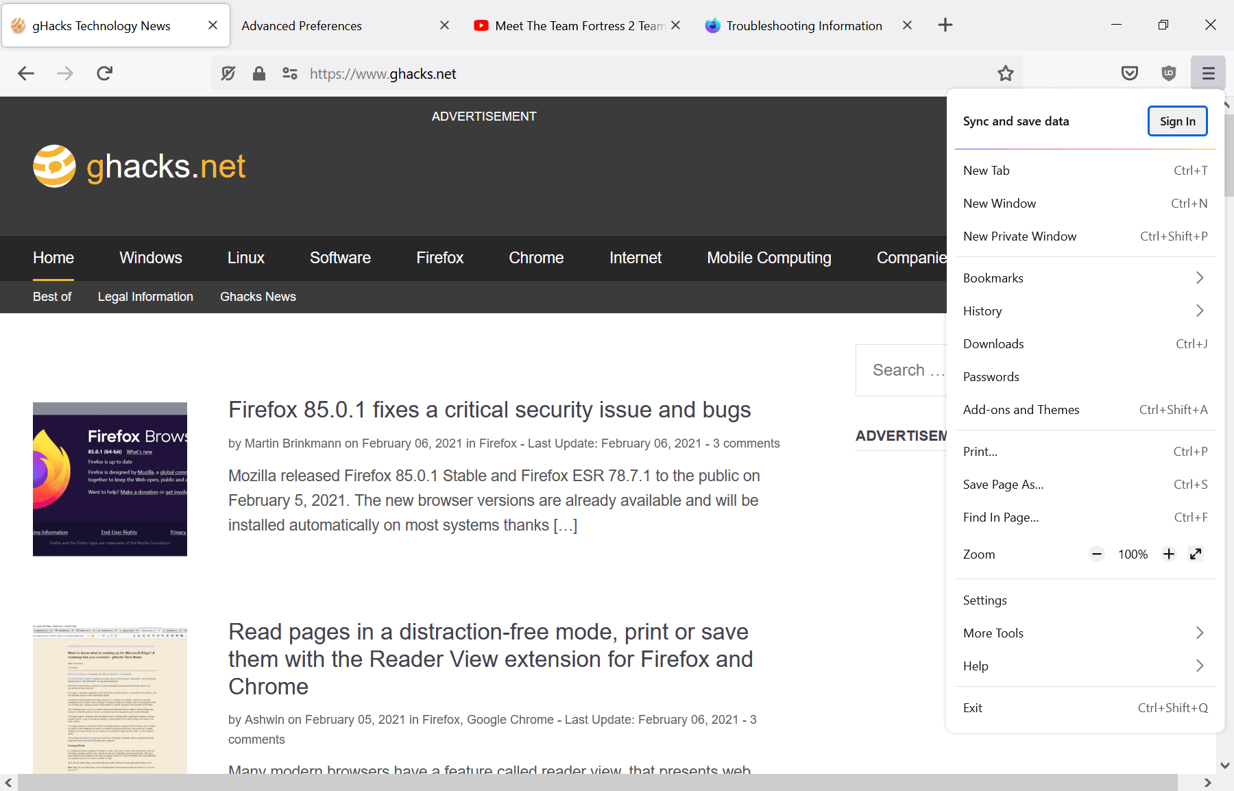
Mozilla Firefox is getting another design refresh; Mozilla has been working on a refresh of the web browser's design under the Proton codename for some time.
The organization plans to launch the new design in Firefox 89 Stable, out on May 18, 2021. Firefox Stable is at version 87 currently, which means that there will be only one major stable version release before the new design release in May. While things may be delayed, it seems unlikely that this is going to be the case for the design refresh.

The refresh will make adjustments to many interface elements of the browser, including its tabs, main menu, context menus, and modals.
Our last preview of Proton dates back to February 2021; a lot has changed since then. Most design changes can be checked out in Firefox Nightly only, which is at version 89. Many are hidden behind flags and not necessarily enabled by default.
The compact density is still available in the latest Nightly version.
Removed Options
Mozilla removed the preferences browser.proton.toolbar.enabled and browser.proton.tabs.enabled in the latest Nightly versions. The functionality is included in the main Proton preference browser.proton.enabled.
New options
Quite a few new preferences have been added to Firefox in the meantime that handle various Proton related features.
Here is an overview of the preferences that are available currently:
- browser.proton.enabled -- This is the main preference. It will be the main preference going forward, while most of the development related proton preferences will be removed at one point in time.
- browser.aboutwelcome.design -- The preference ensures that Firefox displays the new Welcome page for new users of the browser, provided that it has the value proton.
- browser.proton.doorhangers.enabled -- Doorhanger, e.g. when installing Firefox add-ons, are handled by this preference.
- browser.proton.infobars.enabled -- The infobars, e.g. when popups are blocked, are handled by this preference.
- browser.proton.modals.enabled -- The new modals for the browser are handled by this preference.
- browser.proton.places-tooltip.enabled -- The changed tooltips design is handled by this preference.
- browser.proton.urlbar.enabled -- Changes to the address bar are made behind this preference.
- browser.tabs.secondaryTextUnsupportedLocales -- This is an interesting preference, as it will remain available after the launch of Firefox 89. It lists locales that don't support the new two-line tab layout when playing media in the browser. Add your locale, if not listed, to get a single line layout for tabs all the time. I could not get this to work though in the current Nightly.
- widget.macos.native-context-menus -- Mac OS specific preference to enable native context menus under the operating system.
- widget.macos.respect-system-appearance -- Mac OS specific preference to get full dark mode support when dark mode is enabled on the device.
Generally speaking: most preferences are Boolean and accept values of True or False. True enables the new design usually, False disables it; this is true for all preferences that end with "enabled".
Now You: what do you expect from the Proton redesign? (via Sören)








I absolutely love change; and innovation; and artistic endeavors. This version of FF is awesome; it’s among my favorite so far. Excellent work Mozilla team! But as some acknowledge, many people are not able to keep up with sudden changes — stuck in the past; sticks in the mud; slow to change — apply any one of the 40 synonyms for inflexible herein (though they’re oblivious to seeing that trait in themselves of course). These kind are therefore angered and/or resentful whenever change takes place in whatever they do. And angry people are what fuels the Web … and politics (gulp). That’s why they vent the vitriol in places like comments sections and Reddit and other SM platforms; the rage cannot easily be contained. But the wise and contented are at peace, and thus, they/we do not come to these places to vent, and so logistically, the number of angry ranters will always outnumber those who are perfectly satisfied with the works of another. So don’t be dissuaded by the ranters; you are wisely moving above all the Chromium-based browsers that are flooding the browser market. My compliments to the Mozilla team, and to gHacks for this presentation. I use FF synced on all my units; a Win-10 laptop, 2 NUC-PC’s running Linux Mint 20.1-C, on an iPad, and on an Android phone (the only phone app that one can use uBlock Origin on; what a lifesaver). Now that’s what you call thoughtful and civilized discussion! ~ On the Web: PaulAndrewAnderson
It’s here, and I’m not happy one bit!
I feel like I’m going blind looking at these borderless tabs.
The color schemes for the primary theme options are hideous – either sit in the dark or go snow-blind, because I’m not adding the MySpace-looking pastels.
Why does System Theme look exactly like the White Theme? Alternatively, what differences am I missing?
So much for The User’s Browser.
The only silver lining is that I’m getting a crash course in about:config as I try desperately not to leave this trash for the privacy-trodden alternative.
This is not an improvement, it is a downgrade. At least the flat design looked reasonable but this horrible round garbage design makes me want to cringe. The only redesign of firefox I would like to see is aero being brought back with colors and gradients. Yeah I know “it is not modern” well it can be if developers actually listened to people and stopped making horrible flat garbage ui for everything.
Proton sounded like a nice idea when it was the menus and the address bar. Now they made the tabs round too and other tabs without borders, blah! They also increased the size of the chrome at the top of the screen. Not good for small screen laptop users. Looks ugly even on desktop monitors.
The single-most important thing for me will be if I can continue using userChrome.css to put the tabs below the address bar (i.e. “tabs on bottom”) where I want them. If I can’t do that anymore, I’ll be seriously PO’d and simply won’t upgrade.
… I liked this browser so much … And it looks like they’re degrading.
First, the mobile application, which is just buggy and freezes all the time, and now they have reached the desktop app.
Please, why replace such a practical design with that one that inconvenient in use?
How about adding the option to watch youtube in HDR mode like the other browsers instead of a ui redesign?
Its over for Firefox. Edge is now third place. Proton will kill Firefox even more.
I’ll have to see it to know. Our FF’s have themes that change them so much, the default theme is irrelevant. Nothing complicated, just find among the many, many choices, a theme that looks good and displays well.
One thing I’ve found consistently is quite a few dark themes don’t display well unless you have a very good display.
None of the OMG!!! changes FF has made has really had much effect on anything I’ve seen. There’s ESR if the release version gets weirded out with features.
The default interface has always been a template to me; play with it.
I expect Proton to be grey like a cloudy sky or slab of concrete, for an authentic 1970’s brutalist concrete East German feel.
Things designed by data collectors should always be grey, non-visual and brutally minimalist.
This is what I *expect* from any large coroporation.
If a company fires all it’s artists and replaces them with “data scientists” and makes everything grey and minimalistic , then it’s time to start worrying, because it means they’ve gone full blown 1970’s East Germany. Expect data collection and surveillance in everything they do from now on.
What I expect from Proton redesign is grey text on a grey background, with flat look monochrome icons which are difficult to see and confusing. But proffessional “journalists” will celebrate the lack of visualness as “clean” and “uncluttered” and “non-distracting”, because they are journalists, they are more comfortable with words than images and want to abolish all things visual.
Altean commented: “I wonder if they actually employ some good UX designer.”
I can assure you they don’t. I have a degree in this stuff and many years of experience. I never make the types of mistakes they make. Their designs reek of “amateur hour”.
I think their biggest problems stem from not hiring the right people and not having effective management at multiple levels.
Nailed it !
“What do you expect from the Proton redesign?â€
Having to spend 20+ hours of my time writing custom CSS to fix everything they make worse. Maybe I’ll start a crowd-sourced fund to help get this done. Still need to feed my family.
What do you do when you don’t want to actually substantially improve a browser? You eff around constantly with how it looks, even when people say that’s not what they want.
What do I expect from the Proton redesign? *Nothing.* For several years now, pretty much the only time I launch Firefox is to update it when SUMo tells me an update is available. I suppose I *might* notice *some* changes when they reach the version of Firefox ESR used by Tor Browser. But I’m not a heavy user of Tor Browser, either, so … maybe not. I’m still hanging onto Pale Moon as my primary browser, by my fingernails, with Gmail, YouTube, Netflix, and the odd ill-behaved site “offloaded” to Brave. I haven’t really had much use for Firefox since they introduced the Australis interface, and almost none at all since they dropped legacy-extension support. (I know: I’m a relic. I prefer steel-frame bicycles, too. Nicer ride; less prone to catastrophic failure. ;-)
Quick Update: I’ve provisionally cleared Gmail as an independent “problem site” in Pale Moon. It can be badly affected by hangs caused by *YouTube* (my most serious problem site), but it seems to be reasonably well behaved on its own, for now.
Why downgrade from the best UI & UX among all web browser to this thing?
Firefox Quantum’s design is already the best among all other desktop browser. It’s the most consistent and easy to use.
It only need an update to the Library (History and Downloads) and it’s good to go. Instead they wasted time and resources updating something that’s already decent
This new one look so ugly. Thank God they didn’t rounded all corner into a circle or I might mistake it for Chrome!
Why can’t they spend energy on options like “no gray fonts” and “all URLs are colored” not only show if you manage to hover on them?
This looks like I’ll move to somethingelse but never Edge.
By far the most ugliest useless redesign I ever seen. Major downgrade. I will switch to Edge.
RIP Firefox https://i.imgur.com/aQ3XMYQ.png
The range ( slider ) looks awful – like a novelty moving target for archers! Big round target with an orange middle ( on my defaults ). The previous one was subtle – subtle this is not – although Ronald MacDonald would probably like the look.
The FF UI was good and I do not update it for now. I love this like I have here https://ibb.co/gMXpkdY and no browser can do this. Chrome needs to have more UI options to choose from and then maybe but this like I have it here with the fast shortcuts for History (ctrl+H), bookmarks, … and such is for me the best one. Ungoogled Chrome is also nice but I miss the options to fit the UI like I want.
Also the new FF with his small UI that cannot be adjusted…jeez just click F11 if people wants more image space when needed. Is just silly what they are doing and all of them have tunnel vision if you ask me. They sit the whole time figuring out what to do next and in steads of make it PRACTICAL better, they make it worse.
When will the time come that they just give people all the options they need to set it up like WE want, each unique, and just update is 1 or 2 times a year.
> I love this like I have here https://ibb.co/gMXpkdY and no browser can do this.
Vivaldi can.
Not like this (for me) but it has also great options…
> Not like this (for me) but it has also great options…
Actually, exactly like this.
The real question is why would you want to, that’s one of the most cluttered browser UI’s I’ve ever seen.
And just press F11 also and gone is it all and why? Security perhaps… bc if we did not need it IF the internet was clean, then yes but for now this is the way I surf.
Yes for people that cannot browse with this internet. I know this al out of my head and is automatic. These are one of the best add-ons out there. CTRL+C I get a new container tab, screenshot (right click) and on and on… That is not the problem now. I know this all automatic and is for me no clutter at all. Only for the ones that does not understand it all are confused but now FF change the whole thing and that takes me out me flow (if I update)
firefox devs pay too much energy on things like UI re-design, but they leave behind things like password integration with windows or gnome keychain , chrome still superior on those.
I wonder if they actually employ some good UX designer. Those missing icons are really stupid “innovation”. Everyone reacts faster to symbols, icons etc. Not reading each similar looking text line. It really looks like Mozilla is falling apart and cares more about politics and mutliculti madness.
New Proton’s master-switch ‘browser.proton.enabled’ being available I’m likely to set it to false.
Colors, dimensions preferences may be personal but their combination, aesthetically speaking, require either a designer’s native talent or educated learning. One site out of a thousand maybe display color-color and dimension-dimension relations in a way that satisfies what may be called harmony. You don’t wear a brown tie with a blue jacket, you don’t set a gigantic title font-size with a tiny paragraph font-size… and you don’t set an invasive toolbar height given a browser’s window height, in terms of proportion. This is ugly and whatever the pragmatic approach (make it bigger) the result appears uncomfortable if a setting is chosen independently of other settings. Same with motor engines, everything is related. Same with fashion where you’ll see a “new rich” wearing expensive shoes, pants, ties, jackets but chosen independently one from another that the result appears as flashy, cheap. Well, this is Mozilla’s design approach : cheap because ugly, cheap because no global view of the harmony required on a browser’s GUI to bring the whole as pleasant. And not only Mozilla. Whatever my personal affection for Anglo-Saxon culture needless to say aesthetics are not their main talent for the simple reason they are not their main concern.
So no doubt I’ll avoid this new Proton which I perceive as an extra layer of ugliness.
Quote T. Hawack:
“Well, this is Mozilla’s design approach : cheap because ugly, cheap because no global view of the harmony required on a browser’s GUI to bring the whole as pleasant.”
Well, Hurray for this pedantry!
Do you seriously consider your example
as “color-color and dimension-dimension relations in a way that satisfies what may be called harmony”?
To me, it looks like the control panel of an underemployed LEGOLAND® employee who spends a lot of time arranging his beloved bricks over and over again.
If that makes you happy… so be it! But your personal “design” approach does not qualify for condemnation Proton as “cheap because ugly, cheap because no global view of the harmony “.
On the other hand, however, your “Golden Ratio T. Hack-Wack Design” is a splendid example of the many ways in which one can “design” his own “custom Proton”. No matter how cheap … ugly … as long as he perceives it as THE glorified egg-laying wooly milk sow GUI.
Use your unlimited creativity – e.g. Browser Toolbox – to avoid whatever you consider as an “extra layer of ugliness” — done!
@Emil Brausewetter, I’ve been having a second look at this old browser homepage of mine screenshot of mine as well as on your argumentation. I realize that I should have pointed out that the Lego appearance you mention is the very nature of speed dials and even Firefox’s New Tab (as I remember it, banned since always) has that design logic!
If we put aside this speed dial (the one on the screenshot was home-made), if we consider only a browser’s native design, my latest Firefox GUI re-design is not far from the one appearing on the old screenshot. Tabs Toolbar, Urlbar remain IMO closer to a pleasant look than what is offerd natively by Firefox. On an organizational approach, using the Bookmarks toolbar to include all the bookmarks instead of the Bookmarks menu, if out of aesthetic considerations, is smarter in that all bookmarks are made available with one click less. Most toolbar icons are redesigned as well because — and this is not Mozilla’s fault but that of extension developers — too often badly crafted and appearing more as a stain than identifiable and correlated to their extension. Remains several interface absurdities, about:addons, about:config, redesigned in latest browser versions, aimed apparently to kindergarden users, idiot. And much more …
So, yes, whatever the personal touches in this old screenshot (much redesign of my own work since, but basically the same guidelines) I consider (Lego inspired speed dial apart but how to avoid lego in speed dials,?) I consider the result closer to harmony than Firefox’s native appearance (and structure). Free of pedantry, still searching where I could have left it uncovered!
@Emil Brausewetter, or Emil the Arvhiver should I say? That screenshot you mention is old! Harmony is always a work in progress and I did mention in my previous post that colors, dimensions preferences may be personal but that it is their combination which delivers or not an harmonious rendering.
I maintain that out-of-the-box Firefox, as many applications, as many Websites, is an aggression to the eyes. Of course tools exist to correct the interface but, basically designers, IMO, have of such a qualification but the name.
Let’s forget the colors which apply more to Websites and consider only proportions : Firefox was, is and will continue to be ugly (uglier) without a user’s intervention. This is of course my opinion and many may argue that aesthetics is not a browser’s aim; it shouldn’t be the only one, not even the first one, but being neglected at this point is relevant, IMO, of so-called designers total lack of qualification. Remember the Opera browser back then? That was design, that was harmony.
Let’s face it, today’s world aims efficiency to the point of disregarding aesthetics. At the same time never have users been so committed to the ‘look’, sometimes excessively to the point of bashing an application on the ground it’s ugly, or old-fashioned in its design : I don’t participate to that excess, love Firefox technically speaking, but technically speaking only, my dear Emil :=)
It’s not bad. Any news about opening bookmarks, history and download in tabs instead of new windows by default? I’m waiting for this since 2002.
I sure hope they add icons to the left…
No, they won’t, unfortunately…
@ Dumb Wolf,
Why don’t you move them yourself if you don’t like them on the right? Customize menu still works to move stuff around.
@TelV
I think he means the missing icons in the drop-down menu.
There won’t be any in the new design.
This ultra low contrast design with no dividers between the tabs is very hard on the eyes.
> Now You: what do you expect from the Proton redesign?
Firefox will lose another part of its userbase. And, as a result, further shrinkage of Firefox’s market share.
Except, last I looked, FF’s market share has gone up quite a bit. Forget mobile; Chrome and Safari dominate it with Samsung’s Browser visible above the noise of everyone else. FF’s growing on desktop.
A browser doing well on an ad server platform that’s miserable for browsing with an indifferent user base that likely can’t tell you what browser they use because it’s bundled with the OS and they don’t use it much anyway doesn’t mean much to me.
I put Focus on our kids’ phones and disabled Chrome because they never use a browser, just apps. Chrome’s banned here. Focus with its 0.000000001% market share just sits there; when they need it, it works fine. All three of its features. Not sure why Focus still exists but whatever, it gets regular updates.
> Except, last I looked, FF’s market share has gone up quite a bit.
> FF’s growing on desktop.
Source?
I can’t remember a single time when a Firefox redesign hasn’t fxxked its users. This is why Firefox is 2nd best, far lower in popularity vs Chrome and soon may even slip to third place after Edge Chromium.
“What do you expect from the Proton redesign?”
Lots of searching for “userChrome.css” tweaks and “about:config” settings to undo, change, hide or remove some of the changes that nobody asked for.
i don’t like Proton redesign ,especially the big tab,
good bye firefox
+1
I use this from the author of the former Classic Theme Restorer add-on:
https://github.com/Aris-t2/CustomCSSforFx
Thanks for linking this.