Windows 8 Desktop With Less Eye Candy, Drops Aero Glass
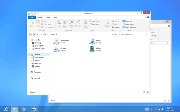
One of the first things that I do after installing Vista or Windows 7 on a new computer is to change some of the default visual effects the operating system ships with. On Windows 7, I immediately switch from the Windows 7 (Aero) theme to Windows 7 Basic which does away with lots of the eye candy that I'd otherwise be annoyed at. This includes first and foremost Aero Glass with its transparent window chrome, but also other visual effects that I find more distracting than helpful.
You may see this different, and there are certainly users who appreciate the Aero interface with its transparent chrome and visual effects. Microsoft however did reveal that it will change the Windows 8 desktop in this regard.
We applied the principles of “clean and crisp†when updating window and taskbar chrome. Gone are the glass and reflections. We squared off the edges of windows and the taskbar. We removed all the glows and gradients found on buttons within the chrome. We made the appearance of windows crisper by removing unnecessary shadows and transparency. The default window chrome is white, creating an airy and premium look. The taskbar continues to blend into the desktop wallpaper, but appears less complicated overall.
To complete the story, we updated the appearance of most common controls, such as buttons, check boxes, sliders, and the Ribbon. We squared off the rounded edges, cleaned away gradients, and flattened the control backgrounds to align with our chrome changes. We also tweaked the colors to make them feel more modern and neutral.
This basically confirms that Microsoft intends to drop Aero Glass, and several other Aero effects that the majority of Windows users have come in contact with in recent years. For me personally it is a welcome change, as I would have turned off those effects anyway on computer's running Windows 8.
Some visual changes will be included in the soon to be released Release Preview of Windows 8. The majority of them are however only included in the final release, and not the release preview. This is kinda interesting, as I had assumed that the Release Preview would be the operating system's release candidate, which usually marks the end of development. It is possible that Microsoft has included the features but disabled them in the release.
I personally like the design that you see on the screenshot above. What about you? Do you think Microsoft is heading into the right direction with these design changes? (via The Verge)
Advertisement







XP has the best interface. Windows 7 is click and cluttered. Wow is 8 trying to look like a apple computer. Copycats.
Jackie, that’s one great sense of humor! Good one!
I was never much of a fan of Windows until Win7. Aero is fine by me. I’m into performance more than looks, but nothin’ wrong with a pretty face. All flat makes me think of a JAVA based app like something with a GUI on Solaris. I’m sure it will look MUCH better than that, but I just had a flashback. For anyone concerned with looks, I’m sure Stardock will come up with a way to make it plenty flexible. It sounds like they are stealing a bit of Display Fusion’s thunder though. Not that MS has ever stolen anything from anyone …
OS matters less all the time so I’m not too concerned.
MS copying Apple here.
Too much white. I have no problem dumping Aero, but just to white everything out is dumb. They should do some research and use just enough color to improve contrast and reduce glare for users. Making everything white is terrible idea.
I think you are wrong martin, This is one of the nicer features that makes windows 7 stand out from the drone of other boring looking os’s. So not only do we now have to content with the sh1tty metro interface they are also now robbing us of some of the prettier bits of 7.
Do they want to loose all of the remaining customers they have to osx and linux.
I swear if apple were clever and added all intel and amd hardware compatibility (officially) to their os then microsoft would be dead within a year.
I also like the aero glass.
In the example image the taskbar has transparency!
I liked Aero Glass, not as much for the actual transparent borders and such, as for the way the taskbar shows previews of open app windows. Win7 Basic themes just show a titlebar list when you hover over a taskbar button. But Win8 is denigrating the taskbar anyhow, so I guess it’s moot, right?
Ross, I think Microsoft is concentrating purely on the eye candy, gradients and transparency for instance, while other Aero features will remain. I do not think they will get rid of taskbar previews for instance.
Noooooooooooo
no one seems to be addressing the folks you have visual issues with seeing the AERO Interface. With my eyes I could find nothing in Win & that releaved the eye strain. At Least Win 8 has potenmtial
I mentioned High contrast… that’s also the beauty of Aero: you can change colors and transparency intensity at will to your liking. So you can find your own settings that work best.
That’s what’s most important to me, customization potential.
the week I was forced to use a Win & Laptop I found no combination of colors that was acceptable. perhaps it was the Laptops issue
I am not worried about the “view” on Windows 7… I am upset about the things they did cut that actually worked…such as .. they took away the ability to download any screensaver..in fact, very few are available for Windows 7 and you have to “purchase” others to enable a variety of screens. They actually “downgraded” Windows 7 from past Windows. A bit upsetting!!!!!
@RN – You can right-click and hide ribbon in Office 07… not sure why all the fuss.
Thanks for posting this Martin. I’ve been interested to hear your take on this.
Maybe this is a sign of my aging, but I really like the Aero Glass on win7.. I like the ability to customize, change colors and transparency levels.
The minimalistic white reminds me of the High Contrast display setting! A little plain and white for my liking. I hope Aero is just off by default, not completely gone.
Oh, and I too hate the ribbon.
There is nothing I like about Win 8, so I don’t care about cosmetic changes in it.
I don’t much care about Aero. There are too many other things to dislike about Win8 – starting with the one app at a time thing. Yes, I read this a.m. that you can make four little tiny apps visible at once. Ha Ha. Not even close to what I need.
They’re making the space hogging ribbon even more gigantic???? Yikes? It all begins to feel like one big joke. Oh well, y’all are welcome to it. I gave up on MS Office when they took up the ribbon. There are plenty of nice alternatives – cheaper, too and not floating in the skies.
Thank heavens Aero Glass is going the way of the Dodo. It’s almost as annoying as Clippy, which is saying a lot. Now if M$ would only give the option to squash down the ribbon by, say, 50%.
And while I’m venting, how about murdering the fussy and outmoded default formatting choices for Word (superscript ordinals, forced accents on French words naturalized in English [cafe, sautee]).
Well, what ever they do, I don’t care. Why ? Because I m using other file explorer & and others shells and replace any interface/program possible.
But to command the post, I’d say the too much minimalistic trend breaks my b***s !
I hate the ribbon.
If it’s not broken, don’t fix it. XP was fine, and still is more pleasant to work with than Windows 7. Windows 8 basically acknowledges that fact.
Never a fan of ‘glass’ I rather like the way this is going. For a long time I’ve used a solid, flat visual style on Windows 7.
It’s probably worth pointing out, the article does say
“While a few of these visual changes are hinted at in the upcoming Release Preview, most of them will not yet be publicly available. You’ll see them all in the final release of Windows 8! ”
So we mustn’t assume this is the final design.
Do not like the plain white though.. way too “sterile”
Wondered when Microsoft will implement the flat metro style in the Desktop/Explorer segments of windows 8, but it will not work until they do the same with the Icons.
MS just doesn’t want anyone to use the desktop. By forcing you to use a bland ui circa 2000 they’ll help achieve just that. The only one’s who’ll like it are the “I’m a troo power user” types.
Like me. haha I’m on W7, but under “Performance” I use “Adjust for best performance”, so yeah my desktop looks like Win 98 in classic mode, but it runs so much better. I do switch themes up here and there, but I’m just drawn to the classic theme.
Every time I learn something new about W8 it confirms my plan never to downgrade to W8. I’ll use Ubuntu or alike while W8ing for W9.
Seems like a step backwards to me – Glass looks nice, and my system certainly has the resources to spare.
No, just one more reason for me not to upgrade to WIndows 8. I realize Aero Glass uses system resource, which is probably why they are dropping it so that the UI won’t lag on ARM processors, but I’d like the option whether or not to use it on my desktop.
I’m sure a 3rd party developer will provide a similar theme, but built-in would be best.
I don’t know where MS was going by putting that clutter on in the first place. I am still running XP because the visual cruft of its successors has put me off of changing. In the PNG you’ve shown, I’m concerned by the large ribbon and the massive icons. I have set XP to show ‘Detailed’ view on all folders – not perfect but icons aren’t helpful in that context. I don’t know what to say about the ribbon except that it has made working in MS Office even more painful than it already was. Seeing it expand is disheartening. Microsoft is asserting that it knows best for us despite howls to the contrary. Furthermore, they’ve learned from the M. Paperclip experience that people will turn this junk off given the chance. So, with the Ribbon, they’ve baked it in and told their users to take it.
You can hide the ribbon.
In Windows 8? That’s good to know.
I have tried to modify/remove the Ribbon in Office 2007 and it requires a lot of Visual Basic or XML tweaking. Since I only have it at work, I am not free to try a lot of those things and just have to live with it.
Yes I think they have even plans to have it minimized by default in Explorer. If that is still the case, I’m not sure about though.