Yuck! Windows 8 Explorer Gets Ribbon Interface
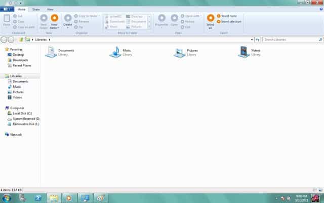
I have to admit that I do not like the ribbon interface that much. You can see it in action in Microsoft's latest versions of Office or Windows 7 applications like Paint or Wordpad.
It is only a logical consequence that Microsoft is now moving from standard menus to a ribbon interface in Windows 8. One of the first applications to get an overhaul is the default file browser Windows Explorer.
Please keep in mind that the following screenshots are a work of progress and that things may change before the final release.
You can see that the ribbon interface has replaced the menubar and previously available toolbars with the exception of the navigational toolbar. It takes up quite the amount of space. I'd estimate that the header space in Windows Explorer had to be doubled because of the new ribbon interface.
If you look closer at the available options you notice that Microsoft plans to display most functions that have previously been accessible via the menubar or the right-click context menu directly in the ribbon interface.
The Home tab for instance offers buttons to create new files or folders, to perform a variety of file operations like deleting, renaming or copying, as well as file selection and opening options.
Part of the ribbon interface is displayed dynamically. A library management tab is added to the interface if a library is selected.
A new File button has been placed in the upper left corner of the screen, resembling the file button of Office. A click on that button opens a menu with management options. Here it seems to be possible to pin frequently used places to the sidebar for faster access, to clear the history, access folder options and perform various other tasks.
It is not clear why the frequent places have been added to the menu, instead of the Windows Explorer sidebar where they would be accessible directly without an additional click.
New or inexperienced computer users will likely benefit from the new interface, as many functions are now directly visible on screen and not hidden behind a menu or context menu entry. This may look like a step back for many experienced users on the other hand, considering that they have to give up screen estate for a larger header with functions that they can access faster with keyboard shortcuts or the mouse.
It seems that Microsoft plans to add options to hide the ribbon interface in Windows Explorer, which many users would probably do in a heartbeat.
What's your take on the new interface, aesthetics aside?












Are you blind enough to not see the little HIDE button on the top right?
And you are commenting 6 years old thread? LOL, you are an idiot and Micro$oft lover?
Common sense says….follow the money, meaning the more ribbon crap is coming out of Redmond the more people will suffer from ribbon stress and choose an alternative route and less revenue will be generated. Office became popular because it standardized solutions on a global scale…..it now standardizes problems on a global scale.
Probably the only ribbon I liked was the nexus ribbon in startrek film Generations allowing one to visit any time and any place that one can imagine.
Ribbons I HATE YOU!!!!
I can’t find anything in the freaking ribbons, it takes too much space wasted on icons instead of on content. Things are berried in a way you can’t find them unless you use help.
It SUCKSSSSS!!!
The ribbon is a glorified toolbar. What I really hate is the loss of the file menu – the ability to control it completely through the keyboard (ALT+F to drop down the file, ALT+E to drop down edit etc) was fantastic – really great for keeping hands on the keyboard and off the mouse.
What we have now is a trend towards mouse dependant programs which are usable but slow if you have to type things.
I would like to get hold of whoever is in charge of user interface design at Microsoft and explain my point of view to him in long sentances – kicking him in the bollocks wherever there would be a full stop!
Microsoft keep taking decent programs and making them harder to use. Sack the dickhead who’s making these decisions!
Microsoft, please, continue with Windows XP interface… search companion, OFFICE 2003 GUI, explorer, iexplorer old interface, etc etc. Its curious why you make good interfaces for your use (like the one in Visual Studio) and fatal interfaces like Office 2010. Im like several guys that have written here… after 4-5 years of ribbons and ugly GUI’s like new search companion or explorer… I still do my productive programming and file working work on a Windows 2003.
And what about the permissions for several folders in Windows 2008 server??? “A feature” …. lol
They suck plain and simple. There needs to be an on/off setting for them.
Also, they should really try these thing out online first, to see what the reaction is. Rather then just sticking us with something horrible to use.
I hate them so much, it almost makes me want to try a Mac for a while. :(
The ribbon is absolutely HORRIBLE UI design. It may embody concepts that make for good interfaces, but it does so in a manner so haphazard and shitty that it shoots itself in the foot.
It is bigger than it needs to be.
The items in it are grouped and ordered arbitrarily.
It makes use of many custom icons, which were long ago proven to be slower to recognize than words.
Most importantly, the ribbon is divided into variably sized zones, each containing variably sized buttons. This makes it much harder for users to learn movement patterns that would allow predictive motions to improve speed.
None of this is opinion, it’s all demonstrable fact.
Yes the ribbon helps some users. It helps those who struggle greatly to find things anyway. But it also slows down users who were not previously struggling.
I also hate the ribbon UI, not a Microsoft hater, but it just looks very clunky and ugly.. I don’t know about you but I’ve hated the latest versions of Word & Excel, the older versions were a lot easier to use.. I think Microsoft should completely redesign the Windows explorer..
Everything needs to be redesigned, Icons, User Interface, Start menu.. A lot of people want functionality, but I want both a beautiful UI and functionality..
I know a lot of users hate Mac OS, but you have to admit its one of the best looking operating system around, not to mention its extremely user friendly (easy to use)..
I would like to see an even better UI then what Mac OS or even Windows 7 has to offer.. Microsoft should hire a completely new design team, cuz they couldn’t design shit currently..
You can either have functionality or beauty.
Beauty is the addition of unnecessary elements to appease the eye.
Functionality is the removal of unnecessary elements and reversion to basic techniques.
They just don’t work well together and when people comment how something is both beautiful and functional, they often haven’t had the fortune of using a TRUE functional device (re: iPhone, iPad).
But since the market is saturated with consumers ( I mean, someone insulted a PC Game for “Forcing me to read the manual” ) who want instant gratification and abhor THINKING about doing ANYTHING… well… there you go.
“Beauty is the addition of unnecessary elements to appease the eye.”
Umm, no it isn’t. The addition of unnecessary elements for decoration is called ornamentation, not beauty.
We don’t add extra noses to the faces of supermodels to make them more
beautiful.
Ribbons are huge mistake, one of many Microsoft made in recent years, end users want simplicity – Microsoft provides the opposite – complexity. Office 2003 is last usable office, new office releases SUCK even for 3 year olds, just one big nightmare, new versions of Outlook are slow moving e-mails, much worse than Outlook 2000, new products are most annoying software products in the world and what is even worst that all the comments we made how we hate all this new stuff dumb heads at Microsoft do not give a squat so what options do we have: if you want to be productive XP Pro with Office2000 or 2003, anything newer will take years out of your projected life span, cause unnecessary stress and aggravation, anxiety and depression. My older age neighbor gave up on computers because of Windows 7 and he loved it before Vista.
Windows Vista – 100% worst operating system of all times. Windows 7 is better (they spend millions on advertising telling us 7 is better), I agree it is whole 7% better than Vista but that is where the better ends.
People, be aware that there will be 3d effects, hide or unhide the ribbon UI in explorer.
when it comes out, give it some time, you’ll get used to it!
don’t forget even coverflow in explorer on OSX doesn’t help at all.
THE RIBBON INTERFACE SUCKS! IT WAS DESIGNED FOR 3 YEAR OLDS!!! It is only there to force older programs and XP to become obsolete for new sales, otherwise they would have given you an option to run either ribbon or a drop down version with all functions activated. A recent poll of XP users have an 80% negative view of the ribbon menu system, so MS decisions are not user based.
I Hope, Windows 8 doesn’t like Vista. Vista Sucks. BTW I Like The Ribbon. But, this is look Very Messy. And I don’t like that orange circle. I Hope Windows 8 is better than windows 7
what about tabs for Windows Explorer and Ms. Office ? that will be great ( I think )
Still not seeing anything about tabs. Simple huge missing feature and still nothing…wow.
Take a look here:
http://ludomatico.deviantart.com/#/d3dfxva
Could someone show me an article, where ribbons advange is clearly shown? I haven’t find one yet.
This little piggie went weh-weh-weh!
Simple solution for those who “hate” the Ribbon (or any other app feature for that matter), you have choices, repeat YOU HAVE CHOICES.
Use another OS or office suite there are plenty out there, some even free. Freedom of Choice applies to computer and software technology.
I know it is easier to whine and bash manufacturers than to make a change but those are your options – accept the change or change what you accept!
For the record, I am not a big fan of the Ribbon however, I adapted and I conquered. Progress waits for no one people even backwards progress! get on board or get to the back of the line. I choose to make my own decisions, so should you. Explore your options, there;s a whole world out there.
I’d rather have oblongcircles bash me and call me a pig than use the MS Office ribbon. Unfortunately I have to use MS Office at work. Also, I have Excel VBA scripts that don’t work in Open Office and Libre Office.
Businesses used to say the customer is always right. Now they have people telling you to get on board or go to the back of the line. What a change.
After getting frustrated by Windows Vista and MS Office ribbon, I’ve moved onto Ubuntu Linux at home and love it. It’s funny that this free software is actually better. But back at the office, it’s the MS Office ribbon world.
It’s not that simple, in the real world, you need Microsoft Office (and Windows, duh) to open files from customers, your boss, whatever… PROPERLY.
If they didn’t force it into me (i.e. added an option to show the good ol’ menus instead of this clusterfuck), I wouldn’t have a problem with it and it wouldn’t affect me. There are 3rd party apps for that, but that’s irrelevant for their decision (and the Addintools one, the best one, is paid).
Umm Windows is playing with the idea of impaling it and they have said that ribon will be heavily overhauled if it will be impeded.
Ugh, I hate ribbon with a passion.
Good thing I’ve been using (and can’t live without) Directory Opus for years.
The ribbon sucks in Excel and Word. I love Excel, except for the ribbon. It’s nice having more rows available in Excel 2007, but I seldom exceed 64k rows. The ribbon is more headache than it’s worth. Given a choice between Excel 2003 and Excel 2007, I would take Excel 2003 because I hate the ribbon interface so much.
I really hope Microsoft come to their senses and give the user an option to disable the ribbon interface… Putting aside the fact that it’s plain ugly, it’s also a nightmare for normal users that are used to old menus style. For myself, they can throw any kind of interface at me; I’m not necessarily going to like it but I can guarantee that I will be able to use it in 30 seconds. But for non-technical users this can turn into a real problem.
BOO HOO
I don’t like seeing functions left over from windows 3.
Therefore I like ribbon.
-_-
Its just plain tedious looking at row after row of plain text in a plain box.
It improves functionality for everyone when things get pimped – Just look at ios.
Evaluating, altering and extending access to functionalty is a microsoft tradition,
And I would say is something Microsoft are good at doing.
Wow, that felt weird,
praise for Microsoft !?!
I would have much preferred to be hearing that they would integrate tabs… or make explorer similar to IE9, over making is similar to Office. The switch to ribbon DOES take up more screen real-estate.
And if the ribbon is the major component being brought to the table for MS8, I’ll have to skip over it, just as I did for ME/Vista.
I want better 64-bit as well :)
Great. More vertical space depletion. 16:9 and now ribbons. There’s not going to be any vertical space left to do anything.
In Office 2003, I use ONE (1) menu bar to hold all the buttons I need. Which gives me the vertical space I need.
Absolutely concur with Jason.
I wonder how long will I be able to avoid Office 2007 and later versions?! What shall I do in 2015? Change to Linux? I thing I know for sure – no ribbon for me EVER!
Developer always hate the ribbon, End users love it. So lets have both Ribbon as well as Menu style. so that end users can choose their best option. I customized my windows 7 to look like windows XP. I am a developer, so i do not want ribbon. I know for sure context sensitive ribbon is good for new and end users. As 16:9 screens are becoming increasing, compared to 4:3 ratio monitors, this ribbon will consume most part of the screen, so Microsoft should rethink to provide both options or in fact avoid such unnecessary options and concentrate on faster file search, better file system, smooth preview, file sharing, security etc into explorer. with very less resolution and size in tablets , this should be revised and planned properly. BTW i am a Microsoft developer and own windows phone 7.
It is Yuck!.
Beware of a “cease and desist’ to this site due to Windows 8 screenshot postings.
some sites that got the warning and colsed/removed screenshots :
winreview.ru
MDL
Ultrawindows
PCPortal.org.ru
http://wst-place.ucoz.com/
http://staforceteam.clan.su/
The reason : “Violation of Exclusive Rights to Microsoft”
Once I figured out where everything was in Office, the ribbon was not so bad. If they don’t have the option to go back to menus and I don’t like it, there is not shortage of explorer replacements and this will generate more.
As to #1, let’s calm down. That is what is wrong with so many blogs. They turn into religious wars. Not being sure he is going to like this doesn’t make Martin an MS hater anymore than me not liking Itunes makes me an MS fanboy.
Martin-
Thanks for all the work you do to make this blog happen.
I don’t like ribbons and I’m skeptical. As we switched from Office without ribbons to one with them anybody was lost. Ribbons took more space, which left less space for the document. The worst thing was that we all knew how to do this and that without those ribbons, but had to look through the options or ask for help. It was a huge loss of productivity IMO. (Also .docx was the default extension and if it was send to someone who hadn’t upgraded we got complains, but that’s another story) (Now I’m working at a place where no ribbons are used, but it’s still an MS Office product.
I don’t use the word pad. Paint sometimes and the ribbons don’t disturb me.
My thoughts about Win8 Explorer is that is takes lot of space. Some stuff seems easier to access like the file extension (which will be probably hidden by default) what prevents that one has to go through the whole menu and the options to toggle that. It looks strange, but I hope that changes.
They should work on things like improving calc, the taskbar and add a blacklist to the start menu. If everything got ribbons finally it’ll be about time to rename Windows to Ribbon.
BTW: I’m using Windows 7.
I have been using Windows 7 for three years, and I still miss Windows XP’s explorer, everything was so smooth.
What if we just simply make more noise about this, facebook is probably the best forum for that? WE DON’T WANT RIBBONS!
KISS! Everybody nows what that mean…
…and now for some more MS bashing: Down with Multiple Sclerosis!
Anyhow, the ribbon interface we all know and love to hate has a justifiably bad reputation in the eyes of many. I think it boils down to the fact that it tries WAY TOO HARD to present elements in a logical and visual manner but yet somehow becomes more convoluted and difficult to navigate in the process. Furthermore, I don’t really know for sure and am too lazy to google it, but I would think most people hate the ribbon style of interface itself rather than how much real estate it takes up (or doesn’t, as noted in an odd nitpick sort of way by our friend above).
All I really want or need is a drop down menu with sub-menus, if necessary. That’s just me. Being an XP user (for life, at the rate things are going) I use “classic” folders and menus and even put the address bar next to my common buttons in Windows Explorer to save space.
Also, first comment is way off-base. Welcome to Ghax.
Nitpick, ei? Tell me which one you’d prefer → http://i.imgur.com/WzDHF.jpg
The slim one on the right or the big-fatty one on the left?
“What we have here is — failure — to communicate.”
I was stating that the first commentor was picking the size of the ribbon to focus on rather than the fact that it’s a convoluted mess when compared to (imnsho) more efficient and user-friendly UIs. The size issue takes a backseat to the most valid reason to hate it: the confusion endured in trying to navigate it. Again, the more pressing matter that needed mentioning was how intuitive the interface is. In addition, I can forgive it being too big, I can’t forgive it for being poorly thought-out in regards to layout.
Right? Right.
The ribbon is just ugly, big, pathetic. Don’t you realize about that?
I love Microsoft, but this is enough! Please stop ruining OS with this kind of ugly and fatty design!
In first place, just ask yourselves: Why Internet Explorer 9 is SOOOOO sleek? Huh? Just tell me.
Now, why W8 Explorer will have Ribbon??? It just have no sense at all!
I have the answers:
1. Internet Explorer is SO SLEEK and refined because Microsoft realize that the USERS don’t want a fatty and full of bars and elements invading the screen, and they just “copy” Chrome’s interface.
2. Windows 7 Explorer is JUST fine! Windows Explorer don’t need this “kind” of aesthetic changes. At all.
Office is Office. Office is NOT Windows Explorer.
Look; Windows Live Mail gets worst when then decided to use the infamous ribbon. I hate the ribbon.
I’m not stupid, and I don’t need that BIG and FAT icons on my face to realize how to copy a file or create a new folder!
You can do almost EVERYTHING by doing a simply right clic!!!
C’mon people, think twice!
Got another reason for not to upgrade to Windows 8 when it comes out. I have a feeling that Win8 will be like Vista – a huge flop!
I don’t particularly hate the ribbon interface for Office, Paint or Wordpad. But when it comes to Windows Explorer I much prefer a clutter free interface. And among all the versions of Windows Win7’s explorer appeared to be the best to me. I hardly use the explorer menus or navigation buttons because most of my explorer tasks are done by right click context menu or keyboard shortcuts. Even if they provide an option to hide the ribbon it won’t change my mind. Look at the File button, when it is clicked it will at least take half of the screen! What do they think of us? We don’t have good eyes for slim menus?
you can always press alt to bring up the “file, edit, view” menu’s and lock them back in anyway. I doubt they’ll take that function out.
hello people. why the fight? if MS won’t make an option to restore old UI, then other developers or hackers will find one.
i think there will be an option to show or not the ribbon
Instead of being just another blogger who bashes MS, why don’t you actually do 5 seconds’ worth of investigation by comparing the new Explorer with screenshot of the old Explorer.
I say this because I love the ribbon. It takes up LESS space in Office than the old interface…. yet there are still people who whine because they THINK it takes up more.
So instead of “estimating” that it takes up more space, why don’t you actually try and find out?
Nah, that’s too hard. You’d rather just be one more MS hater, like most bloggers.
I’m not an MS hater, but I definitely don’t like the Ribbon control. It sucks.
Bullshit, I’m not a MS “hater” but the ribbon is simply terrible. You sir are a dumb fuck.
Do you even read this blog? Seriously? It’s not a hotbed of fanboi-ism for any side, and has way more favourable Windows coverage than most of the blogs of its type.
Some people hate the ribbon interface – I’m one of them. You like it. Good for you. I’m one of the poor sods who has to spend a long time sitting down with users who don’t have very much interest or confidence running through where everything is, and they still struggle.
I volunteer at a medium sized charity, and we’re in the process of moving everyone over to Windows 7 which has been fairly easy – we’re *dreading* moving everyone over from Office 03 to Office 11, purely because of that damned Ribbon.
A hater? For reasonably explaining why he personally doesn’t like a dramatic change in an interface? Some critical reasoning skills needed, methinks.
Yep I’m a MS hater, you are right. Goodbye.
Cool! I’m also a MS hater. I don’t think I’ll ever use any of their products.