Windows 11: Microsoft improves File Explorer sidebar significantly
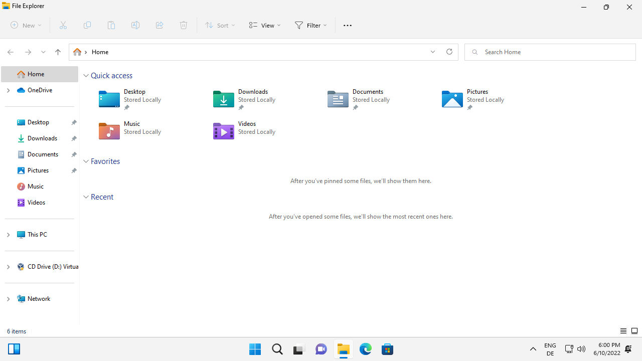
Windows 11 version 22H2 includes a new Explorer sidebar design and layout, that gives users more control over the links that are displayed in the File Explorer sidebar.

Microsoft released a new Windows 11 Insider build this week with several File Explorer improvements. Ashwin highlighted the tabbed File Explorer interface already, which many users have been waiting for.
Another File Explorer area that has been improved in the build is the file manager's sidebar. The sidebar lists links to various locations, including all connected and mapped partitions, optical drives, quick access links, OneDrive, network shares, and user folders.
The first thing that you may notice is that Microsoft added separators to better distinguish sidebar groups from one another. There is also a new Start section at the very top with a link to Microsoft's OneDrive file hosting and syncing service underneath it. OneDrive is displayed by default, even for local accounts and users who are not signed into the OneDrive app.
Uninstallation of the OneDrive app on the system removes the OneDrive entry in the File Explorer sidebar. The user folders are listed below Start in Quick Access, and when you expand This PC, you will notice that user folders are no longer listed in this group. This PC lists all mapped local drives, with optical drives displayed separately from hard drives.
Group titles, such as Quick Access, are no longer displayed. It is unclear if these will be added in later releases or are gone for good.
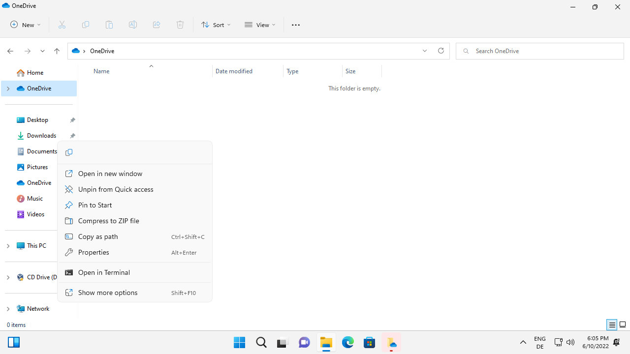
All user folders can be removed from the sidebar with a right-click on the item and the selection of "unpin from quick access".
The ability to display libraries is still present. Right-click on a blank location of the sidebar and select "show libraries" to add them. There you find options to hide This PC and Network, and to expand all folders in the sidebar or only the current folder.
Windows 11 adds a new Desktop root entry to the sidebar when you select "show all folders" in the right-click preferences. All sidebar folders and links can be collapsed and displayed with a click on the arrow icon of the desktop root entry.
Our colleagues over at the German tech site Deskmodder found out that the change will be included in Windows 11 version 22H2, which Microsoft plans to release later this year. There is still a slim chance that the change won't be included, but it seems unlikely at this point.
Closing Words
Microsoft modified the File Explorer sidebar significantly in the latest Windows 11 Insider build. The company removed the user folders from This PC and added group separators. Some users may miss group titles, as these are not displayed for all groups anymore.
Now You: do you use the File Explorer sidebar? What is your take on the changes?











What a confusing mess!!!
Duplication everywhere, what folder do you use, I now have three desktop folders, three music folders etc., and icons that like to disappear for no reason into a where are my files cloud. Not a good start to using Windows 11.
Even if the sidebar is improved, that doesn’t really weigh up to the breakage Microsoft has caused to the rest of the program.
More clutter. Why do they keep duplicating content in the sidebar!? How many locations do you need to access Desktop/Documents/Downloads/etc?
I have 22H2 installed but don’t have these changes, so presumably beta only!? I too use QTtabBar.
Deskmodder suggests that you can use Vivetool to enable it, did not test.
I’ve had a try but no idea what to try to change.
My build 22621 is not listed so I looked 22161.
I like this improvement, along with the file explorer tab, and taskbar improvements in your other articles. Look like Windows 11 version 22H2 is when I’ll be upgrading my Windows 10 to 11.
I use QTtabBar for many years. It’s miles better than Microsoft attempt at tab bar.
good god that’s revolting. please tell me this can be reverted in some way
You will be assimilated. Resistance is futile.
As I look at your screenshot on one monitor and an open windows 10 file explorer window on the other one though comes to mind.
What waste of space, in the screenshot that is.
My screen has 3 times as many locations displayed in only 2/3rds of the space of the folder pane on the left.
Windows 2000, Windows Vista, Windows 8, and now Windows 11. Why do they continue this cycle?
I never had a problem with Windows Vista. It was a revolutionary release.
There is no cycle of good and bad versions of Windows.
Nothing wrong with Win 8.1 either.
There is no cycle of good vs bad OSes.
Windows 2000 was an excellent operating system, maybe you mean Windows Me.
Thats ugly. Hopefully it can be turned off.
Nice improvements, I hope they will arrive soon. Thanks for the article! :]
CD-Drive not in “This PC”… so… where is it?!
It is listed below the This PC group.