Office 365 interface redesign to roll out in coming months
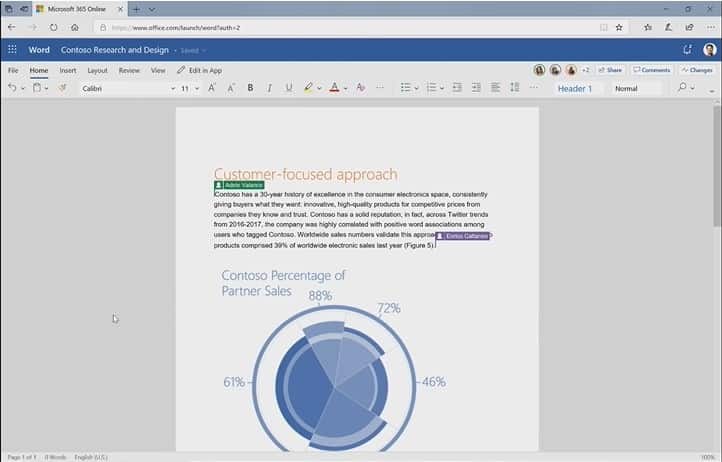
Microsoft announced yesterday that it plans to roll out an interface redesign for Office 365 in the coming months.
Probably the biggest change the redesign introduces is a new smaller ribbon bar that the company believes is easier to use yet still powerful enough to provide users of Office 365 with the right tools to get work done.
One interesting aspect of the change is that Microsoft won't just do away with the current ribbon interface; Office 365 users who prefer to work with the full ribbon bar can switch to it with a click on the down arrow icon located at the end of the ribbon bar. Microsoft notes that it has no plans to remove the full interface in the future from Office 365.

The new Office experience displays collaborators in the top corner of open Office documents; up to three are displayed with avatars that have a specific color assigned to them that is used throughout the document to highlight edits made by a particular collaborator.
The collaboration part of the interface displays options to open comments and changes in a sidebar like interface for fast access.
Note that the changes affect Office 365 only at this point in time and there only in Word. Microsoft will expand some of the changes to other Office applications and will move them to Word, Excel, PowerPoint, and Outlook on desktop devices this year as well.
The company's current rollout timeline is the following:
- Now: rollout started for the new interface in Word for Office.com.
- June: Insiders will get to test new colors and icons (but apparently not the smaller ribbon) in Word, Excel, and PowerPoint for Windows.
- July: Microsoft adds Outlook for Windows to the Insider test.
- August: Begin of rollout of the new interface for Outlook for Mac.
New colors, icons and a smaller ribbon are just some of the changes that Microsoft will roll out over the coming months. Microsoft revealed that it worked on search to make it more useful.
When users activate the search field in the new version they get suggestions right away without having to type anything. Microsoft calls this "zero query search" and notes that the recommendations are powered by artificial intelligence and Microsoft Graph.
Search could display recent searches done, people, or upcoming events.
The company published a video that highlights all major changes of the new Microsoft Office user experience.
Now You: Do you use Microsoft Office?








The Office 2000 toolbar design is back.
As someone who detests the ribbon, I would prefer being able to get rid of it entirely, but making it smaller is, at least, a little bit of improvement.
About time that MS starts adopting some of the innovations we see in the GSuite – e.g. collaborator icons.
Will see how those interface changes affect mobile use too.
Quote from Microsoft’s post: “Search will become a much more important element of the user experience, providing access to commands, content, and people. With “zero query search,†simply placing your cursor in the search box will bring up recommendations powered by AI and the Microsoft Graph.”
Translation: We will hide and remove everything we can, and hope you will find whatever you want to use via the search bar. Also “artificial intelligence” because we want to be hip and trendy so we threw in a couple of buzzwords too.
…simply placing your cursor in the search box will bring up hints directly from our database used on Microsoft Support Forums, with all those lines that does not help anybody, and some broken and/or outdated pages from Microsoft site, enhancing it with some misplaced pages about updates for Windows XP and some new features from Excel 97.
I’m still waiting for Windows 10 search to work like Everything by Void….maybe they’ll read this comment and just integrate it into W10.
p.s. – fuck your consent to comment checkbox @ghacks..
“With “zero query search,†simply placing your cursor in the search box will bring up recommendations powered by AI and the Microsoft Graph.—
Oh, god help us.