Google tests horizontal tab switcher in Chrome mobile
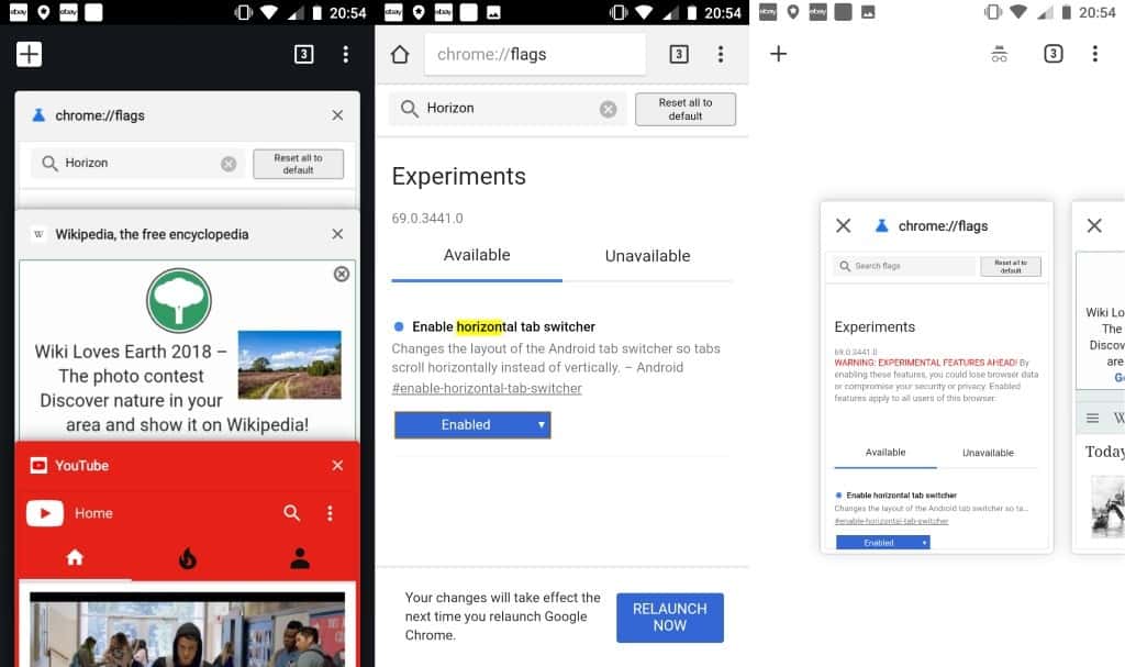
Google is testing a new feature in Chrome mobile for Android right now that changes the tab switcher from a vertical layout to a horizontal one.
When you open the list of all tabs in Google Chrome mobile right now on Android, you get the list of open tabs and the sites loaded in those tabs. The sites are stacked vertically with one site displayed fully and others in front or behind the active tab.
Touch controls are provided to scroll though the list of open tabs and to load any tab that is open using the tab switcher.
Note: Experimental features may come and go unannounced. While many make it into the stable version of Chrome eventually, the past has shown that some are removed again without being implemented at all.
The most recent version of Google Chrome Canary for Android includes an experimental feature that changes the tab switching interface of the mobile browser.
The following screenshot shows Chrome's current tab switching interface on the left and the new interface after it has been enabled in the most recent version of Chrome Canary on the right.

Here is what you need to do right now to enable the new horizontal tab switcher in Chrome Canary:
- Make sure you have the most recent version of Chrome Canary for Android installed on your device. You can run the browser next to the stable version of Chrome or any other browser.
- Start Google Chrome Canary on the device.
- Load chrome://flags in the browser's address bar.
- Search for enable horizontal tab switcher, or go to chrome://flags/#enable-horizontal-tab-switcher to jump directly to it.
- Flip the preference from "default" to "enabled".
- Restart the mobile browser with a tap on the relaunch now button.
You will notice that the display of open tabs changed when you open the list of open tabs after the restart.
The open tabs are displayed horizontally after the change; this has advantages but also disadvantages. The main advantages are that the interface looks a lot cleaner and that you see the full page content for each tab. The main disadvantage is that you see fewer tabs on the screen in the tab switcher.
I saw only one and a quarter or so tabs on the screen after switching to the new interface; if you open lots of tabs, you may need to use more swipe motions to find and switch to a tab open in the browser.
Closing Words
I try to keep the number of open sites to a minimum on mobile devices to preserve memory. That's the main reason why I don't mind the change. Chrome users who open a dozen or more tabs in Chrome for Android may not like the change as much as provides less of an overview of open tabs and requires more touch actions to find and open tabs open in Chrome.
Now You: What is your take on the horizontal layout of open tabs in Chrome mobile?













Terrible.and just the fact that you cannot have to the way it was is simply Facist.
Phones are so large nowadays, annoyingly, that we can easily have desktop-like tab behaviour: imgur.com/9wFnWdq
Just do it already. It works incredibly well, especially Firefox’s style – being able to scroll through them.
Do they also still have the tabs show up in the Android Recents?
If so, I don’t really understand this choice. The separate listing in Chrome would then primarily serve as a way to view all your Chrome tabs in one place, whereas the actual multitasking takes place through the Android Recents.
So, it would make sense to have that listing in Chrome show many tabs per screen to give you a quick overview, rather than a detail-view of just a handful of tabs.
And well, I don’t know about Chrome specifically, but most browsers on mobile don’t load tabs until you tap on them, after having closed and reopened the browser, so RAM use shouldn’t be too big of an issue either.
It would look very good together with chrome home.
This is exactly how it works on Windows Phone, and it’s way better than the way it currently works (on Android).