What I like and don't like about the new Gmail interface
Google started the rollout of the new Gmail interface yesterday. While the company stated that users would be able to try it out as early as yesterday, it appears that the new interface is on a staged rollout which means that some users may not have access to it yet.
You can check out my initial review of major changes of the new Gmail interface as it helps find out what is new and changed, and how to activate the new Gmail interface right now.
The new interface is available only on request right now and it is possible to go back to the classic Gmail design as well. It is likely that Google will make the new interface the default eventually and remove the option to go back some time later.
In this article, I will focus on the things that I like and things that I dislike when it comes to the new interface.
The new Gmail: like and dislike
While there are certainly differences to the old Gmail interface, the general layout of things has not changed. Search, compose, the sidebar, and email listings are still there and displayed in the same order on the new Gmail.
The new design looks like a new paint job more than a complete overhaul of Gmail; that is good as users generally dislike interface updates that change things around.
Quick Actions

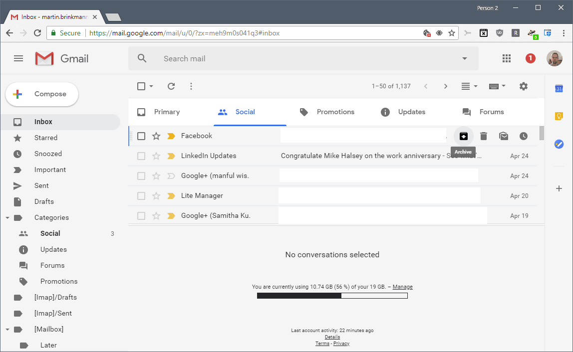
I really like the quick actions that Gmail displays when you hover over an email. Use them to delete, archive, snooze or mark as read emails without leaving the email list view.
Quick actions are available in all three "densities" that you can display the Gmail interface in.
While you get similar options (and additional ones) when you check emails, quick actions speed it up if you need to process just a few emails.
You need to use the select option to report spam, move emails, add labels, or use other actions such as mute, marking as unread or not important, or creating filters based on the selected emails.
Direct access to file attachments

Direct access to file attachments is another feature that I like a lot. Gmail displays file attachments in the email list so that you may open them directly without having to view emails first to do so.
The option is only available in the default display density, however. If you select comfortable or compact, attachments are not listed directly in the mail listing (only the indicator that emails contain attachments).
Not designed for smaller windows / screens

One of the things that I dislike is that Google has not designed the new Gmail interface for smaller windows or screens.
If I display the Gmail window on one half of a 1920x1080 display, some menu options are not displayed at all.
If you check out the screenshot above, you may notice that the Settings button is not displayed at all. There is no option to display it other than increasing the size of the Gmail window.
Another issue that I have with the new design is that the font color, dark gray on light gray background, is not optimal in my opinion.
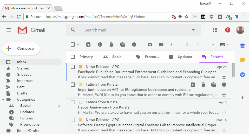
You may not have issues with that if Gmail is displayed in a large enough window, but if you don't, you will notice that Gmail uses a different layout for email lists.
Tip: you can change the text color in the Settings under General.
The right sidebar
Gmail displays links to the Calendar, Keep and Tasks in the right sidebar now. The sidebar is new and it cannot be removed from the Gmail interface. Even if you don't use any of the services or add-ons that you may add to the sidebar, you are stuck with it.
Closing Words
Users should treat the new Gmail interface as a preview. Google may modify it before it is rolled out as the new default interface for the web mail service.
I think that Google needs to optimize the layout further and address at least the width issue as users may not see the Settings icon at all otherwise.
Now You: What's your take on the new interface?







i forgot gmail password
I WANT TO CHANGE MY ACCOUNT GMAIL
Awful, distracting, slows down my work I absolutely HATE IT
Here’s another thing to add: the long loading times that weren’t in the classic design unless you were just logging in. Now, it loads for ~seven seconds every time you open Gmail, even if you’re already logged in (e.g. just opening it in a new tab).
The icon for “Primary” is almost the same as the “select all” box above it. In clearing out my promotions I accidently clicked the Primary icon rather than the select all icon right above it. I noted that the page was not selected so I clicked the icon again, but this time the right one which selected all of my inbox. I deleted several pages before I realized I was wiping out my in box rather than promotions! This is a disaster just waiting to happen. Is it possible to change that icon?
October 20, 2018. There is very little that I find helpful in the new Gmail. There also seems to be scant simple instructions about how to solve problems when you can’t find answers to problems you never expected.
I am switching to yahoo and possibly will also make an account on AOL. Don’t have time to work out how to use Gmail.
I’m forced to use this thing for work. As many others have noted, the layout is way to spaced out and even the compact mode is just too big.
Losing the ability to have the calendar plugin/lab to show on the lower left also stinks. Now all I can do is view “schedule” on the left side which eats up a ton of real estate. Was way better when it was just on the lower left side with the inbox folders/labels compressed half way.
Also, viewing schedule defaults to the first day of the month with something on it every time expand the calendar. I try clicking “Today’ and it does nothing. I have to manually scroll, then click Today and it cycles to today.
Seems I’ll be forced to use this in 8 days according to the menu alert I got today… great. I only have this thing open and being used all day every day. As a company that lives and breaths in the google suite, this is going to be painful. Just what I needed… more reasons to not like work.
I’ve already sent 5 different feedbacks in the past 30 minutes of using it… I’m sure that matters. I’ve switched back to classic… for 8 more days.
Just got slammed/forced into this.
It’s awful.
My tags are now sppaaaaaceed out vertically, and there’s screen real-estate now wasted with all those too-large icons to the left of the tag names. Also, the tags are larger and spaaaaaceeed out horizontally, but even with that the full text is no longer displayed. And there’s no adjustment.
End result: nothing fits in the window any more. It’s side-scroll death to try to find things.
There’s no way I’ve yet found to return to compact listings.
Bah. The UI designers behind this are simply no good as designers. It’s awful.
I get a horrible ugly blue when I select an email. Can’t seem to change it. It’s a big deal when you are using something every day. At least make it customisable!
I find the ‘loading’ animation annoying – especially because I see it twice as often as I ought.
I log in, Gmail loads up, and the Inbox is barely in sight when I’m kicked off. Round we go again!
This wasn’t a problem before the change.
After so many years…I now hate it. Any suggestions on another email service?
The ugly thing on the new gmail design is the Compose button. It’s too round, the plus sign has too much colors, the font is too small, the white background make it not important. Anyway the old Compose button was better.
Also the font Compose, Primary, Social, Promotions don’t fit with the usual font used in page. It looks like a mistake.
The rest of the design I find OK.
It seems that google likes to use wider spacing between lines. The same thing happened to chrome. It hurts the eyes.. I had to move back to the old gmail.
The new layout is horrific. This is what happens when you set non-UX people ‘design’ interfaces. Just awful !
The article says “Even if you don’t use any of the services or add-ons that you may add to the sidebar, you are stuck with it.”
Today 2018.08.11 I noticed you can delete it with a click on the lower part of the sidebar. FYI
Thanks, I don’t have that option. Maybe they do an A-B Test?
I prefer a very compact view on Gmail. With the new layout – everything seems huge from the font (which is ugly) to spacing, even with it set to “compact” view. The old layout was much better in this regard. I could see a long list of my tasks on the side bar and now I can only see a few items because the font and spacing is enormous!
I have the same probleme.
I feel like my screen went from 1920×1200 to 1200×768 because the font and spacing are so big now, even in compact mode.
The last time they change the design of gmail, I had the same probleme !
Next upgrade, we’ll have a row with a height of 50 pixel ?! (Right now, it’s 30 px, it used to be about 25)
+1. And in addition to the whitespace, all the additional graphics take up space and add visual clutter without adding any useful information.
JFC this font is UGLY!
At times I like to use my own installed fonts when I compose or reply to an email. I have circumvented the Gmail shortcoming (as well as my ISP web based email) by using LibreOffice Writer to make a small 2 line document using the IBM Plex font I want to use in web-based emails. Then for Gmail i copy-paste those 2 font, color, and point size into my email (either new email or a reply) and say what I wish. To keep these 2 lines handy in Gmail I store them in New Gmail Gear – Settings – (to bottom) under “Plain Text”. That way I have a fast, in Gmail way to copy – paste my font priming information in creating or replying to an email. I like the new Gmail very much after customizing to to my liking.
Am I the only one that can’t select text anymore in an email?
I constantly have to restart chrome to be able to select text in Gmail messages. Only GMAIL behaves this way.
I like everything about the new gmail, with the exception of the Compose Button, which should be rectangular, not a fully rounded rectangle. The other thing that should be corrected, is the size of the font in email composition – which for some reason appears smaller, when set to normal size. When you increase the size to large, the font is too big. I really like Roboto, which is one of my favorite fonts, and I am glad Google went completely to this in the new gmail. I set my theme to high-contrast, which improves legibility. I’m sure we will see some tweaks to the interface as time progresses.
JF, I appreciate you raise two issues that are annoying me to the point that I can’t use Gmail anymore. I am amazed very few people are talking about the ugliness of the Compose button and the awkward font sizes in Gmail Compose.
What an horrible font selection,the interface remembers me Windows 95, running with 256 colors at 800×600.
Leave it as it it, trust us!
I stopped using my Gmail account via web and switched to Apple mail. This works actually really nice these days. (No more endless drafts and troubled syncing like a few years ago.)
Hated new gmail: could not close search box, switched back and search box is still there. It was made by accident when I said huh? and what?. now I have a permanent search open????
I find it repulsive. I have switched back to the normal interface.
The fonts are bulky and ugly. Attachments only available in email list with the chunky default view. When you hover on an email in your email list the Date/time dissapear and are replaced with useless little icons! this is an outrage. The sidebar calendar doesn’t even show all your calendar events. When you reply to an email a stupid font toolbar appears covering the content of the email! Worste of all it crashing sometimes when logging in. Emails responded to from the trash still don’t go to sent folder they stay in trash. LOL, google really needs to pull up their socks here. This new Gmail interface is absolutely terrible and they need to get people working on this who actually know what people want. Give us a slim modern interface and fix the bugs, go for conventional instead of trying to change everything to have a yuppy google confusion twist, it’s getting old. I have just about had it with google slacking off, 12 years to update an interface is just lazy, what are those hipsters getting paid for?? PS get off your bums and fix the gmail app i am sick to death of the confusing idiotic converstion view being locked to on even when you turn it off!
Am I the only one who thinks the new font is ugly?
Definetely not. I want the regular sans serif I see in the settings menu. It should allow me to set the font to whatever I want it to be. Also, all the icons got bloated and bulky.
I find the new Gmail great after taking the time to customize it. On my 1920×1080 screen in Compact mode, if you change zoom from 150% to 175%, the right sidebar is invisible so no space is wasted. An email line becomes 2 lines; sender and subject.
Right sidebar is a complete waste of space. All of those apps are readily available from the 9-grid icon above them. I also couldn’t find Contacts. Did they remove it? How are we to manage an address book?
As with the recent Calendar regression, this is simply Google forcing their main apps to work like the mobile counterparts. I use Gmail on a computer for several reasons, not least of which is that their mobile apps are not yet ready for primetime.
Google apps have become increasingly frustrating in the last year or so. While I’m hesitant to abandon more than a decade of history with their products, it’s becoming less and less outside the realm of possibility.
You can remove it with uTorrent by putting in this rule:
mail.google.com##div[style=”width: 56px;”]
The mail sent/undo notification box is now annoying. It pops up in the lower left of the screen after an email is deleted, blocking the view of a portion of the next email’s contents, or the list of emails if deleting from the inbox.
This! I can’t stand this. I’m hoping someone figures out a way to change this? Even decreasing the size or something! I’ve browsed several forums looking for answers and haven’t seen anything. :(
Super busy and cluttered. Not pleasant to use at all. It gives me anxiety, actually.
I can’t see the contact list. I’ve always liked Gmail but this is their worst possible design. Some of my favorite extensions are not working properly. I may have to opt out of Gmail, the existing design is much friendlier but Google will move this ugly design in to production in not too distant a future. Will have to migrate to outlook.com or some other alternative. Another unnecessary task. Some crazy idea of Google.
Gmail still doesn’t show desktop push notifications after the tab closed in Chrome. I’m not sure if it’s an issue with the website or if the desktop version of the browser doesn’t support that kind of functionality yet. I have background sync and “Continue running background apps when Google Chrome is closed” enabled.
Agree with the earlier comments – losing the ‘contacts’ key is just ridiculous – what were they thinking? But it made me realise that the contacts listing is quite separate to GMail, and the more easily available to unidentified eyes, no doubt. Just great.
Hopefully, using the clients to beta test could change this?
I am sure every Gmail user wants to have Contacts readily available instead of having to search for them in the settings menu.
As a friendly aside. I almost never need direct access to Contacts. When I click Compose in Gmail, I almost always know how their email address starts, so when I enter a few letters in the new To: line, I immediately get a choice of complete email addresses to click on.
Don’t like the wasted screen space, especially the forced vertical bar on the right side.
I don’t like it at all.
Still a bland, monochromatic default UI, with very BLINDING, excessive white space.
Not impressed and will continue using gmail only for junk mail address sinks.
If you click on the gear settings wheel you can select themes. I like the High Score theme at the bottom. It changes from day to night at around 10 PM. You can also upload your own, so you don’t have to stare at that blinding white page.
I like the new “Loading Gmail” animation, I don’t like losing easy access to contacts, they would be good in the sidebar IMO. The sidebar calendar is nice too. I couldn’t yesterday but today I am seeing direct attachments in other display density’s also. I don’t like the permanent vertical scrollbar in Inbox view, and they removed the little tag colors so it is hard to quickly determine a tag on an email.
And can anyone tell me if there is an easy way to quickly see other emails from a certain user besides doing a search? In Outlook.com you can just click on the profile image and it shows other recent emails from that user, is there a equivalent in GMail?
I love the sidebar with Calendar and Keep. Very useful.
My only gripe with the gmail update is that it uses a lot more memory and scripts compared to the old version. I hope work is being done to optimize it for users with lower end devices and less reliable internet connections.
agree. its pretty but it runs slower, downloads take longer and outlook is easier
dont use it often enough to really notice difference, chocolate type theme I got still works.
“Compose” button don’t fit.
First thing we found is that ‘Contacts’ seems to have disappeared… Is there a way to access them in the new interface?
I found the same thing, I am currently accessing it via the button with 9 little squares on it (GApps) in the top right, then press “More” button in the bottom of the popup, it’s not very convenient though.
That little box of 9 actually works. Just drag the contacts box toward the top of the list. Easy. Thanks for the tip.
I have the same problem with the new Gmail, am unable to find my Contacts. There is no button showing for Contacts.
With exceptions such as those listed in this article, it’s nice to see that the new Gmail UI doesn’t sacrifice too much in terms of productivity, accessibility and general usability. Unfortunately the same can’t be said for Google Voice and other services that received desktop redesigns.
A reminder to others: if you’re like Martin and you have constructive feedback to share then go to Settings->Send feedback so it reaches the engineers in charge of the design who can hopefully improve it to suit your needs.
1. Quick Actions
I fail to see how this can speed up things, you need to hover first then click the action. It’s much faster just to ‘check’ the mail and choose action. It maybe faster for 1-2 email but not for more than 2 emails.
2. Direct access to file attachments
Attachment is additional information for email. I always read the email first before opening the attachment later. I wouldn’t want downloading virus accidentaly.
3. Not designed for smaller windows / screens
4. The right sidebar
A regression compared to the old one because it does not support smaller screens. Smaller screens will suffer more from the unused sidebar space.
Agreed.
I don’t use anything in the right sidebar either so I used uBlock Origin’s ‘block element’ feature to hide it. I also didn’t like how the folders sidebar on the left took up so much room until I clicked the ‘hamburger’ at the top. Have you tried this on smaller screens?
@hallmike — I tried uBlock Origin, and while it hid the elements in the sidebar, it didn’t hide the bar itself… so I have an empty bar that still takes up real estate. What am I missing?
Nice uBlock Origin tip. See that coming in handy. Small screen issues a bummer. At least can changes those default text colorings.
Hiding the right sidebar should still be a built-in Gmail setting for the times when third-party extensions like uBlock Origin are disabled or otherwise unavailable.
I like it, and the snooze feature is a real game changer for me. Previously I’ve used a snooze script that allows you to snooze 1-7 days into the future with emails returning early in the morning. This is much more customizable.
Features I’d like to see: the ability to use snooze in filters – for example, if X email shows up, auto-snooze it until Saturday morning; the option to have quick actions show up on the left side of the email rather than the right (less mouse movement); and the ability to turn off the new sidebar along the right (with Keep, Calendar, Tasks).
I like it. Especially the new sidebar with direct access to Keep and Calendar – both of which I make a lot of use of.
I wish that you could add your Contacts to that sidebar.
Searching for an email is vastly improved with the new Gmail. Lots of small improvements in the new Gmail as well; this is a keeper!
Very unpleasant. I came back to the old version
Having to click on the x every time a post gets deleted is ridiculous !
There are custom themes available from Stylish/Stylus.(Personally, I like Highlight blue etc.
by war59312.)
So far, so good, Martin. Nice improvement over the fairly bland interface that preceded this. I’ll take it, thanks Google – and thanks for your review (as always.)