YouTube App update launches with major UI changes
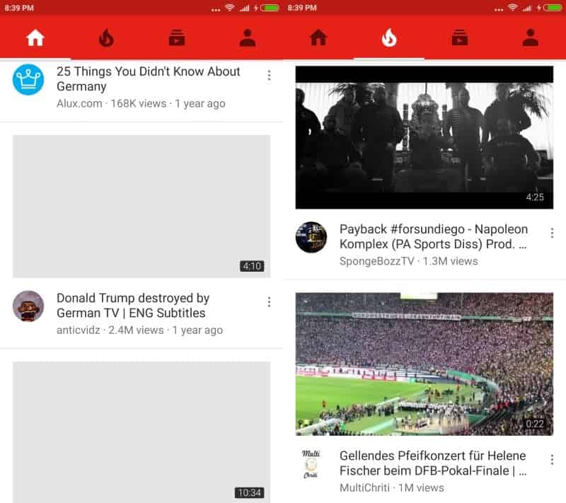
Google launched a new version of the YouTube application today on iOS and Android which comes with major changes to the apps' interface.
Changing the interface of an app that has been around for some time is always a daunting task. It is almost guaranteed that part of the user base will dislike the change.
Google notes that the update "provides a consistent layout across mobile" and "allows for easier navigation within the app".
The biggest change of the update is the moving of the top navigational bar to the bottom of the screen. The old application on Android used the following layout.

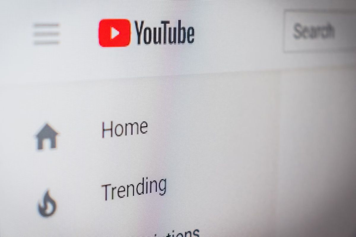
The main navigation tabs, Home, Trending and Subscriptions have been moved to the bottom of the screen in the updated YouTube application.
While those three were moved to the bottom, Account was not. In fact, you find account a row higher from its initial position in the old layout; it is now located at the rightmost side of the top toolbar of the YouTube application.
But Account does not list all the links anymore that it listed previously either, as some of them have been moved as well.
If you are looking for your YouTube History, the videos you uploaded to YouTube (my videos), or your playlists, you will notice that they have been moved to the new library menu at the bottom of the screen.
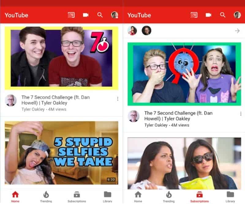
The top toolbar features new options as well. You find the new Cast button attached to it there, and there is a link to the camera of the device as well there now. The camera was previously available on the account page from where you could run a new show.
So, Home, Trending, subscriptions and Library are at the bottom, account and search are still at the top, and Cast and Camera are two new options up there as well.
Account lists settings and user account related information, while library anything that has to to with videos.
One great new feature of the app is that it remembers now where you left off on each tab. If you scrolled down the trending videos for instance, switched to subscriptions, and go back to trending, you can continue where you left off before you switched tabs.
One thing that is not so good is that Google removed the option to swipe to flip to another tab. This means that you need to tap on the icons now instead to switch from one tab to another in the application.
Apple iOS users should have access to the new version of the YouTube application already if they have updated it to the latest version. The app roll out is slower on Android, where users get access to the feature gradually. If you don't have access to it yet, you will have to wait until the roll out reaches your device.
Now You: What's your take on the new UI of the YouTube app?






> What’s your take on the new UI of the YouTube app?
No idea, I use the regular YouTube website with Firefox for Android and uBlock Origin. Safer, better privacy, no ads, limited tracking (we are still talking about a Google site with JS allowed, but a lot of it is blocked), and I don’t need a thousand apps any more.
This is a phone app, not a website.
Ugly as hell.
I have a 16:9 monitor and think it is crazy that so many space on the left and on the right that is totally white.
What is the point of selling 16:9 monitors when YouTube is optimising for Portrait mode?
You are aware this is for a phone app, and not the YouTube website, yes?
I like it, one less nuisance. Nokia Belle only sometimes had tabs on top, everything else was reachable at the bottom. Now I hate my life a little every time I have to stretch my thumb across 5 inches to tap on an option (or use the other hand). No wonder so many phones nowadays have cracked screens.
I hate it personally. I don’t know why google went to all this work to make a unified app design across their whole platform just to throw it all away /once again/.
“A consistent layout across mobile” Yeah, maybe if you’re on iOS. Sticks out like a sore thumb on Android though.