FBackup 5.0 Final has been released
Our last review of FBackup dates back to the year 2009, which makes today's release of FBackup 5.0 final a great opportunity to take another look at the backup software.
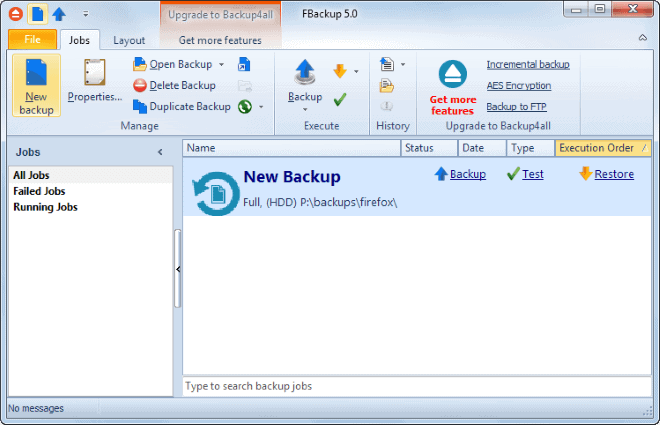
The first thing that you will notice after installation is that the program's interface has been redesigned completely. It now uses a ribbon style interface, which is certainly a controversial change considering that this interface type is not liked by all users of the Windows operating system.
The interface uses tabs (or ribbons if you like) that provide you with access to the program's functionality.
It is the jobs tab that you will use the most, as it lists all the backup related options, while the two other tabs are used to make layout modifications or advertise features of the commercial Backup4all software.
FBackup 5
You can start new backup jobs with a click on the new backup button in the program interface. If you have used the program to create backups in the past, you can also open them right here, for instance to restore files or check up on them.
The create backup dialog walks you through the process page-by-page, which you can change by clicking on the advanced mode link on the page.
Experienced users may like this option better as it displays additional configuration options that the wizard does not.
You need to select a backup destination -- locally or on the network -- and at least one backup source to create a new backup job. One interesting feature are source profiles the application ships with. You can use it to backup browser profiles for example, or the My Documents or My Pictures folder right away by selecting them in the menu that is displayed here.
Other options that you can configure optionally include:
- File and folder filters.
- If you want a full backup or mirror backup.
- Whether you want to use compression or split backup files.
- Running programs before or after the backup.
- Schedule backups.
You may have noticed that a couple of features common to backup programs are missing. This includes the option to use AES encryption or configure incremental backups. Those features are only available in the paid program and not the free one. It is still possible to password protect the backups, but the encryption is not as strong as AES.
New Features
Here is a short overview of the new features introduced in version 5.0.
- Full Windows 8.1 compatibility.
- Processes can now use up to 4 Gigabytes of RAM.
- Plugin Manager has been redesigned.
- Progress is now displayed for the running backup job.
- Missed schedules can be run.
- Option to suspend the application and with it all jobs.
Verdict
FBackup 5.0 improves the backup program further. While not all changes will be liked, like the ribbon interface for example, it is a step in the right direction.
It is still not a backup software for all purposes, as it lacks features such as stronger encryption or options to configure incremental backups. If you are looking for a basic backup software and do not mind ribbons, then this program is worth a closer look nevertheless.
Now Read: Overview of backup software for Windows
Advertisement








Not doing incremental backup removes the free version from consideration.
The paid version, Backup4All, is also beyond consideration because it’s licensing is per system and not per buyer or per LAN. Older systems and systems with different physical form factors tend to accumulate on a personal LAN without getting a whole lot of individual use. Nonetheless things do update on them and having to buy a license to back up each of them just isn’t practical. I wish they’d get it that their licensing model is costing them revenue. They aren’t the only company that needs to consider personal use licenses that are charged per LAN or per buyer.
The ribbon killed the app. I have Backup4all from the same developer which in version 4.9 is still ribbonless but if it happens that the add a ribbon to Backup4all I will dump it.
I wasn’t going to post this comment about Ribbon because this article is in general
about the fbackup back-up software, but seeing as others have added their opinions
I thought I would add mine own thoughts regarding the toolbar as well.
I personally think that the tabbed toolbar user interface section in programs is the Bee’s Knees,
it’s much better that GNOMES HIGs user interface layout used throughout GNU software.
Specifically in regards to Ribbon – the tabbed toolbar layout used in Microsoft Office, I think that the toolbar achieved it’s purpose to persuade and facilitate users to take better advantage of the many of features that have been around in previous iterations of the office suite, that were, in my opinion, less-intuitive to navigate through using the former drop-down menu layout.
The Ribbon toolbar layout in Microsoft Office 2007 has allowed me to obtained a superior understanding of how to implement the myriad of features available in the office suite.
Continuing in regards to the aforementioned office suite, many users would complain before about how distracting the colours of the Ribbon toolbar icons were in previous versions of Microsoft Office that use the layout, the ribbon icons in it’s latest version (2013) now use a bland or subdued colour scheme to minimize the disruptive element of the icons.
I would personally prefer that more software developers would implemented this toolbar layout if they felt it would it granted the user better access to their programs. I think the general layout of tabbed toolbars and their use of icons is an effective way to facilitate the access to a program’s various command features for both mouse navigation used on desktop and touch navigation used on table PCs.
I HATE ribbon GUI’s (though if a program gives an option to go back to a “regular interface” … I think there was an office suite that did that … Kingston Office? I cant remember), then I don’t mind.
I will give this another shot (never really disliked it … just stopped using it) ..though I am comfortable with Batch scripts and/or SyncBack (Free Ed.)
-Xmetalfanx
Really liked the new UI!!
” It now uses a ribbon style interface, . . .”
That’s a killer right there. No need to read on. Thanks for the warning.